morgan girvin
illustrator, maker and hermitinfo
about
contact
shop
illustrated work
wimmelbilder
film postersalbum art
maps
general illustrations
crafted work
hand crafted projects
big things
film boxsets

morgan girvin
illustrator, maker and hermit
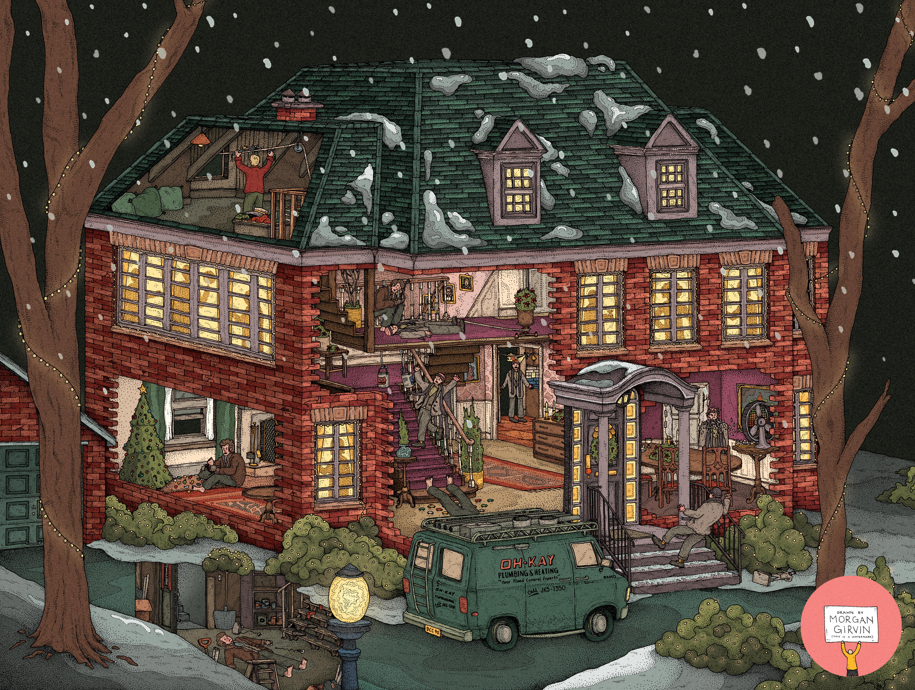

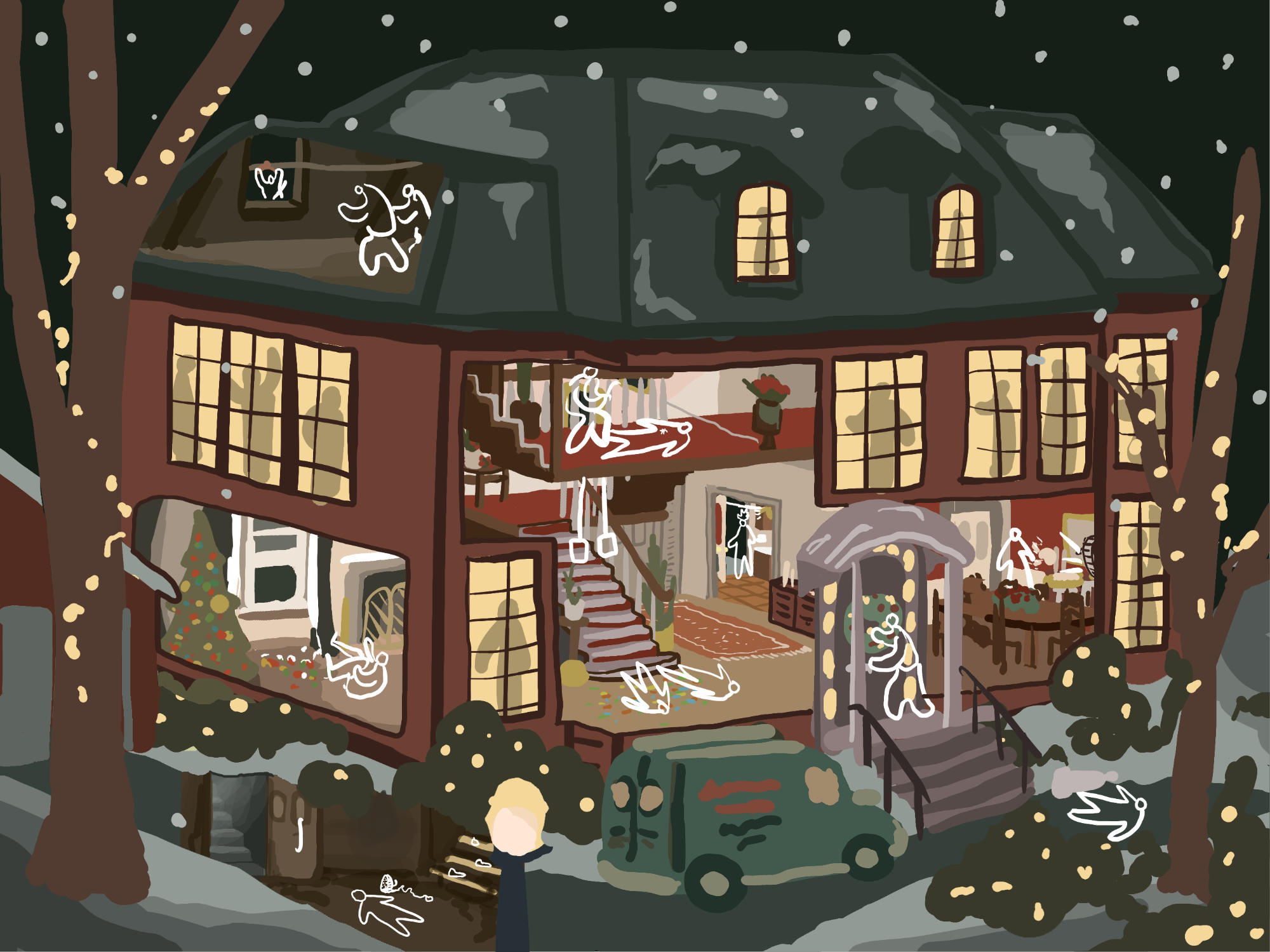
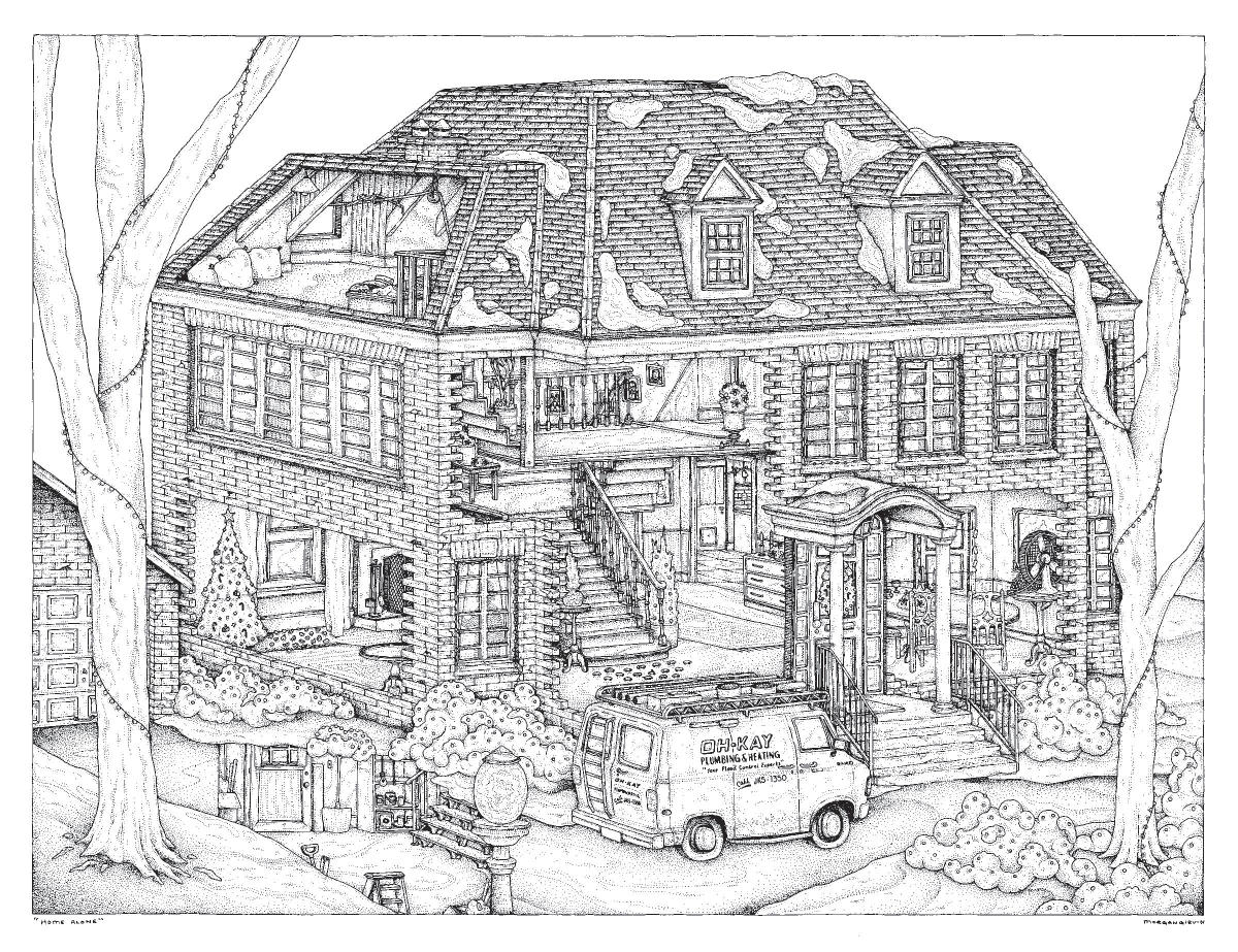
The Final Illustrations for Variant A (Pre-Break-In) and Variant B (Post-Break-In) of the 18x24” print, as well as the Original Drawing
HOME ALONE
18x24” / 0.35 rOtring Isograph / August 2024
Here’s the Home Alone piece(s) I had the honour of creating for Bottleneck Gallery this year! There are 2 Variants, each with a logo and non-logo variant, making 4 versions in total.
The guys at Bottleneck asked if I’d be interested in drawing the house from the film, to which my immediate thought was: “I am definitely drawing all of those traps”.
PLANNING
This really was one of those pieces where I knew right off the bat what it was (mostly) going to look like. The opening shot of the film is of the house itself, so that served for a good chunk of inspiration. The first port of call I had was to rewatch the film and take notes, focusing mainly on the traps and the order in which they happen but also on the general geography of the house.

For the most part I (think) I was pretty accurate with the floor plan of the house, but I also didn’t beholden myself to it too tightly. I didn’t want to compromise a good layout by having to keel over and say “Oh, but the kitchen has to go on this side!”. So long as the vibe is right I reckon everyone will be happy.
And for the most part, the final piece doesn’t commit too many faux pas. The most noticeable is probably the fact that the entrances to the basement and the kitchen are at opposite ends of the house, whereas in the film they’re next to each other. There doesn’t also seem to be much physical possibilty in how the stair case proceeds from the landing into the attic, but oh well. I have no excuse for that one.
Eager to get going, I jumped straight from this scawly mess into a digital version. This allowed me to refine the location of the rooms, since some had to change, and also plan out how the colours would look. It’s a Christmas film, so naturally I bumped up the red and the green. I also got a jump on planning out how the variants would differ, and where the characters would appear during the break-in.
DRAWING
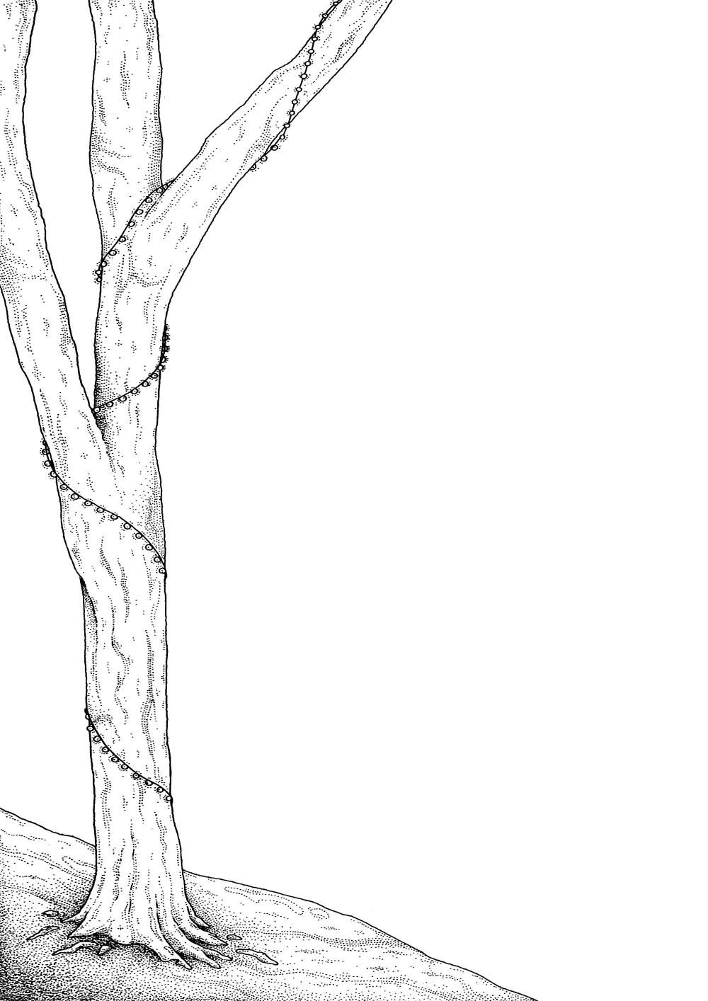
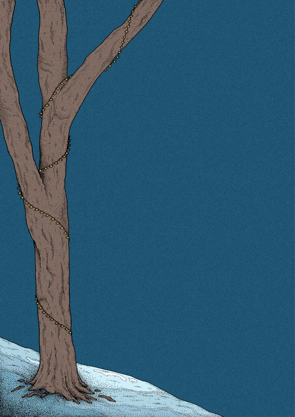
Often, my next step would be to hash out a separate pencil sketch before I use a lightbox to trace it with ink. Not this time! Given the fact that it’s a fairly simple composition (one building + a van + two trees) I did the inking and pencilling in conjunction with each other. I did the tree on the left first, which came out remarkably well by my own standards. I remember declaring to people “I just drew a tree and I’m proud of it.” much akin to a child with crayons.
I scanned it in, gave it a bit of colour and put it on my Instagram Stories as a nice little ‘out of context’ work in progress.
I’d set a 10x10 grid on the digital plan, which I’d then drawn at the same scale on my paper, so I didn’t feel like I needed to pencil the whole house before I started inking. I knew where the house was going to finish even if I hadn’t marked it out yet. This led me to doing a bit of pencil, bit of ink, bit of pencil, bit of ink. I started from the left and for the most part worked my way right, ending with the top right roof tiles and with the interior of the dining room.
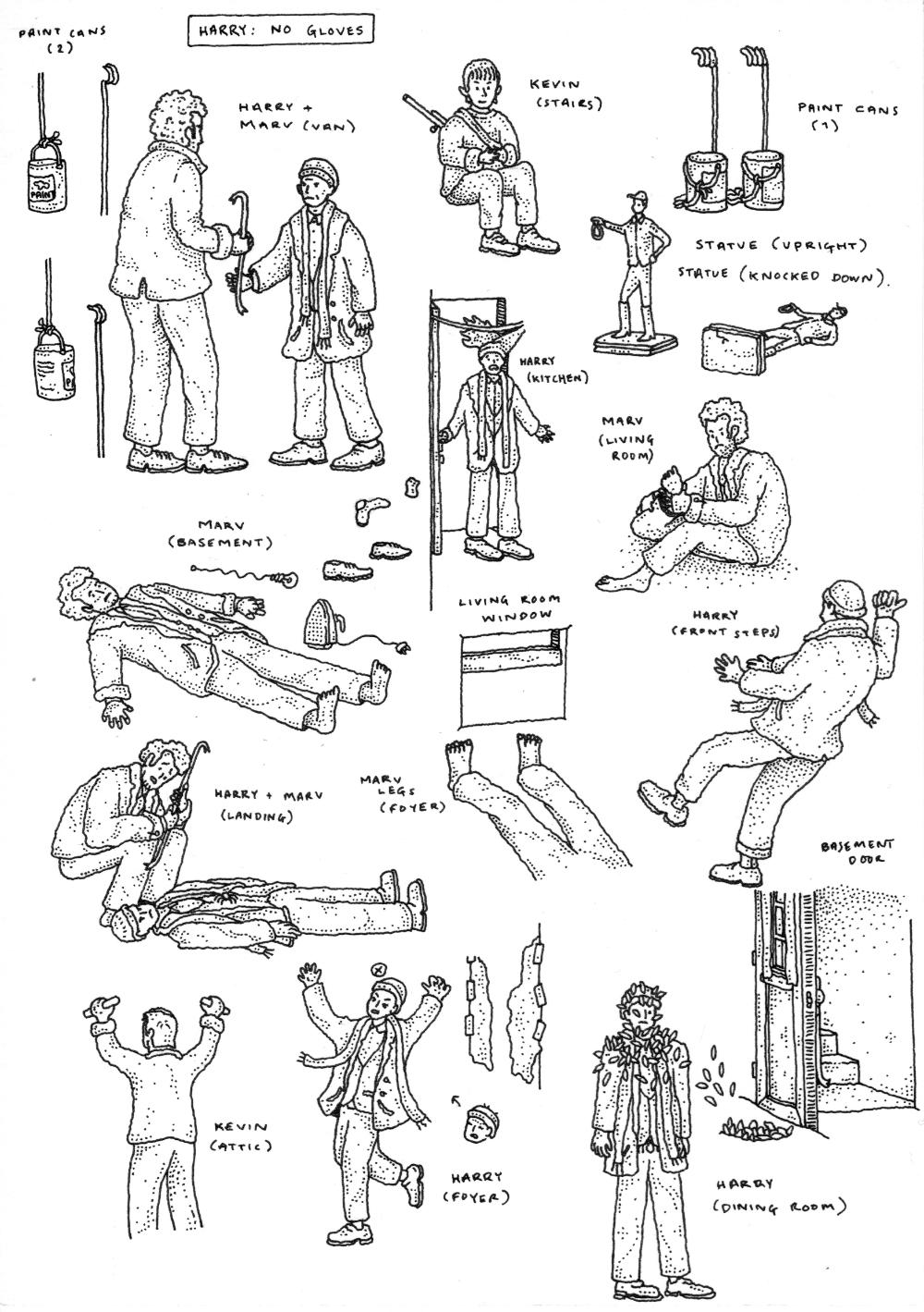
One notable thing about this piece is that the main drawing is devoid of all characters. Previously, when working on artwork that will have differing linework for it’s variants, I will draw the main linework as it appears on the lead variant, and then I will draw any differing linework for variant 2 on a separate sheet of paper, as well as any linework that needs to cover up elements from variant 1.
This has worked fine in the past, but I thought that this time that it might be easier if I do the drawing as a simple ‘base’ linework that I can then add characters into willy nilly, without having to worry about covering up linework and making changes.
Since I’m cheap, I tried to squeeze all of the additional linework onto one spare sheet of A5 paper that I had lying around. I inevitably had to go back later on and do more linework, but all of the character stuff managed to fit onto this sheet (just).
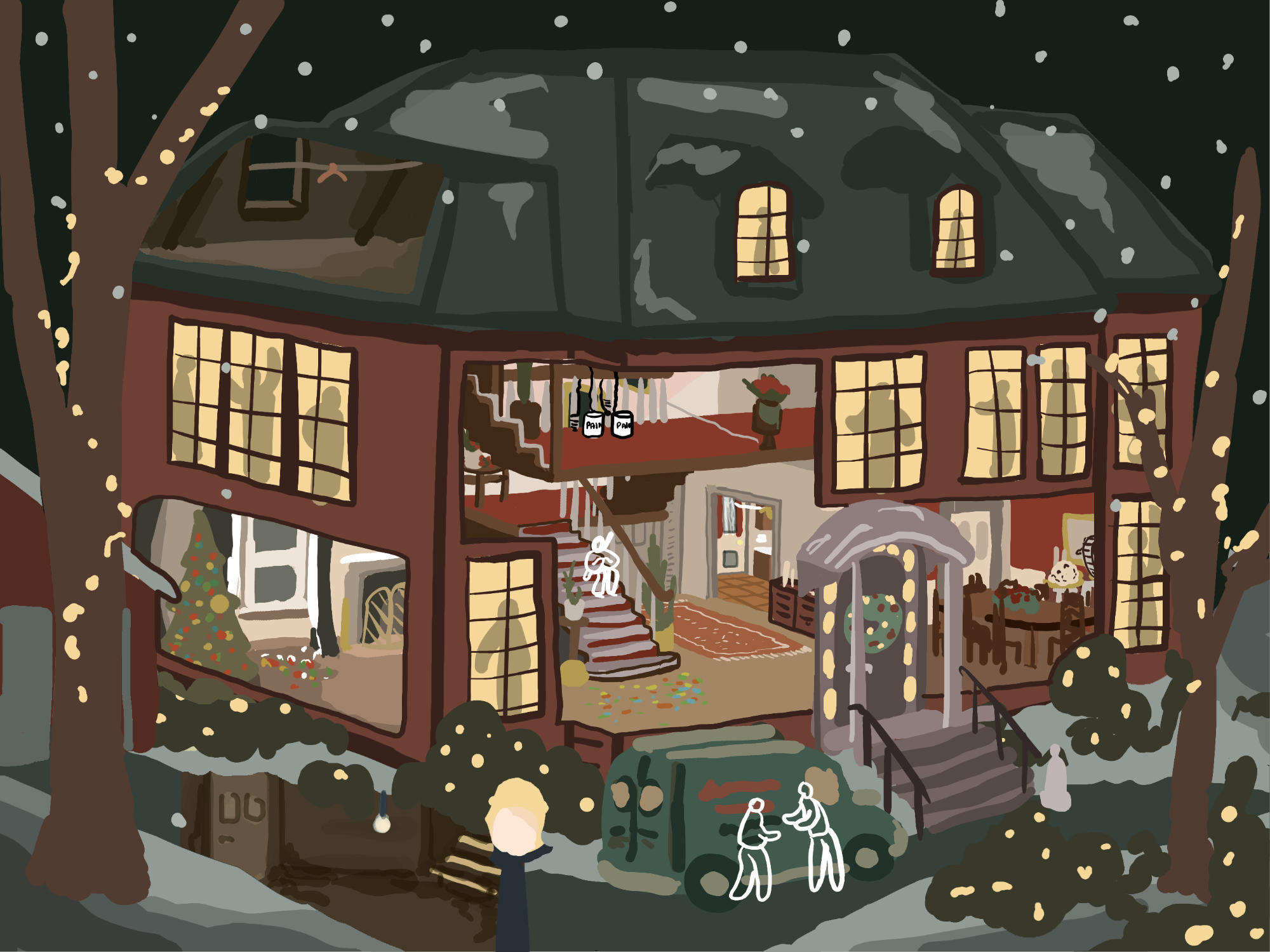
Even though the linework wasn’t finished, I’d already got the jump on colouring and a lot of it was done. That’s why it’s so frustrating that this was the point where I stepped back and realised I had to make a few changes. Below you can see the artwork as it stood:

There were two things standing out to me. The first being that the right edge of the roof was completely out of whack. I’d neglected to use any form of perspective grid at any stage of this drawing, instead just figuring “it looks right in the digital plan, so I’ll just work from that.” And, you know, for the most part I think it looks great! But it was only this far into the colouring that I’d realised I’d have to fix the roof. Not an awful job, just tedious.
The other realisation was that I didn’t like that the house wasn’t centred to the page. I’d known about this from the beginning, and it’s the same in the digital plan that I did, but for some reason I elected to move forwards with it that way. Maybe I thought it looked good? I can’t quite remember. And here I didn’t think it looked bad, but I felt it was ultimately damaging to the illustration and probably *should* be rectified. I tried out 2 quick solutions digitally:


I wasn’t inherently against stretching the artwork, but the house ends up too close to the edge of the canvas and it feels slightly claustrophobic. So I went with option B, which meant resizing the digital file, drawing additional linework and lining it all up digitally. I’m glad this is something I did, even if it was begrudging at the time. I allowed myself a second sheet of A5 paper (a nice little treat for the stingy boy!) and also did the linework for the logo and the bricks that would cover the window behind the logo.

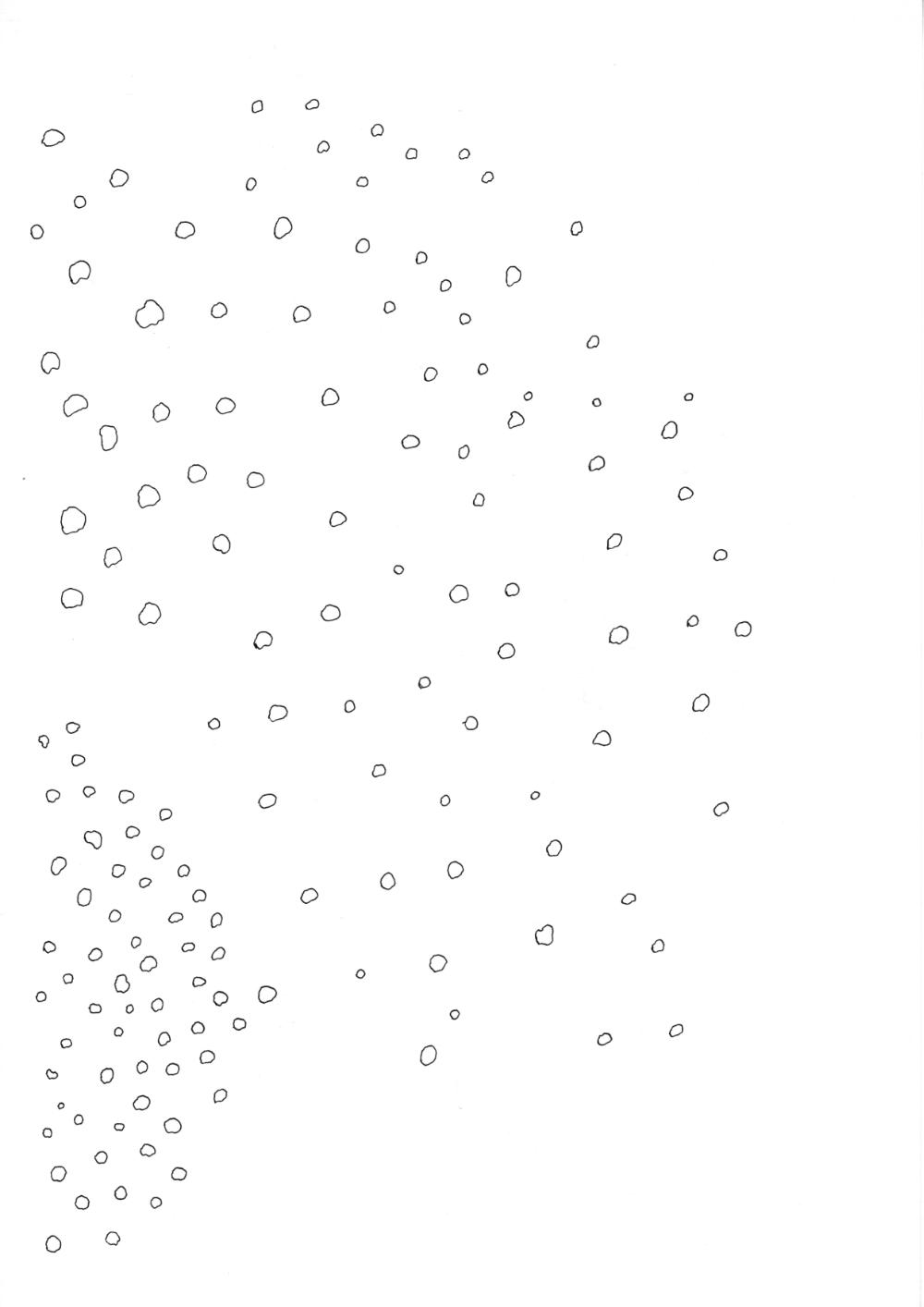
On the back of this sheet I drew the snow. I wasn’t really sure how this was going to turn out, but once I’d imported it into Affinity and messed around with some of the layer settings I was pretty happy with it. The snow layers became a bit of a mess from trial and error, but I think it was mostly just a combination of changing the opacity and adding a simple gaussian blur. I also had to pare the snow back a lot more than I originally planned because it just became so overwhelming. Not that this is anything bad, just something that took me by surprise.
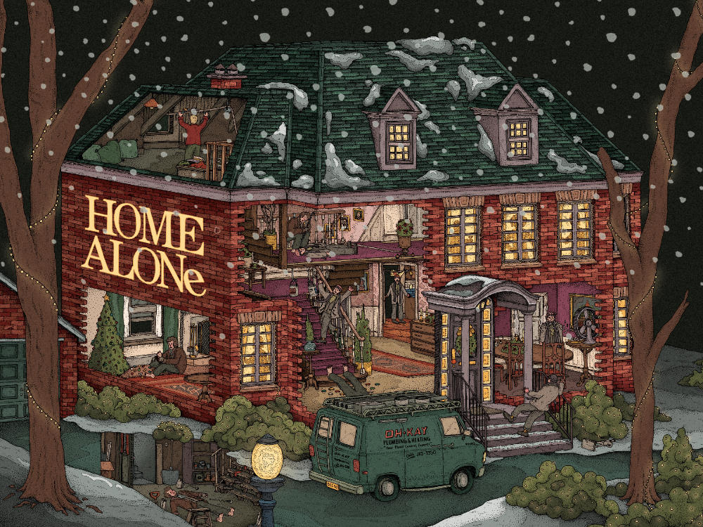
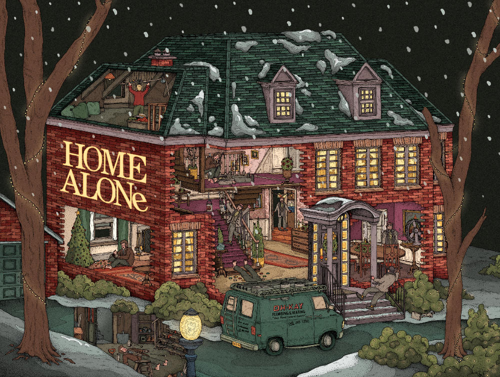
And voilà! A final piece(s) of artwork. I’m really chuffed with how these came out, I think they’re a lot of fun and I think I’ve captured a good vibe with them. They’re go up for sale via Bottleneck Gallery on the 16th September (2024 that is - just in case you’re reading this in the future).