morgan girvin
illustrator, maker and hermithome > wimmelbilder > jak and daxter
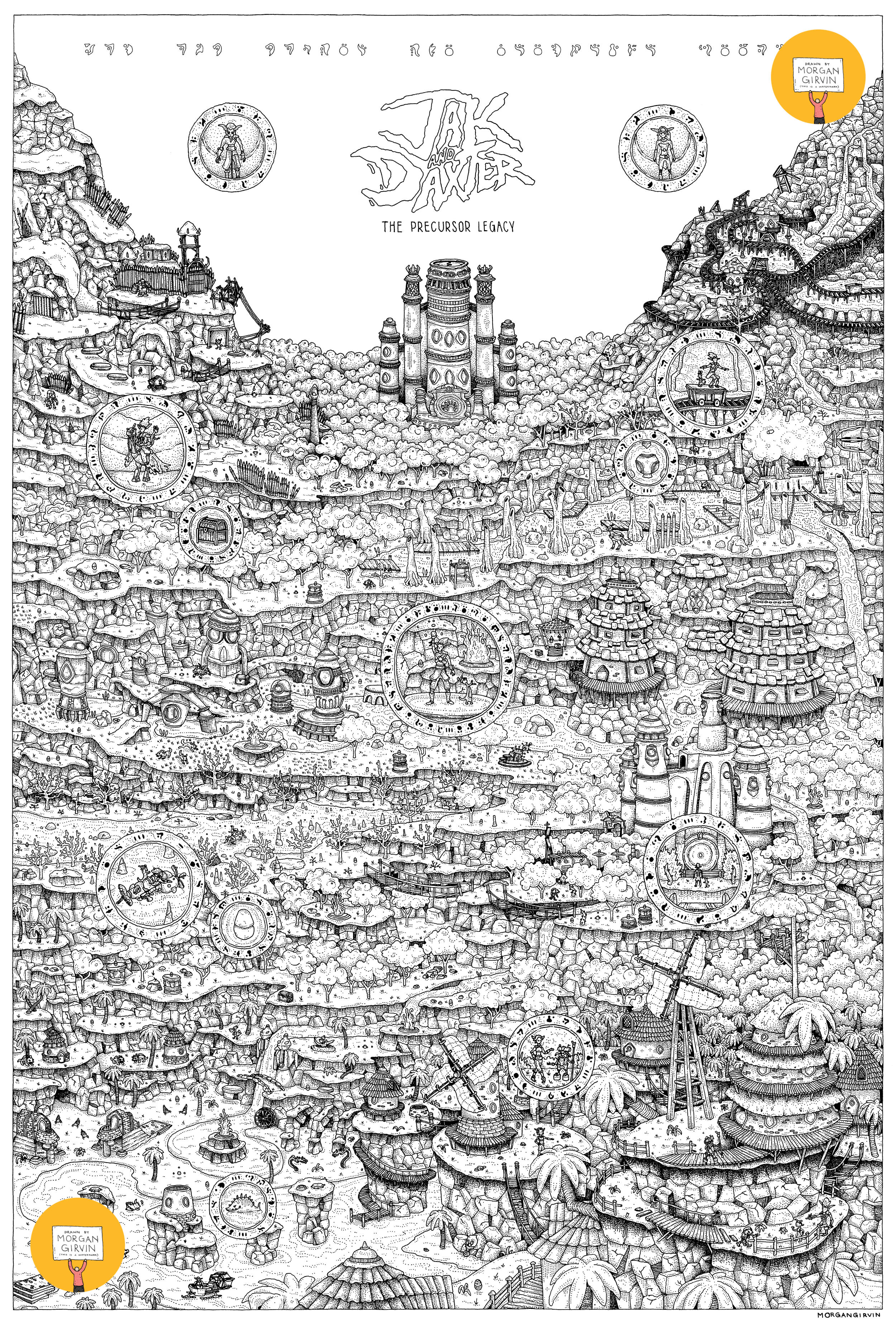
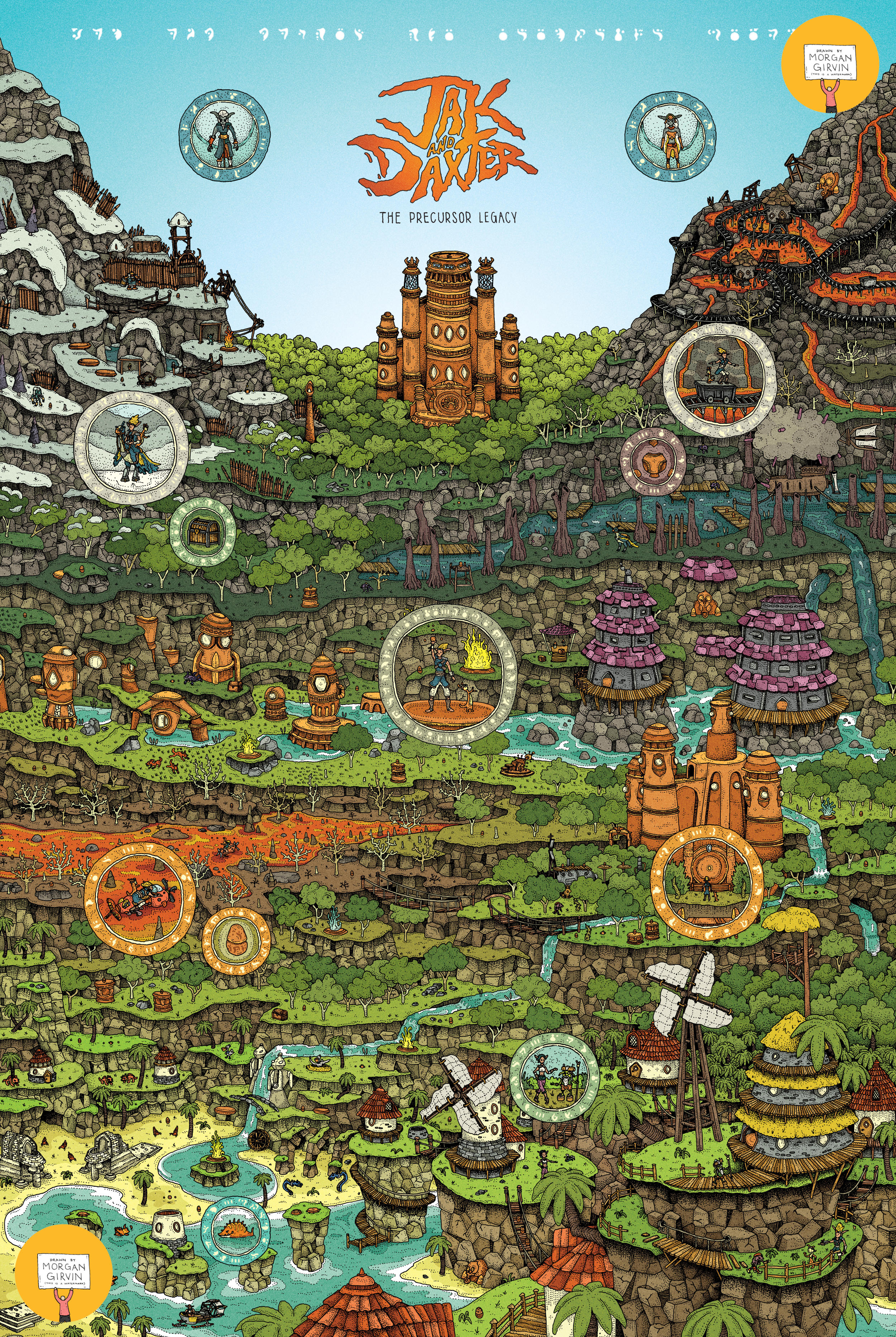
The Black and White Linework and the final Coloured Illustration
JAK AND DAXTER
24x36” / 0.35 rOtring Isograph / March 2024
PLANNING
Despite this one being mega dense with detail, it surprisingly wasn’t too hard to figure out the composition. There was of course a good bit of research/content collection/playthrough-watching done before I could start planning. After that I did a bit of rough digital painting to familiarise myself with the aesthetics of the levels within the game.
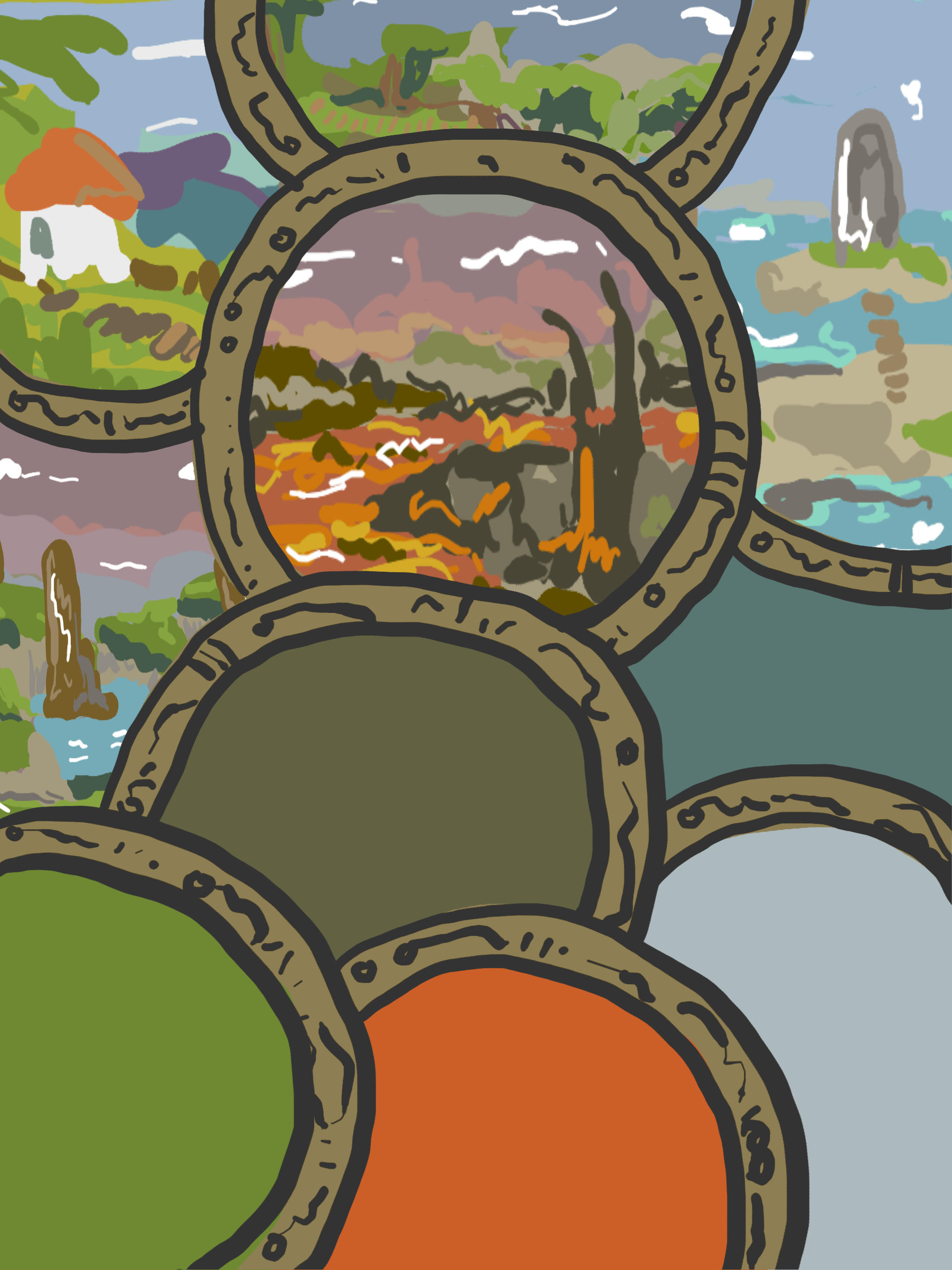

I only got 5 levels in before I realised that what I was doing was a bit of a fruitless endeavor. I knew that ultimately all of the environments would have to be stitched together for the final artwork, so drawing them separately (even if just to get my head around them) wasn’t overly useful.
With that, I jumped straight into combining the different levels into one congruent landscape, which looked something like this:
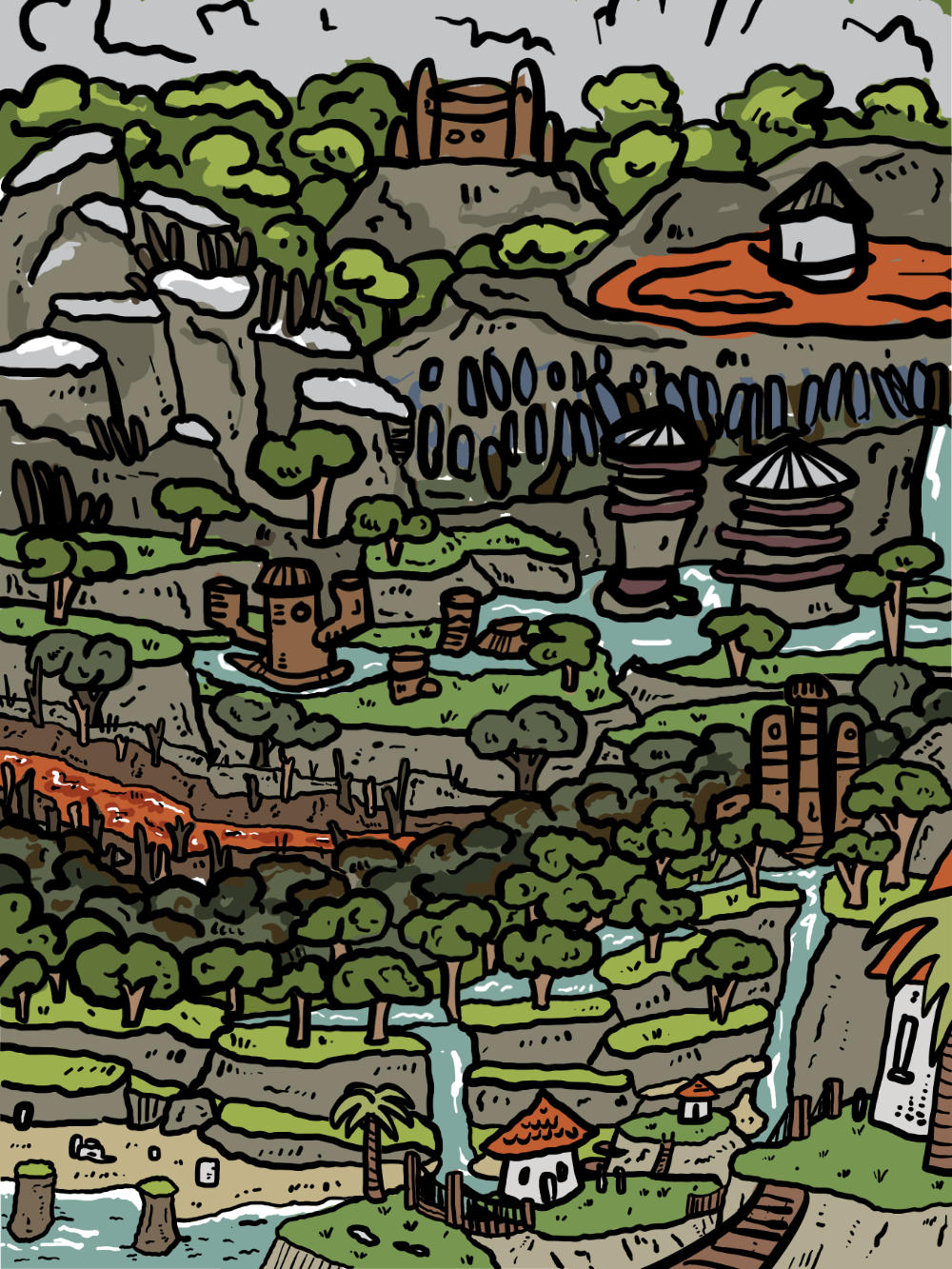

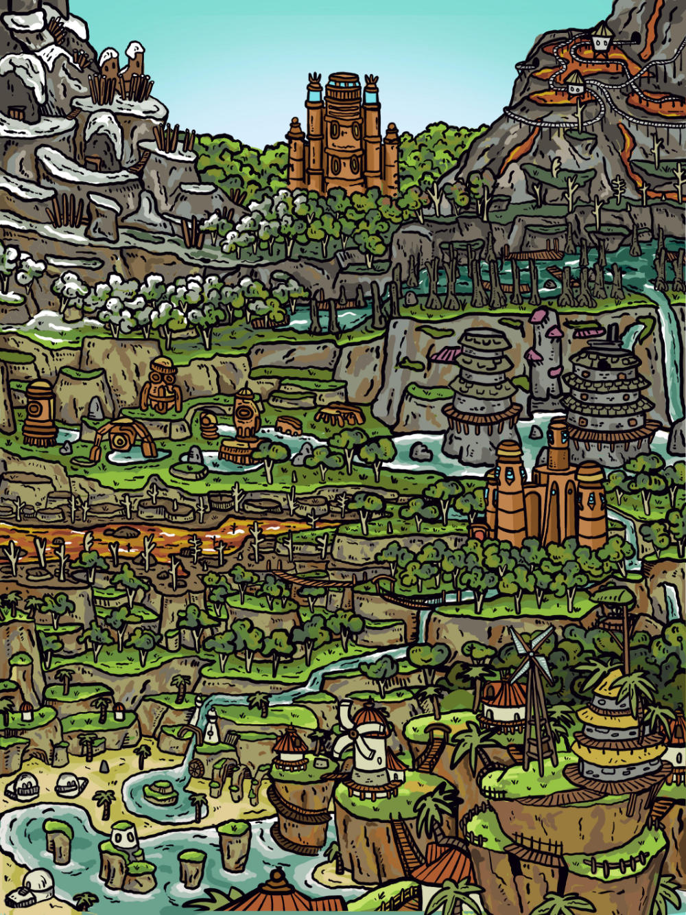
Pretty similar to the final artwork, right? This was intended to just be the broad strokes so that we could check the environments would blend from one to another. I then did a more refined plan, working on the specifics and getting the imagery more accurate to that of the game. There is still a lot of ‘me’ in the artwork, and I don’t hold myself to being overly faithful, but at the end of the day I’m drawing inspiration from the game and that should hopefully be clear.
With the artwork being so dense, and with the linework looking to be so small, we started talking about including ‘spot’ details: small sections of the artwork that are zoomed in to show characters/vehicles/easter eggs etc. You can see some of the layout options I came up with below:
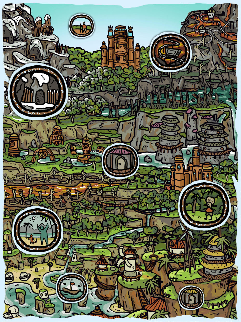
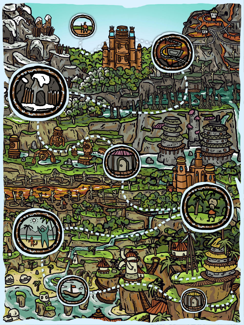


I was (and still am) quite a fan of the third image, the one with the white line border and track marks between the spot details, but ultimately the commission preferred when they weren’t obscuring the artwork. They’re also more familiar with the game than I, so if they weren’t suitable then they weren’t suitable. I’ll just have to make the artwork be good enough to hold its own!
DRAWING
At this point the final artwork was still going to be 18x24”. I did the illustration by hand on an A2 sheet of paper, which would be slightly scaled up after I scanned it in. It is a very (very) dense piece.

A bit of a closer look at the detail:
![]()

On its own, I don’t think the linework works. There’s just too much to comprehend and it’s hard to distinguish details from one another. I think this is rectified once it's paired with the colour, at which point it works delightfully, but as a drawing on its own I think it struggles. This is something I’ve aimed to avoid in subsequent drawings, as I like when both the final coloured illustration and the linework itself can stand on their own two feet as ‘final’ pieces. While it can be hard trying to stop myself from going into too much detail, it’s something that I think I’m (slowly) managing to improve.
You might also notice that the original drawing is devoid of the ‘zoom-in’ details. This is because we weren’t entirely sure where the circles were going to be placed (or what was going to be in them), so I decided that I’d draw them later and composite them digitally.
This proved to be a smart decision, given the fact that after the drawing was completed we decided to bump up the size of the final print from 18x24” to 24x36”. With this, the layout of the circles changed completely and more were added than originally anticipated. You can see the separate linework for the circles, and the additional linework that extended the drawing into its new format, below.

The glyphs I used in the artwork are derived from the substitution cipher that Naughty Dog created for the game. The lettering around each detail ring spells something related to what each image depicts. It’s nothing fancy, but might be fun to translate if you’re looking for something to do!
COLOURING
And with that, it was just a case of getting the colour behind the lines. As seen in the rough plans above, I already had a loose idea of how the colour was going to look, and I pretty much stuck to my guns. Given the amount of detail (and the amount of rocks), it took me longer than anticipated to colour. But hey, what else is new?

Details:
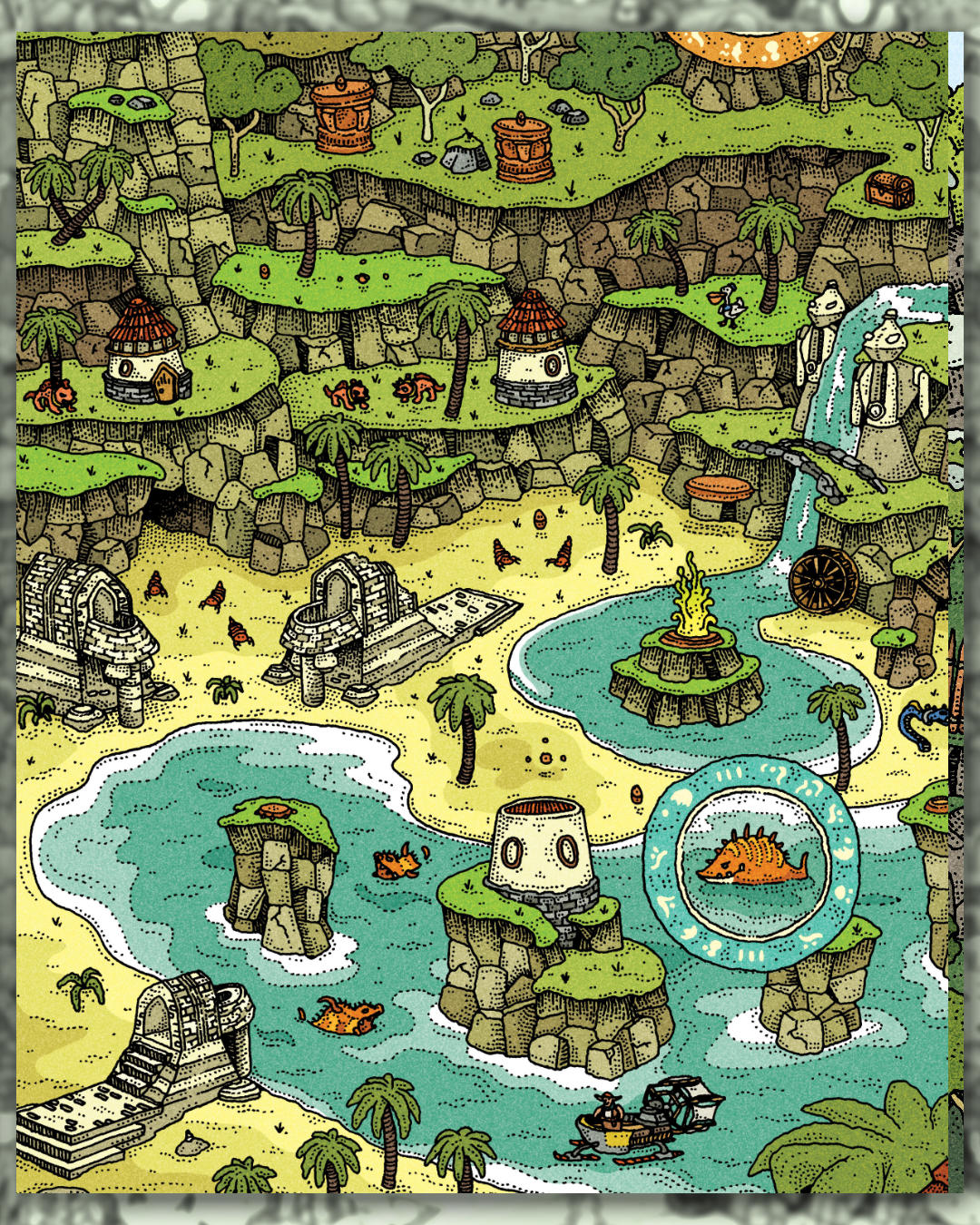


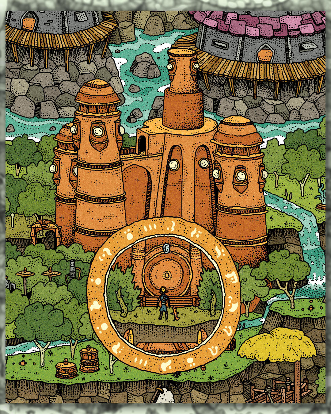
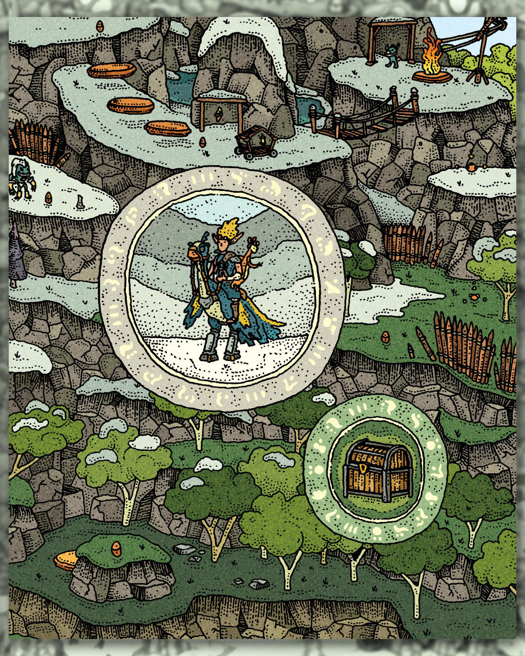

Overall I’m pretty chuffed with how this one came out. My aim with most of my artwork is to come away with at least one thing I want to improve on next time, and with my Jak and Daxter piece it’s to not rope myself into such an aggressive amount of detail. That said - it looks great, and hopefully you enjoy looking at it as much as I do.

