morgan girvin
illustrator, maker and hermithome > general illustrations > penthouse 5000


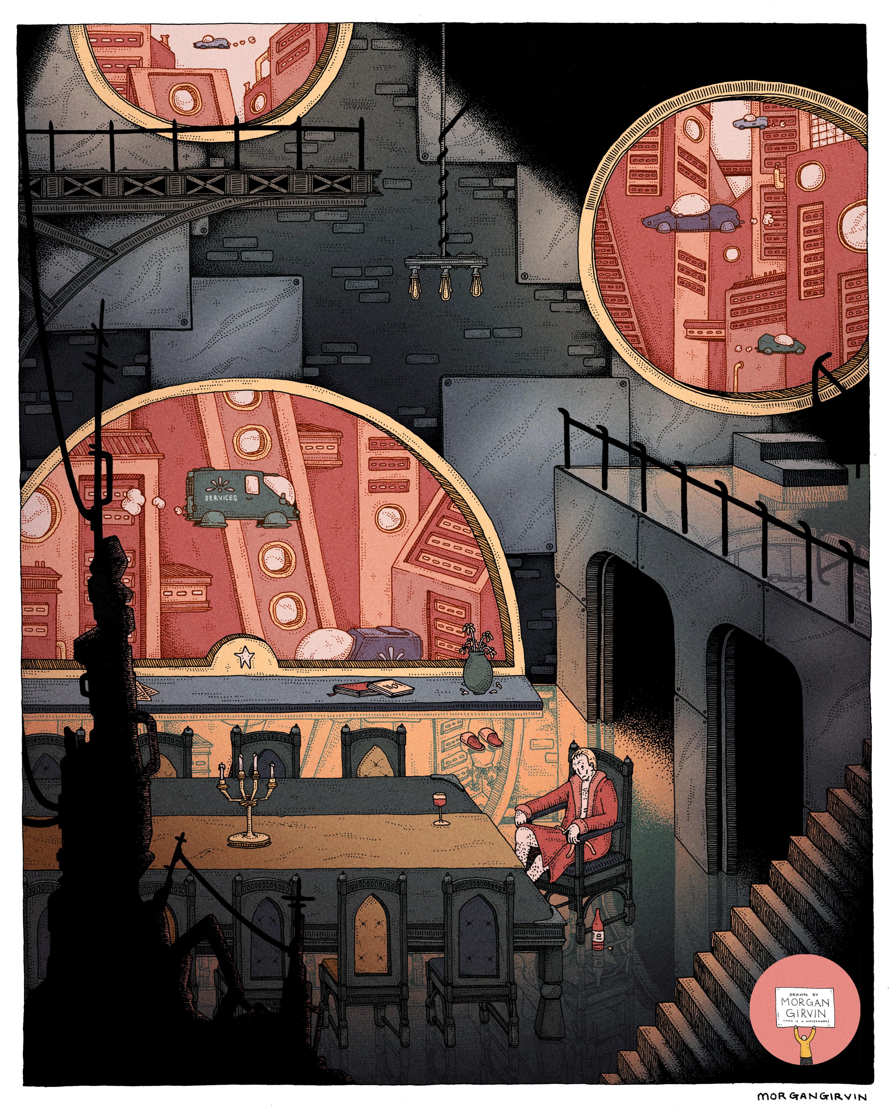
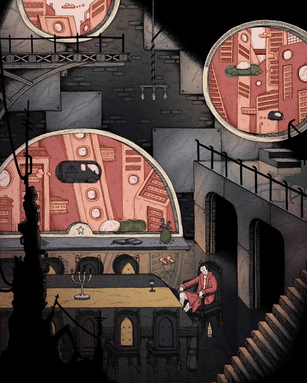
Uncoloured and Coloured versions of ‘Penthouse 5000’, a 2023 Personal Project
THE MAN IN PENTHOUSE 5000
A3 / 0.35 rOtring Isograph / July 2023
‘The Man in Penthouse 5000’ (or just ‘Penthouse 5000’) is a personal illustration that I did in July 2023. This was an interesting piece, since it spawned from an abstract sketch of shapes; I had drawn a composition that I thought was nice (as seen below in the top left of the sketchbook page), and then I interpreted that and refined it into an illustration.
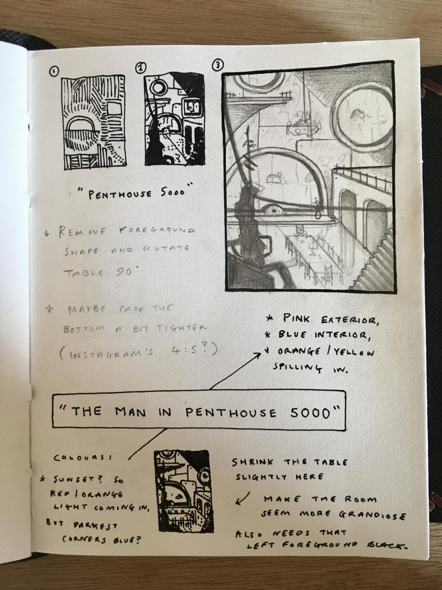
This hasn’t (historically speaking) been the way that I’ve worked, so it was nice to try out a new process and let an illustration emerge purely based upon shape and composition. It’s also, in hindsight, nice to have the entire generative process be documented in a neat little package. Normally ideas come to me sporadically and are noted/scribbled on loose bits of paper (I’m not much of a sketchbook man), but here you can see the genesis and the development of the idea all on one page.
After drawing the initial shapes and lines, I felt that the oval and square could be windows in perhaps a grand room. Given the shape of the windows, I imagined the room to be futuristic; surfaces of reflective chrome. I knew that light would be spilling in to the room and reflecting from the surfaces, so I added harsh shadows to the corners of the illustration to balance it out.
And it was here when I felt like the composition had inadvertently become quite gothic, not that I minded. Take away the sci-fi elements that I planned to incorporate and what do you have? A grandiose and expensive space filled with shadow, the outside daylight streaming in. It felt exactly like a castle from a 1940s black and white horror film. And what do those castles always contain? A mysterious and decrepid man who has locked himself away in the darkness. Once I thought about how I wanted to frame the man in question I became aware that this was going to be a penthouse, an updated futuristic equivalent for where the bourgeoisie live. Since it was going to be a living space I added the table and the chandelier and voilà, The Man in Penthouse 5000 was born.
DRAWING & COLOURING
I got about half way through this piece when I decided that I was going to restart the linework. Not something I usually do, but I’d gone with quite a rough approach and I wasn’t happy with how it was turning out. I had opted to draw it with my 0.5 rOtring Isograph, and then drop down to a 0.35 for the linework in the windows to give the illusion it was smaller and thus further away. But I think this just led to the main linework feeling clunky and big, and I chose to cut my losses and start again rather than plough ahead. I’m ultimately glad that I did this, as I much prefer the lighter linework to that of the rougher one.
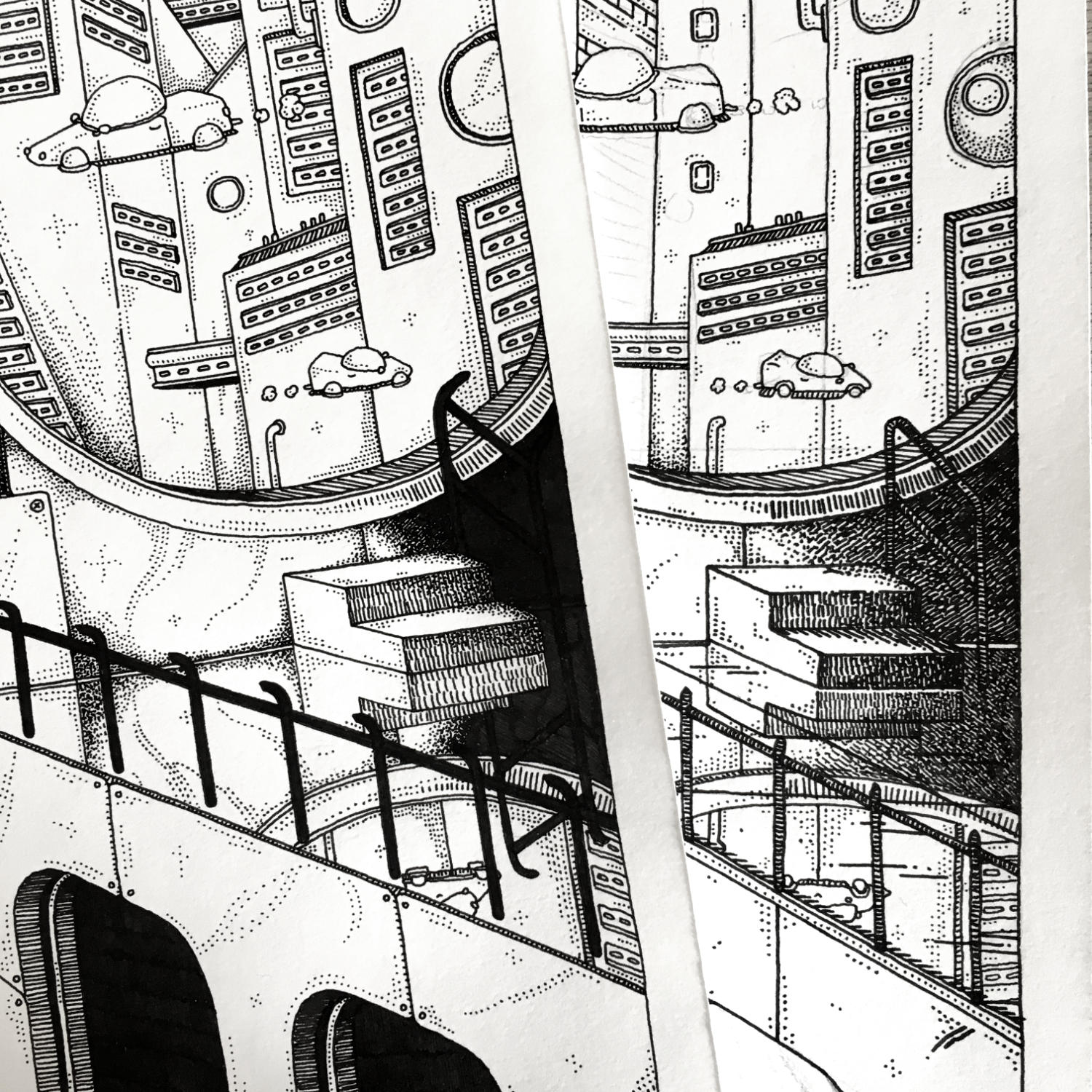
The new linework on the left compared to the old linework on the right.
I knew from the get-go that I wanted the colours to be blue, pink and yellow and I had written as much in my sketchbook, so when it came to getting the rough colours down I found it quite an easy process.
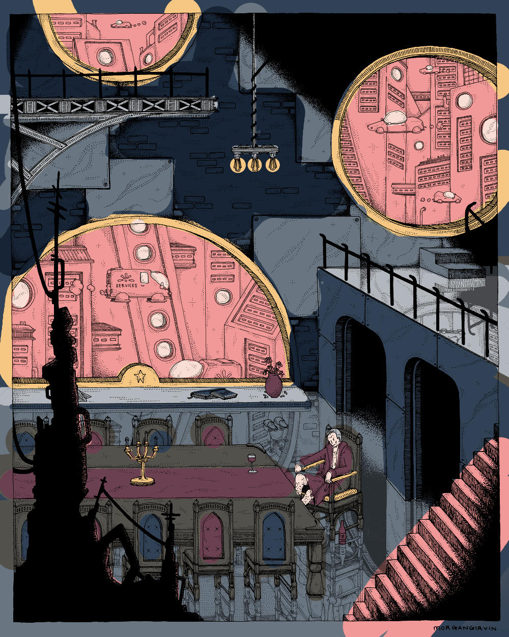
This did change throughout the process of colouring, as inevitably the piece became darker and (hopefully) more atmospheric. One struggle I had, as I usually do, was that the colours ended up becoming very muted.
The colouring in progress.
My natural tendency seems to want to make everything bland and depressing, and often I have to fight my own instincts to do something with colour. Hopefully though I managed to bring back enough red and pink to make it somewhat brighter.
One other little trick that I did, that I don’t do too often, is colour the linework. Rather than opting for solid black throughout, I gave the window scenes a dark red outline, and I then gave the reflections in the floor a lighter outline. It was a bit of a pain to seperate the linework, but I think it goes a long way to softening the lines and making things seem more ‘realistic’ and three dimensional. (You can thank Mr. Finn Sorsbie for that bit of advice). I’ll share the final illustration here again, so your lasting image isn’t that bleak and desaturated work in progress.
