morgan girvin
illustrator, maker and hermitinfo
about
contact
shop
illustrated work
wimmelbilder
film postersalbum art
maps
general illustrations
crafted work
hand crafted projects
big things
film boxsets

morgan girvin
illustrator, maker and hermit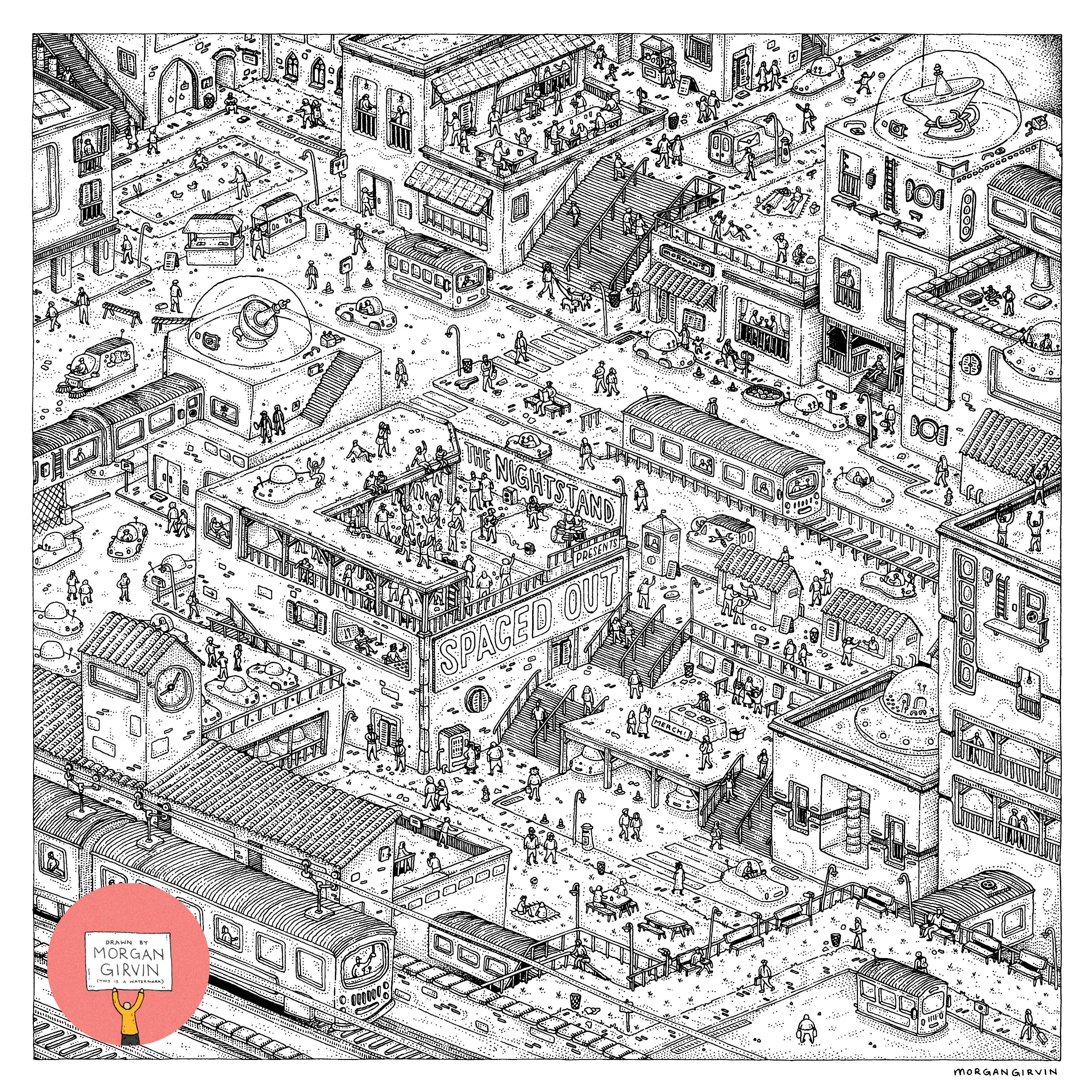
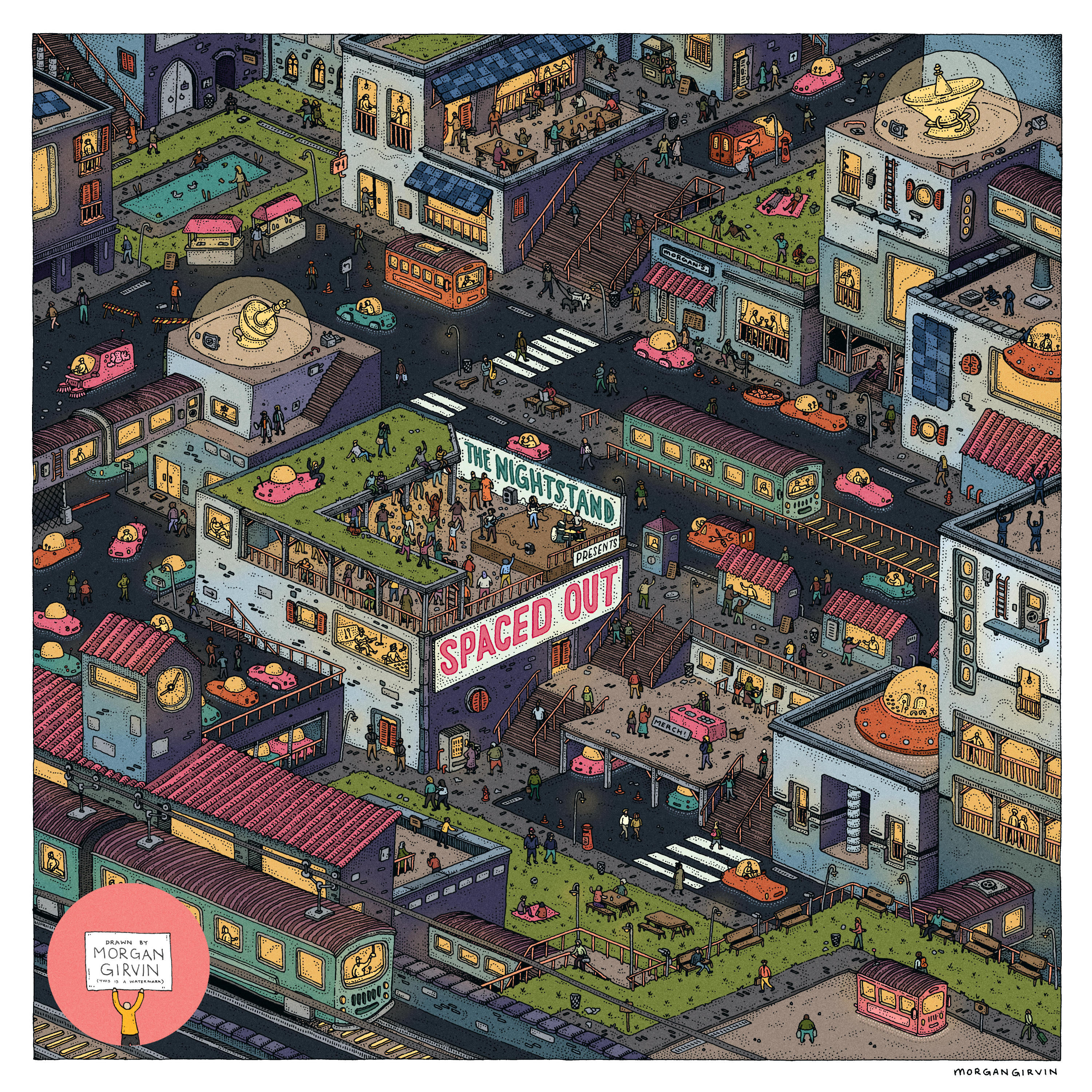
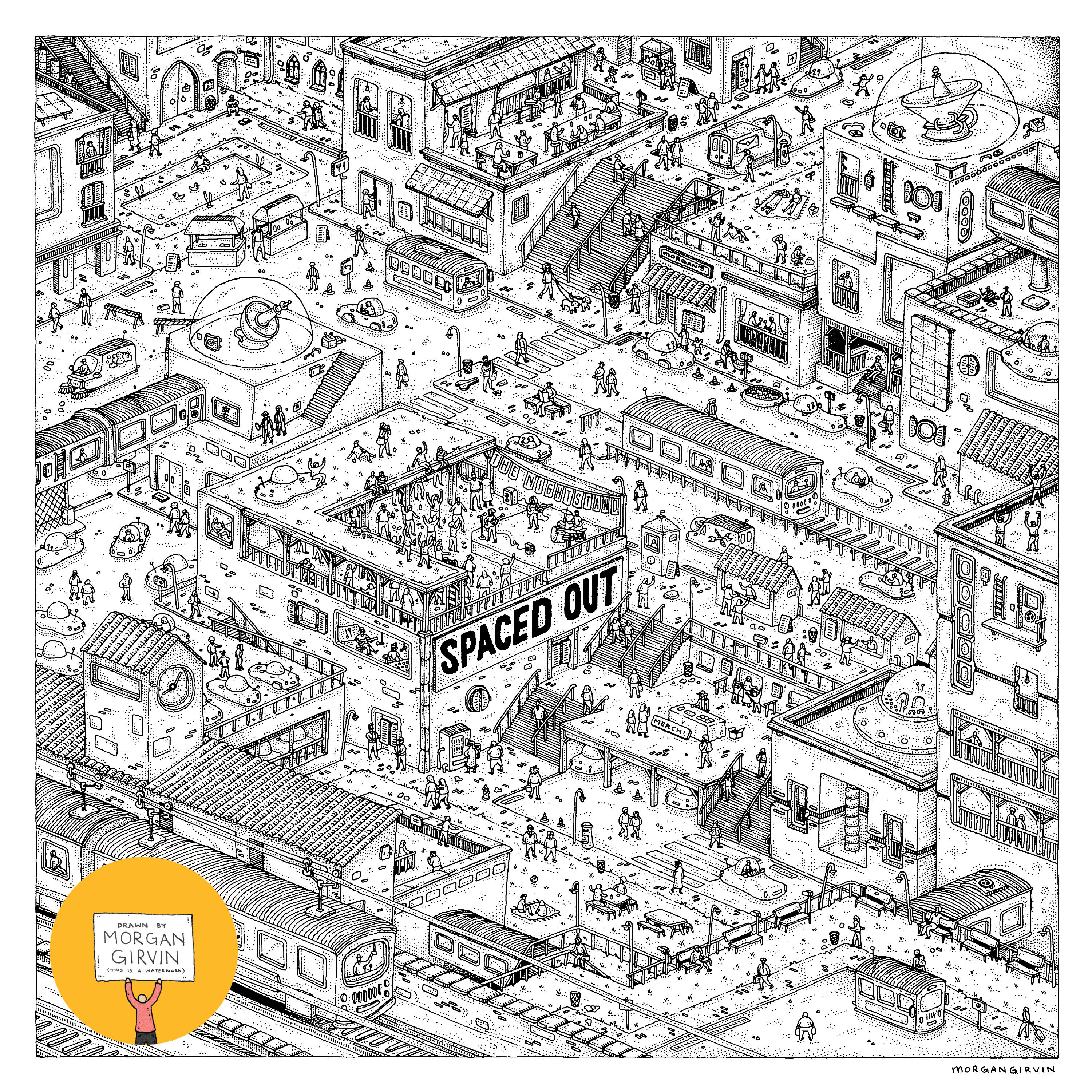
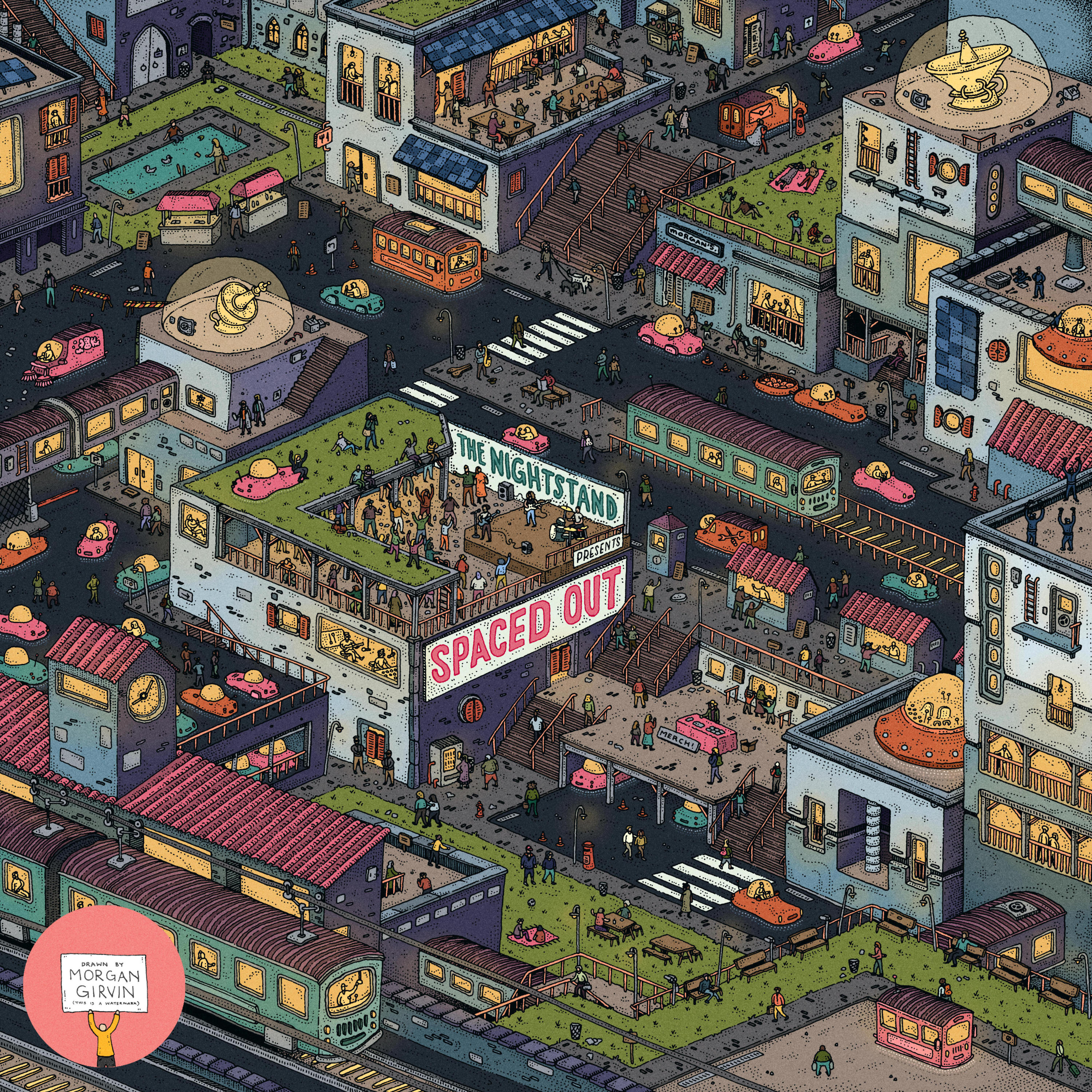
Both the final linework and the finished illustration I did for the cover of The Nightstand’s debut album ‘Spaced Out’
SPACED OUT
30x30cm / 0.35 rOtring Isograph / March 2024
At the start of 2024 I had the delight of working on some artwork for The Nightstand’s debut album ‘Spaced Out’! At the start of the project the band were wonderful enough to send me over a PDF containing a design brief, so for any prospective clients who are thinking of hiring me: this is the dream!
DEVELOPMENT
The Nightstand were really open with what it was they wanted me to draw, and there weren’t really too many prerequisites for what the artwork had to be. They had a colour palette in mind, they knew they wanted it to be something along the lines of a Western-esque (re: cowboys, not the hemisphere) space colony, and most importantly they wanted it to be isometric and detailed. Lovely stuff!

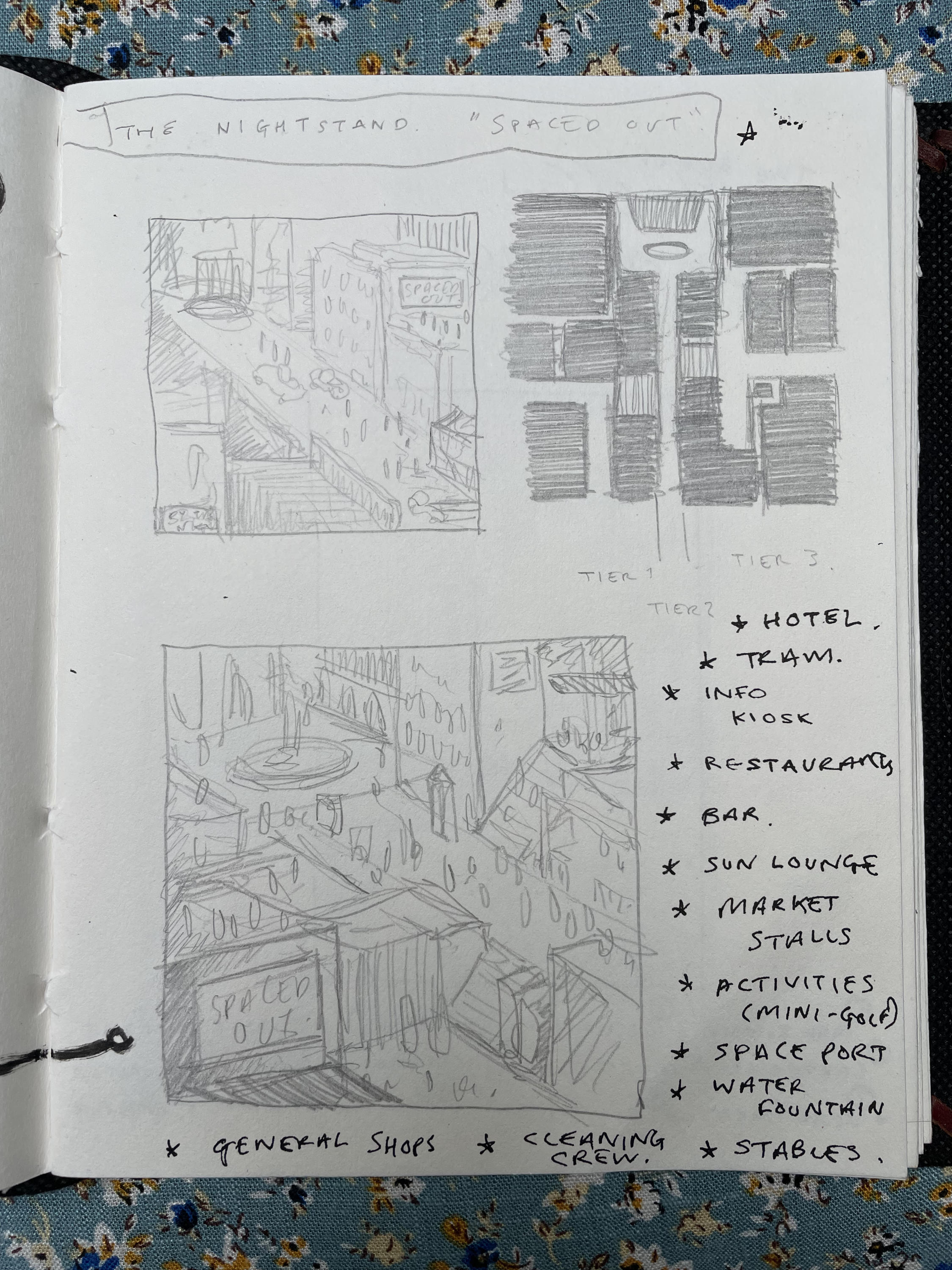
[Above] Initial Composition Sketch
My initial step was to try and block out the main composition, so I had a think about what defines a Western town, and the starting point that came to mind was the conceit that there is always ‘one street’ in a Western. One where the big shootout takes place, or where the cowboy rides into town for the first time whilst everyone gawps at the stranger on horseback.
Now it’s clear to see that I didn’t stick exclusively to one street, and I think that’s fair given that this is a space colony - there’s a lot going on! But there’s definitely one central strip of road that anchors the drawing, and that remained throughout the process. In another bid to infuse the western town with a space-age feel I opted to add stairs (one up, one down) either side of the road. The prairies in Cowboy films are often flat and dry, but not in our space colony! These people have conquered more interesting terrain. Besides, things are just more interesting to look at when there are ups and downs.
I did a few more sketches; thinking about the potential specifics. Usually these are things I hash out on-the-go whilst I’m drawing, but it never hurts to give yourself a head start with the planning.

[Above] Further Rough Sketches
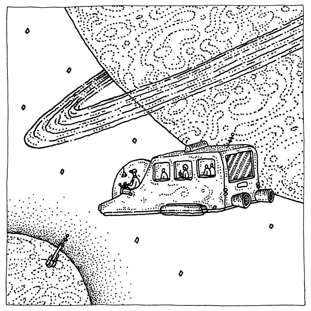
I then moved onto doing the main sketch that would be used as the basis for the final illustration. I followed a grid for this, so that the isometric nature would stay consistent, but I realised about half way through the drawing that the angles were much (much) too steep for what I wanted. So what I decided to do was stop sketching about an inch from the right border, and then once I scanned it in I was able to stretch the artwork horizontally, thus reducing the harsh perspective. It’s strange looking back on the original sketch, and how I initially thought that was the correct angle to go with, but hey-ho. Live and learn.
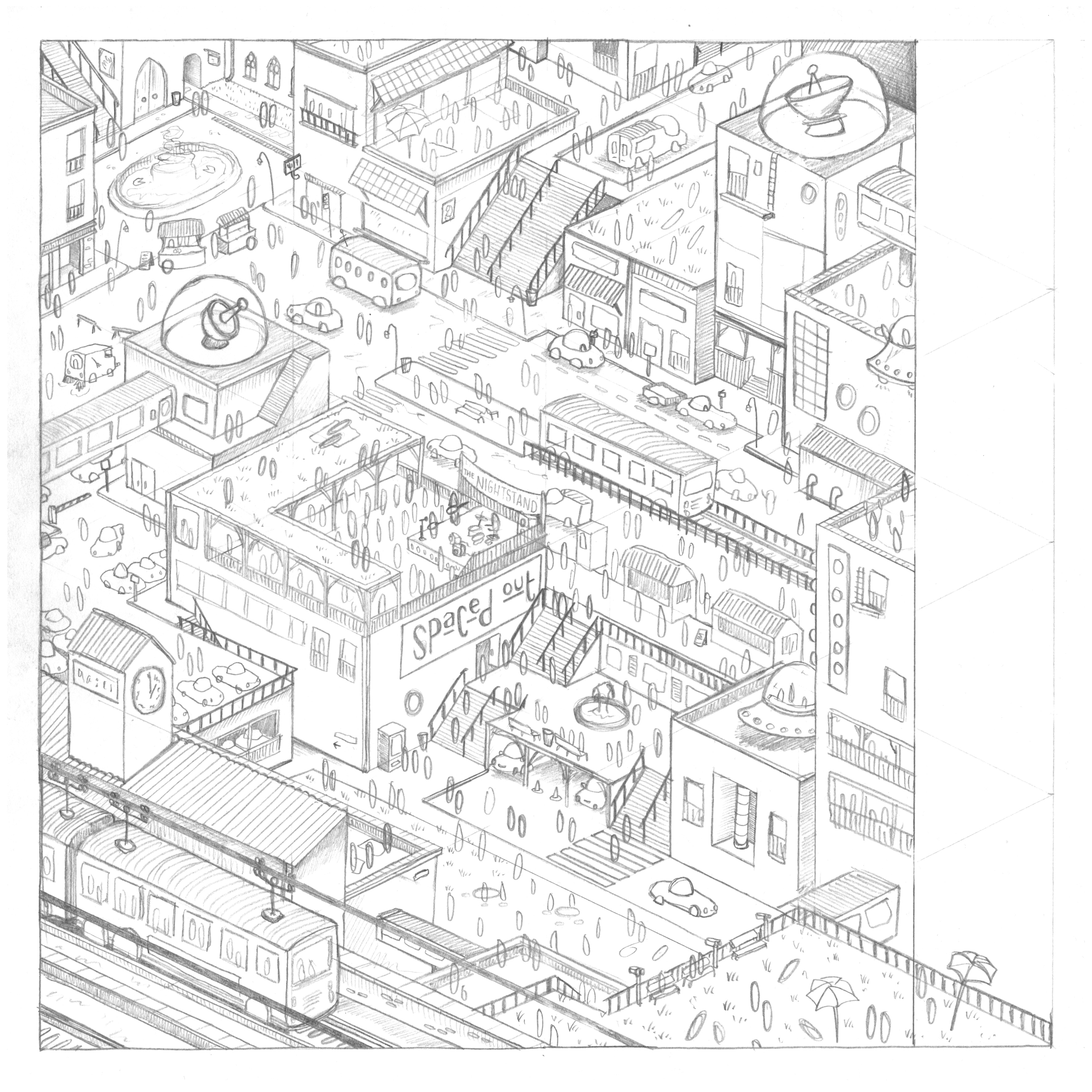
[Above] Initial Pencil Sketch, and the cleaned up version
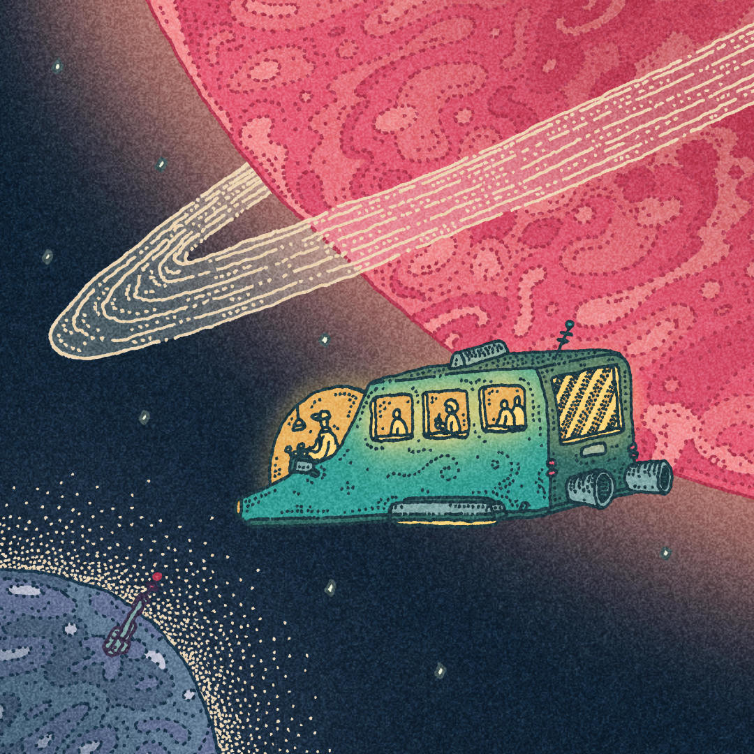
Before I moved onto the linework, I did a quick pass at how the colours might look. The band had already given me a colour palette, so it was just a case of translating that onto the artwork and finding how much wiggle room I had whilst staying within those parameters.

[Above] Rough Colour Plan
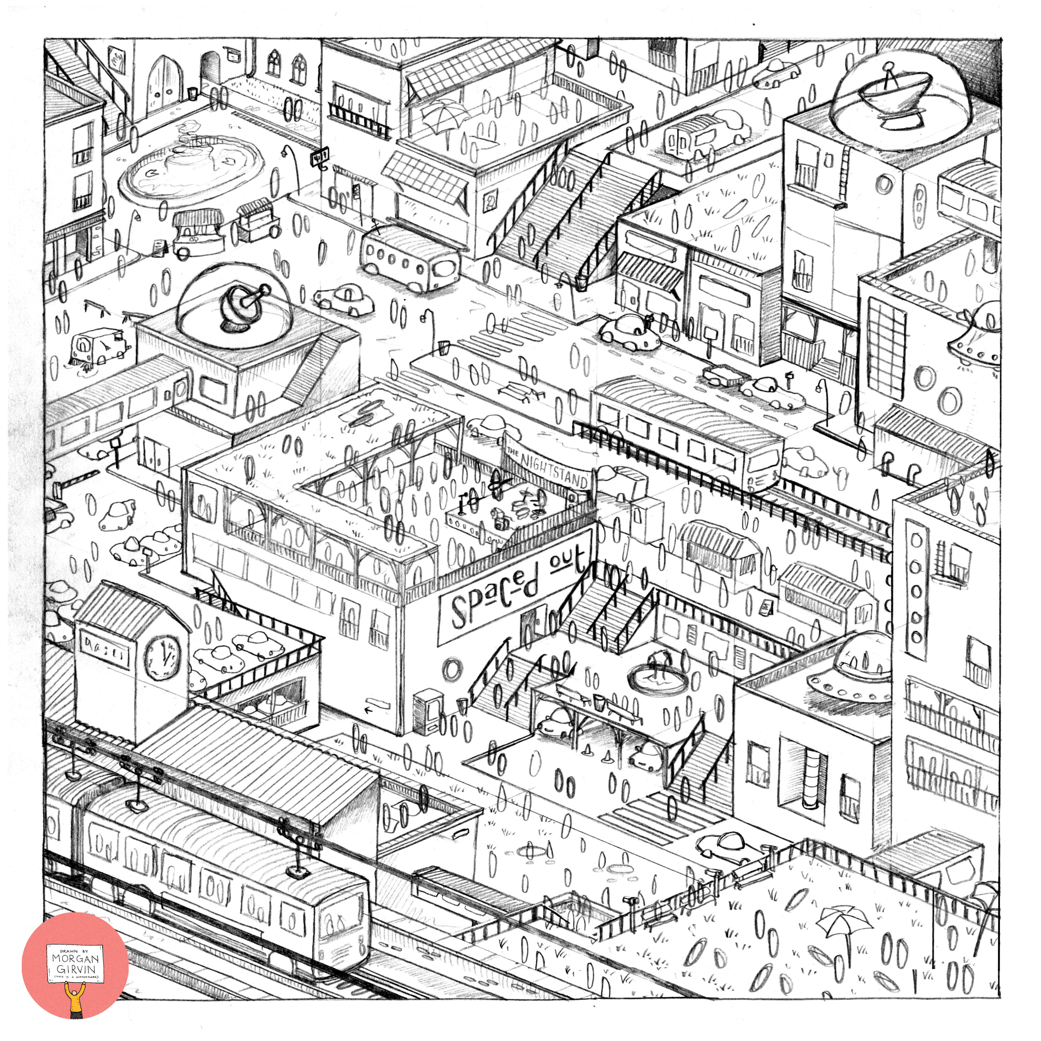
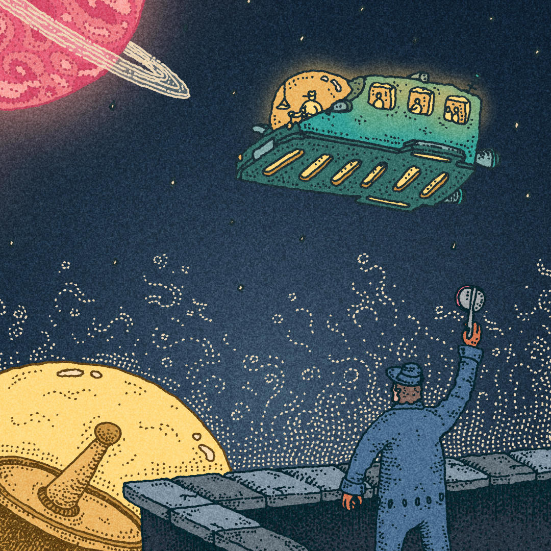
With everything looking good, I moved onto the linework; the bit we all know and love. There weren’t any hiccups here, everything was plain sailing for once. Of course as I was going I kept an ongoing list of changes and tweaks I would have to make once the drawing was scanned in, but thankfully it was nothing earth-shattering.
[Above] Scanned in Linework
By this point I’d also had feedback on the colour plan from the band, (”Can it be nighttime, instead of daytime?”) and I was able to tweak it before I started applying the actual colours.

[Above] Updated Rough Colour Plan
From here I just ploughed ahead with the colouring. It took me longer than I thought it would, I seemed to forget how it is when you have lots of small individual details (people) rather than just something generic like bricks or trees.
One of the main things I had to fixed on the linework was the name of the band itself ‘The Nightstand’. They told me at the start that they wanted the name of the band, and the name of the album, hidden within the piece, as opposed to clearly being a title. However when I had drawn it in, I didn’t realise quite how small I had done it, and it was borderline illegible. So on a separate piece of paper I redrew the text and then composited it digitally.
One of the main things I had to fixed on the linework was the name of the band itself ‘The Nightstand’. They told me at the start that they wanted the name of the band, and the name of the album, hidden within the piece, as opposed to clearly being a title. However when I had drawn it in, I didn’t realise quite how small I had done it, and it was borderline illegible. So on a separate piece of paper I redrew the text and then composited it digitally.

[Above] Band Name Comparisons
And from here we got to the final artwork! Very pleased with how this came out, and it was nice to be working on a classic ‘Wimmelbild’ illustration for once!
WHERE’S WALLY-ISMS
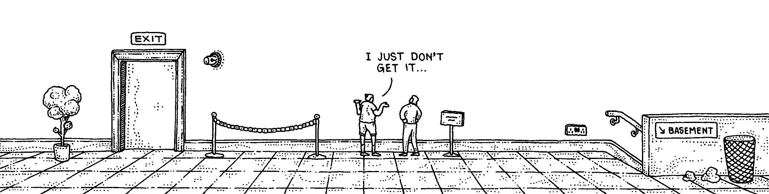
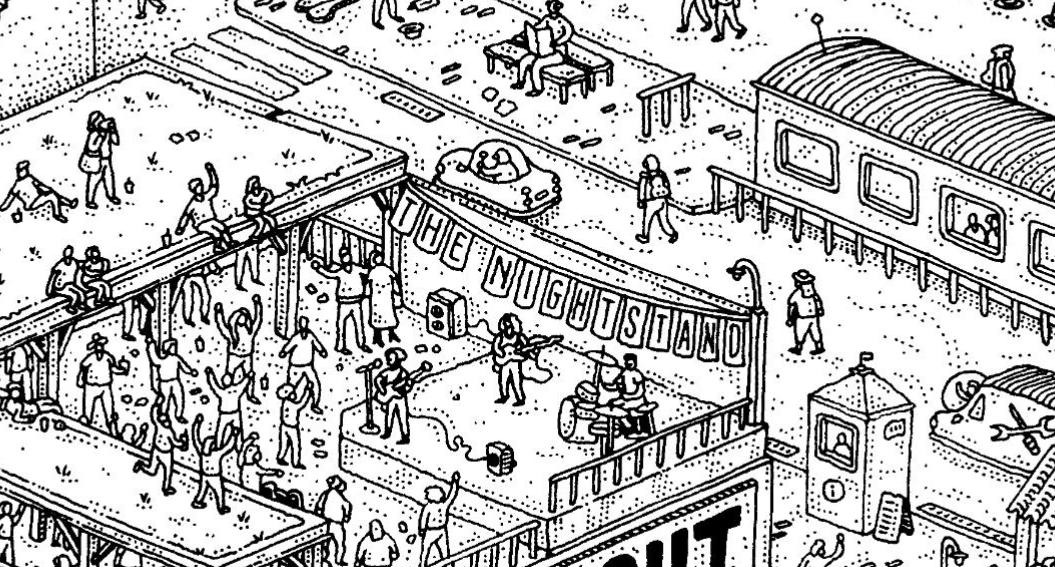
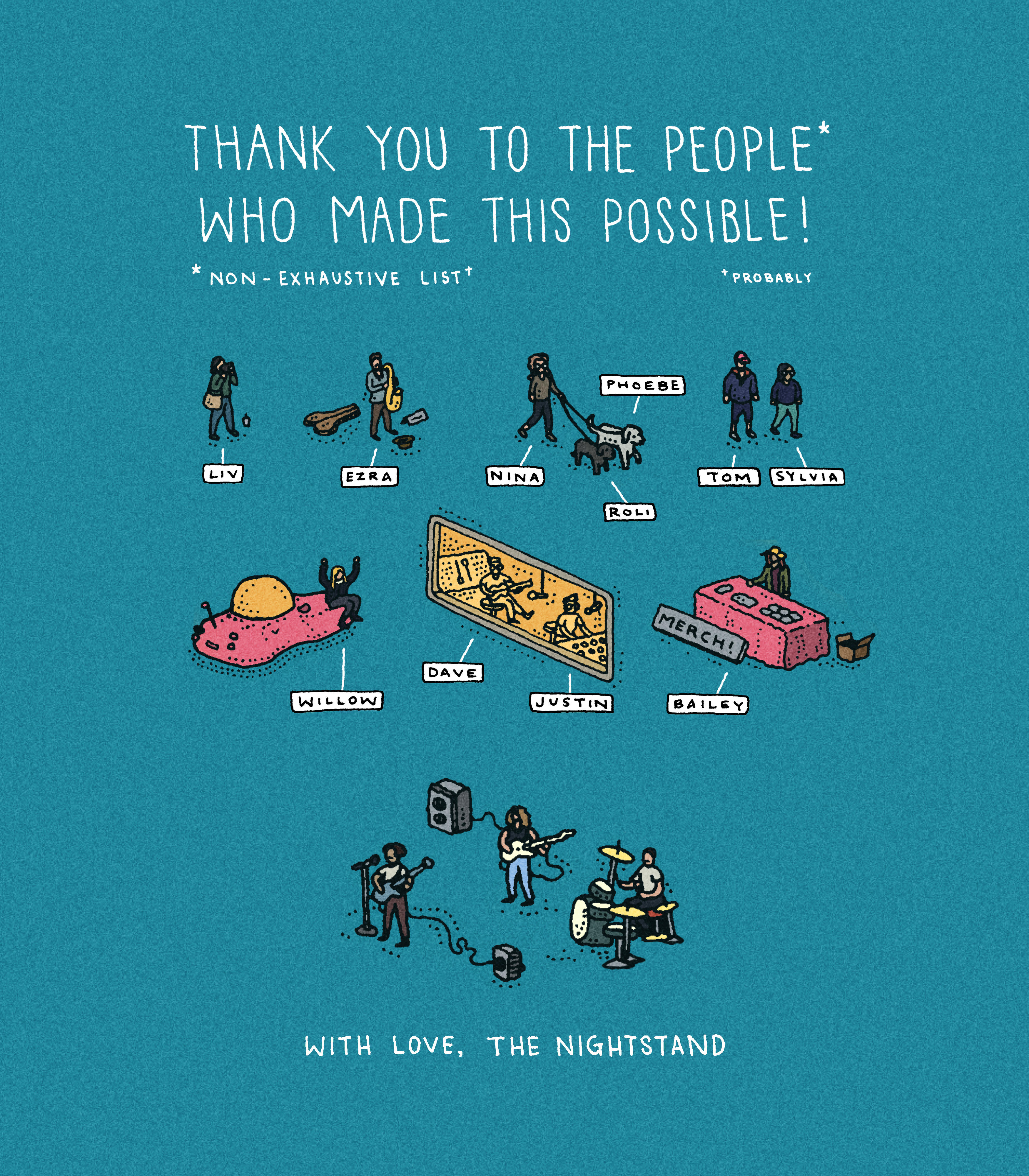
But wait, that’s not all! Before I started the linework, the band asked me if I’d be able to dot some of their friends and family around the artwork. “Gee” I thought, “That sounds fun!!” Since the people came out quite small (and mostly feature-less) I also suggested creating a character key, so that the band could distribute it to their friends and family and they’d actually be able to find themselves. And here it is! I’ve also put in the final artwork again, so happy hunting!
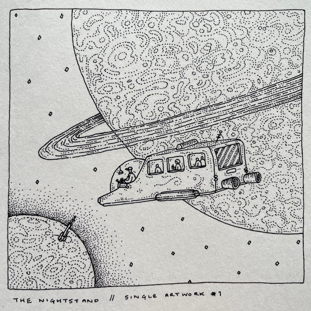
SINGLE ARTWORK
But wait, that’s still not all! After the main artwork was completed, the band asked me if I’d be interested in creating 2 small pieces of artwork for the first two singles. To which I said of course I would! They had very specific images in mind, so my job in this case was translating rather than imagining. I was away from home when I did the linework and had to work in a sketchbook*, so excuse the wobbly border on More of the Same.
*As a sidenote, I usually work on standard cartridge paper when I’m drawing. I’m a man of habit. This was the first time using my rOtring Isographs on a type of paper that had a very clear texture difference to what I’m used to and man, what a strange experience!
*As a sidenote, I usually work on standard cartridge paper when I’m drawing. I’m a man of habit. This was the first time using my rOtring Isographs on a type of paper that had a very clear texture difference to what I’m used to and man, what a strange experience!
[Above] Artwork for The Nightstand’s first single: More of the Same


[Above] Artwork for The Nightstand’s second single: Room for Nowhere
The album releases August 2024, and is available on all those different music platforms that exist. In the meantime, here’s their single More of the Same (with the aforementioned artwork) to wet your appetite: