morgan girvin
illustrator, maker and hermit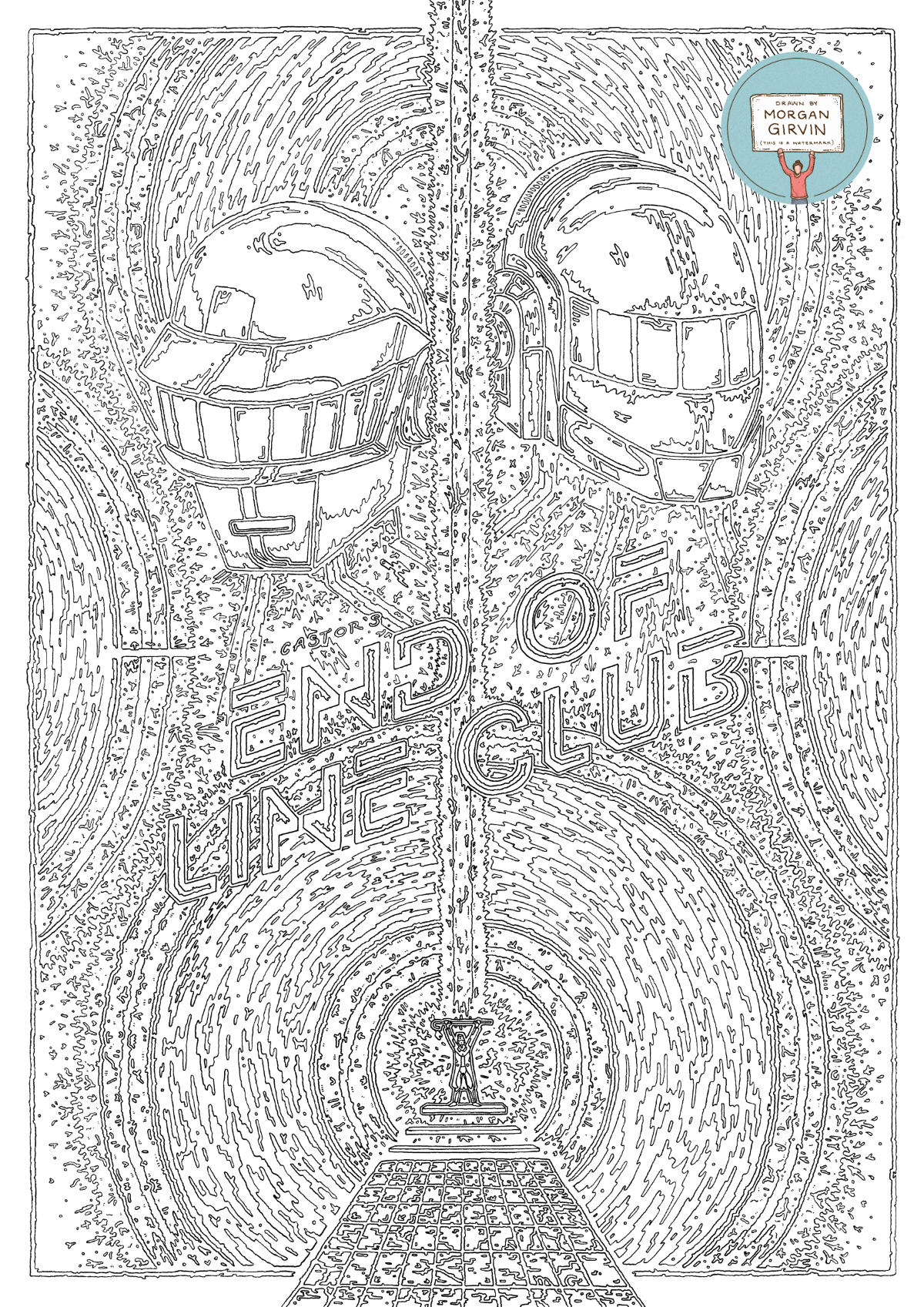
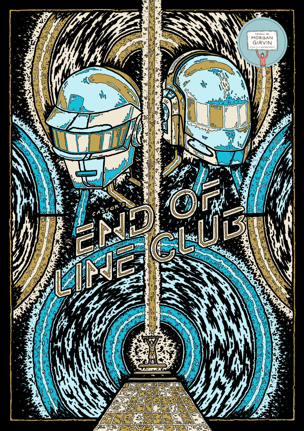
Inspired by ‘TRON: Legacy’, this is the original illustration (Left), and the digital colour version that was used for the final screenprints (Right).
THE END OF LINE CLUB
A3 / 0.05 Unipin Fineliner / September 2021
This was an absolutely brilliant project to work on for a whole number of reasons. Firstly, I was invited to take part in Gallery1988’s “Fake Gig Posters” Exhibition, which in itself is mind-boggling. Secondly, I also got to be able to work in screen printing and hand print my final designs! And thirdly, I was able to create a piece of work celebrating the film (and music of) ‘Tron: Legacy’, a film I absolutely love.
THE BRIEF
The idea behind their exhibition was to create a piece of work in the style of a classic gig poster, but for ‘pop culture fictitious concerts or performances.’ Generally speaking, music does not have much of an impact on my life. The lyrics of songs don’t go into my head and I often don’t register them, so if I do want to be interested in music I often have to rely on the sound of the actual instruments. So whilst it’s a bit of a pain when asked “Who’s your favourite artist?”, it’s brilliant when asked “What’s your favourite film score?”.
The Tron: Legacy soundtrack is an absolute masterpiece, and it’s probably the first piece of music I started to listen to regularly of my own accord (before shortly thereafter finding Daft Punk), so when the opportunity arose for me to be able to celebrate it, I wasn’t going to skip it.
In the film, there is a moment where Sam goes to seek the help of a program named Zuse, and in doing so finds himself inside the nightclub of Castor. This is also the moment in the film where Daft Punk, the film's composers, cameo as Disc Jockeys for the club. It is for this nightclub that I wanted to design my gig poster.
THE DESIGN
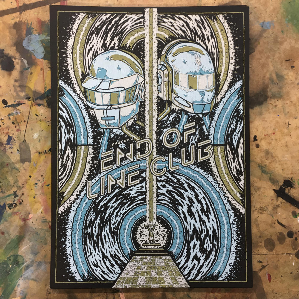
Even though I hadn’t really done screen printing properly before, I knew the basics of how it worked. I found it quite interesting trying to create the design with exact colour in mind, knowing that if I wanted to keep my screens to a minimum then I’d be working with a limited colour palette. I opted to go for a 3 colour screen print, using blue, yellow and white ink to print onto black paper. As such, I started trying to come up with a design that embodied the idea of a ‘gig poster’. The type of things I was coming up with were quite different to what I usually illustrate, but I was enjoying it nonetheless. I began by sketching with Posca Pens, before moving
to experiment digitally once I was happy with each step.

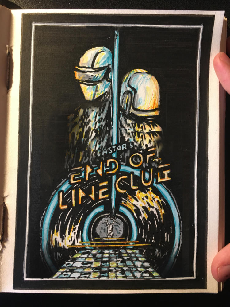
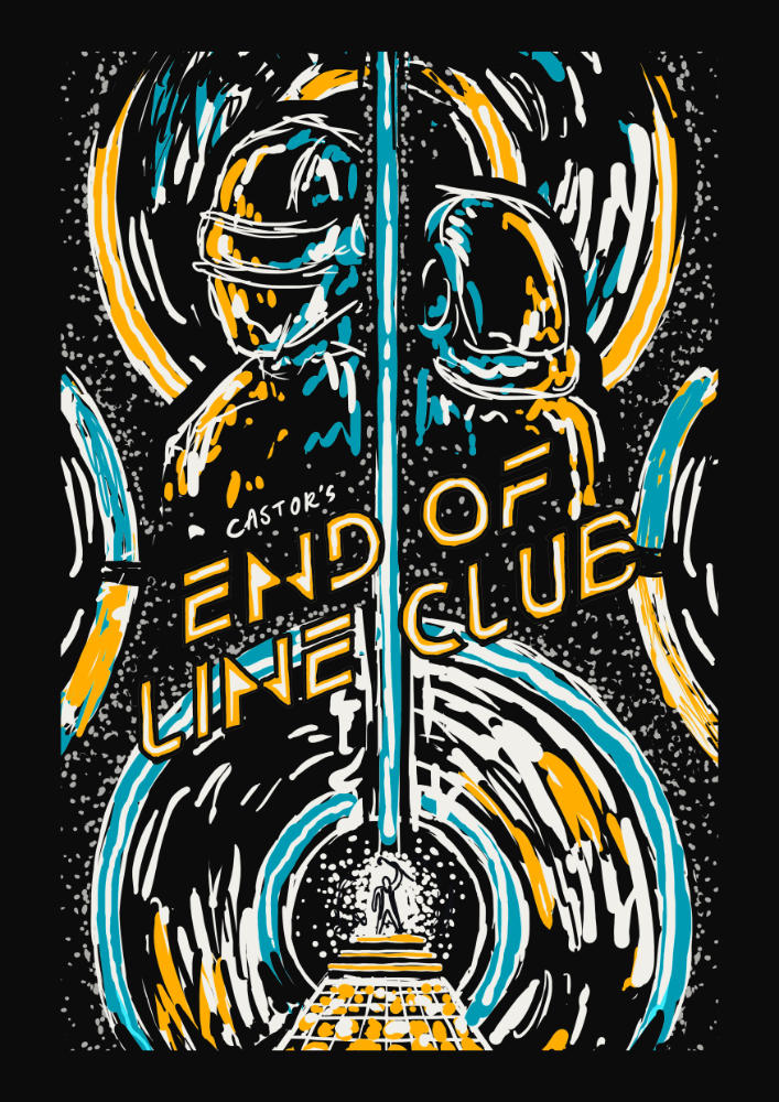
The main idea that I was exploring when coming up with different designs was having the visual of the Light Discs from the films double as a vinyl record disc. I felt that they gave a lot to work with visually, since I’d be able to have lots of lines and abstract streaks of colour that could function as both ridges on the vinyl disc, and also as neon light coming from the Tron light disc. I also (clearly) wanted to feature Daft Punk in the illustration, since the soundtrack they create for the film (and the music they play in-universe at Castor’s End of Line Club) is absolutely intrinsic to the atmosphere of the film. At the bottom of the design is a grid, something familiar in TRON but also something that doubles as a dancefloor, where Castor can be seen atop his floating staircase, striking the iconic TRON pose with his cane.
APPLYING COLOUR
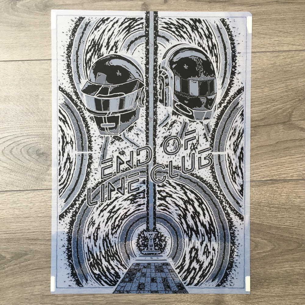
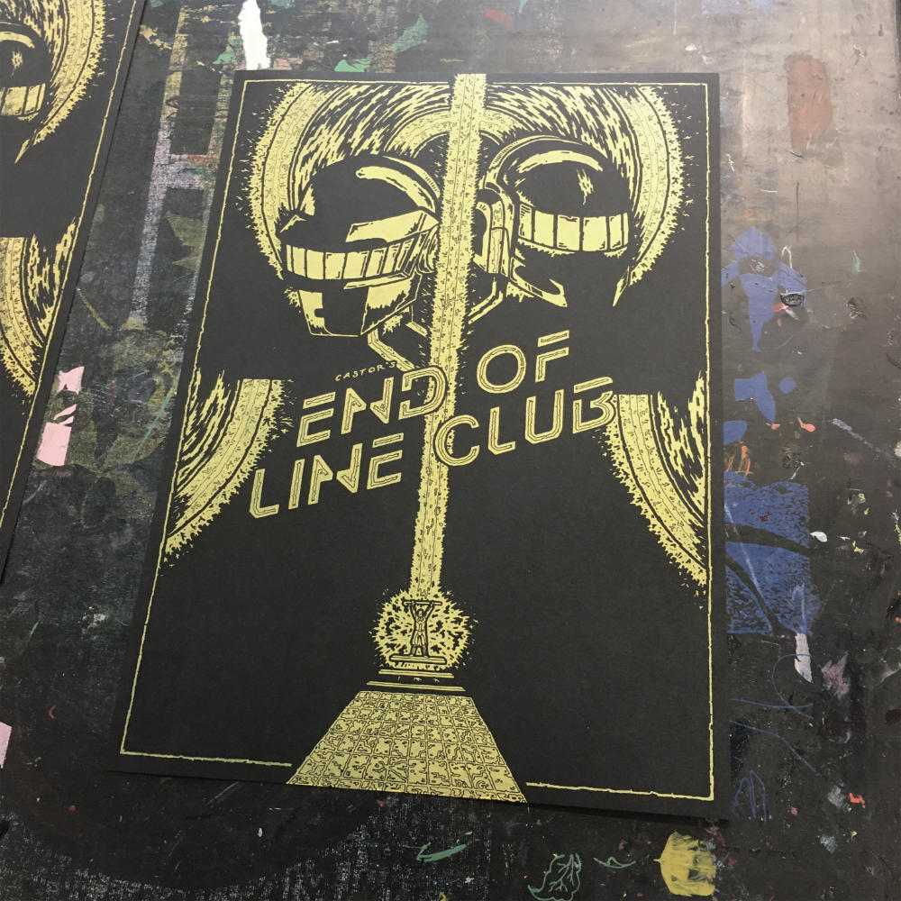
Once I had done the final illustration (featured at the top of the page), I scanned it in and coloured it digitally. Both to get a sense of how the final design might look, but also so that I could convert each layer into a bitmap file to expose onto a screen. The one thing that surprised me the most was that by the time I had finished experimenting and exploring, the beam of light going through the middle of the design ended up being yellow instead of blue. I liked both variations, but ultimately I felt that the blue beam got lost in the design and was less visible than the yellow one. Initially I had the design being a strong blue and yellow, however when it came to printing it the black of the paper dulled the ink, and the yellow came out more as a gold. This is something I actually preferred, so it was a fortunate turn of events.
SCREEN PRINTING
Actually being able to be hands-on in the printing process was incredibly fun to do, albeit very physically tiring! Below are some of the photos I took throughout the process.



THE FINAL PRINTS
Overall I’m incredibly happy with the final prints that I came out with. I wasn’t too sold on the design initially, since it’s different to the work I usually produce, but comparing it to other gig posters I think I really managed to capture the spirit of the exhibition! Some of the prints aren’t perfect, with there being some slight misalignment, but I think that’s part of the vibe of screen printing; being able to see that it isn’t perfect and that it has all been hand pulled!
Overall I produced a limited run of 35 prints, all of which are signed and numbered, and they’ll be on sale (and display!) over at Gallery1988 during their Fake Gig Posters exhibition on Nov. 5th - Nov. 20th 2021!


