morgan girvin
illustrator, maker and hermitinfo
about
contact
shop
illustrated work
wimmelbilder
film postersalbum art
maps
general illustrations
crafted work
hand crafted projects
big things
film boxsets

morgan girvin
illustrator, maker and hermit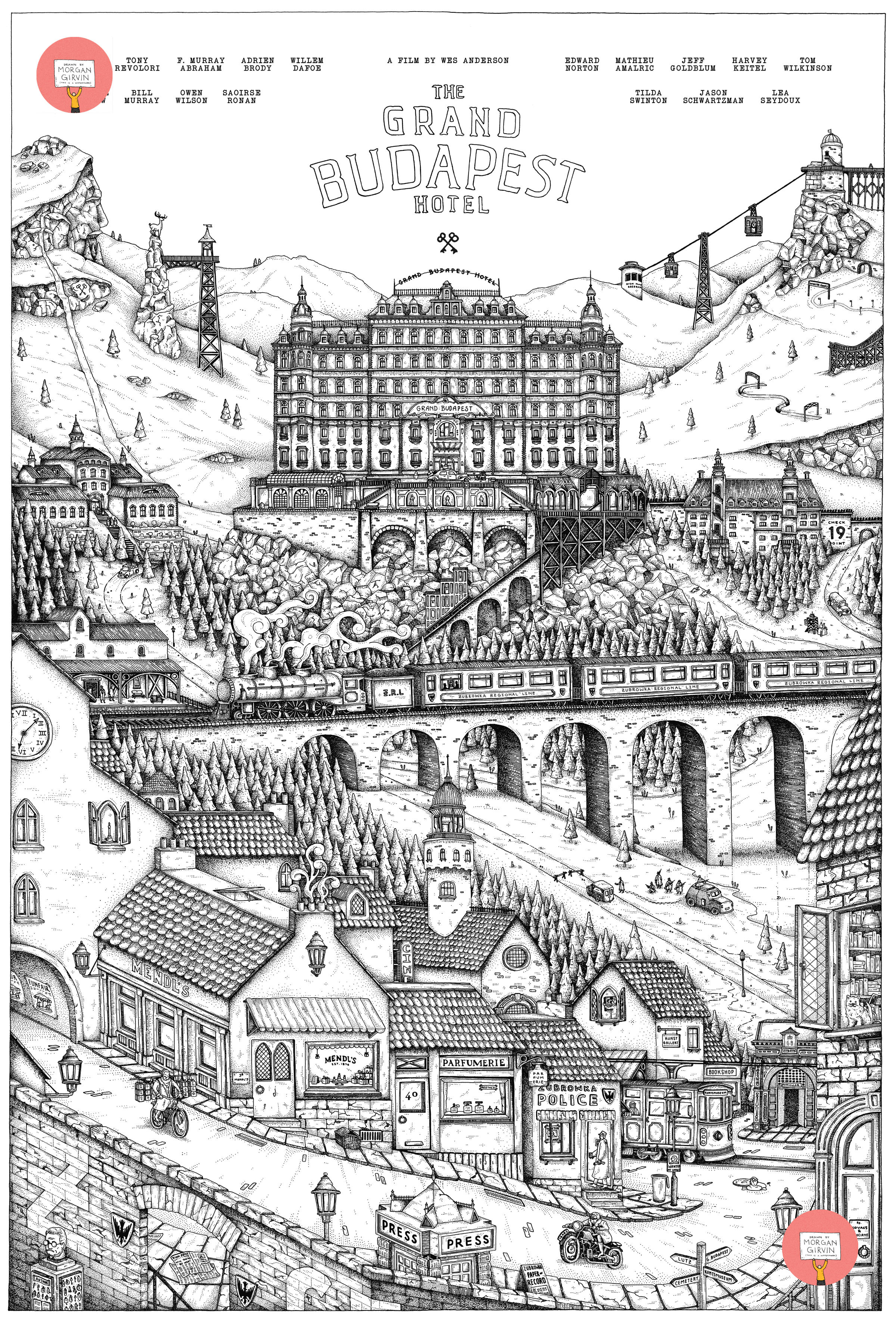
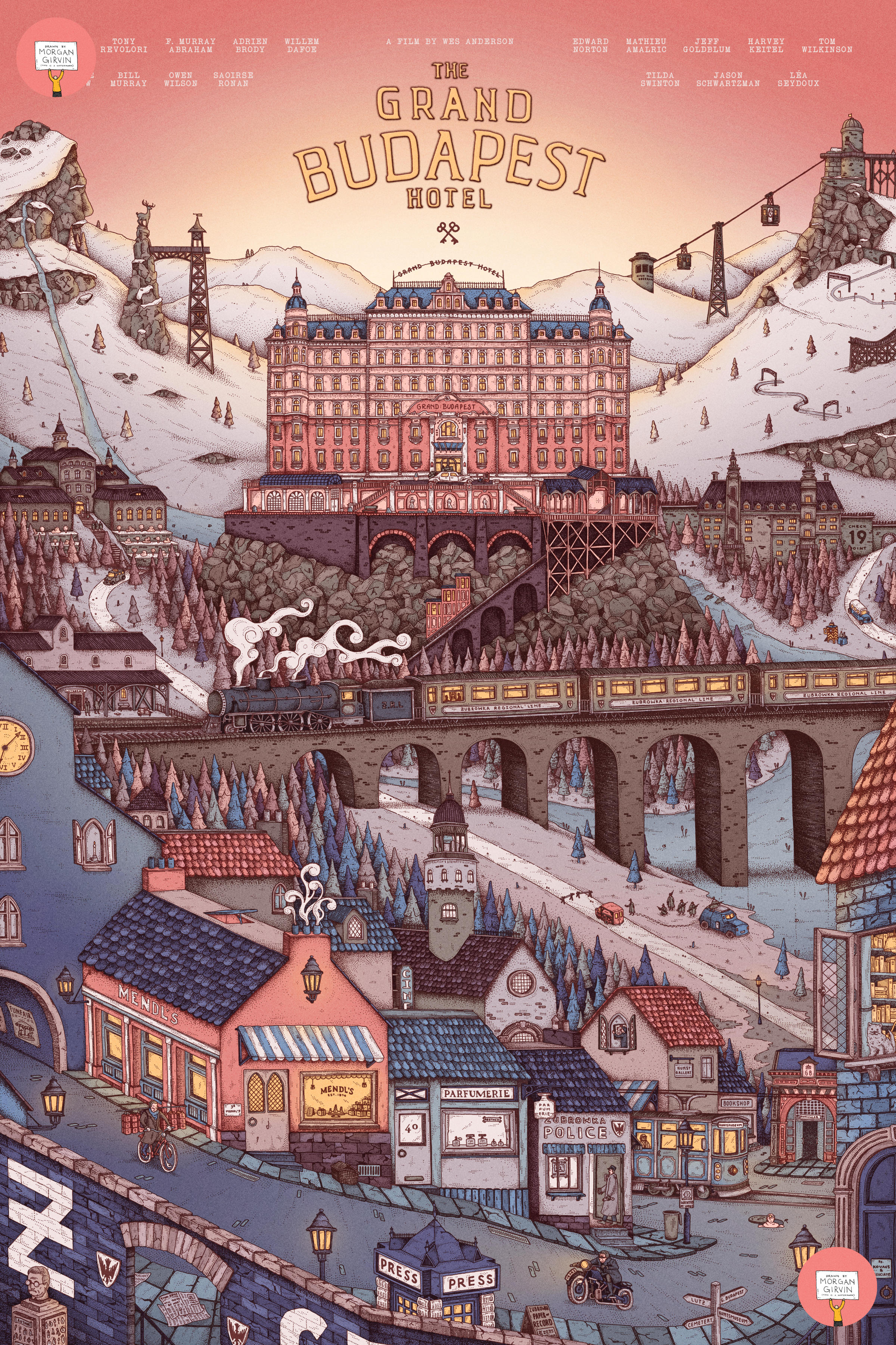
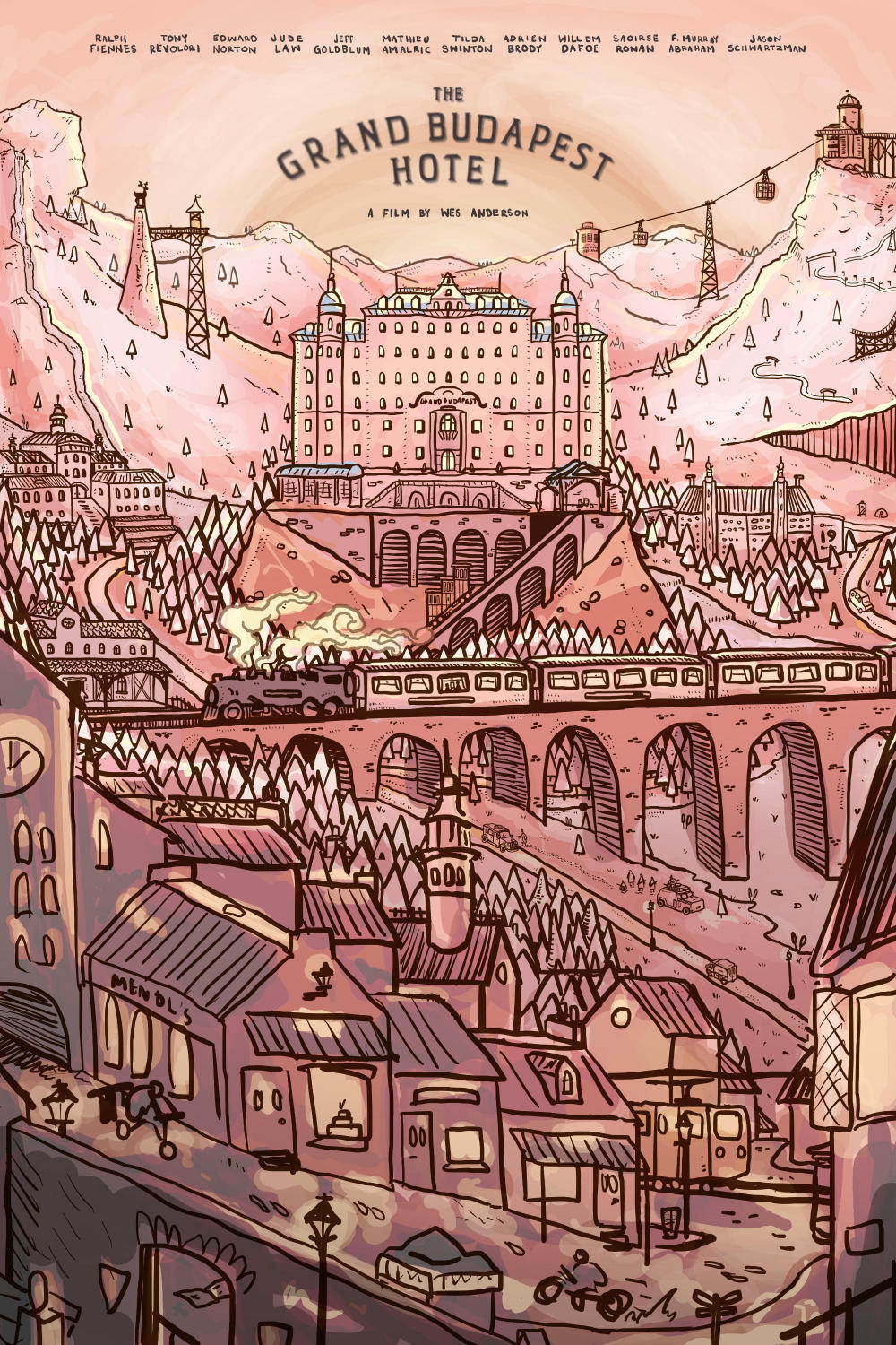
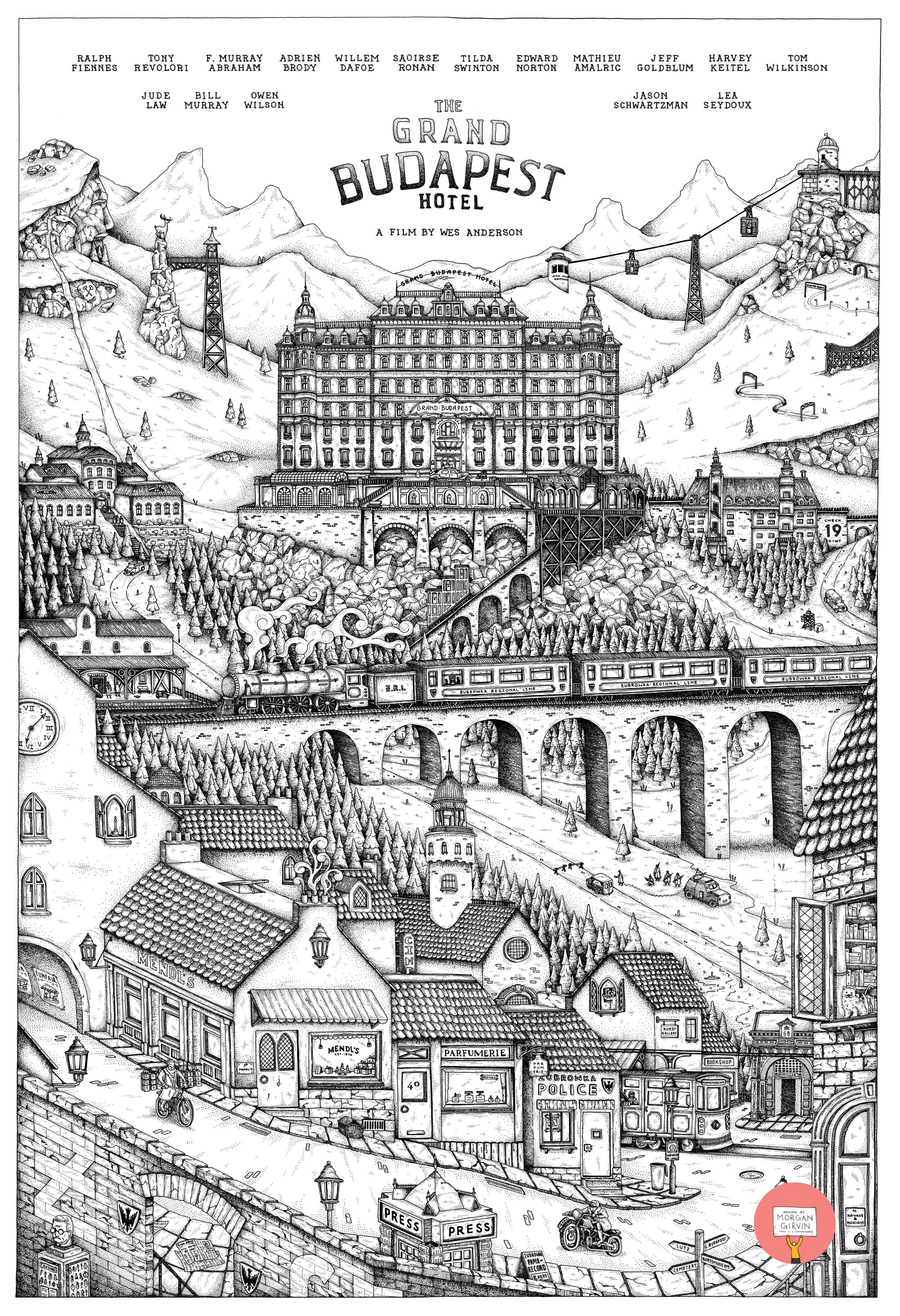
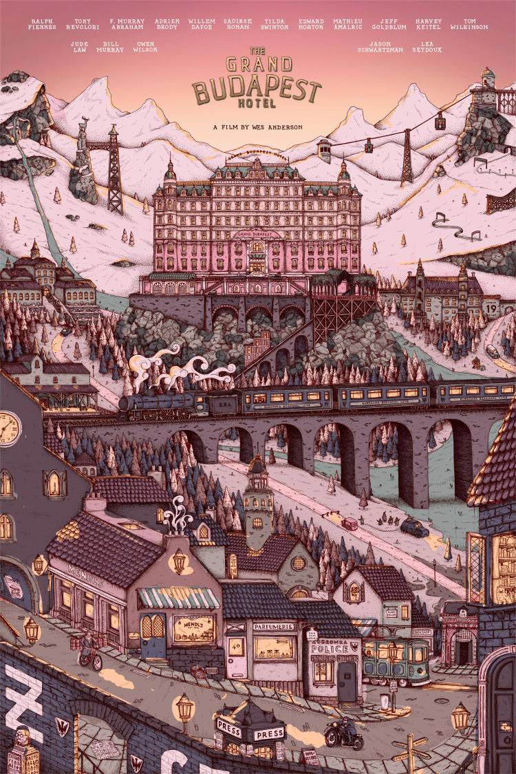
THE GRAND BUDAPEST HOTEL
24x36” / 0.35 rOtring Isograph / August 2023
This was a Private Commission piece I created inspired by Wes Anderson’s film ‘The Grand Budapest Hotel’. I absolutely love this film, and it’s certainly one of my favourite Anderson flicks, so I was absolutely delighted to get the opportunity to try and capture it in a piece of work. There was a lot of back and forth with how this was shaping up, especially with regard to the colours, but I’m so happy with where it landed (so it was definitely worth it!).
DEVELOPMENT
For anyone who has seen the Wes Anderson Box Set that I made previously (click here if not!) then you’ll know that I really like the image of The Grand Budapest standing tall atop its lone little mountainside. I knew right from the get go that that would probably feature within the illustration, and given the hierarchical nature of that type of imagery, I knew that it would probably be the centerpiece atop the landscape. Which worked out fine for me since, you know, it is called The Grand Budapest Hotel.
As to what would fill the rest of the image, we (we being myself and the commissioner) knew that we wanted it to have as many details as possible crammed into it. The film is so rich, both visually and narratively, that there really was such a wealth of things to choose from. One particular visual I was inspired by was this wallpaper I had on my laptop a few years ago:
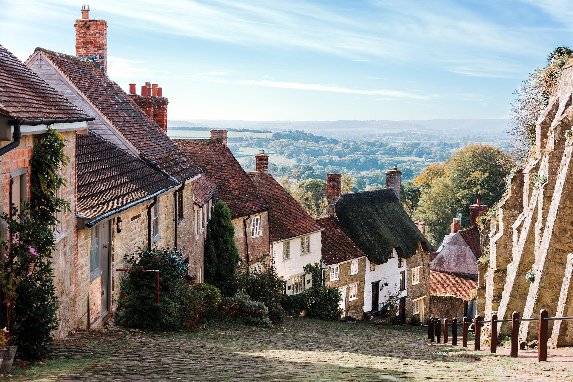
A photograph of a sloping cobblestone laneway with the far-reaching landscape sprawling out into the distance. Google reverse-image search now tells me that this is a place in North Dorset, England. But whilst I was in the midst of planning out the illustration, it felt quite reminiscent of the Eastern European villages and landscapes that we get brief glimpses of throughout the film, and so it was with this that I started planning out the general layout; village in the front, mountains in the back.
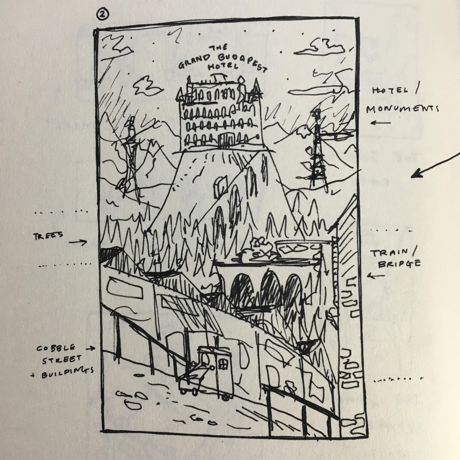
As you can see in the rough sketch above, perspective (still) isn’t my strong suit, and the incorporation of the village wasn’t quite working as I was hoping. But from here I transitioned to hashing these things out digitally. On the computer I’m able to draw the hard things (characters, vehicles, anything with more than 2 angles) on seperate layers, so that they can be easily moved around. +1 for technology. Below you can see how the layout was beginning to take shape.


One of the other things that was tremendously helpful with the project was the book ‘The Wes Anderson Collection: The Grand Budapest Hotel’ by Matt Zoller Seitz. There were a lot of useful pictures, screengrabs and info that I could draw upon and use within the illustration. And besides that, it’s just an interesting read!
Around this time in the development process, I also started to try and think about colour:
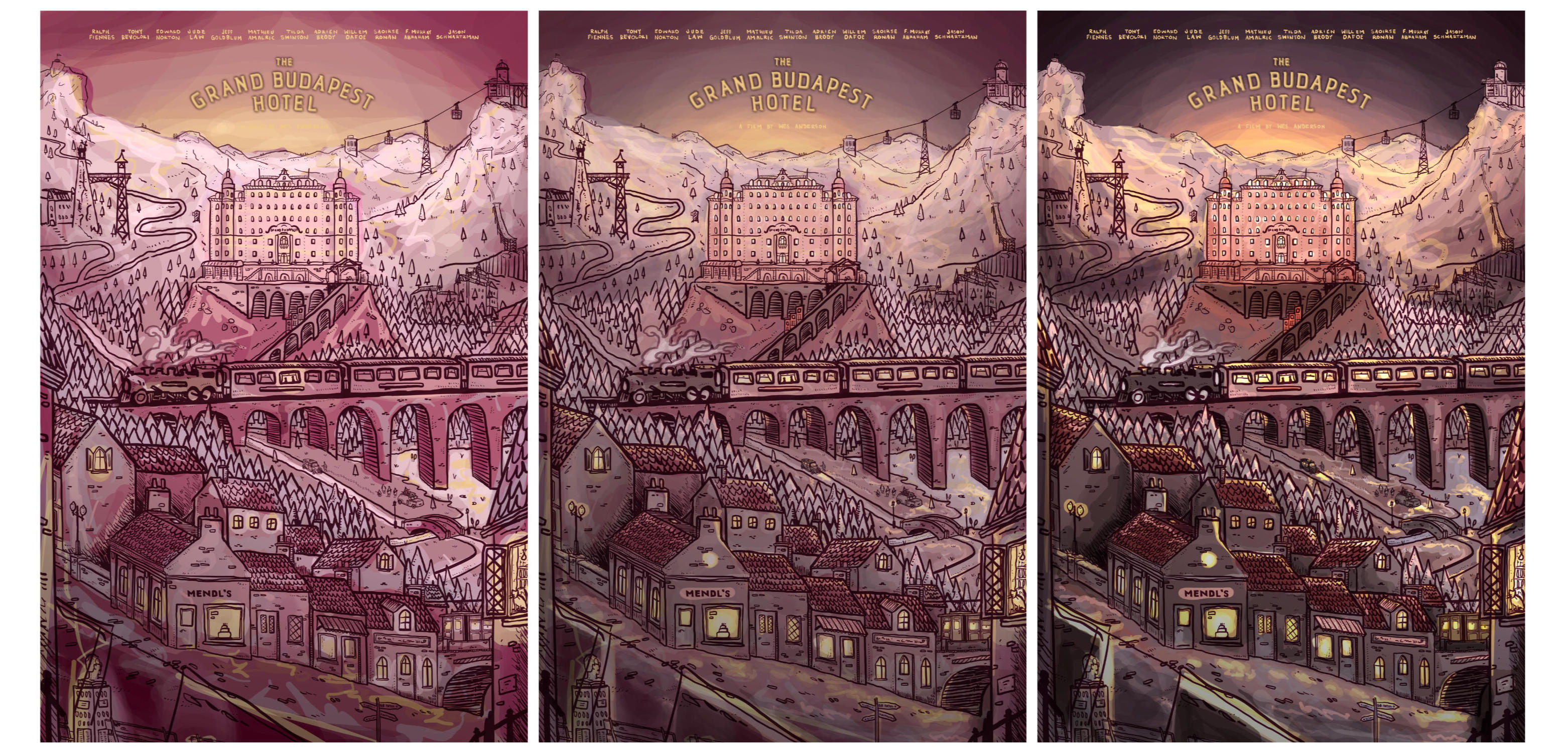
At the time I thought it was great, but with distance it is very (very) clearly much too pink, and too dark! Very glad this wasn’t the direction we ended up taking. Here are some of the further developments we made to the general layout:


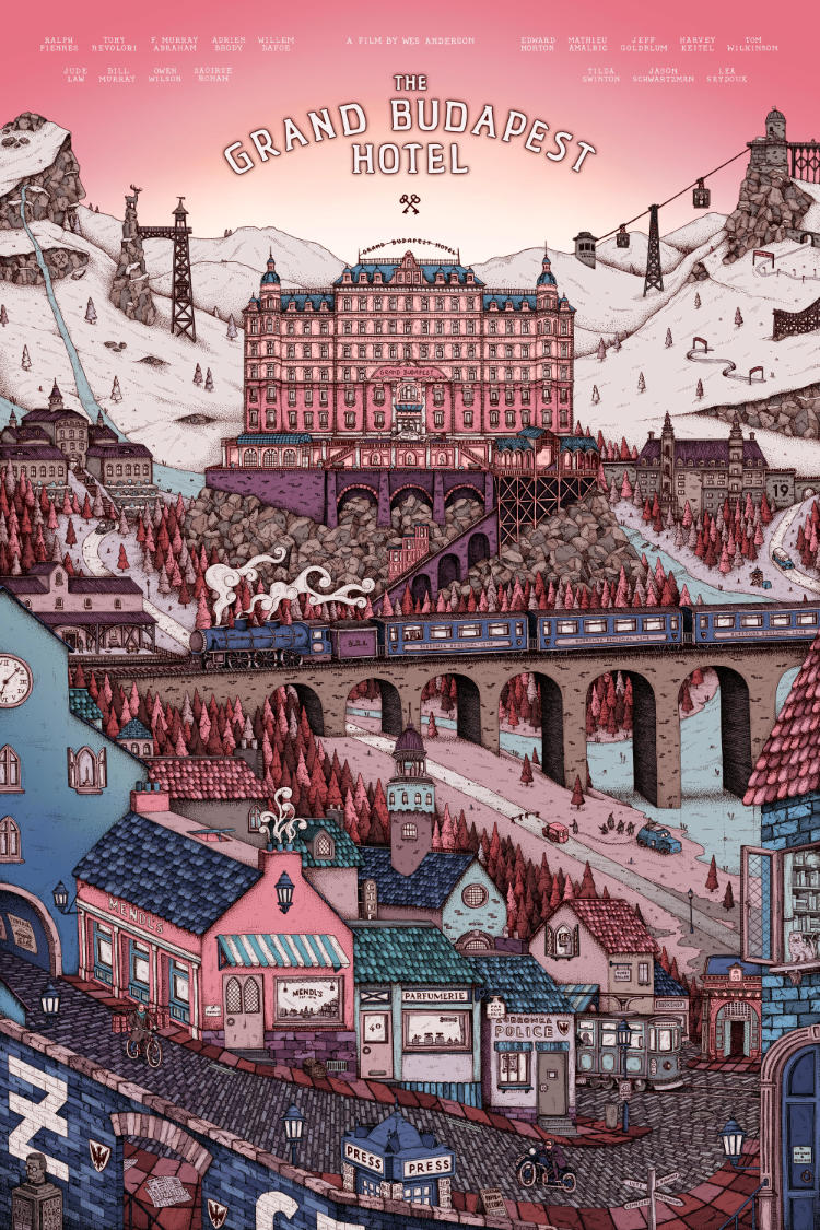
Again, alongside the linework, I was also trying to figure out the colour. Off the back of the previous colour roughs, I gave it another crack, this time aiming for something lighter. I also altered the Pink hue I had chosen, as looking back at stills/promo for the film made me realise that it’s a lot closer to salmon than I had remembered.
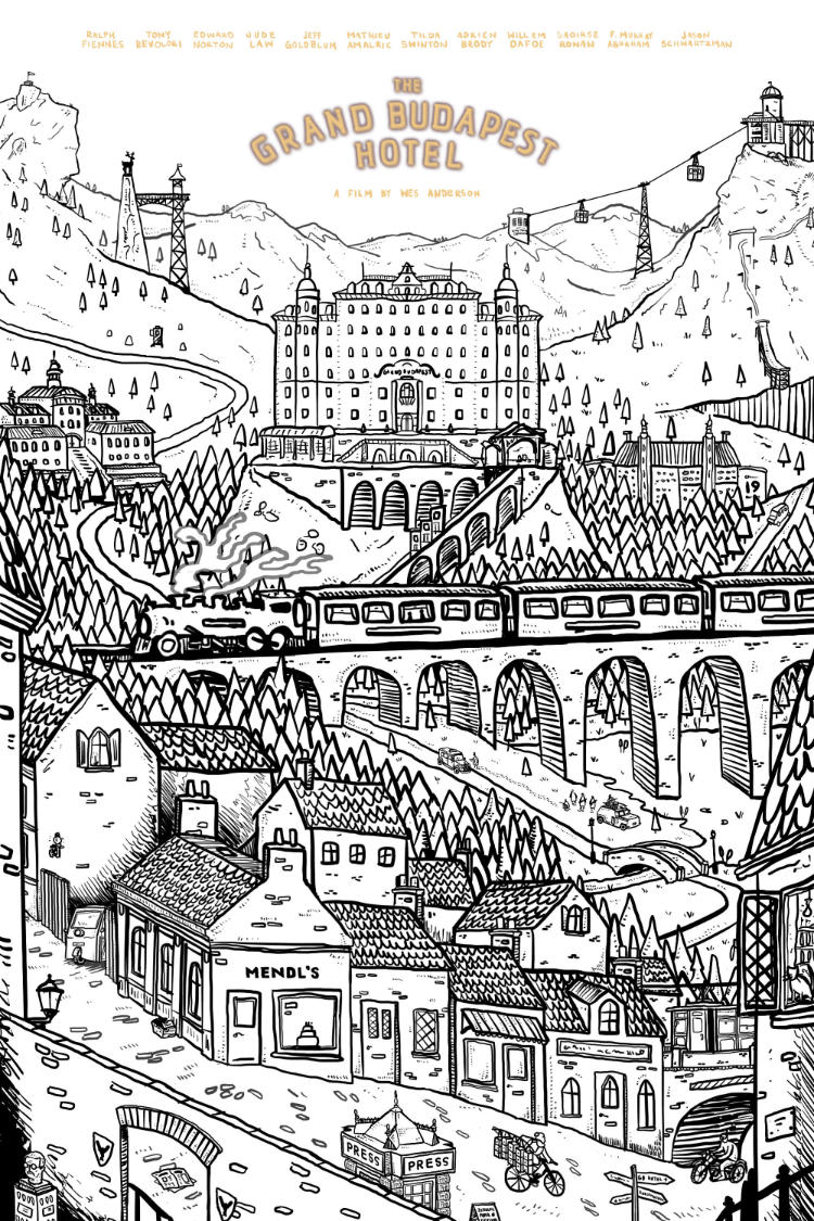
With the general layout pretty much set, I moved on to creating a pencil sketch. This bit can be quite time-consuming, but I find it incredibly helpful to fill in all of the details that I don’t want to hash out digitally. The digital stuff is great for layout and being able to move things around, but as for the texture of the buildings, the bricks in the road and the shape of the trees? I need a pencil in my hand for that.

”A seventeen-actor ensemble received star billing in The Grand Budapest Hotel.”
I thought that was quite an interesting notion, and since Anderson’s films are often heralded for their collaborators, I wanted to honour that and carry it through in my ode. After the pencil sketch was scanned in, I noticed things had to change. Below you can see some of the iterations. Some big differences, some little.
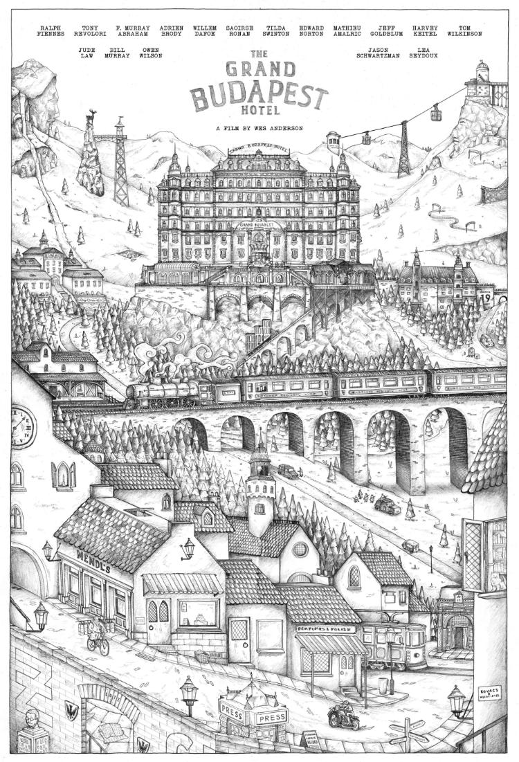
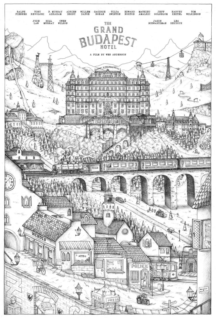


After the pencil stuff was sorted, I scanned it in, blew it up, printed it off, and used it as a basis for lightboxing the ink on a fresh sheet of paper. I think I overdid it on the stippling, not for how it looks, but just for how much work I ended up putting into it. But in fairness, it looks fab! The drawing itself was just shy of 24x36”, so it really was a massive undertaking. It was 4 sheets of A3 paper that I’d taped together, which made it easier when it came to scanning as I was able to disassemble it to fit it on the scanner bed. Here’s the scanned (and stitched together) drawing below.


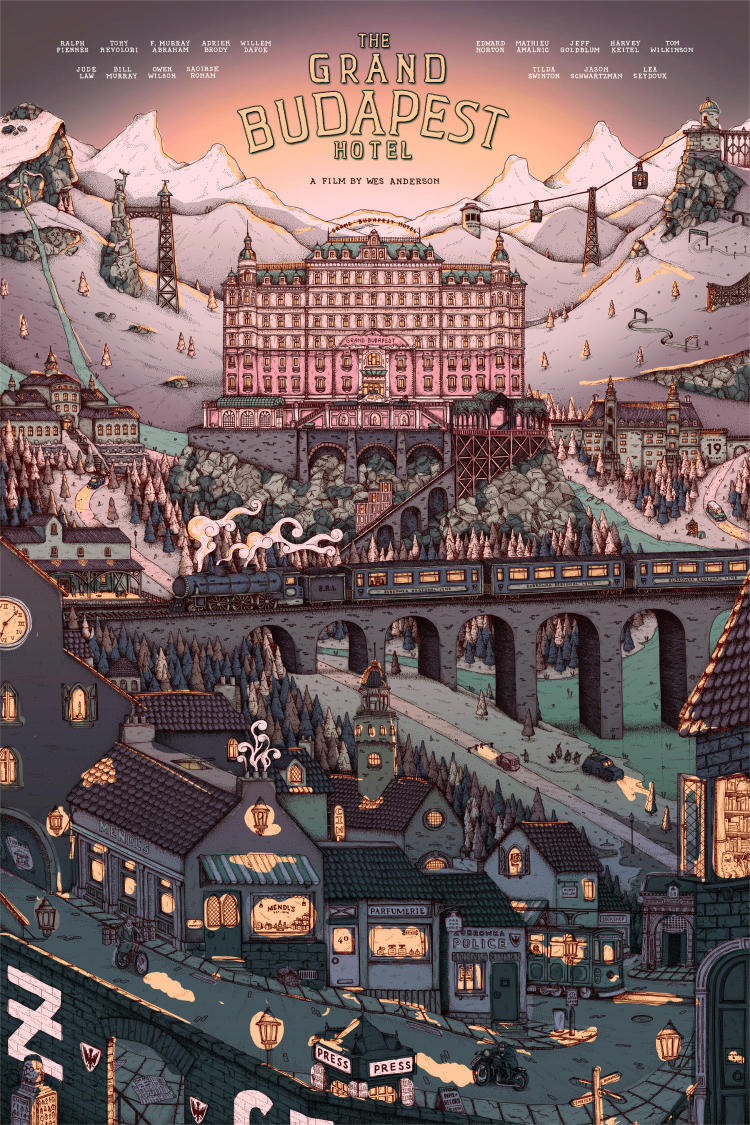


One of the things we were trying to capture was the idea that the artwork is taking place early in the morning. The Village is dark; the sun is rising over the mountains. Agatha is out on her early morning deliveries and the day is about to begin. The problem, we realised after a while, is that the dark colours we were aiming for just didn’t reflect a Wes Anderson film. I was making things too dark and it was coming across too gloomy.
The breakthrough moment came when it was suggested that I try to use blue in place of the darker tones. Instead, if we used a light, baby blue (which also features throughout the film - and on the Criterion Cover), it might hopefully convey that early morning chill that we were looking for. You can see below where it started to become a bit more refined.
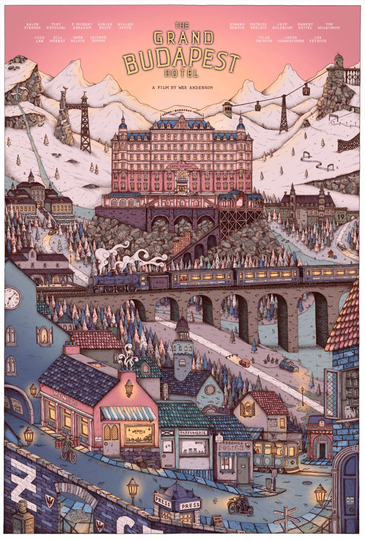
And thus ensued a good few weeks of mucking about with the colours, and it ended up being a nightmare. I’d loved the work I’d drawn, but I wasn’t able to colour it in a way that I, nor the commissioner, were particularly happy with. So we went round and round the garden, tweaking and changing trying to get something everyone was happy with. And believe it or not, this is what we decided on:
Yup, that’s where we called it quits. That’s the point where we tucked it away and decided “That’ll do”. And what an absolute goddamn travesty that would have been if we stuck with that decision! I mean, sure, it works, but it’s hardly a Wes Anderson poster.
Thankfully, after 2 weeks of stepping back and having a break from it, I was cleaning up my desktop when I saw the light blue version we’d had, when we initially felt like we’d made the breakthrough on colour. I sent it through to the commissioner - “I’m not sure what on earth I was thinking with how we left it. How about we look at this version again?” And lo and behold they had thought the exact same thing, with the exact same version.
I took everything back to how it was and cleaned things up. Some buildings needed changing, the yellow glow was toned back so it was more subtle, and voilà, we got where we ended up! Don’t get me wrong, there was a LOT of fiddling and fine tuning that was to be done, especially regarding the trees and the logo, but for the most part it was finished! And now, looking at it, I’m absolutely delighted. Possibly my favourite thing I’ve ever drawn (I say this most times I do something new, and every time I mean it). Hopefully everybody else likes it too!