morgan girvin
illustrator, maker and hermitinfo
about
contact
shop
illustrated work
wimmelbilder
film postersalbum art
maps
general illustrations
crafted work
hand crafted projects
big things
film boxsets

morgan girvin
illustrator, maker and hermithome > wimmelbilder > the muppet show
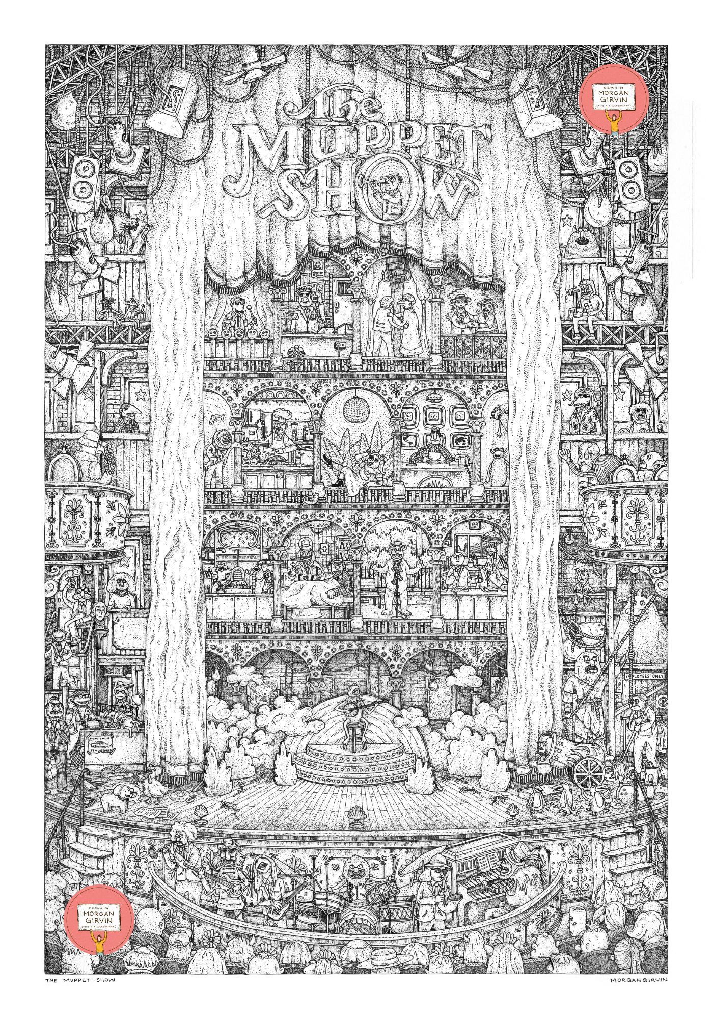
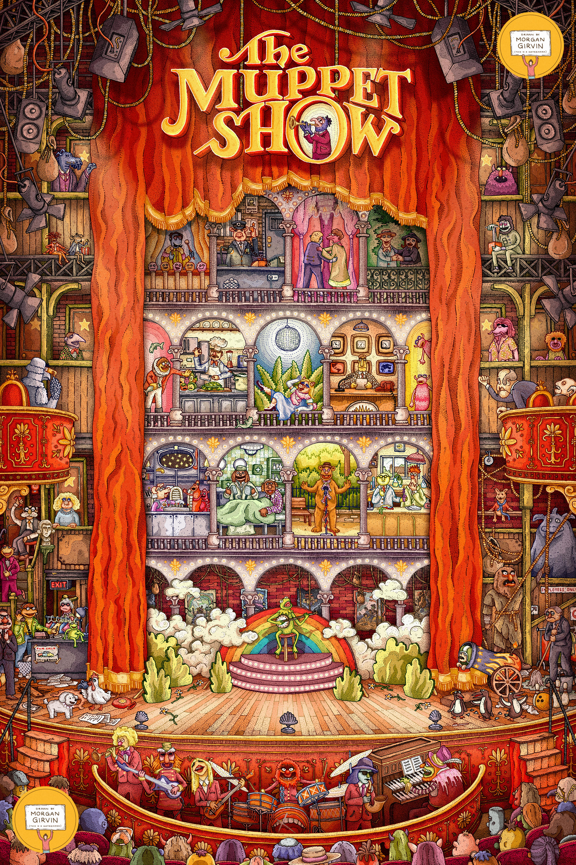
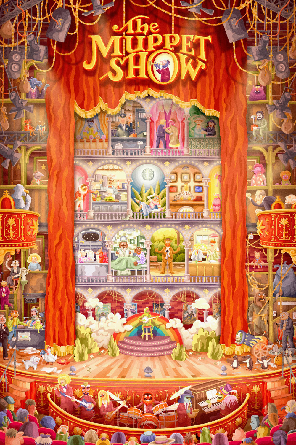
The black and white original drawing and the final coloured illustration
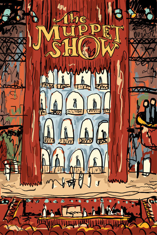
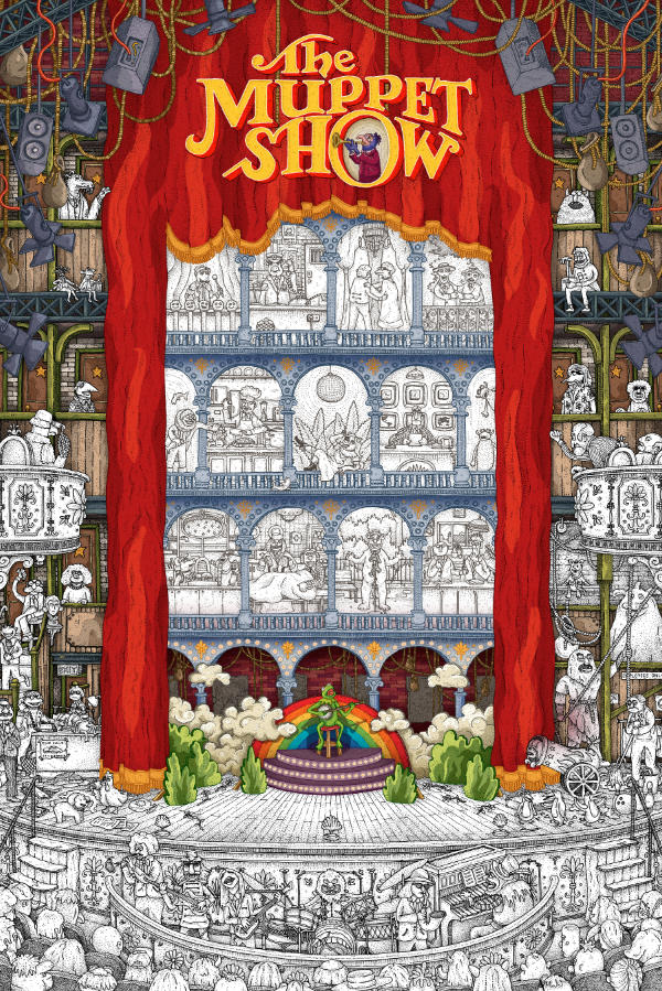
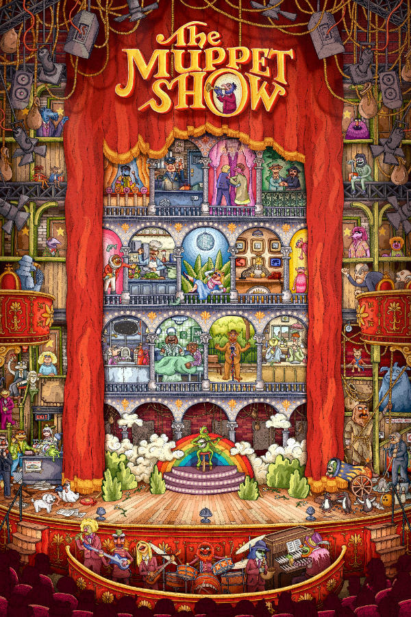
THE MUPPET SHOW
24x36” / 0.35 rOtring Isograph / October 2025
First, a love letter to the Muppets
Amongst the multitude of physical media in my possession, tucked away in the bottom corner of my shelf you can find a DVD that was bought for me as a gift when it first released in the early 2000s: The Very Best of The Muppet Show, Vol. 2. God knows how many times I watched this back to front whilst growing up. A madcap collection of various sketches featuring the likes of Roger Moore and Sylvester Stallone, a selection of Muppet Fairy Tales that provided me inspiration when we made pop-up books at School, a quiz on the history of the troupe – all that to say: I’ve grown up very fond of the Muppets, even if my exposure to them was limited to repeat viewings of this singular 2 hour collection.Now, having broadened my knowledge of Muppet Culture, I reckon I’d lay my chips down on the fact that the Muppets are probably the single best fictional creation we’ve ever known. I could wax lyrical for a long time about Kermit and Co, but I suppose it boils down to this: they represent such gorgeous, optimistic and human ideals of who we can be.
It sounds mushy, especially coming off the back of the gritty pop-culture landscape that has permeated every corner of the last 15-20 years, but the Muppets’ commitment to being earnest, sweet and kind is important; if not to everyone else then at least to me. Being a property for all ages, I can’t help but admire how steadfast both Sesame Street and The Muppets have been in their mission for being good natured, especially through the times when that hasn’t been socially popular.
Despite what a lot of modern ‘content culture’ might lead you to believe: trying is such a wonderful skill. To have pride in what you create – to pour all of your effort into something and stand by it as a determination of self – is something that I think has slipped from public consciousness. The eternal chase of corporate cogs, or the validation of being a square peg in a square hole to capitalise on a social media trend. There’s a tendency to forget how to be weird, to do what you want to do irregardless of the sway of the wind. And nobody embodies that as confidently as the Muppets do. A ragtag band of weird, creative freaks, each an owner of their own strange oddity, all so different and temperamental. And yet, they support each other to the end of the Earth. God knows what Gonzo’s doing this week; some peculiar flight of fancy, I’m sure. Whatever it is, I know he’s going to be mocked by a forever-flustered Kermit the Frog. And yet Kermit, like us, loves Gonzo irrevocably. He’s a freak. And he’s singular. But he’s our freak. In the same way that every member of that troupe is. Each Muppet is a reflection of somebody we know, or somebody we want to be.
I think that in the last few years there’s been a small trend back towards earnestness. Of not producing work and cowering behind making it the socially acceptable standard of ‘realistic’, ‘grounded’ or ‘normal’. I hope, in the years to follow, the pendulum continues to swing in favour of trying. Of being nice, wonderful and weird without pause or apology. And with the recent announcement of a Muppet Show revival being in the works, I can only hope that Kermit and the gang are going to return to lead the way in reminding people how to be communally singular.
PROCESS
If not clear from the writing prior: I love the Muppets wholeheartedly. And I had an idea. The theme song and the introduction to the original show is burned into my brain, and so thus was the idea to produce an illustration that featured those wonderful arches so prominently.
With the idea being so singular, there really wasn’t much to decide or figure out – it was just a case of translating thoughts into concepts. As always, it started as a very scribbly sketch, and Bottleneck were kind enough to trust that it was going to come together significantly better further down the line.

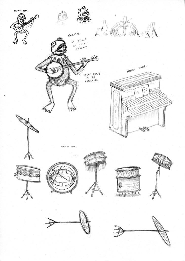
The other thing I did, after those digital sketches, was to test how some of the characters might look. I had no idea if my harsh black linework would mesh with the characters from The Muppets, which are most often soft and fuzzy. I chose Floyd and Kermit as my test subjects.
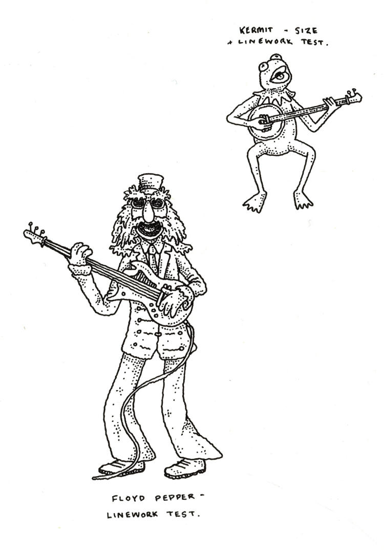
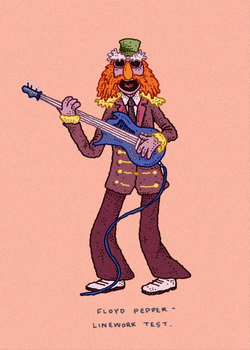
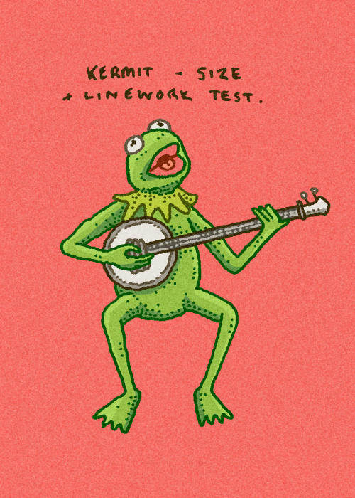
I was very happy with how they came out. One thing I had chosen to do was to colour the linework, so that it wasn’t solely black lines. Whilst time-consuming, it does a good deal in softening the edges, and I think it was needed for the art.
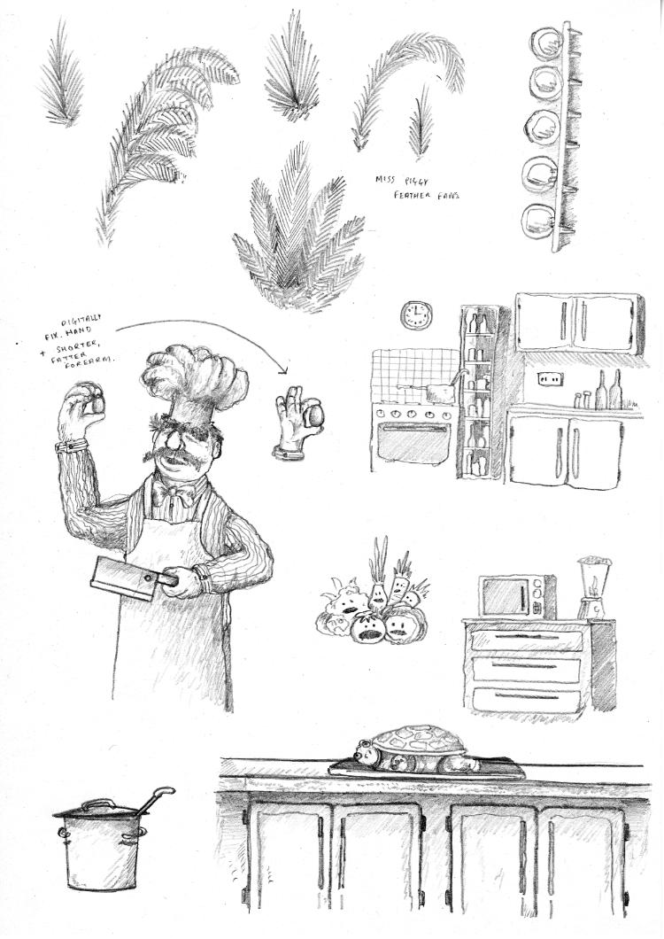
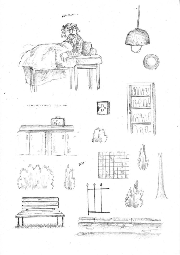
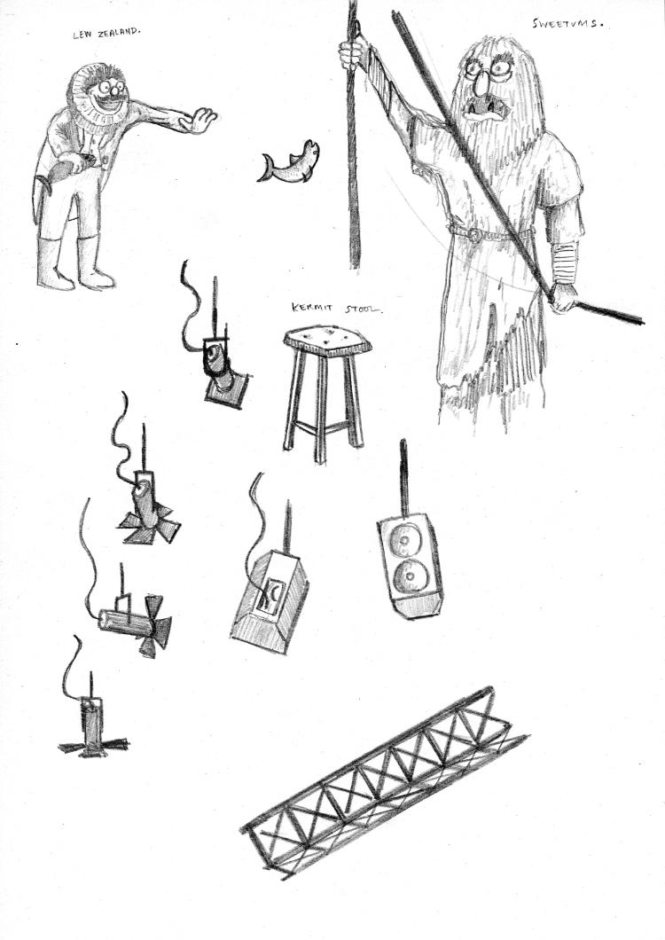
Taking an A2 piece of paper, the next step was to do a detailed pencil sketch. From here, I would ink directly over the top and then erase the pencil afterwards. This process started off swimmingly - until I hit the snag of including the characters.


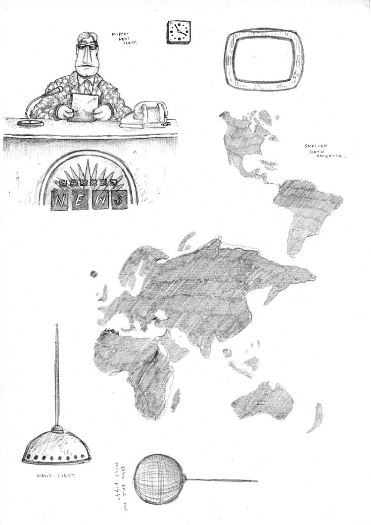
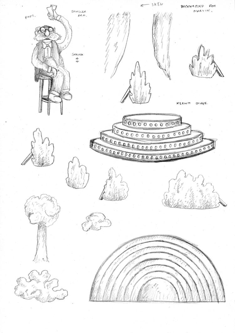
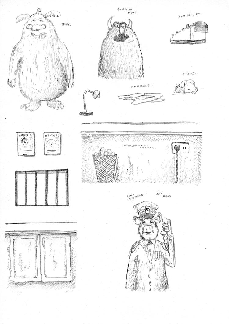
If you put pencil on paper and erase it, and put more pencil down and then erase it again, eventually the paper stops being forgiving and you find your drawing being permanently greyed by the so-called temporary marks you have laid down. And when adding the characters into the environment I’d started drawing, I was finding it very hard to get them right. I’d draw them too big, or too small, or not in the right position. You can see the remnants of many attempts at a centre-stage Kermit in the pencil sketch above. I decided, in order to combat this, I was going to hash out all of the characters on separate sheets of paper. I wouldn’t worry about scale – I would just draw them however they came to me. I’d then scan them in, rescale them digitally, print them off at the appropriate size, and then trace the resized version using ink.
And holy moly was this a life saver. It was very freeing not having to worry about erasing one-too-many times. If I mucked up I could just go again on a fresh sheet of paper. But even more so - not having to worry about size was great. All characters came out somewhat relative to each other, although some are certainly bigger than they should be. In fact, it worked so well that I drew a lot of the elements this way - especially for everything within the arches. All of the sketches below were done across 15 sheets of A4.
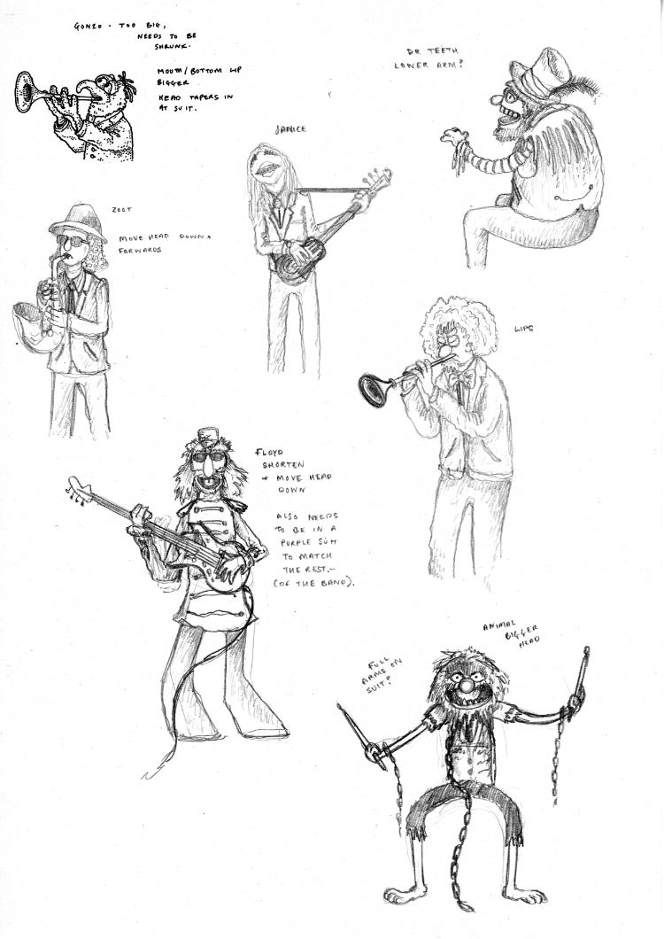
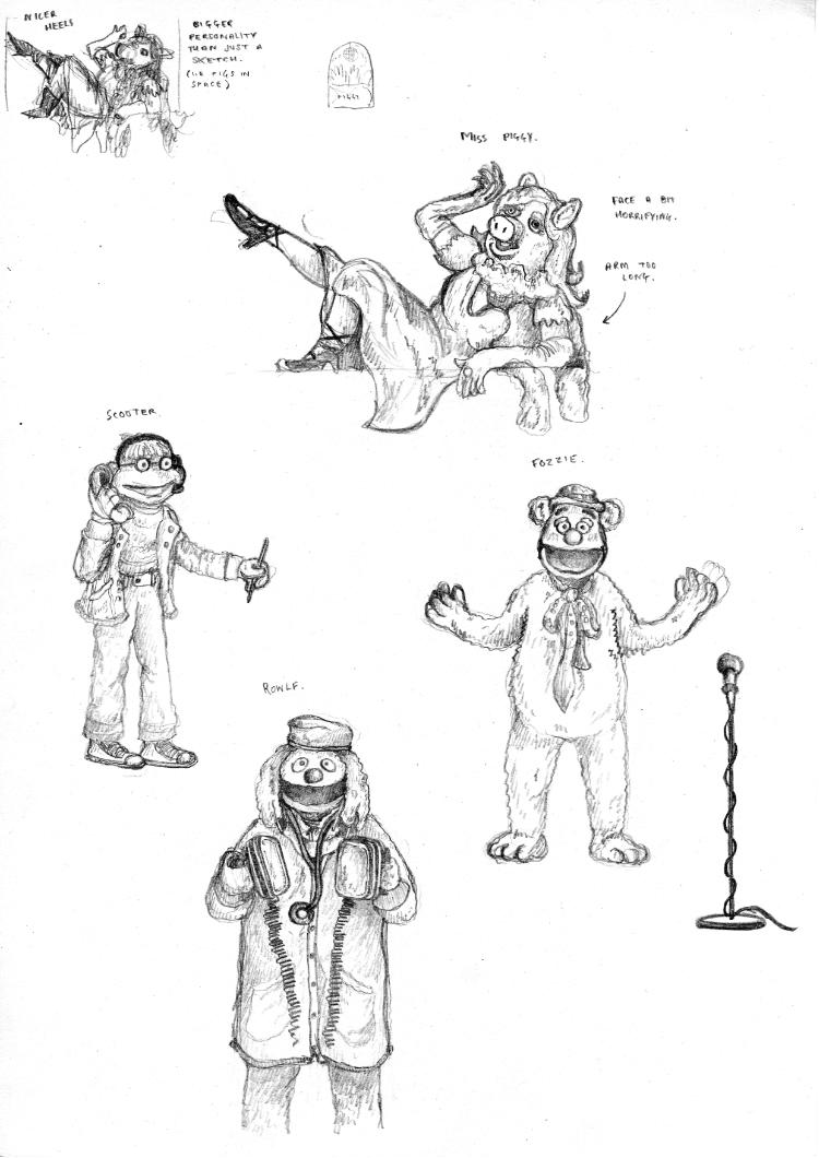

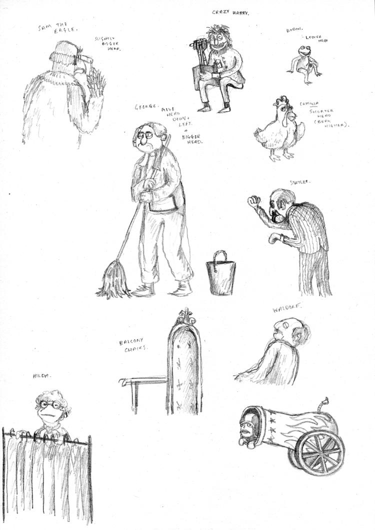
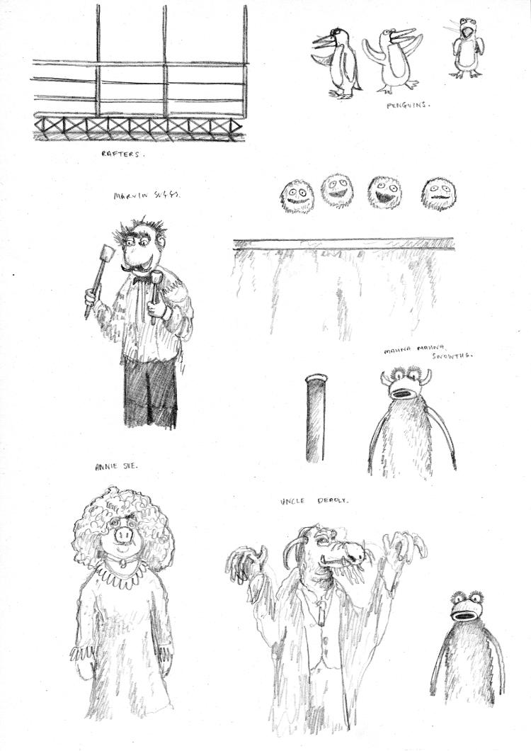

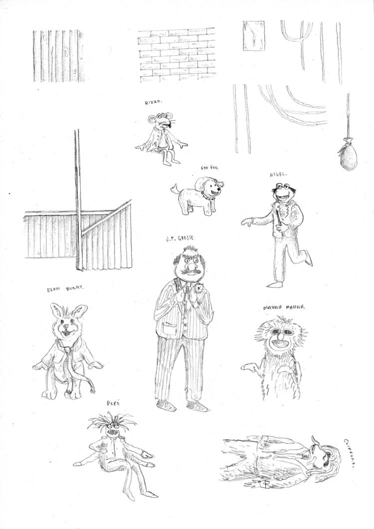
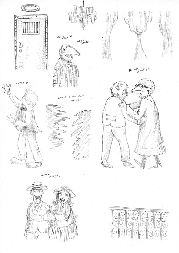
Now, in terms of characters I chose to include in the illustration, there wasn’t a solid line. For the most part they all originate from the original Muppet Show, since that is the framing for the illustration. However, I mostly wanted it to be a celebration of all things Muppets, hence the inclusion of later characters like Pepé, Bean Bunny and Clifford. Interestingly, I didn’t include Walter from 2011’s The Muppets. I love the film dearly, but I think in my head there is a soft distinction between pre and post 2011 content. I’m not sure if that is an opinion shared or not. Regardless, I wanted this to be a celebration of the ‘old’, and so I opted to leave out the new(er) content. There will inevitably be gaps in which characters I did or didn’t include, but since this is an illustration dear to me, I wanted to focus on the characters that I personally know and remember. Even still, hopefully I got most of the big hitters.
Once separated and cleaned up, I compiled these into the digital version of the full pencil sketch I had been working on. Once I had them all positioned, the plan really came to life, and I was finally starting to have confidence that I could pull off the multitude of characters that I was aiming for. I printed this mashed-up sketch and used it as a guide for tracing the linework on a fresh sheet of paper.
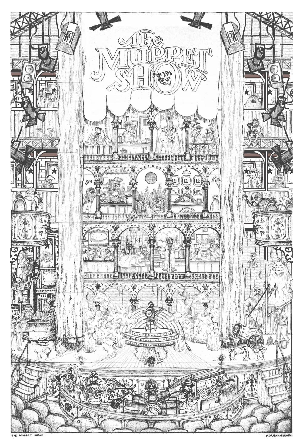
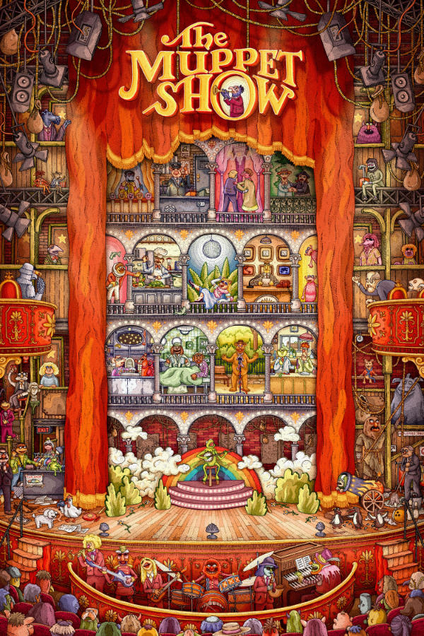
And with the linework done, it was pretty much plain sailing (as it, thankfully, often is). It took me longer to colour this piece than it did to draw it, which isn’t the most fun to think about since the drawing is my preferred part of the process, but I’m very happy with how it came out. Below are some different save states from along the way.
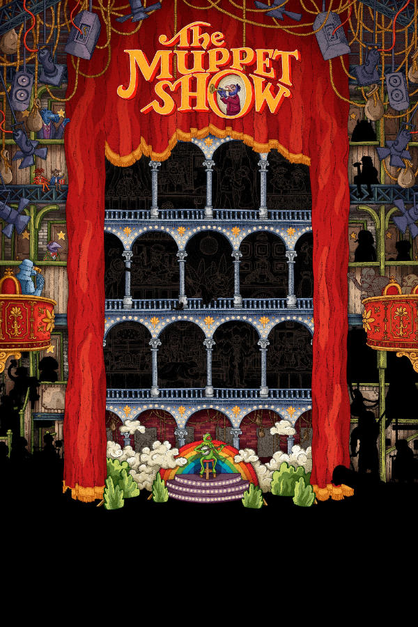


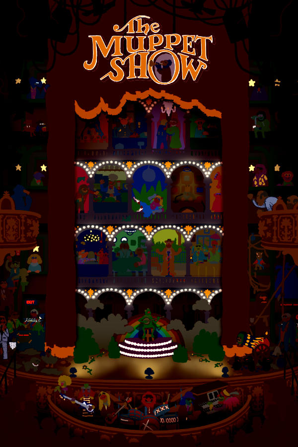
Something else I can show as a nice detail are the various layers that went into this. Below is the artwork with black linework, the artwork with no linework at all, and then the coloured linework used in the final piece (unclipped from the lines themselves).

Whilst nice, the art with the black linework feels a touch heavy to me. As mentioned earlier, the characters don’t feel as soft or as warm as I would want them to be. It’s a dreadfully stupid process I use to colour the linework, as I have to be very exacting, but ultimately I think it’s worth it. And as mentioned in my love letter at the beginning of this write-up – I want to stand proud of the work I have put into something, and I want it to be reflective of myself.
Thank you again to Bottleneck Gallery for bringing this to life, and for letting me capitalise on the rare occasion that I want to work on something specifically because it’s very close to my heart and soul.