morgan girvin
illustrator, maker and hermitinfo
about
contact
shop
illustrated work
wimmelbilder
film postersalbum art
maps
general illustrations
crafted work
hand crafted projects
big things
film boxsets

morgan girvin
illustrator, maker and hermit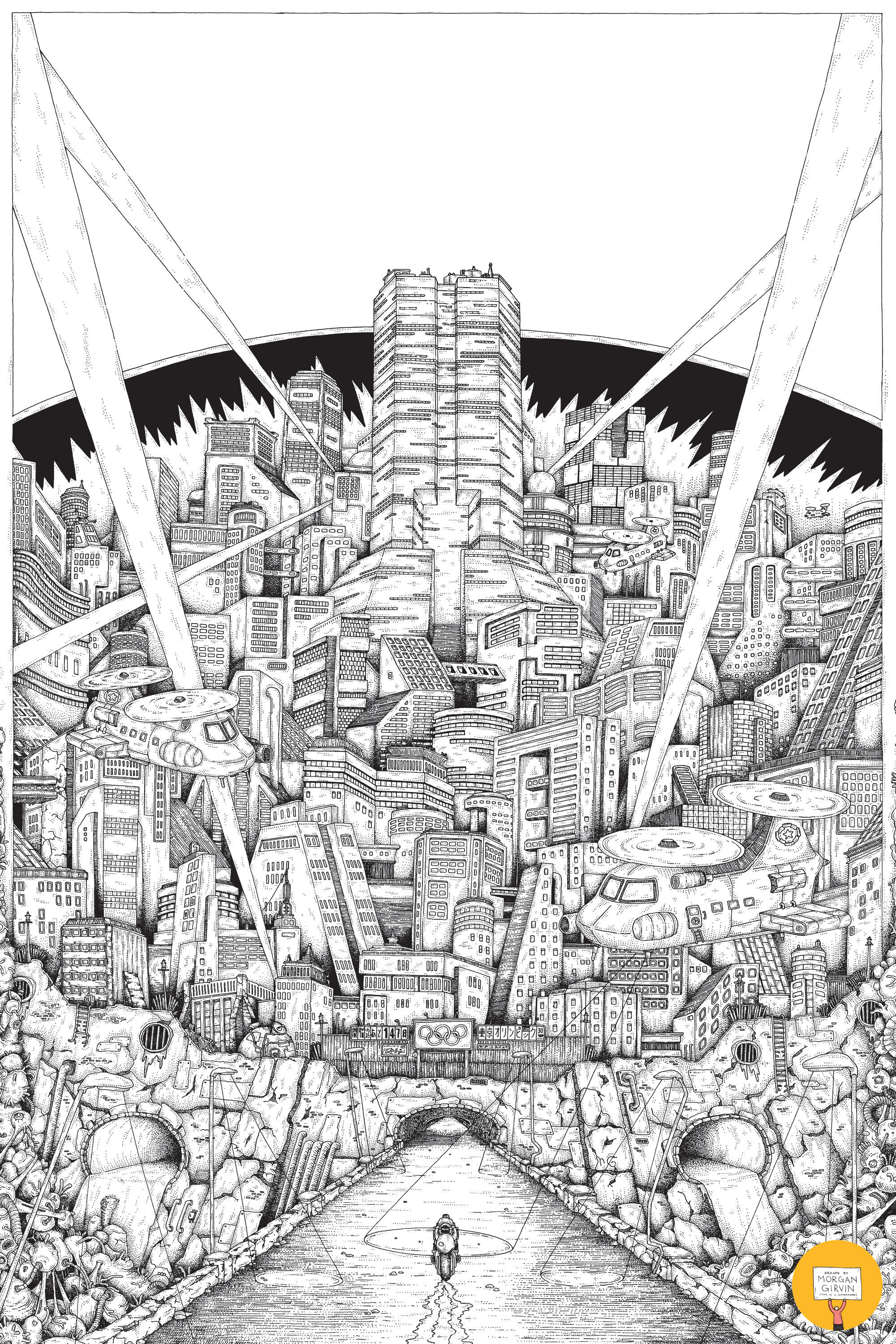
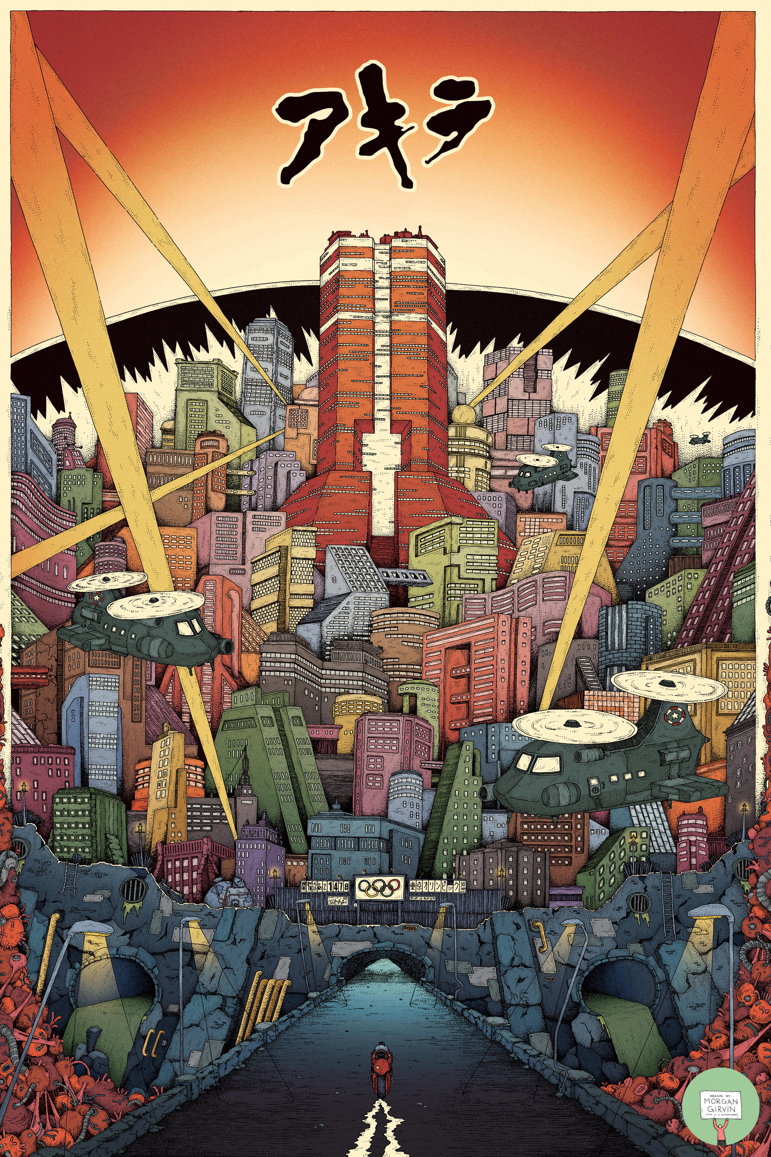
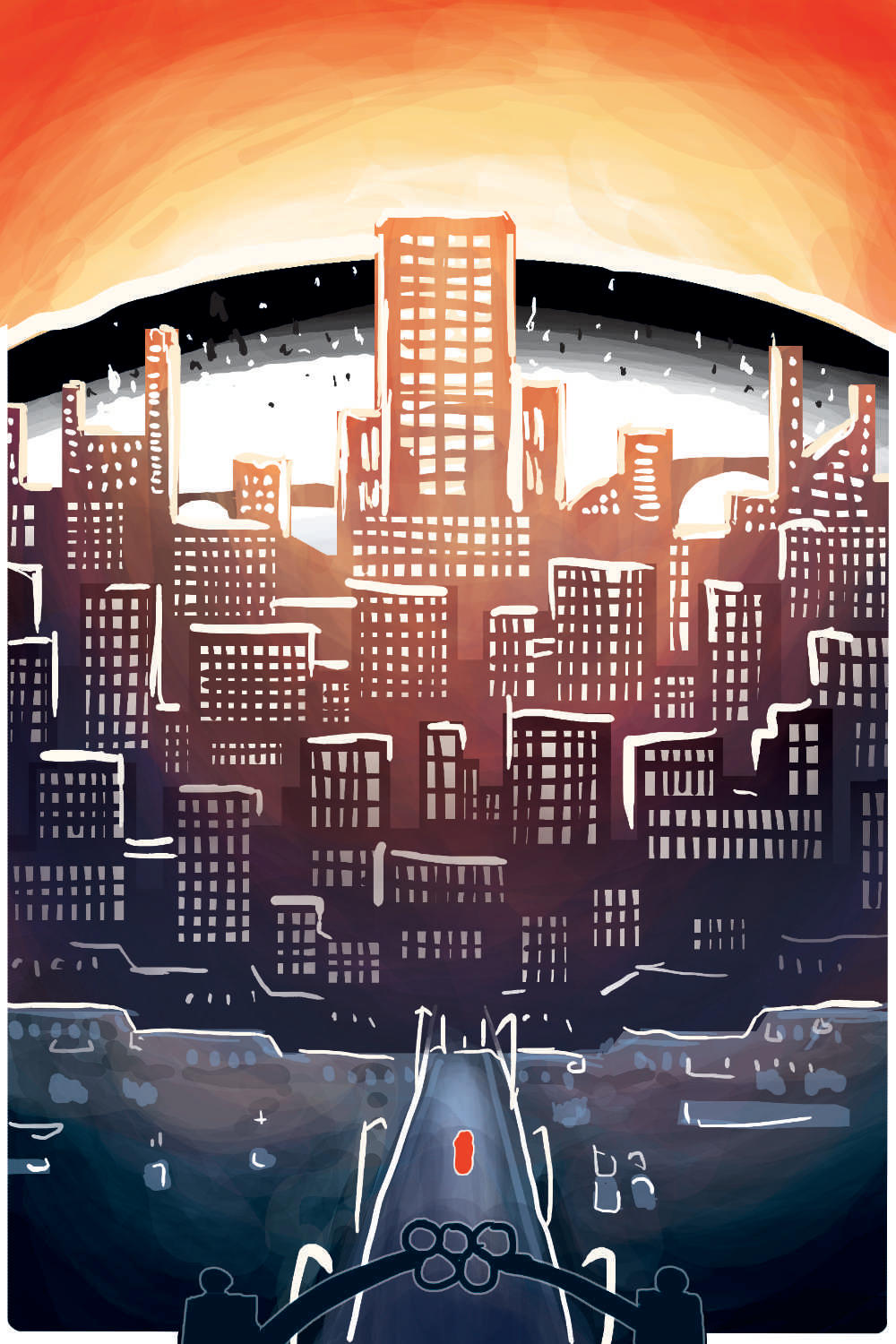
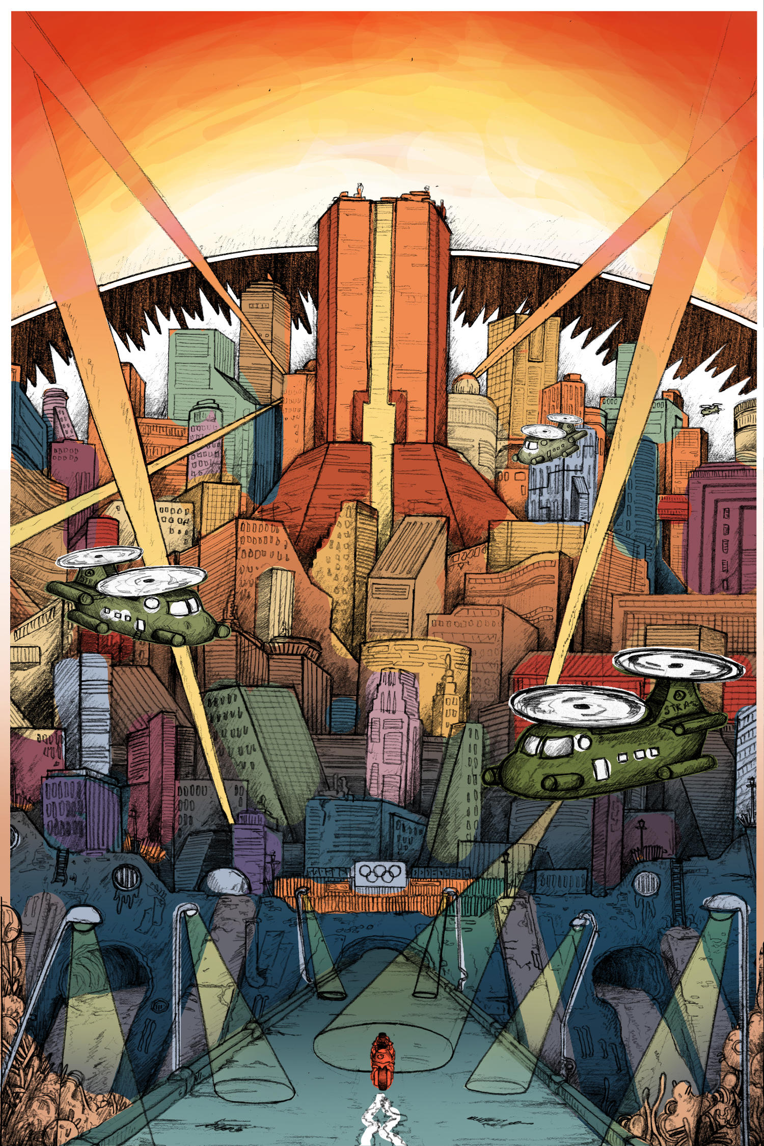
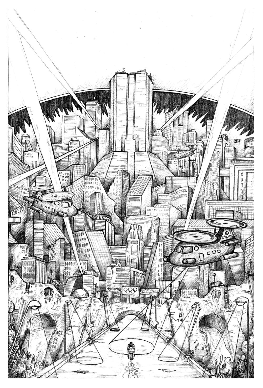
AKIRA
24x36” / 0.35 rOtring Isograph / June 2023
This is my illustrated poster inspired by the ever-influential Japanese film “Akira”, which I had the absolute delight of working on thanks to the lovely folks over at Bottleneck Gallery. Limited runs of both the logo and non-logo variants will be up for sale on their website at 12pm ET on 13th June 2024.
DEVELOPMENT
[Above] Initial Concept/(very) Rough Sketch
However, once I rewatched Akira and began grabbing frames of reference I was particularly taken by the film’s constant kaleidoscopic colours. Whilst a lot of the film takes place at dusk and is quite dark and moody, the colour of the buildings is in a constant change of flux. Everytime we’re shown sweeping shots of the cityscape we get to see Neo-Tokyo under a new light (literally).
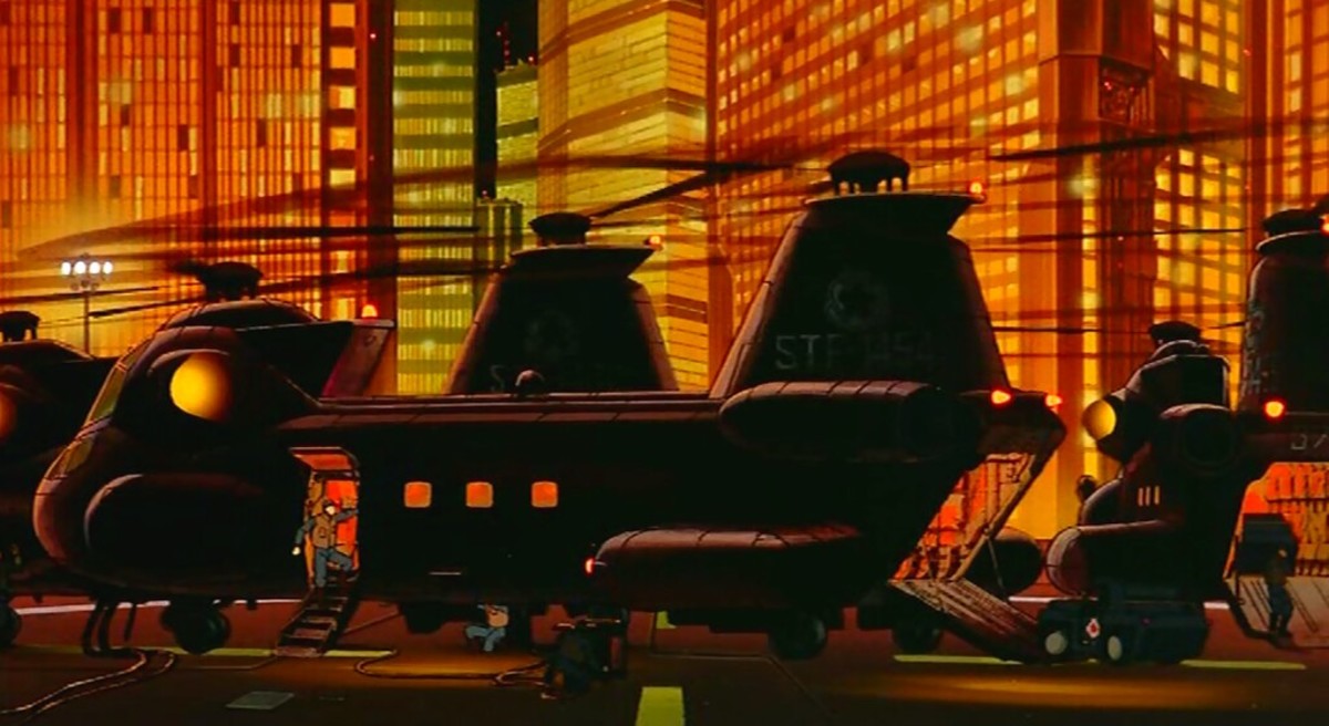
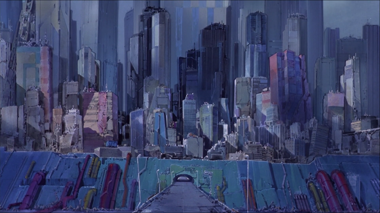
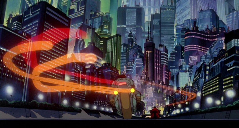
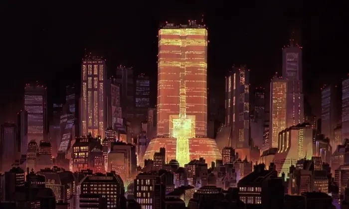
[Above] Plenty of blue, green, orange, pink, yellow...etc
So I pivoted and reworked the colour palette into something a bit more explosive and varied. I thought this would also be a nice challenge for pace for my own work, since I often struggle with colour and usually fall back on fairly muted tones.
When it came to creating the actual sketch, things started to fall into place a bit more. I knew from the beginning that the piece would have a slight border, and that the bridge that Kaneda is riding on would overlap the frame along the bottom edge. It was only when it came to drawing it that I realised this would be the perfect opportunity to also feature the mass of Tetsuo creeping up the sides, overlapping and engorging everything in his way.
Below you can see the various stages of sketchwork I did.
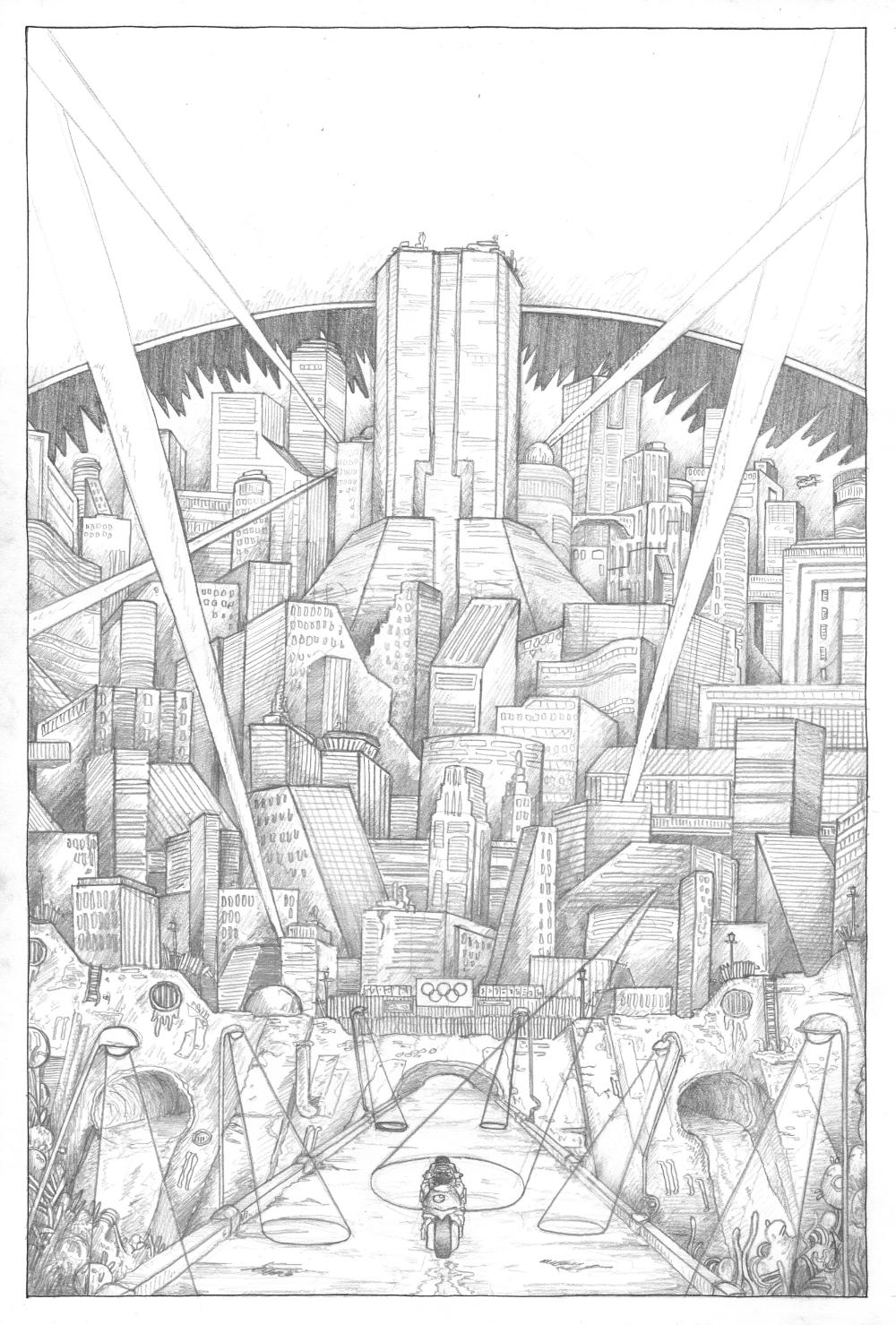
[Above] (1/2) Initial Pencil Sketches, (3) Refined Sketch, (4) Colour Plan
From here, I blew up and printed out the refined sketch super big, where I was then able to trace over it and complete the linework with my trusty rOtring Isograph. I had a lot of fun completing the linework, and I really enjoyed bringing the city of Neo-Tokyo into a new, Morgan-esque light!
Again, Limited runs of both the logo and non-logo variants will be up for sale via the Bottleneck Gallery website at 12pm ET on 13th June 2024 if you’re interested in nabbing yourself a print.