morgan girvin
illustrator, maker and hermitinfo
about
contact
shop
illustrated work
wimmelbilder
film postersalbum art
maps
general illustrations
crafted work
hand crafted projects
big things
film boxsets

morgan girvin
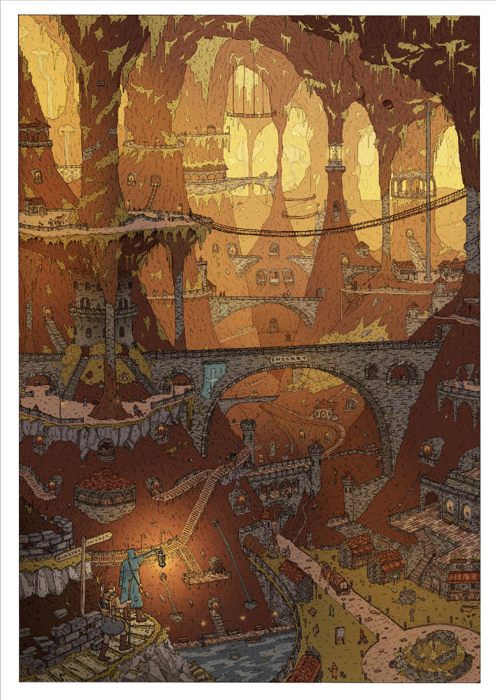
illustrator, maker and hermithome > wimmelbilder > dawn at the snicket
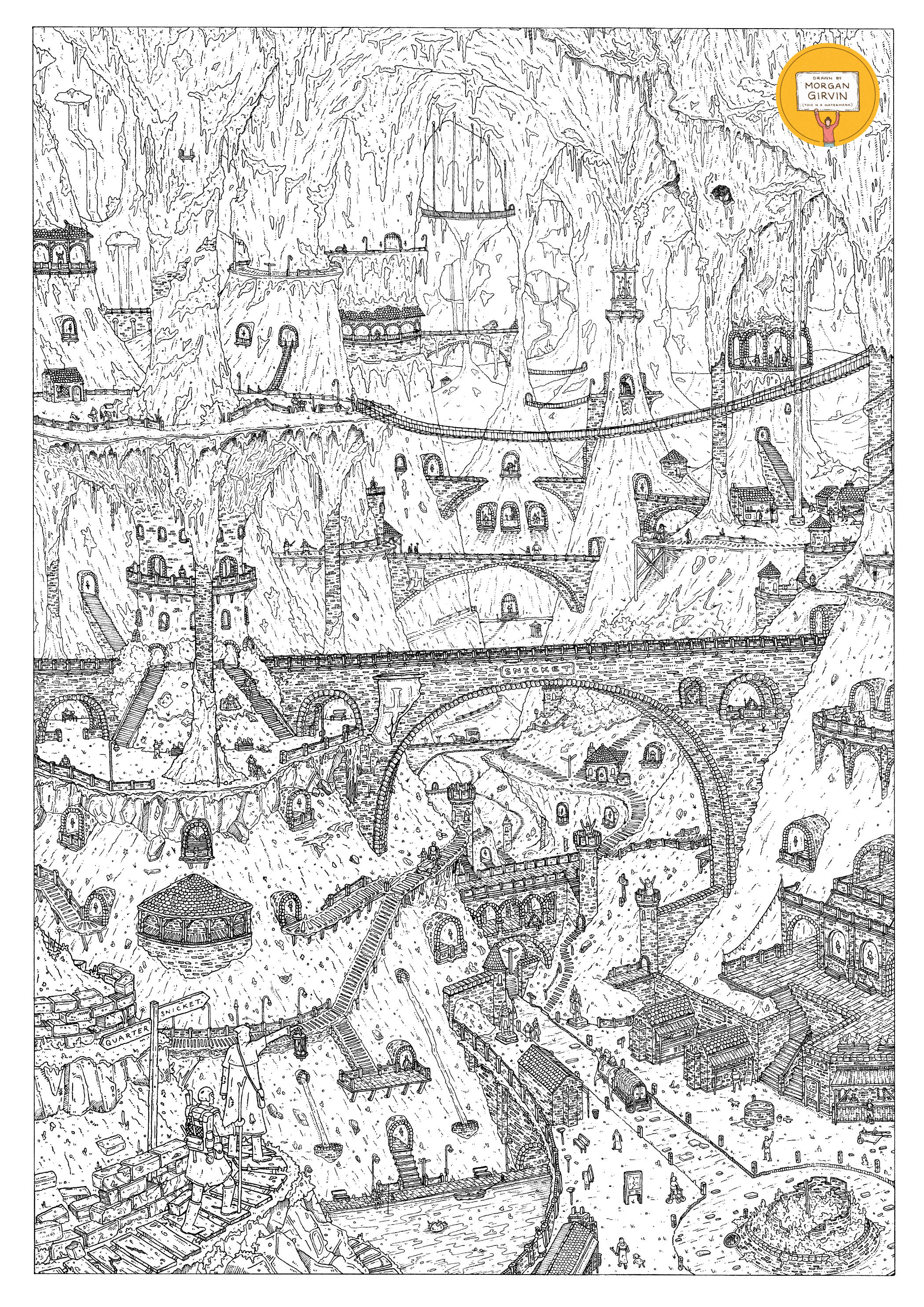
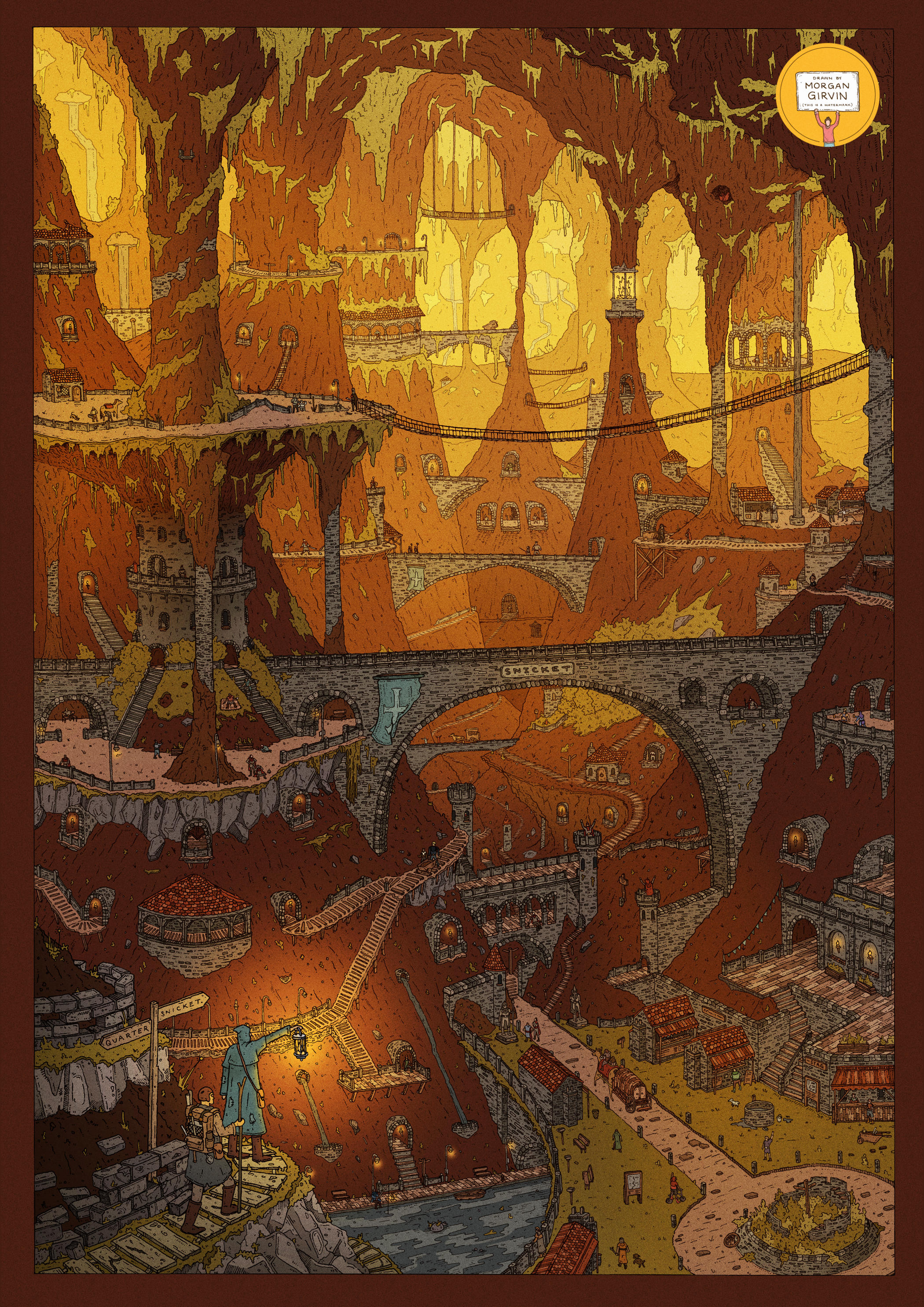
The Original Linework and the final Coloured Illustration
DAWN AT THE SNICKET
A3 / 0.01, 0.05 & 0.03 Unipin Fineliners / December 2021
INITIAL SKETCHING
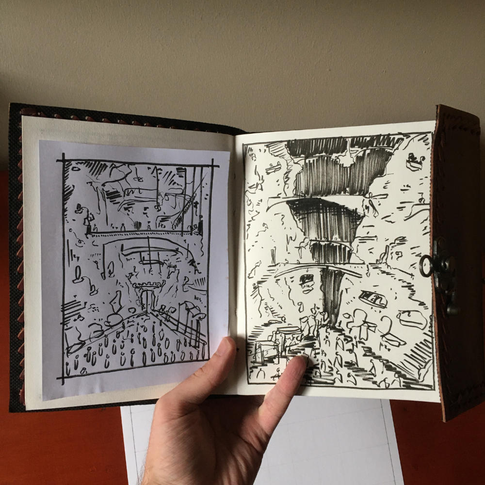
The drawing started as a quick sketch on a piece of paper. The starting point of the idea was basically “a long, narrow, lived-in cavern that has bridges connecting either side”. It was quite a simple sketch initially, but the core ideas of the bridges and the marketplace on the bottom were there from the beginning.
The last ‘big’ illustration I’d done before this one was ‘Dredd’, and my process with that one was to jump straight from sketch to drawing, and then figure out the colouring as I was doing it. That proved to be quite hard, since I ended up going with a different colour palette than I expected, so this time around I wanted to do that experimenting from the beginning.
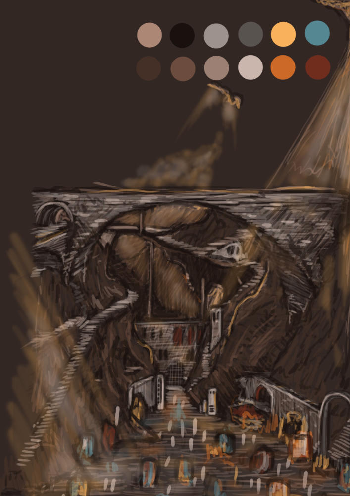

I moved into Photoshop and began doing some digital sketching using my Wacom tablet, which proved to be so incredibly useful. The Progress v1 image was me working mostly on a direct translation of the sketch I’d done on paper, with the bridge going across the centre and a marketplace at the bottom, but when I got half way through I realised I wanted the scale to be a lot bigger so I increased the size of the canvas and began expanding the image, i.e. Progress v2.
I think this helps me capture the idea that the world of the drawing is a lot bigger than just what is within the frame, especially since the initial sketch only ended up being about 50% of the final piece.
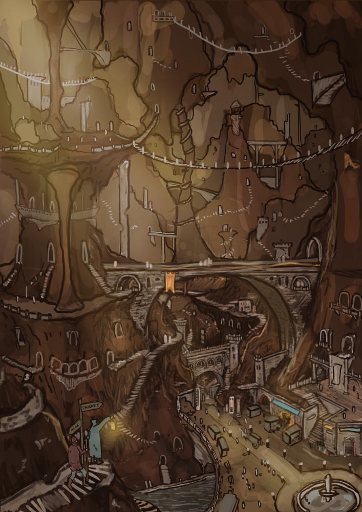
I ended up doing the same again until I settled on Progress v3. By this point I’d created more of a foreground/background situation in the image to give the eye something to focus on before you start looking around at the smaller details.
ILLUSTRATING

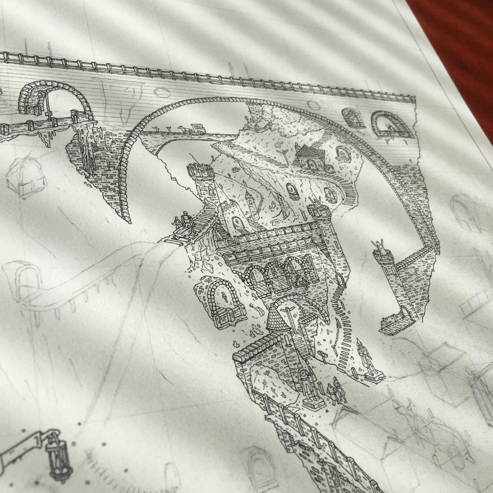

If you’ve ever done a portrait drawing, you’ll know there’s always that moment where you’ve drawn one eye, and then you spend the rest of the drawing purposefully ignoring the second eye in case it goes incredibly wonky and you mess it up. I think this is what I was doing here. Rather than pencil it all in one go, I felt better completing the bottom half and just neglecting the top half. This probably happened because there are less details in the top of the drawing, and the illustration becomes mainly rock formations, which seemed harder to draw. But eventually I got it done.
I think one fault in the black and white drawing is that it feels slightly unbalanced. The top of the illustration should have more linework in it to compensate for the lack of details. I think the addition of more black would create something that feels better compositionally. However, I also knew that I needed to leave it lighter for when I scanned it in and coloured it. Those issues within the linework would fade once the colour was applied.
COLOUR
Having already planned out the colouring in a digital sketch, it was a lot easier when it came time to colour the final thing. Something I had also been doing this time around was colouring the illustration as I was drawing it. I scanned it in after I’d drawn the bottom half so that I could see how it was looking, and how the top half looked like it was going to pan out. This was really useful for knowing how much/little detail I should include in the top 50% of the drawing. It also meant I had a leg up on colouring, since I had already figured out what colours were going where.
One thing I tried to do with this illustration was work smarter, rather than harder. My photoshop file for my ‘Dredd’ drawing had over 500 layers by the time I’d completed it. Since I was going to be working at 600dpi this time I didn’t think my old, rickety Macbook would be able to handle that and I tried to minimise layers as much as possible.
The main thing I did for this was to utilise layer-masks where I could. I started by setting the background colour to be one solid brown. Then I separated the image into the layers that I had incorporated in the illustration. The best way I can describe this is that the section with the travellers in the foreground is layer 1, then the marketplace/large bridge would be layer 2, and so on and so forth, going back with each rock formation. In total there are 7 layers. I then added a Curves and Hue/Saturation to the image, which lightened it, and I layer-masked it to layers 2-7. This meant that the brown background was now lighter everywhere except for the travellers section. I then did this again, except I layer-masked it to layers 3-7, so the background had got lighter for everywhere except the travellers and the marketplace. I did this again and again, each time knocking off the foremost layer. This means that the back of the cave has 7 lots of filters over it, whereas the marketplace only has 1. You can see below how the filters turn the solid brown background into a number of different colours.

Had I done this illustration before ‘Dredd’, I would have coloured each section of the drawing with a different colour, but by thinking of a workaround I was able to use 1 solid background colour, and instead have 7 layer-masks that changed the entire atmosphere of the illustration. And not only does it change the brown colour, but since the filters were sat at the top of the file, it also changed the other objects such as stone, bricks and people. It really does make the entire illustration feel like it’s disappearing into the distance and I’m proud of myself for working in an efficient way for once.
I also applied this thinking to the linework too (thank you Finn Sorsbie), so that as the drawing goes further back into the cave, the linework gets lighter, and it really helps to sell the grandiose atmosphere.
If you like this illustration and would like to buy a print, then I have some available in my shop!