morgan girvin
illustrator, maker and hermitinfo
about
contact
shop
illustrated work
wimmelbilder
film postersalbum art
maps
general illustrations
crafted work
hand crafted projects
big things
film boxsets

morgan girvin
illustrator, maker and hermithome > film posters > dredd
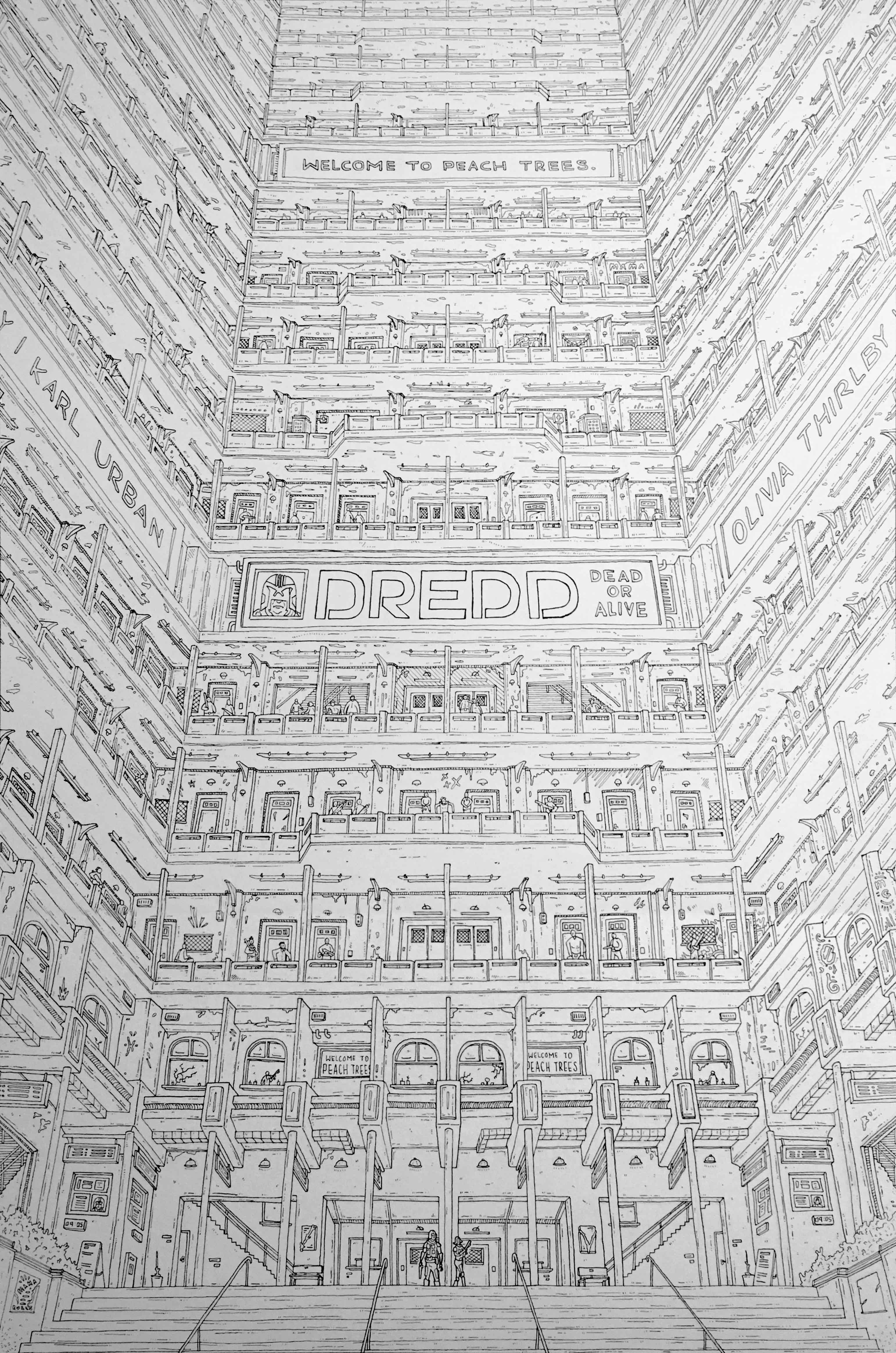
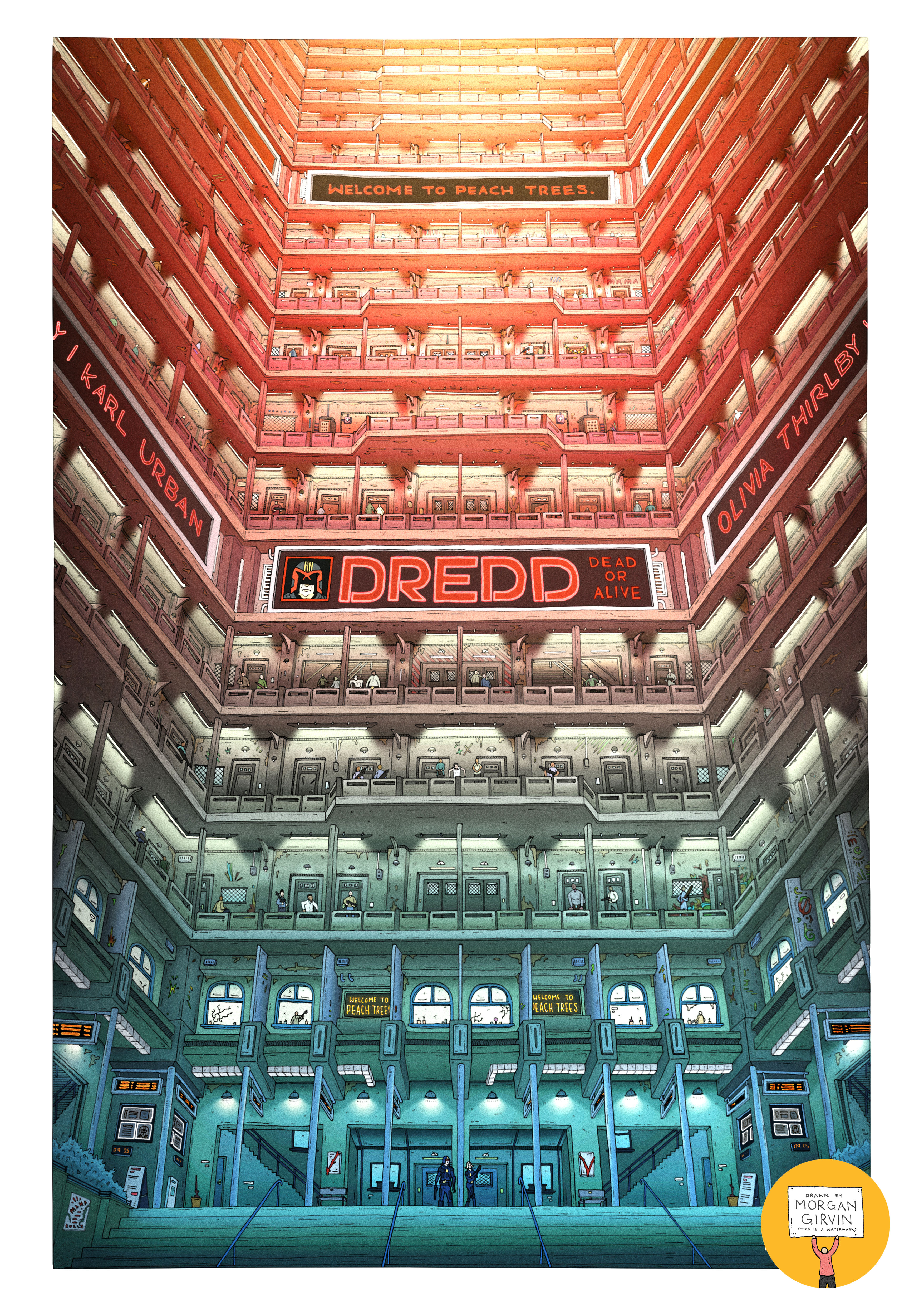
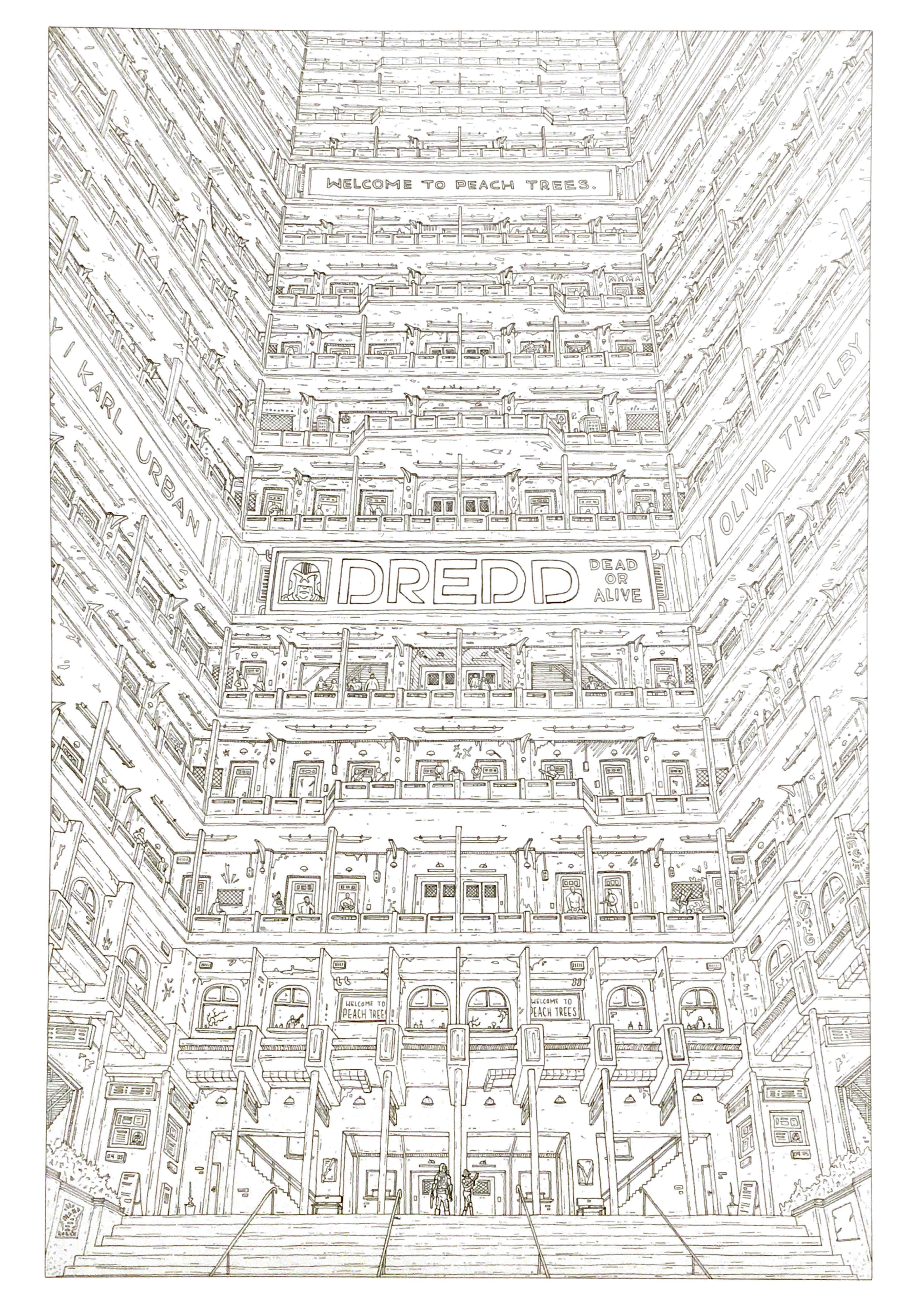
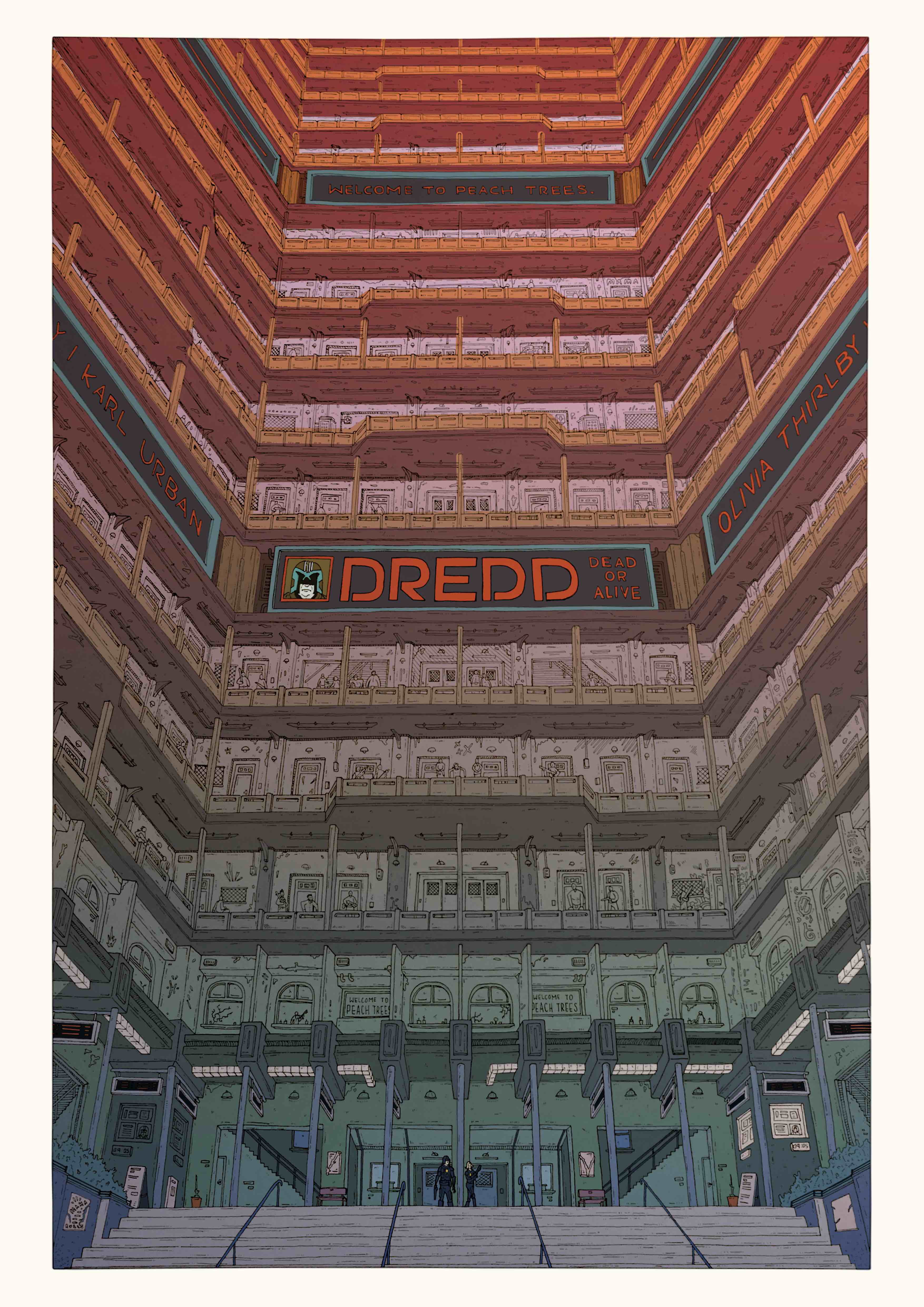
The Original A3 Drawing and the final Coloured Illustration
DREDD
A3 / 0.05 Unipin Fineliner / May 2021
Dredd (or Welcome to Peach Trees if I’m in the mood for a fancier name) is the poster I illustrated for the 2012 film of the same name. This is the second film poster I’ve completed, the first being Kill Bill, and I’m tremendously happy with how it came out as a finished piece.
So far there hasn’t been any particular rhyme or reason as to the films that I’ve chosen to illustrate. Whilst I do immensely enjoy this film (and think it’s criminally underrated), I wouldn’t say it’s a ‘favourite’ film. Like with most of my work, I think I just had a concept in my head after watching it and found myself wanting to draw it. So I did.
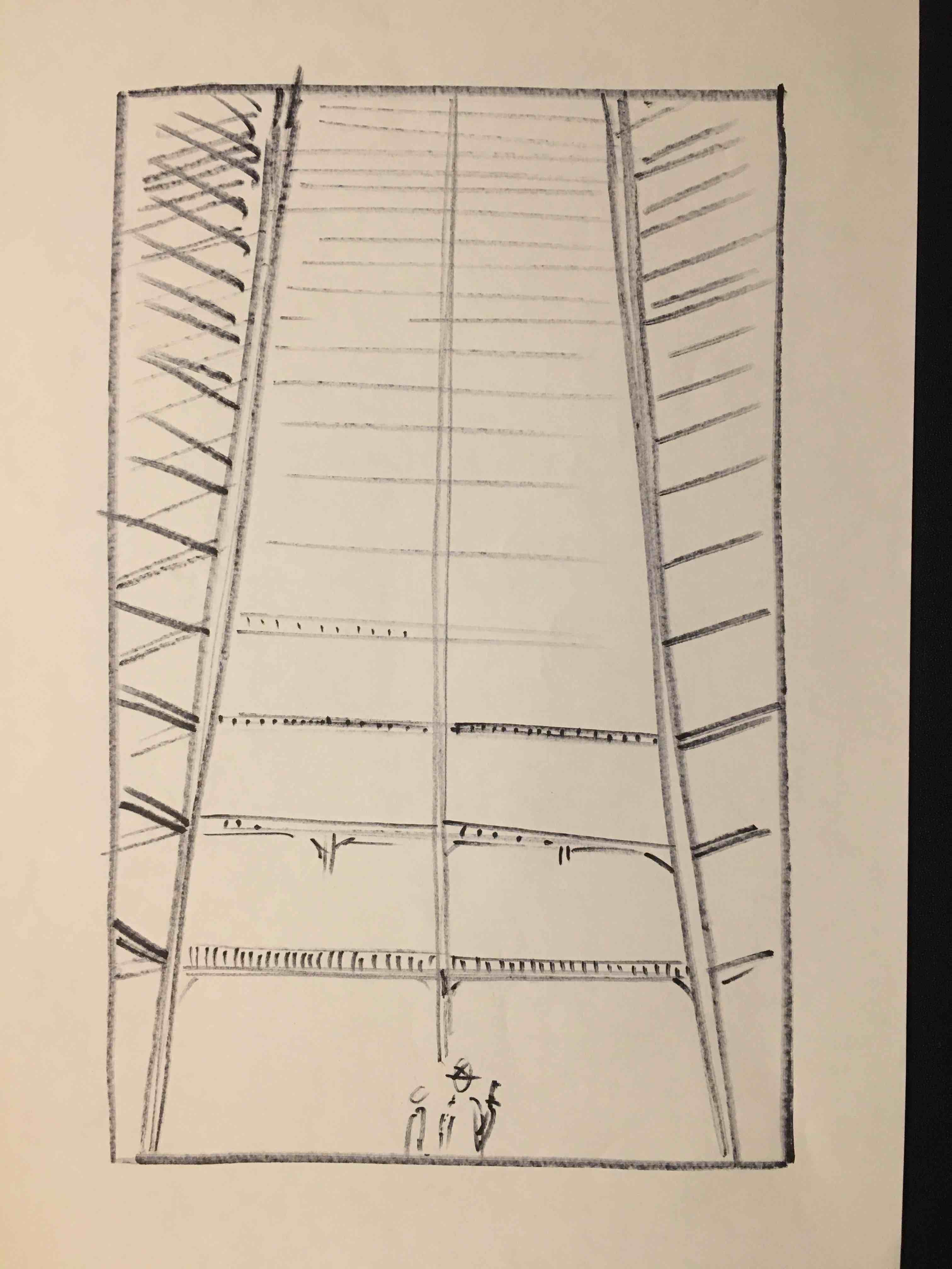
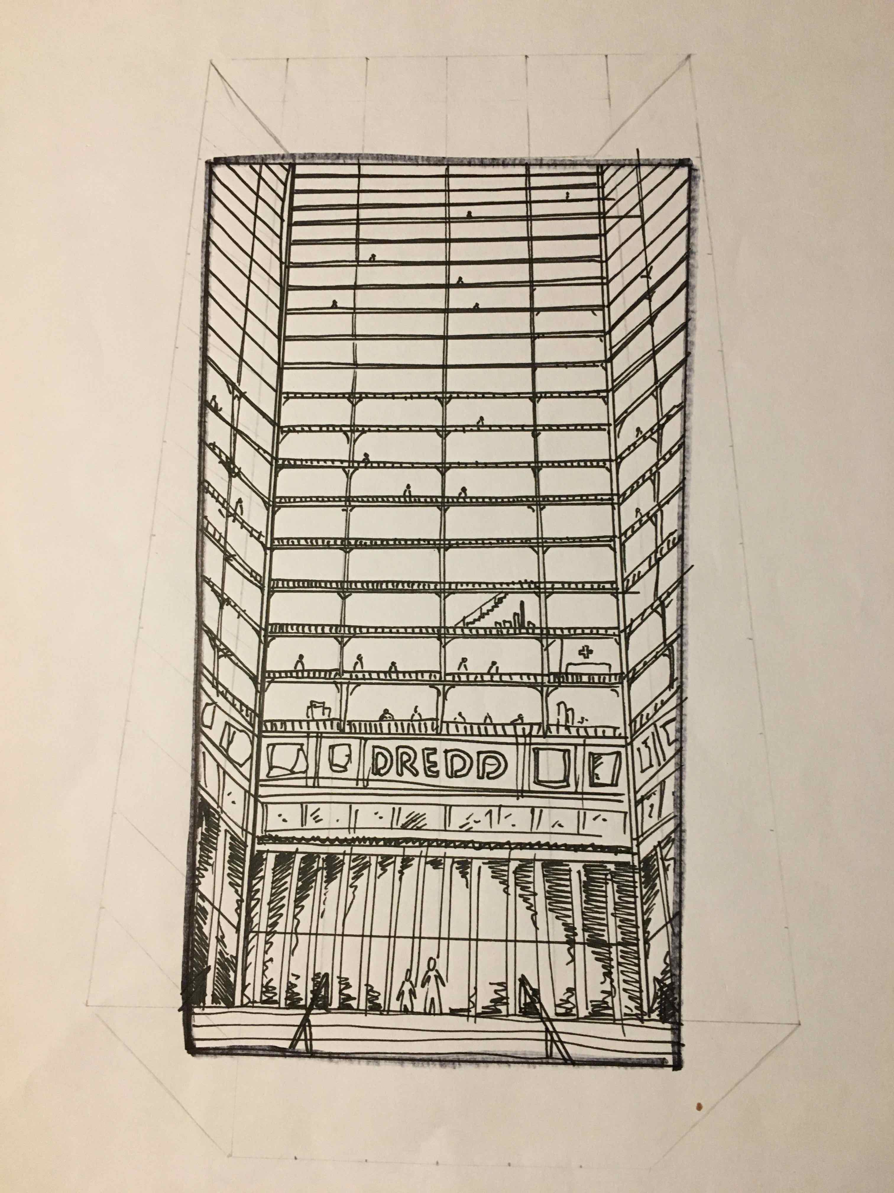
The idea for the illustration grew around wanting to illustrate something that had a tonne of detail but also a strong sense of perspective. As a developing illustrator, I’ve been trying to become more experienced with drawing the ”correct” perspective, so when it came to ‘Dredd’ I really wanted to emphasise the fact that Peach Trees is a tall, looming tower block.
If you’ve seen the film, then you know that Peach Trees is as much of a character in the film as Dredd, Anderson or Ma-Ma is, so I really wanted to try and present that within the illustration. By having Dredd and Anderson be dwarfed by the size of the building, I felt I was able to represent the almost ‘David v Goliath’-like situation that takes place in the film, as they face the prospect of fighting their way to the top of the block.
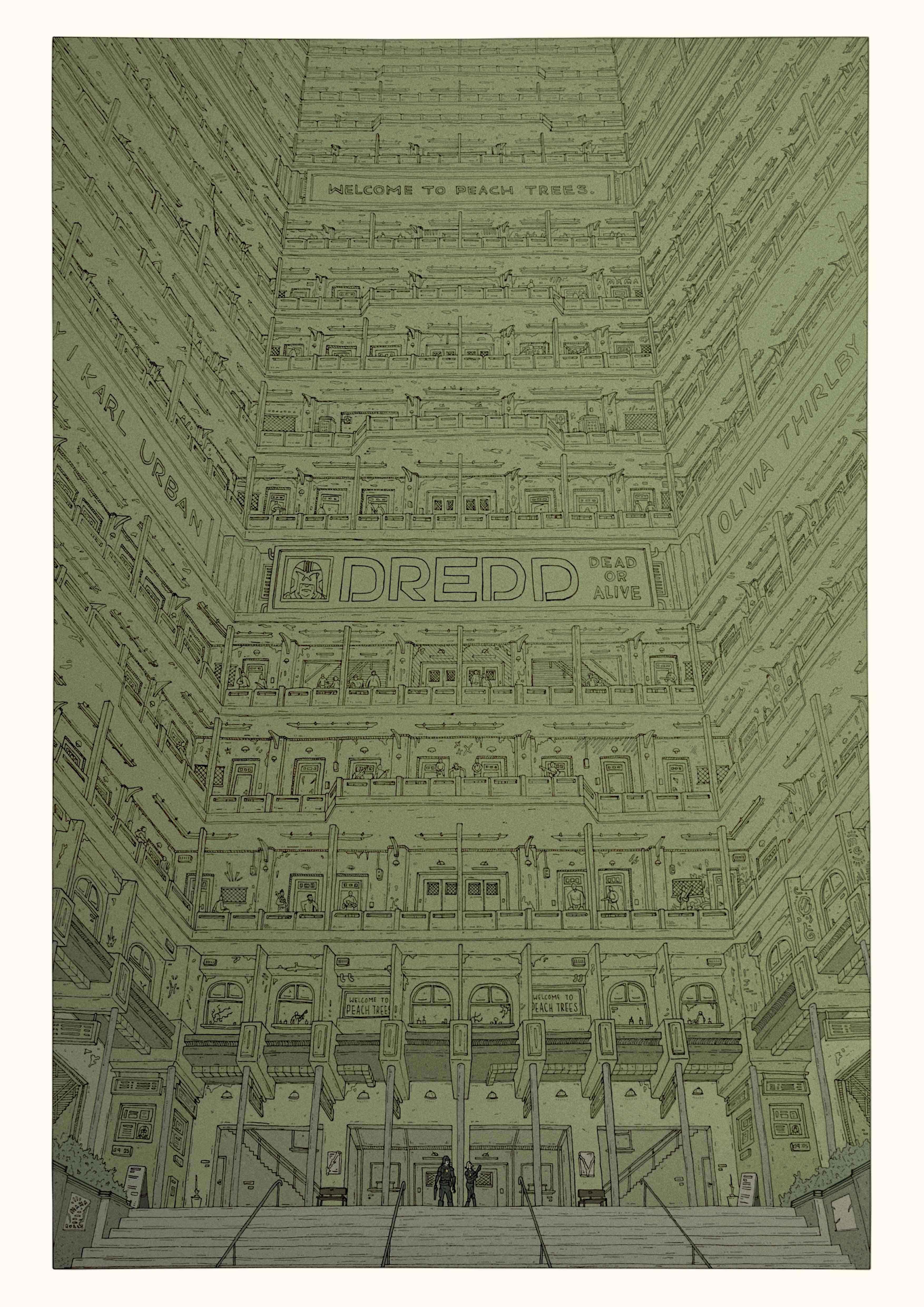
One major thing I managed to learn from this illustration is the idea of planning the colour of the work first. Initially, in my mind, I had imagined that the image would mostly be a dingy green colour (like it is in the film), but when I first tried this out in Photoshop I found that I just couldn’t find a balance between aesthetics and accuracy. It just looked horrible. What followed was quite a long and large stumble in the dark trying to find a colour that I liked. Eventually, I tried the red/blue gradient that is in the final illustration, and voilà!


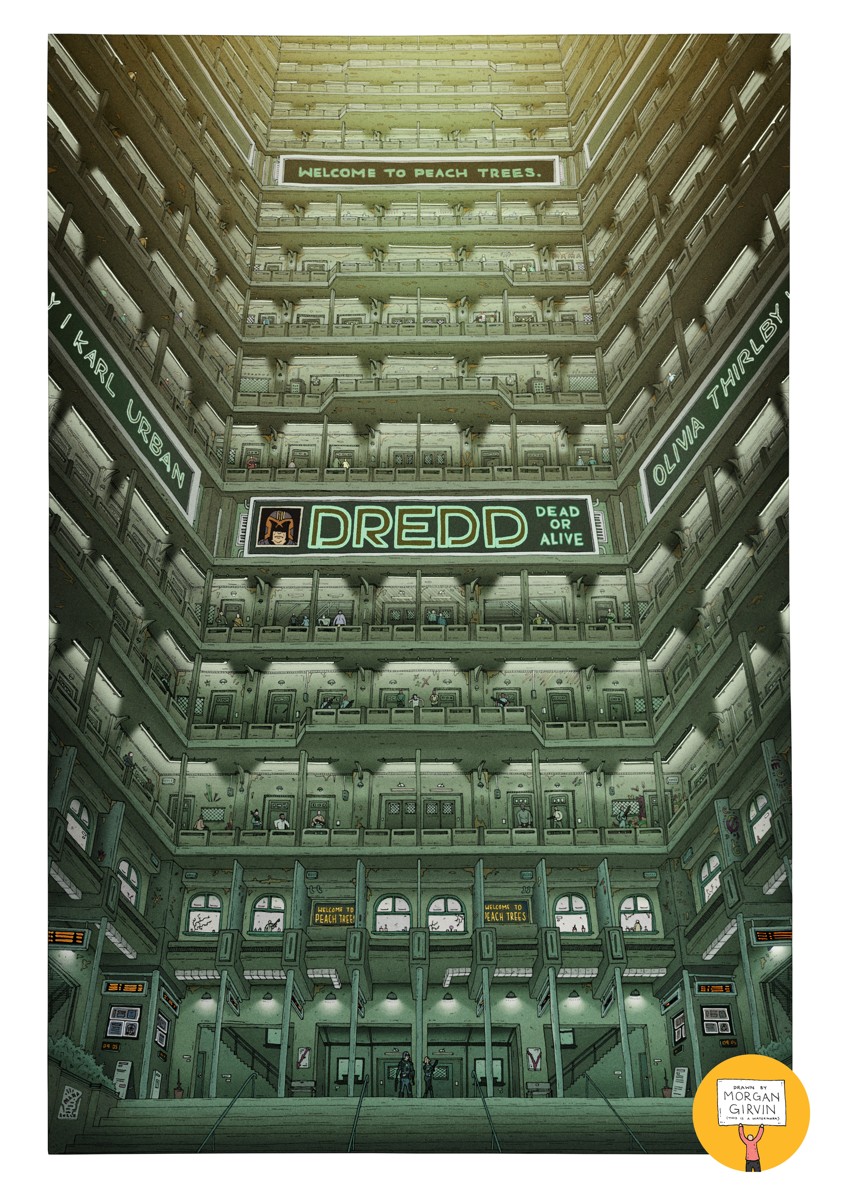
After I had finished the illustration, I went back and played around with the colour some more. I felt I owed it to both myself and to those people who are sticklers for detail to try and get a film accurate colouring of the illustration. I knew it wouldn’t be impossible, it was just a matter of finding a shade of green that was both accurate and nice to look at, and after much experimentation I think I found it. I’m really happy with both colour variants I created, and it’s certainly my favourite illustration I’ve completed to date!
If you like the poster enough to buy a print, then you can find them in my shop!