morgan girvin
illustrator, maker and hermitinfo
about
contact
shop
illustrated work
wimmelbilder
film postersalbum art
maps
general illustrations
crafted work
hand crafted projects
big things
film boxsets

morgan girvin
illustrator, maker and hermit
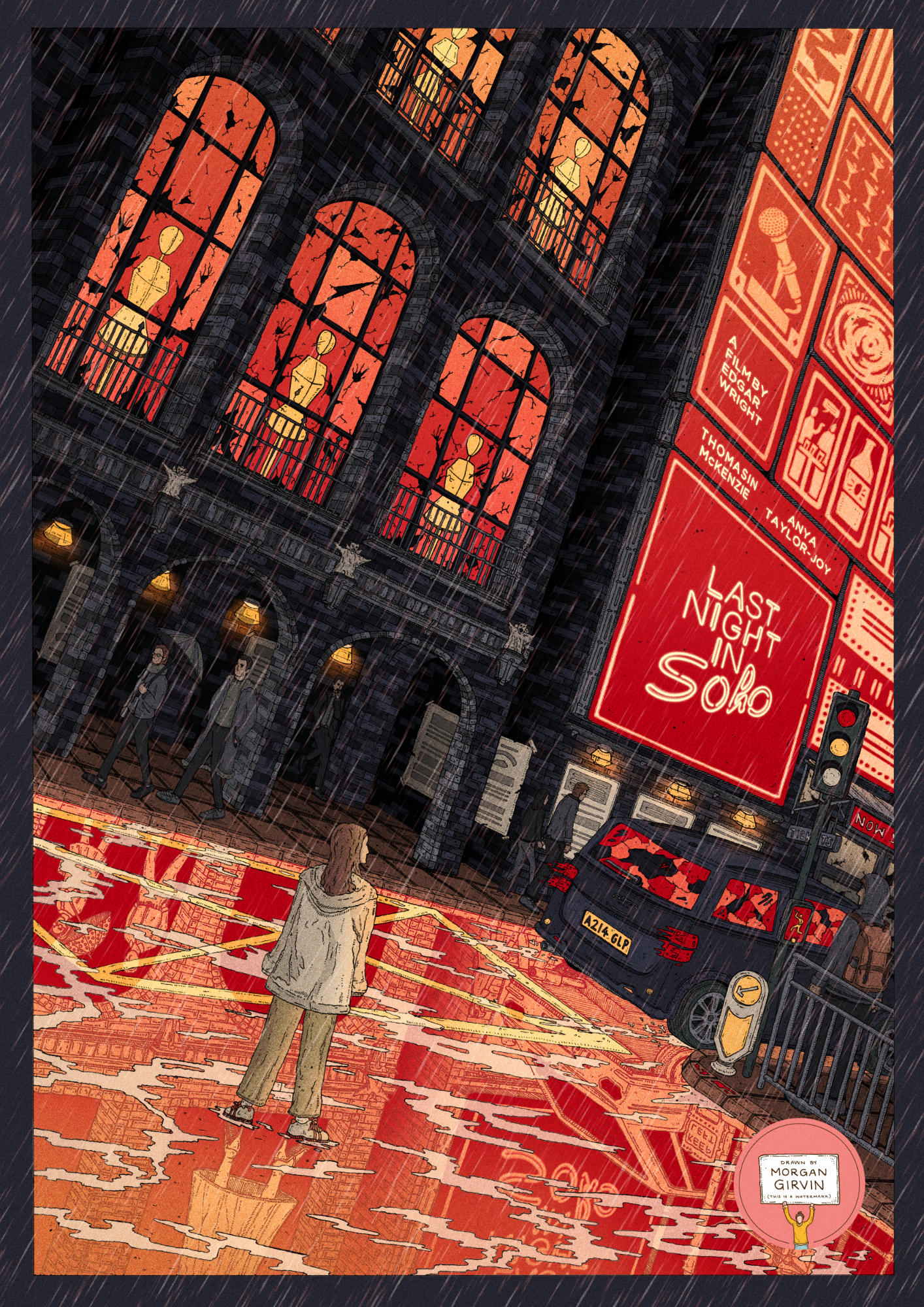
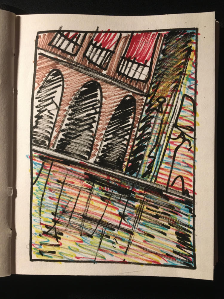
The Original Illustration and the final Coloured Illustration
LAST NIGHT IN SOHO
A3 / 0.05 Unipin Fineliner / November 2021
This is an illustrated film poster I did in preparation for the upcoming release of Edgar Wright’s Last Night in Soho! The poster was done as an entry for Talenthouse/Focus Features competition, and I was fortunate enough to be selected as one of the winners!
You can see all the submissions to the competition (and the other incredible selected creators) here!
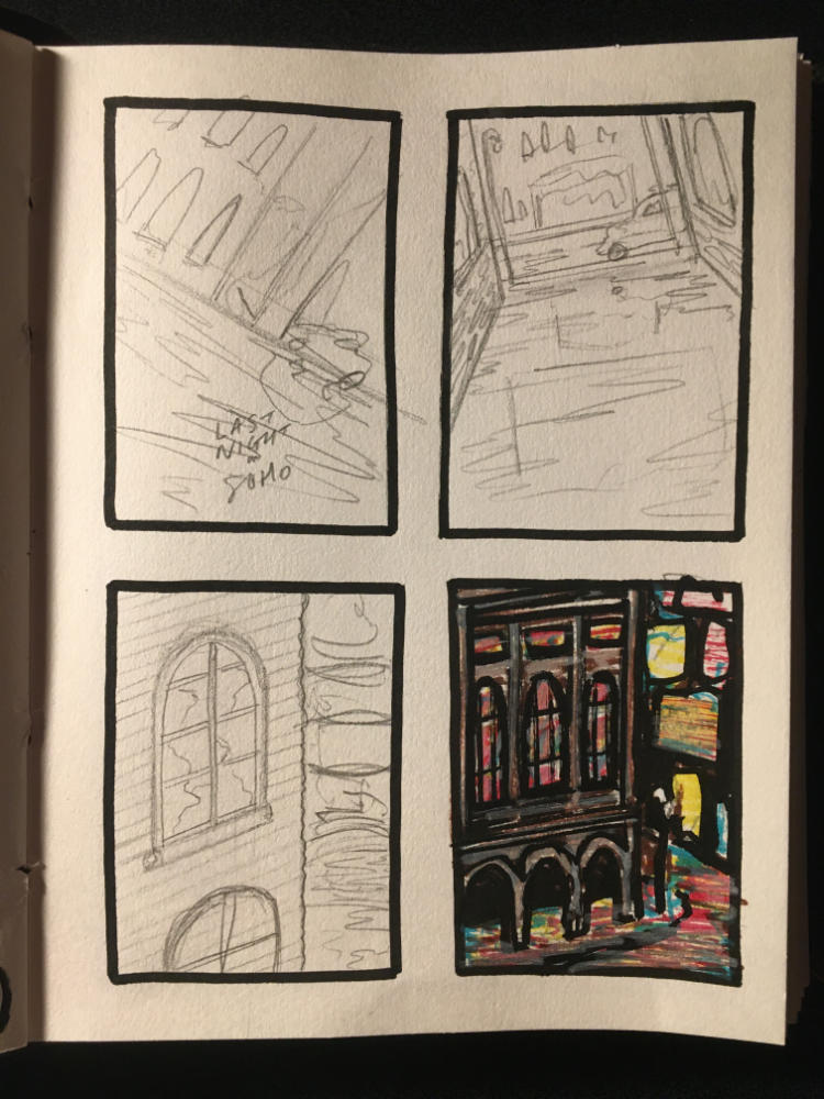
PROCESS
This was the first time I’d created a piece of work for something I hadn’t yet seen, so it was a bit of a challenge in the sense that I couldn’t truly know what the film would be like, and I had to be guided by marketing material and the information that the brief gave us. The main thing I knew is that Edgar Wright is one beautifully meticulous film maker, so my best bet was to do what I do best - include lots of detail!
One of the main themes in the trailer is the idea of duality, and there are a lot of cool camera tricks involving reflections and texas switches in the film (yes - I watched Edgar’s Vanity Fair scene breakdown) so that was definitely something I wanted to include. It was also suggested (and evident in the trailer) to explore the idea of London’s dual identity, both the allure and the unspoken seediness of the city.
Like most projects I started off with basic sketches of what I wanted to explore. I very much wanted to express the city itself as a character, and have the buildings and the sense of place overshadow Thomasin McKenzie’s character. There’s also a shot in the trailer where she exits a dark and dingy alleyway and enters into the bright lights of 1960s London. This was probably the main inspiration for the design, having the character of Eloise be both dwarfed and enamoured by the large billboards and the razzle dazzle of the theatre.
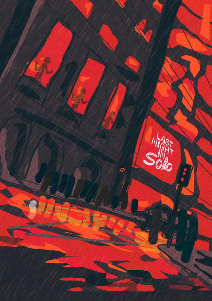
I then moved into Photoshop to create a colour plan. The colour was something I had settled on right at the beginning. Once I had the general layout of the image, I knew I wanted to use a lot of red and black/dark blue. It’s a horror film after all, so it’s nice to be able to lean into the tropes.
I decided for it to rain in the illustration so the ground could be wet and I could explore the idea of reflections. It’s also England, come on - might as well be realistic. The objects that feature ‘above-ground’ all have a 1960s counterpart in their reflection. So Eloise has Sandy, the car and the lights are of an older design, the people in the background are in more time-appropriate clothing. It’s subtle, but if you’ve seen the film it’s hopefully something you’ll pick up on. At the very least, if you’ve got a keen eye you should notice that something is different. And if not? Well, the intention is there.
My favourite element of the illustration is probably the mannequins in the windows of the building. The cracked windows around them represent the hands and the figures from the trailer that seem to be chasing her through the 60s.
The only main roadblock I hit with the illustration was the billboards themselves. If I’d seen the film, this would be the perfect place to hide details from the film and include little nods and easter eggs, but as it hadn’t come out at the time of completion I wasn’t able to. As such, I initially just drew random shapes and outlines, and when I coloured it I felt it came across as really lazy. A mistake I wouldn’t be making again. So I went back and redrew that section on a fresh piece of paper, thinking more about the types of things that might appear within the film (or what might feature on a non-descript advert in general).
Absolutely loved working on this piece, and I absolutely loved the film too. What a dream!