morgan girvin
illustrator, maker and hermitinfo
about
contact
shop
illustrated work
wimmelbilder
film postersalbum art
maps
general illustrations
crafted work
hand crafted projects
things I’ve made from wood
film boxsets

morgan girvin
illustrator, maker and hermit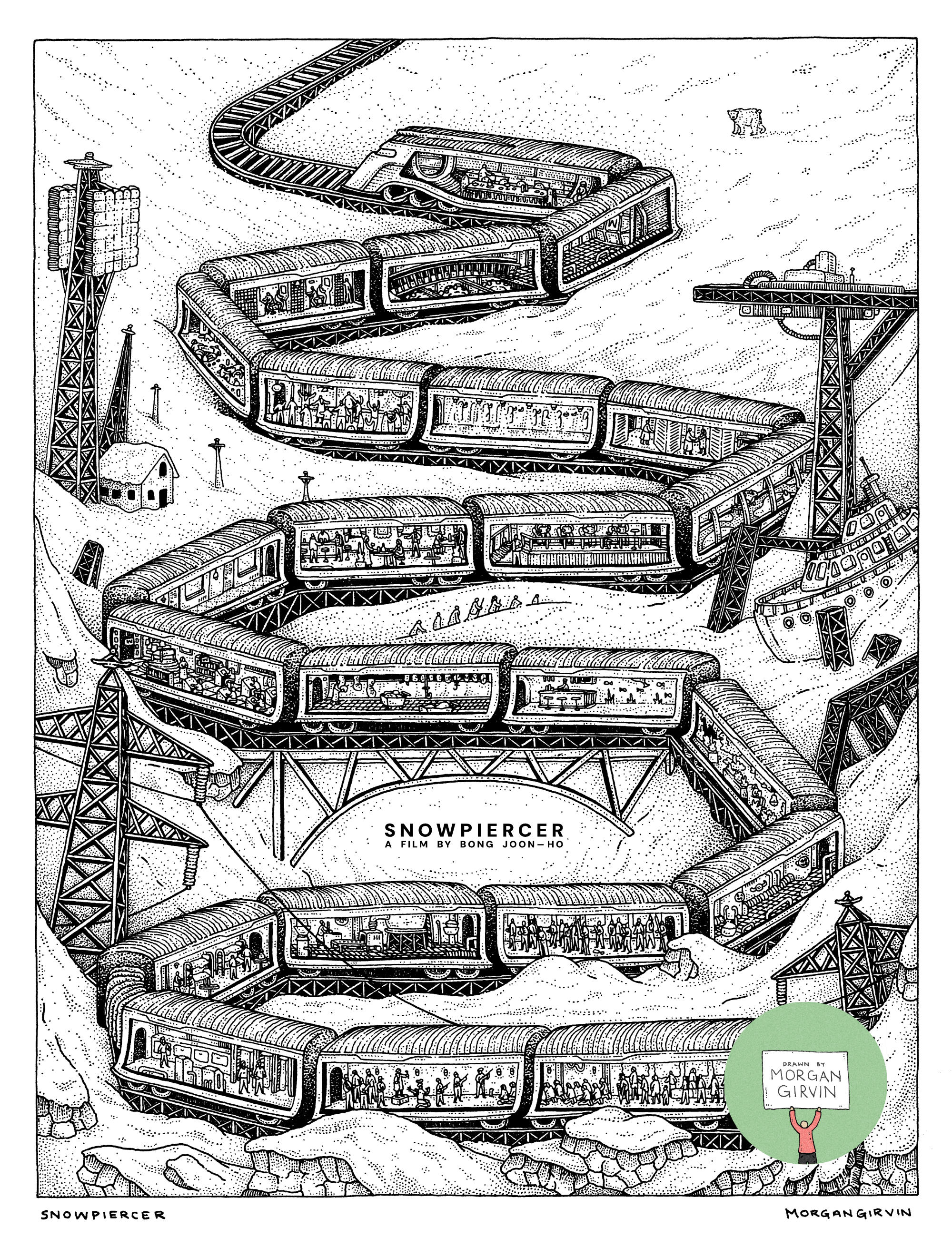

SNOWPIERCER
20.5 x 27cm / 0.35 rOtring Isograph / February 2025
When I first started trying to gain freelance work a few years ago, I emailed a whole bunch of editorial art directors hoping to get my work in some form of magazine (since that seemed like the most common and straight-forward route to getting paid gigs). Other than a few who were kind enough to reply and add me to their backlog, no actual opportunities (as of yet) materialised from it. So, when Alexandre from La Septième emailed me out of the blue with this commission proposal, I absolutely jumped at the opportunity. Big (huge) thank you to Alexandre for allowing me the chance to get my work into something physical (and something championing films no less!)
DEVELOPMENT
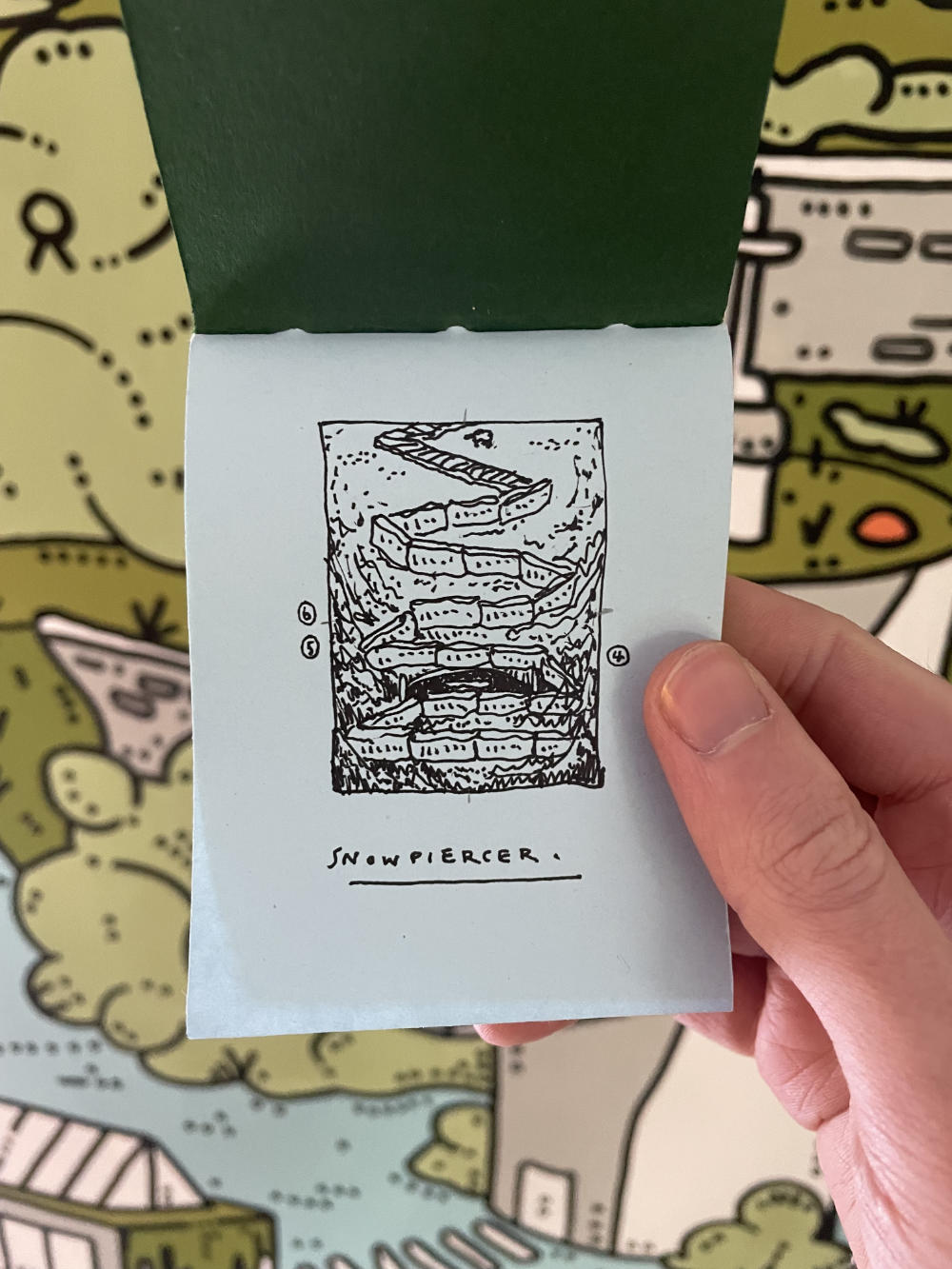
[Above] The initial thumbnail sketch
As far as development goes, this one was pretty lovely! Even before rewatching the film, I had some form of structure in mind; following the carriages from the tail-end of the train through to the front.
This film is probably the most diligently I’ve taken notes during, since I wanted to try and get an accurate(ish) order for the carriages, as well as figure out a general geography for the train (spoiler - from what we see on screen, it doesn’t make much sense). With that, and with the general layout already in mind, it was just a case of matching the carriages to what I’d loosely sketched.

[Above] The pencil sketch
The number of carriages wasn’t particular - I just drew however many seemed to make for a nice composition, and then assigned the different themes afterwards. I knew that if I did too many, I could include more carriages along the bottom for the ‘poor people’, whereas if I had too few I could be a bit more harsh in choosing sections of the train to cut out. But, pleasantly, I had neither problem, as things seemed to work out.
There was another, small problem, that reared it’s head at this stage though. For anybody who has seen the film, you’ll know there’s a scene where Curtis and Franco shoot at each other across carriages. Curtis is in the pool section, whilst Franco is 3 or 4* cars away in the classroom. Since the train is going round a huge bend, the cars are opposite each other, and they are able to shoot through the train windows and across a ravine-type scene to try and hit each other.
*There is absolutely no way it is only 3 or 4 cars, the bend we see is HUGE. But we don’t actually see what’s in those other cars. So, for the sake of argument (and for the sake of what we see on screen as they move through the train) I’m calling it 3 or 4 cars.
Now, in my illustration, the train is snaking left and right. The perfect opportunity to have the Classroom and the Pool opposite each other! Except it just didn’t line up, not with how I’d planned it out. I could have resketched the layout, or I could have started moving carriages around. Another sauna scene perhaps to move things down one (like I tried in the rough colour version below). But neither option seemed optimum, and I thought it best to just let that idea go. Apologies to any die-hard fans of the film who are going to leave me upset comments.

Other than that, everything was straight forward! I had the colour in mind from the beginning (mostly white background with the carriages being in colour) and it all went swimmingly (for once).
If you read french, like films and want look at my artwork in person, or if you can’t read french but want to support the celebration of film anyway (like me!), then feel free to nab yourself a copy:
La Septième Obsession, Issue 57 - Bong Joon-Ho