morgan girvin
illustrator, maker and hermit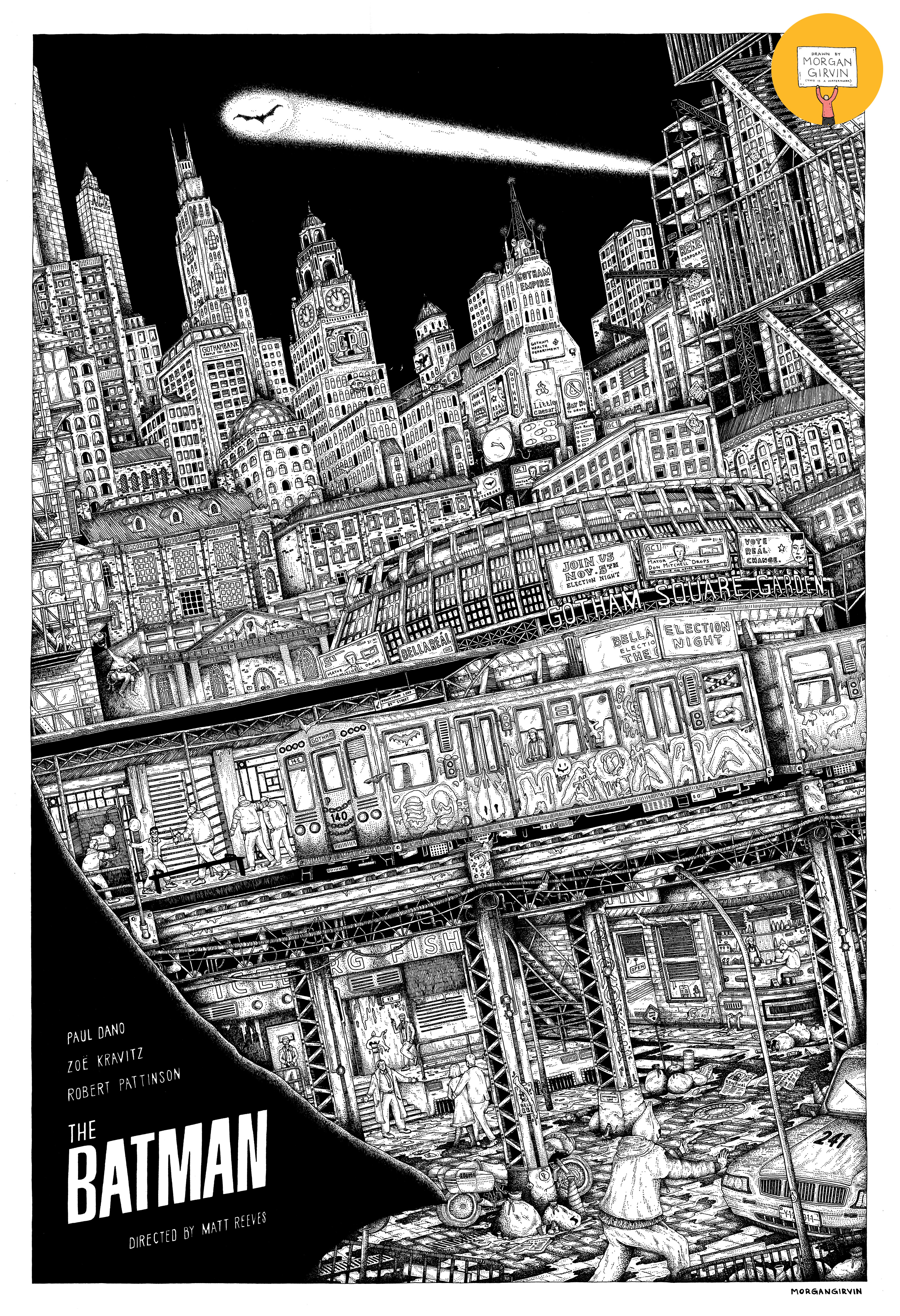
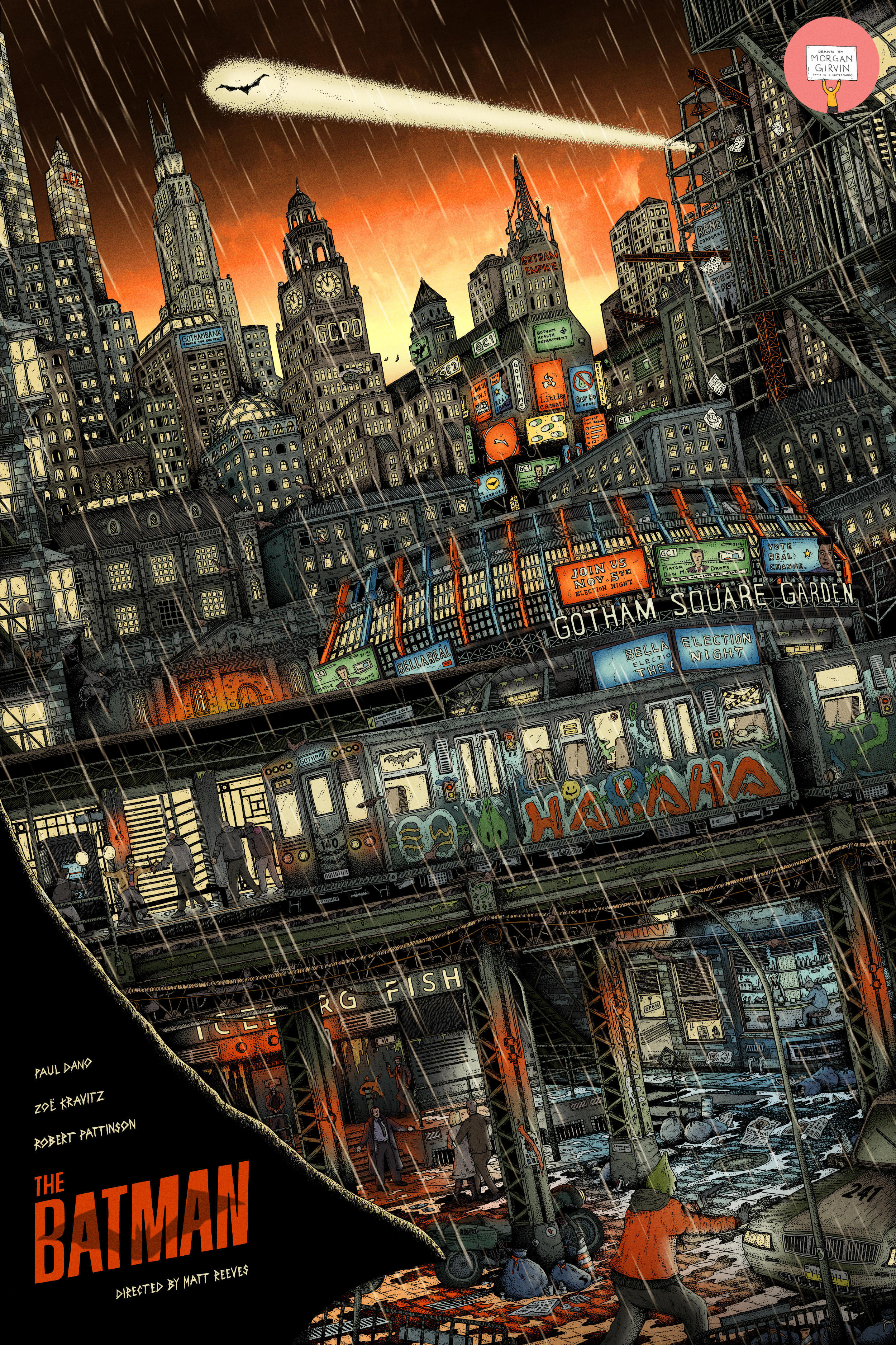
THE BATMAN
24x36” / 0.35 rOtring Isograph / July 2023
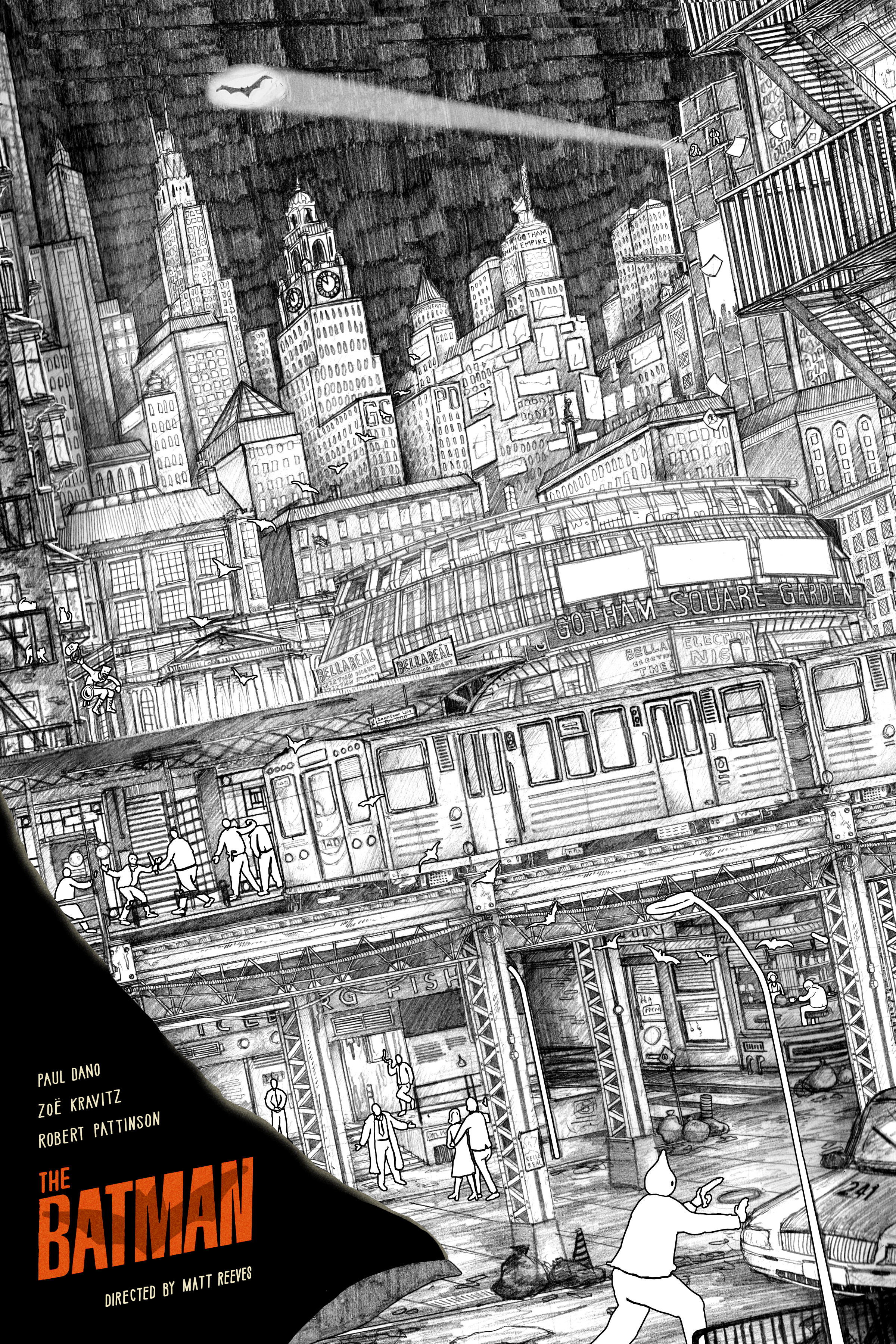
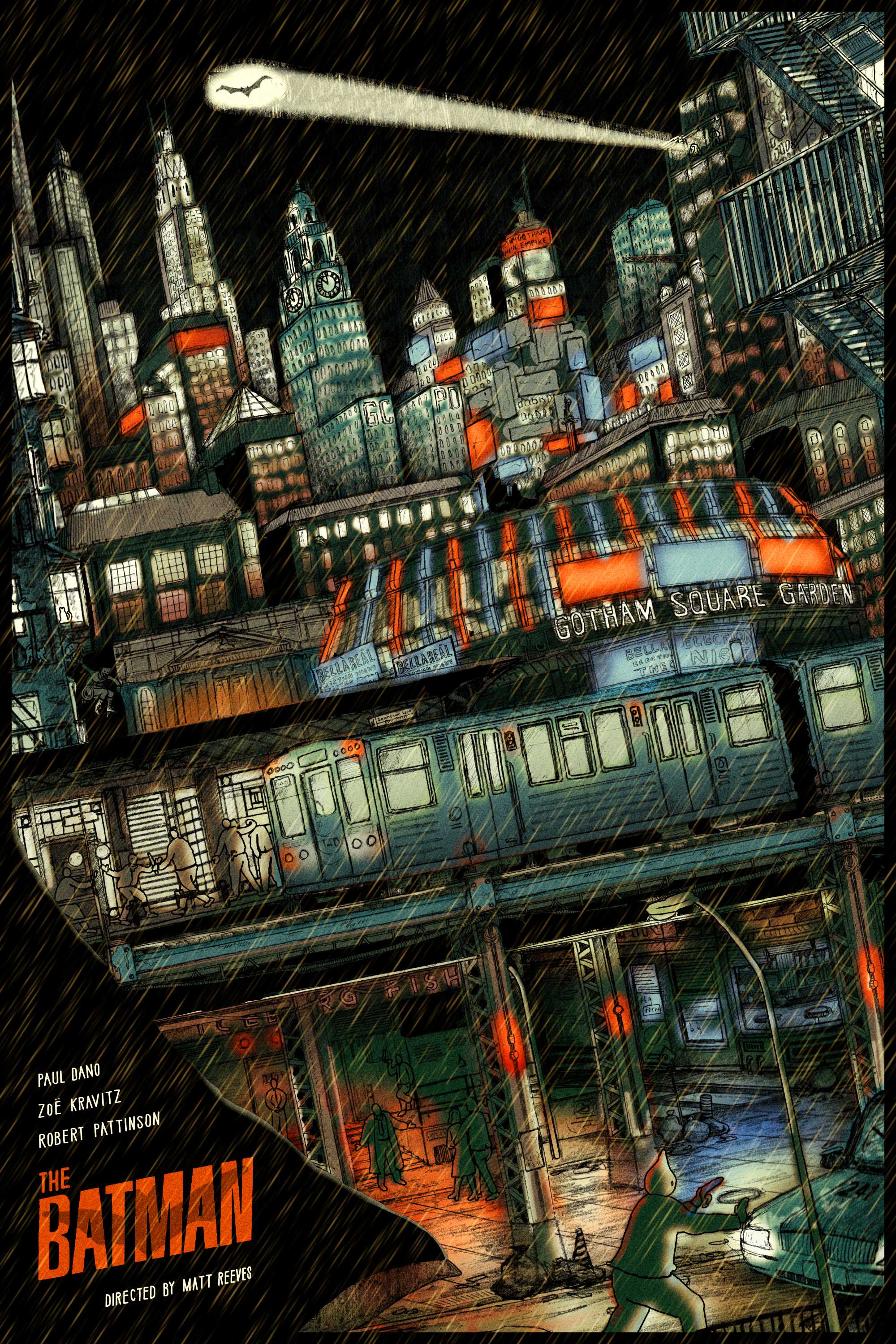
Here’s my 24x36” Illustrated Poster for Matt Reeves’ The Batman! This was a private commission and was quite finicky to both conceptualise and subsequently bring to life (AKA it was both a huge joy and a stress-inducing tightrope walk).
THE CONCEPT
Just like my Batman Returns poster, when presented with the opportunity to do a piece for Robert Pattinson’s outing as the Caped Crusader I knew that it would have Gotham as its focal point. One of my favourite things about Matt Reeves’ film is that it gave us a dirty and, more importantly, a distinctly characteristic city that I think was sorely lacking in Nolan’s (and to a lesser extent Snyder’s) entries in their franchises..
When combing through screenshots from the film it was fascinating to see how interlinked a lot of the architecture is. The train station from the opening is just outside of Riddler’s apartment, which in turn is just above the Iceberg Lounge and around the corner from the diner. You also get a lot of dense shots of the city as Bruce and Selina are weaving in and out of buildings travelling from place to place - lots of good references!. As with all Batman films, there’s also a large dichotomy between the elite of Gotham and the City’s underbelly, so I knew that I wanted to have both of those featured. The bottom of the frame would be the lowlifes, and the top would be the sprawling cityscape. A rat race upwards.
I realised pretty early on that I wanted to have the train cutting through the middle of the artwork. It would work as a solid divide so that I could transition from close-up streets on the bottom into packed skyscrapers up top. Actually bringing this to fruition, however, was a tough bloody job, as I had a hard time figuring out the exact layout and composition. In my early sketches I wanted Batman and the Batmobile in the foreground, watching over, but it proved really difficult to hint at them without taking up a significant amount of frame. You can see a variety of my sketches below:
PROCESS
After I’d managed to get the concept hashed out, I started to try and figure out the perspective. This was a lot of back and forth on both paper and digital. Eventually I got a rough pencil sketch done, which was then refined into a better, ish, pencil sketch. I then scanned it in and altered it digitally to iron out some of the kinks and unfinished bits (for instance, I copy and pasted the train carriage and bridge rather than drawing each section again). I was also able to add in the people digitally, this was a lot easier since I suck (big time) at anatomy, and there would have been an ungodly amount of erasing going on had I hand drawn them right off the bat. All previous concept work had been done on A4 sheets of paper, but now these pencil sketches were done on A2 to try and incorporate the necessary amount of detail.
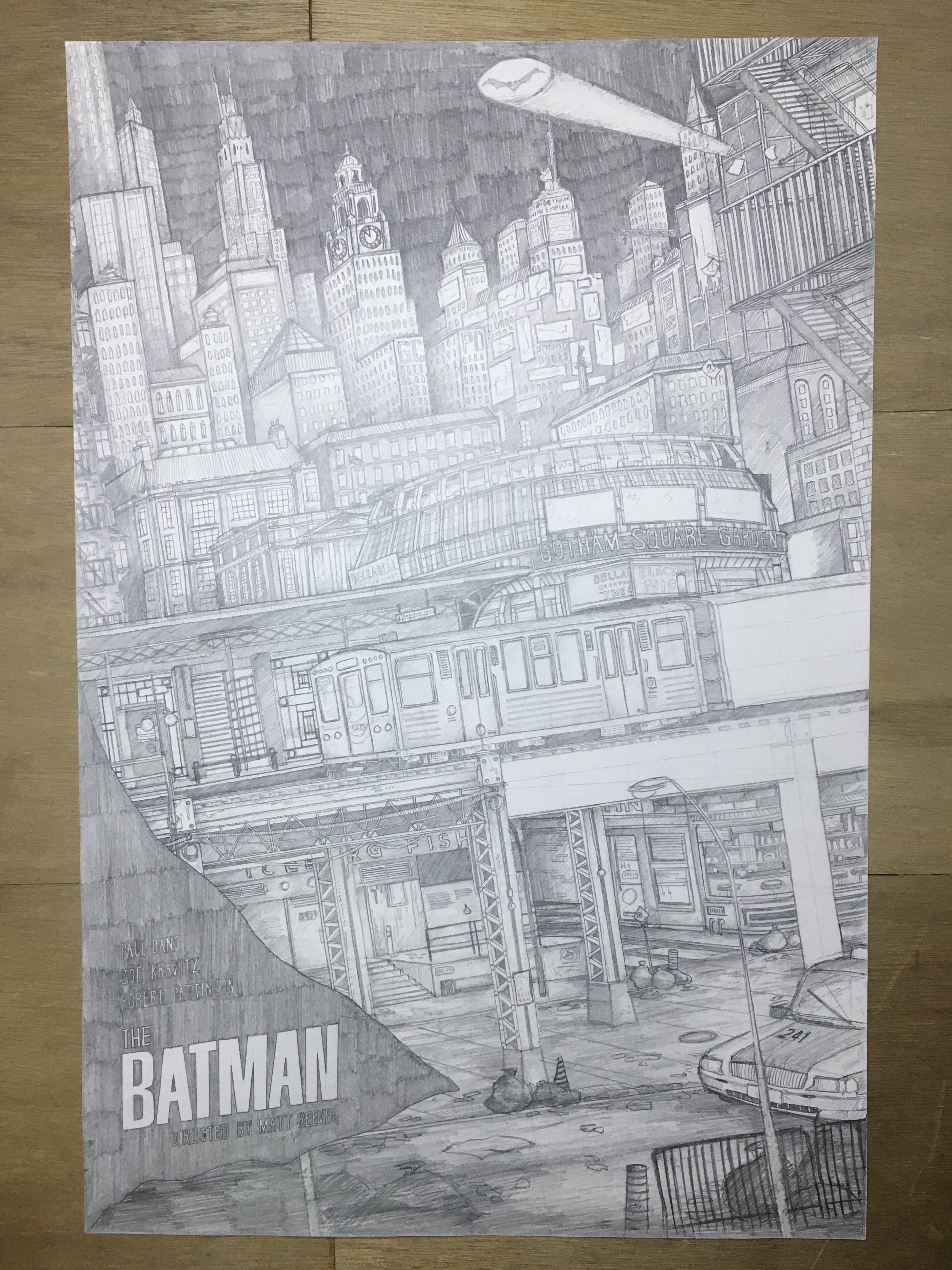

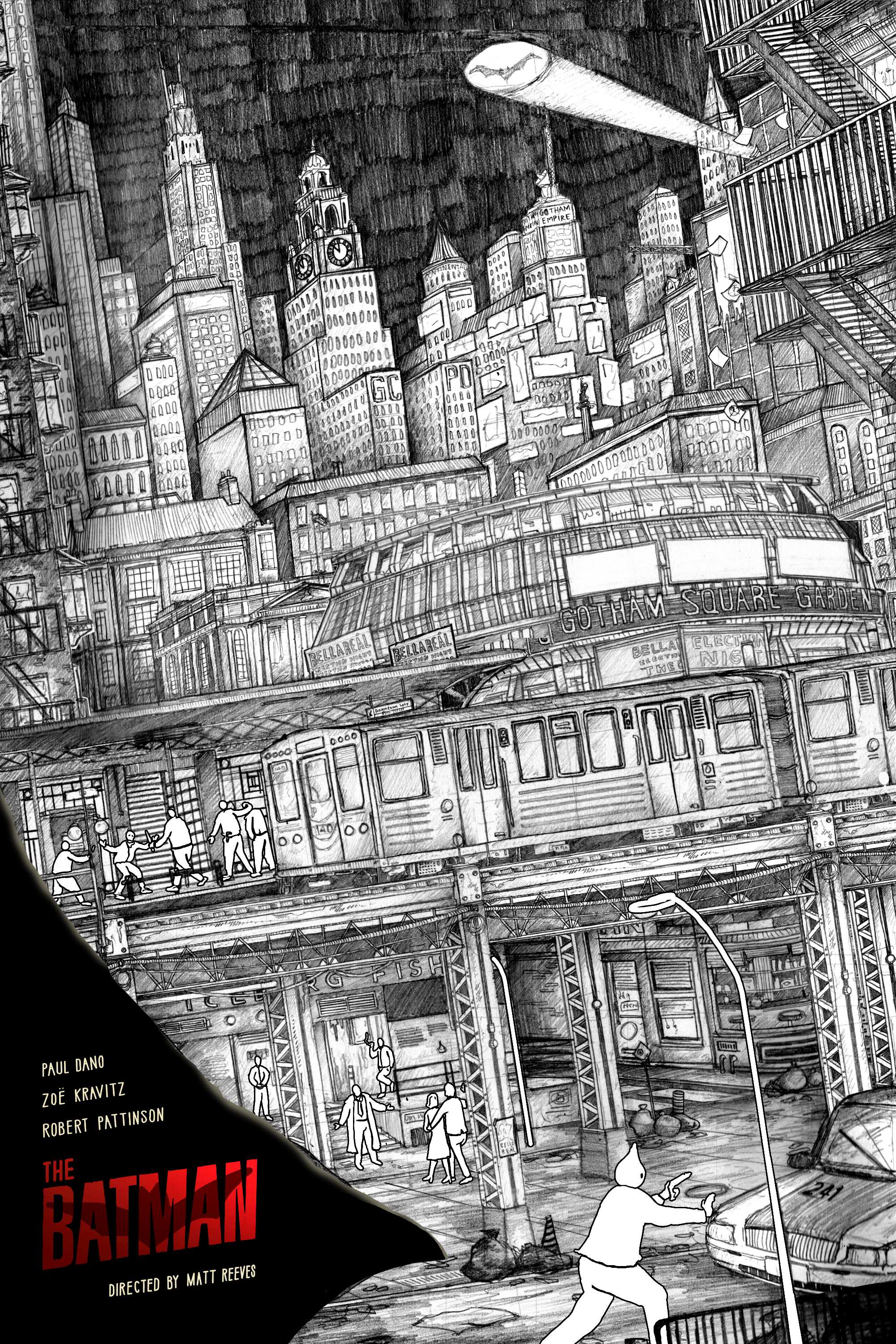

After feedback I then tweaked the new hybrid sketch slightly and started thinking about how it would be coloured. Initially I planned for the sky to be black, so that it would parallel Batman’s cape in the foreground. One of the initial ideas I floated was for the piece to be in black and white, with flecks of red throughout. We didn’t decide to go that route however, and instead did it in full glorious colour. Here are some (but certainly not all) of the colour developments I did:
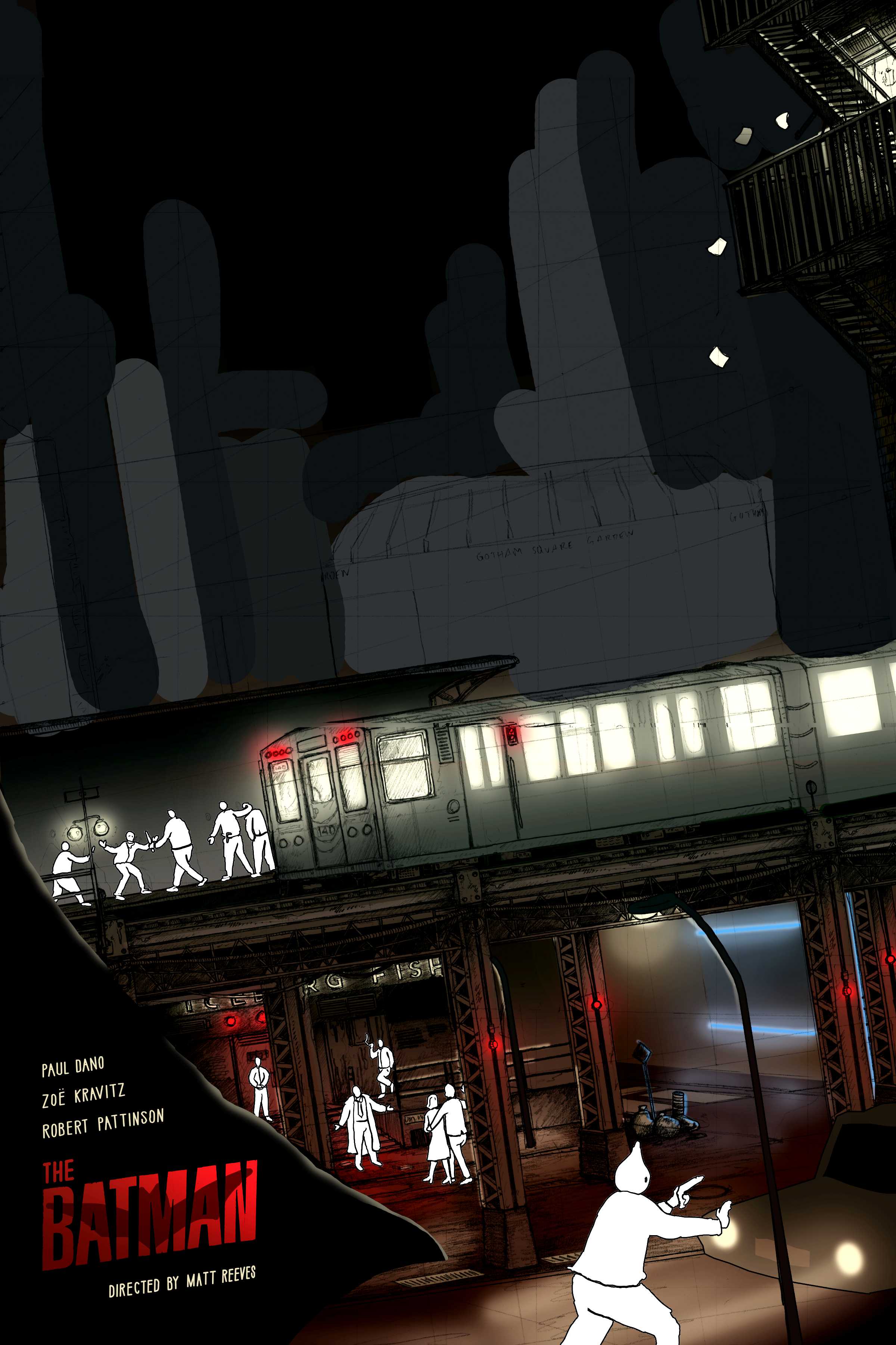


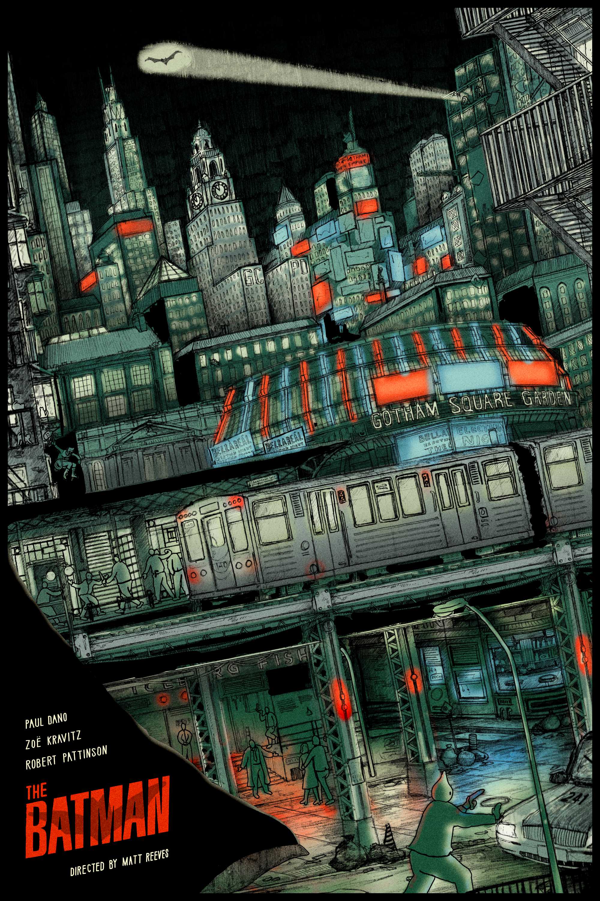


After a lot of tinkering, I finally settled on a sketch and colour plan that I was happy with. This is potentially the most trial and error I’ve ever done with colours, but I’m ultimately very happy with where it ended up.


DRAWING
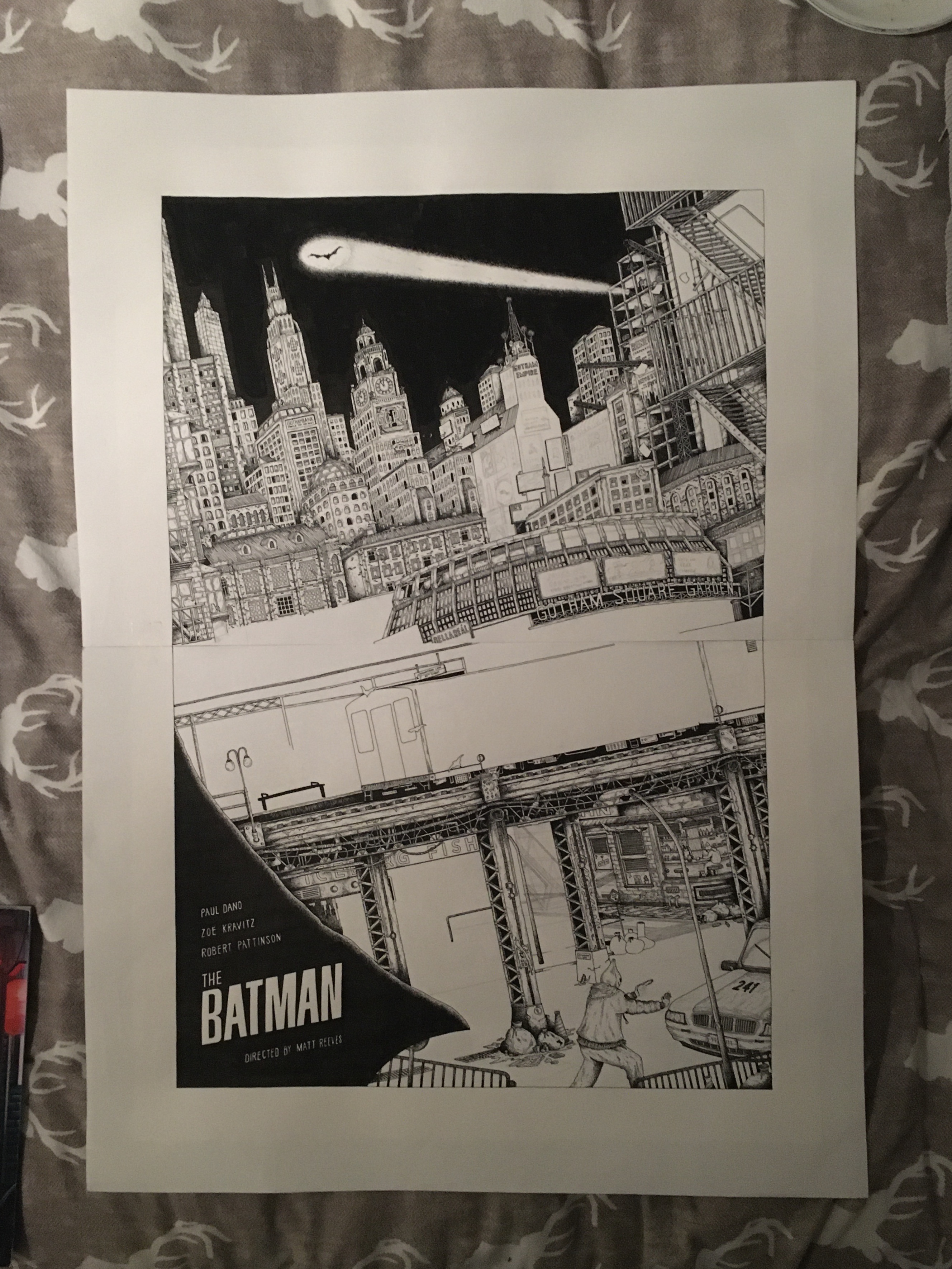
After I had this all worked out, I scaled up the hybrid sketch and printed it out. I then used it as a template for my inked linework. With this piece, I was aiming to really try and include a lot more black than usual. It’s a Batman drawing after all! A lot of that black came from the sky, which ended up being a huge mistake. Once it got to the colouring stage, I realised this didn’t work. It was just too much, and so I had to digitally remove the black sky whilst also fabricating a black line around any bit of cityscape that was touching the sky. Below are some photos from the drawing process:
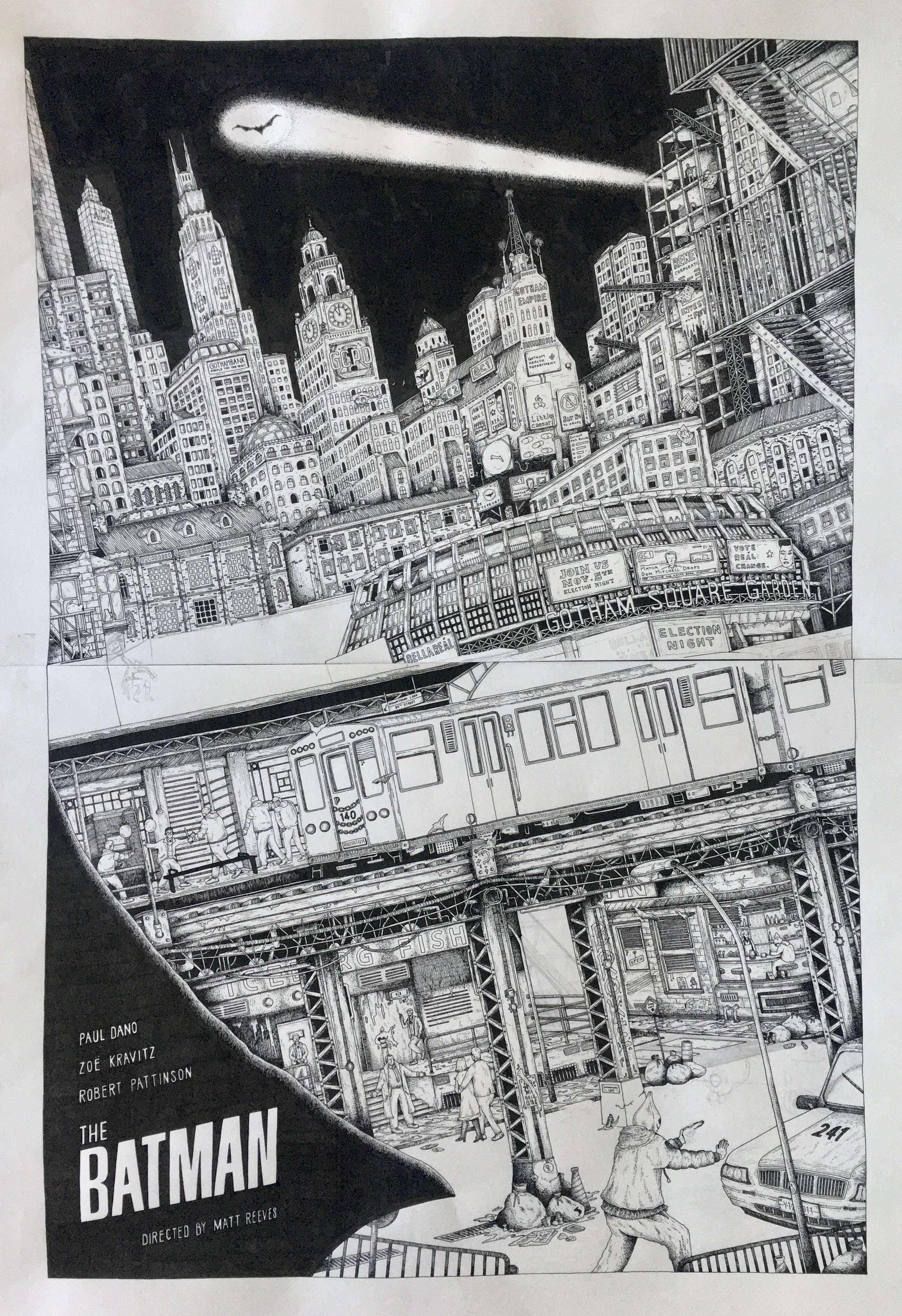
And then, finally, once I had it all scanned in and stitched together I was able to colour it! Since I had already planned out the colours earlier on, (thank you, younger Morgan, it was quite the straightforward task of eye-dropping them into the final artwork file. Hopefully you like the final poster!*
Hopefully you like the final Poster!*

*If you don’t, no worries, but feel free to keep that information to yourself


