morgan girvin
illustrator, maker and hermitinfo
about
contact
shop
illustrated work
wimmelbilder
film postersalbum art
maps
general illustrations
crafted work
hand crafted projects
big things
film boxsets

morgan girvin
illustrator, maker and hermit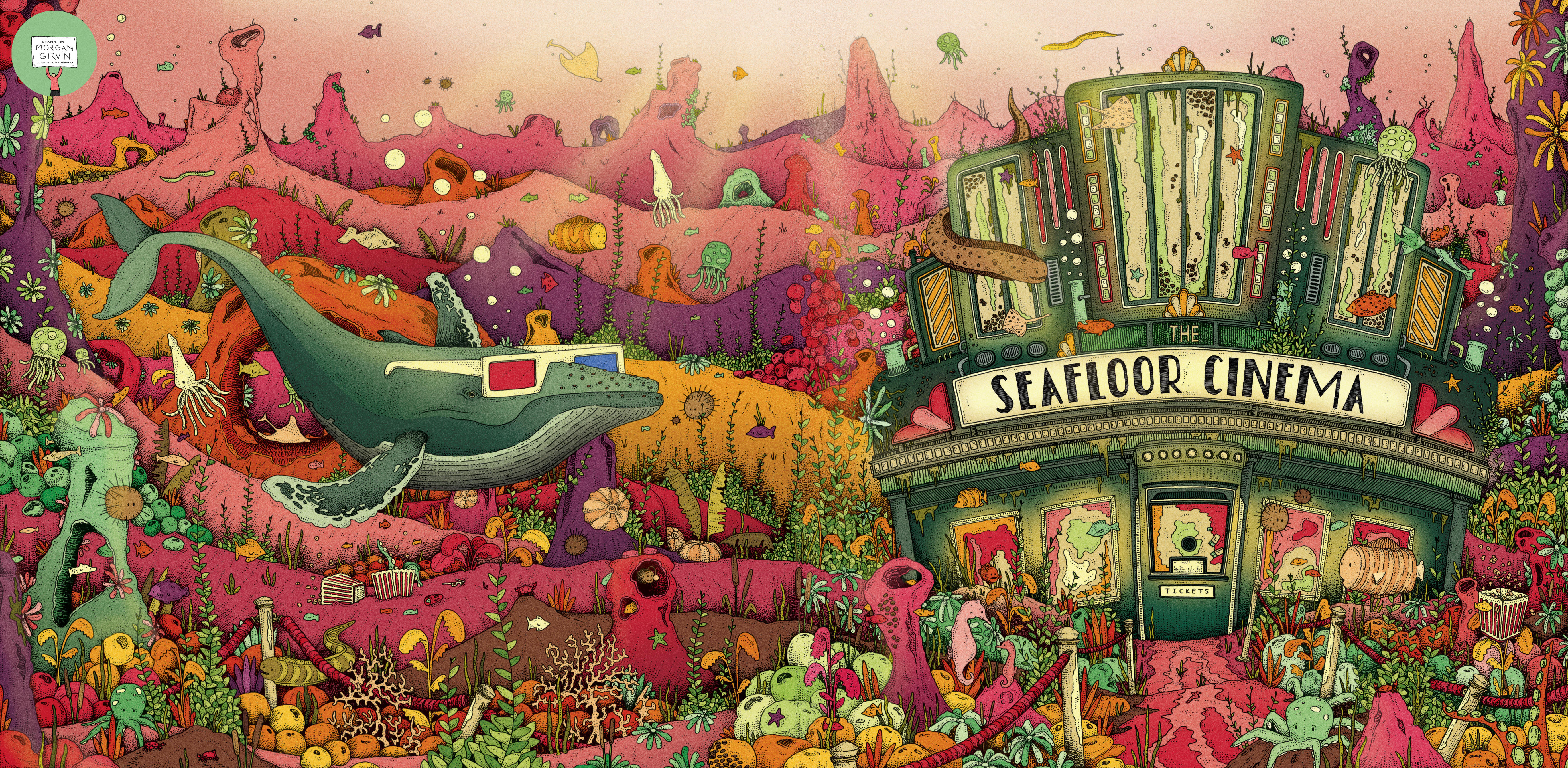

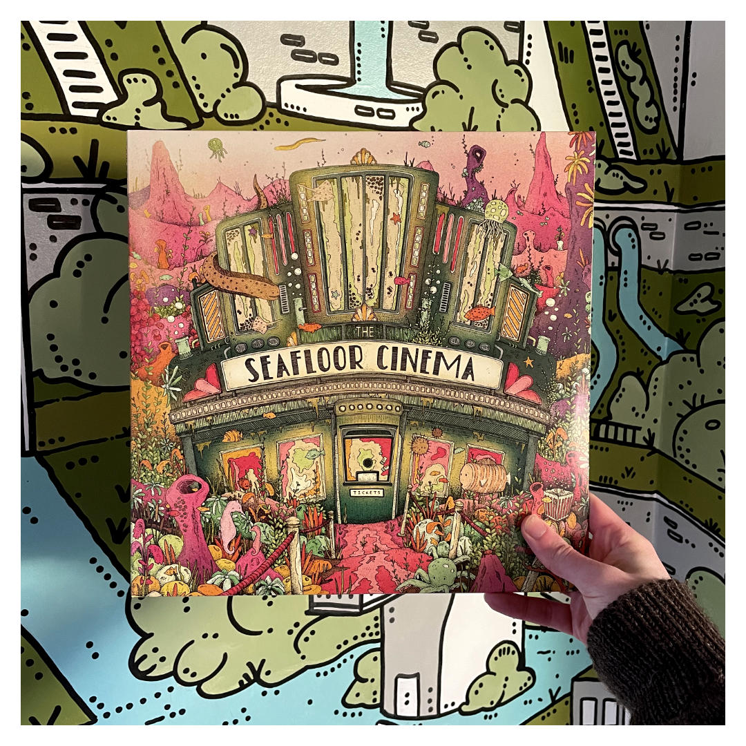
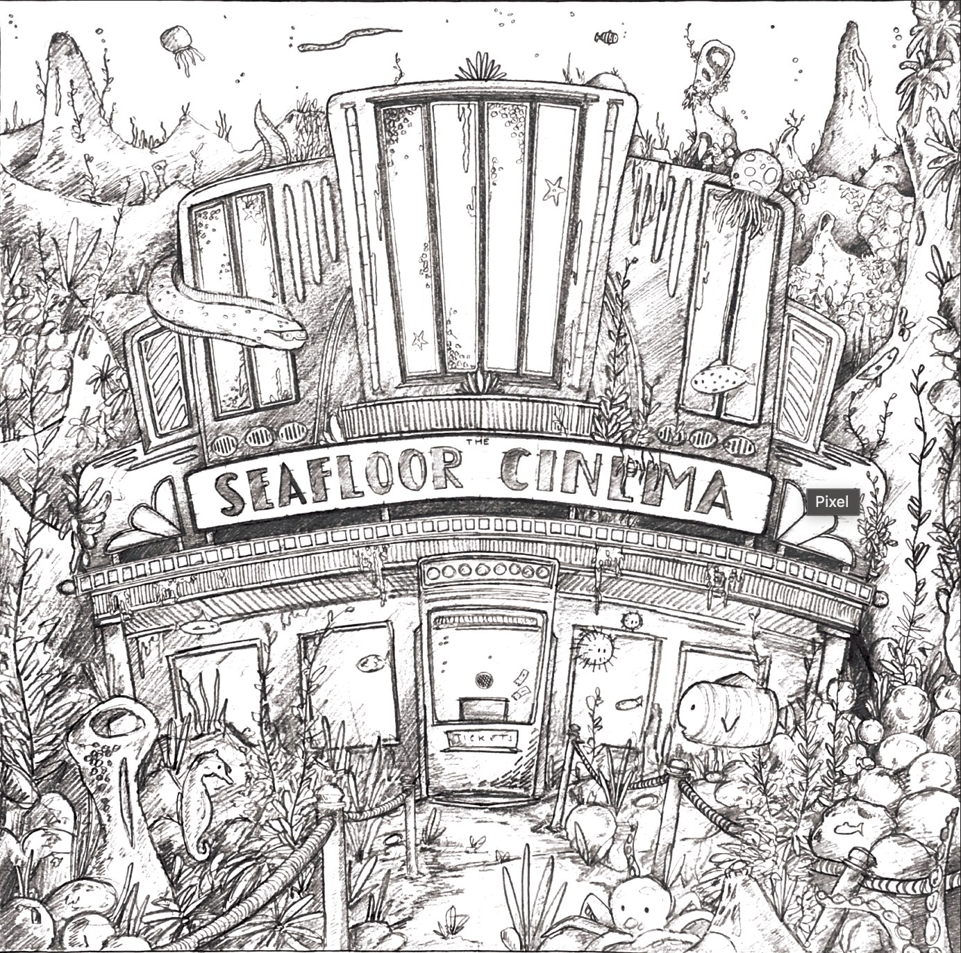
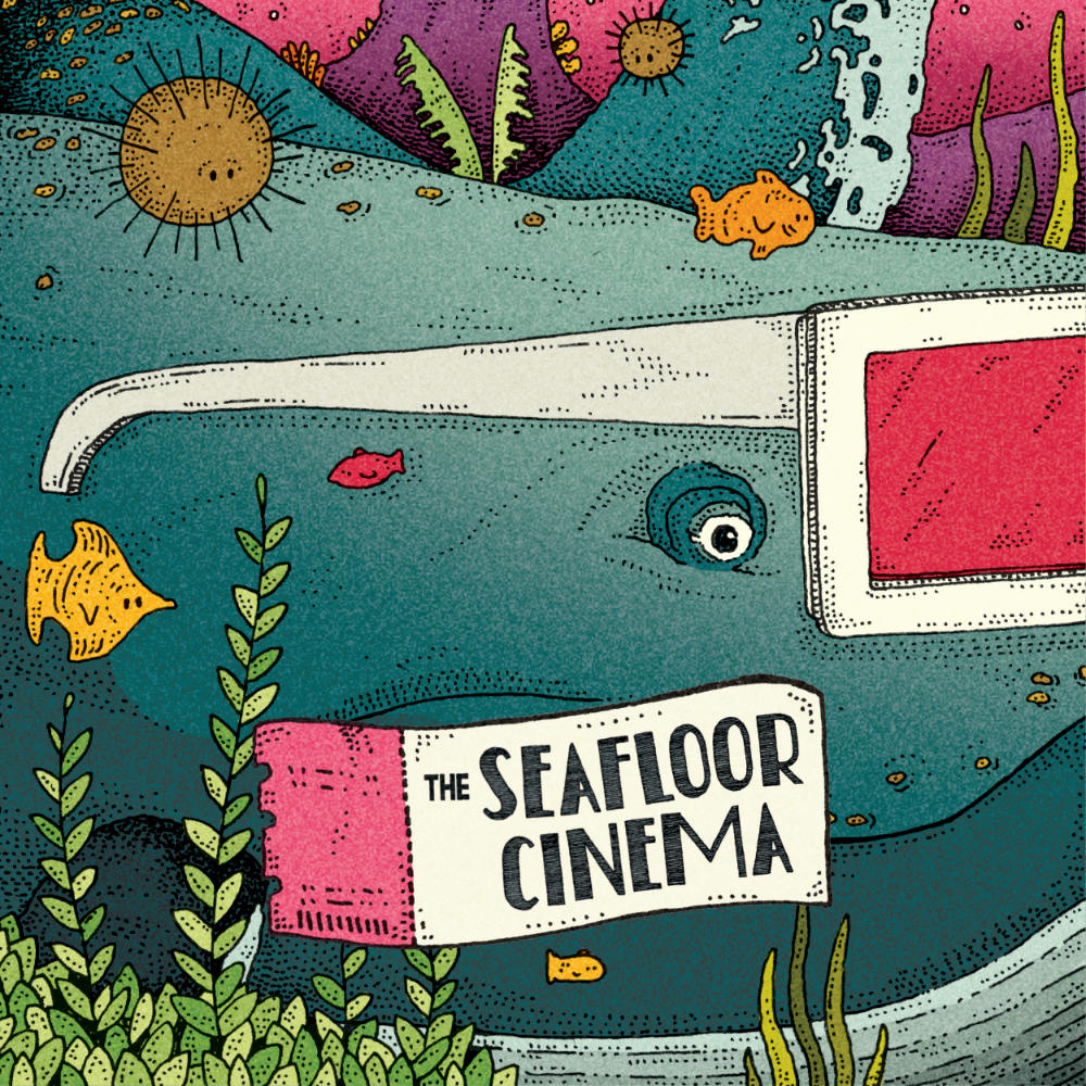
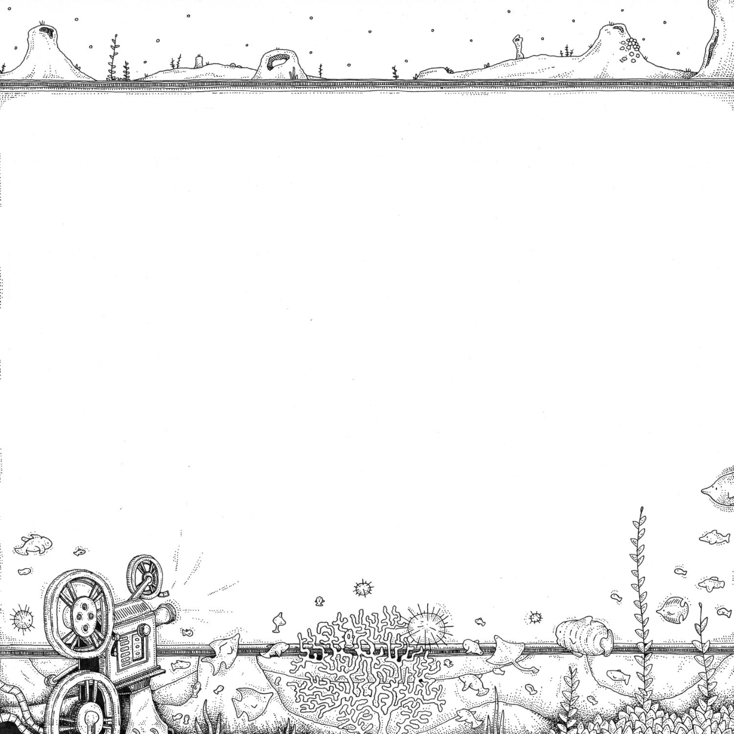
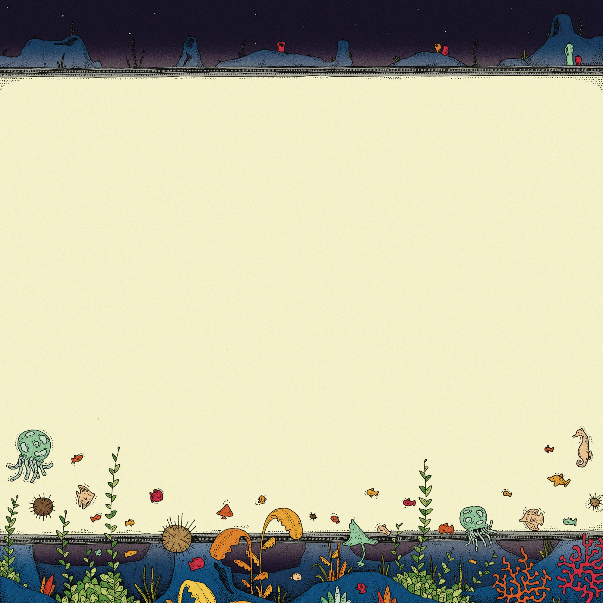
Both the finished illustration and the original linework I did for the exterior artwork of ‘The Seafloor Cinema’
THE SEAFLOOR CINEMA
60x30cm / 0.35 rOtring Isograph / March 2023
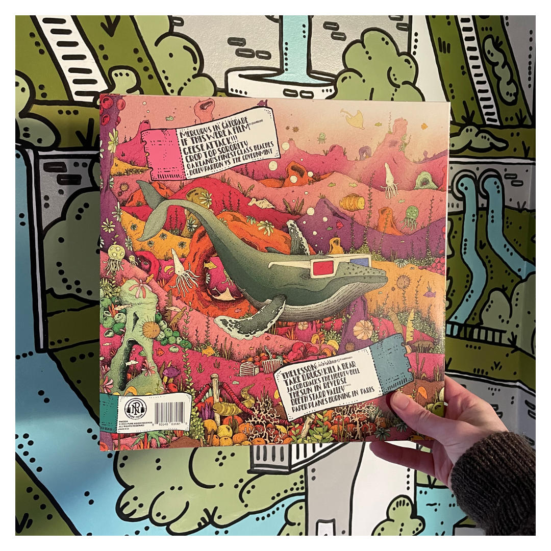
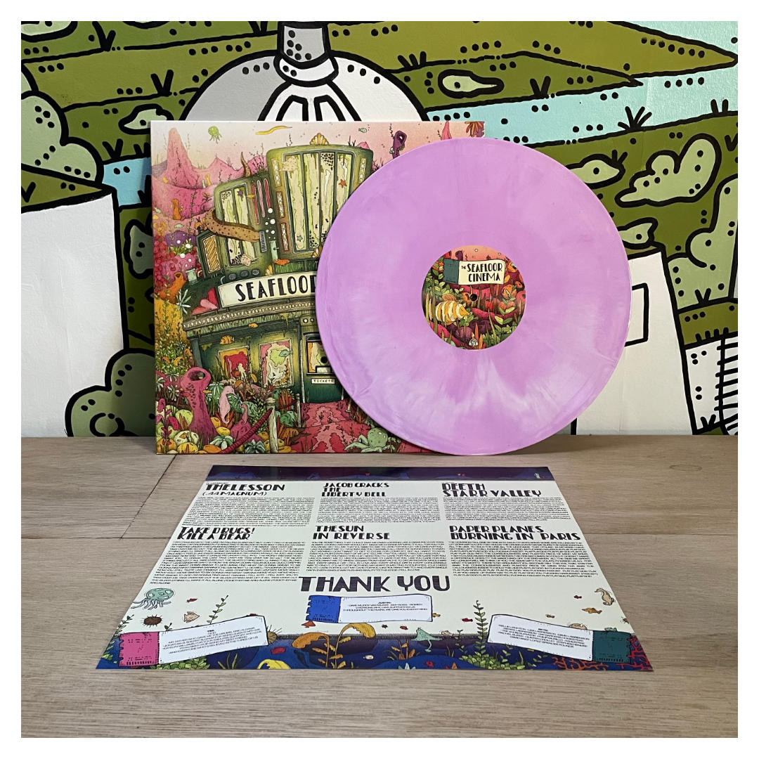
In 2023 I had the honour of being asked to create the artwork for The Seafloor Cinema’s self-titled debut album, and what a joy it was! The brief was simple - we want it to be what it says on the tin: a seafloor cinema. The project required me to create artwork for a vinyl release of the album, for which I needed to illustrate a vinyl jacket, 2 disc labels and an insert to sit inside. It was quite a quick turnaround, so the development was relatively higgledy-piggledy as I developed everything simultaneously, although I will try to give it order here for ease of comprehension.
JACKET
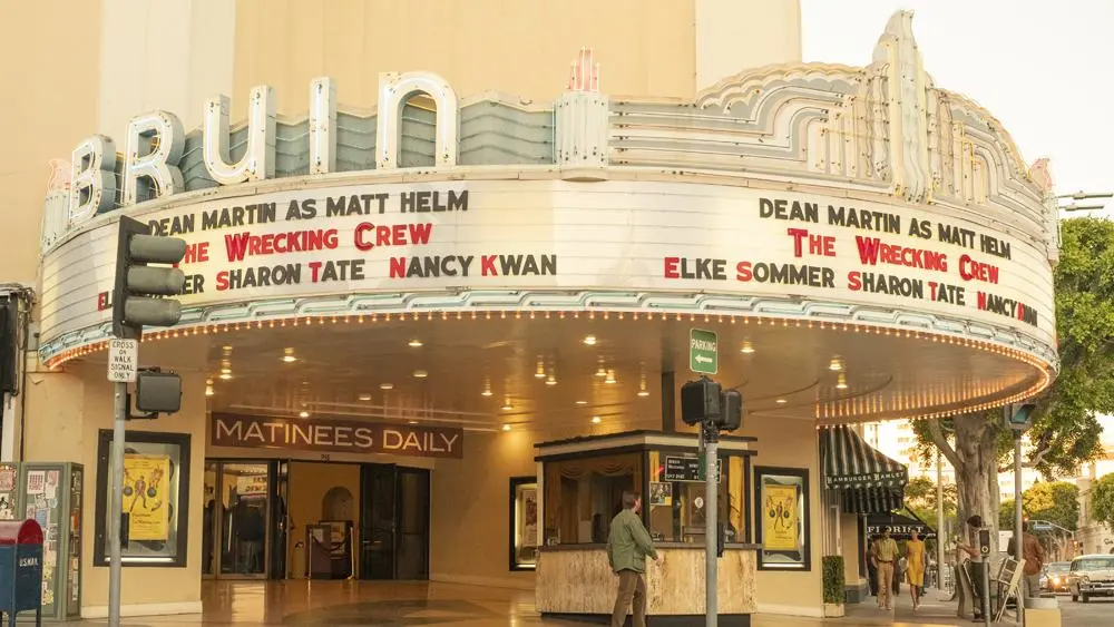
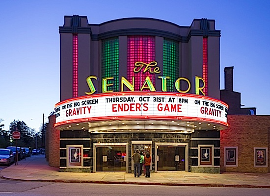
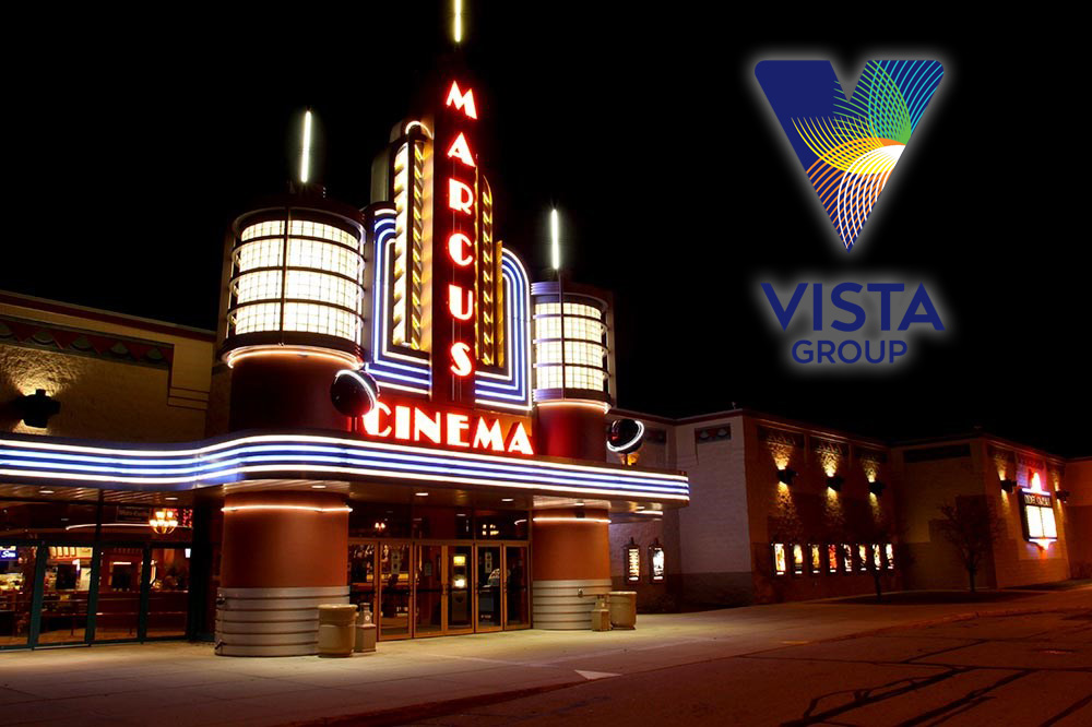
The first thing I needed to establish was the jacket. The main illustration. The big cheese. I was hoping that once I had that established everything else would fall in to place (which, thankfully, it did). I was given a lot of creative freedom with the artwork, which as I’m sure any artist would agree is always a delightful piece of music to my ears. In terms of visual inspiration, I looked at a lot of art-deco style cinemas. I’ve attached a few pictures below that I looked at, but one of my driving inspirations was the memories I have of the types of nostalgia-fuelled picturehouses that grace the screens of Quentin Tarantino’s movies, particularly in Once Upon a Time... in Hollywood. These types of buildings are often romantised in a lot of films (and wider culture); there’s an edge of love and familiarity to them that people (myself included) like to champion. So by utilising this I was hoping I could make the album art feel inherently warm and pleasing.

Beyond the particular building style, I also based the general shape of the Seafloor Cinema upon that of a seashell, just to give it a sense of belonging in it’s underwater world. The near-sole piece of direction I was given was that the cinema should be slightly derelict and overgrown, which initially prompted me to create something quite dark (and blue), as seen below.
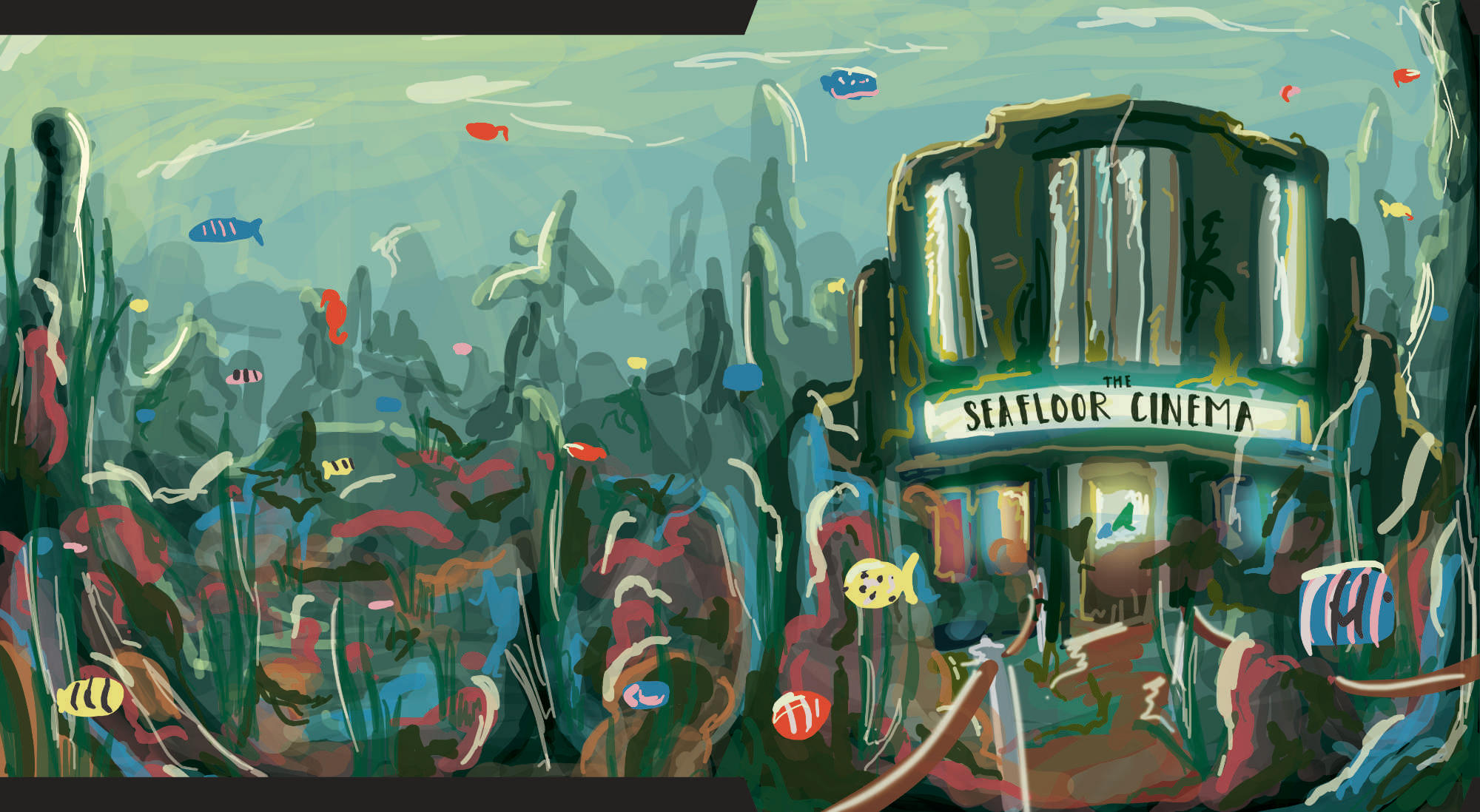
Whilst the colours weren’t exactly what the band was after (they were hoping for something a bit brighter), the composition worked and was something the guys were happy for me to push forwards with. With the composition approved, I did a more refined pencil sketch of the cover, which I then coloured with 2 different variations. If you’ve seen the final artwork, you can see which choice the band was more enthusiastic about!
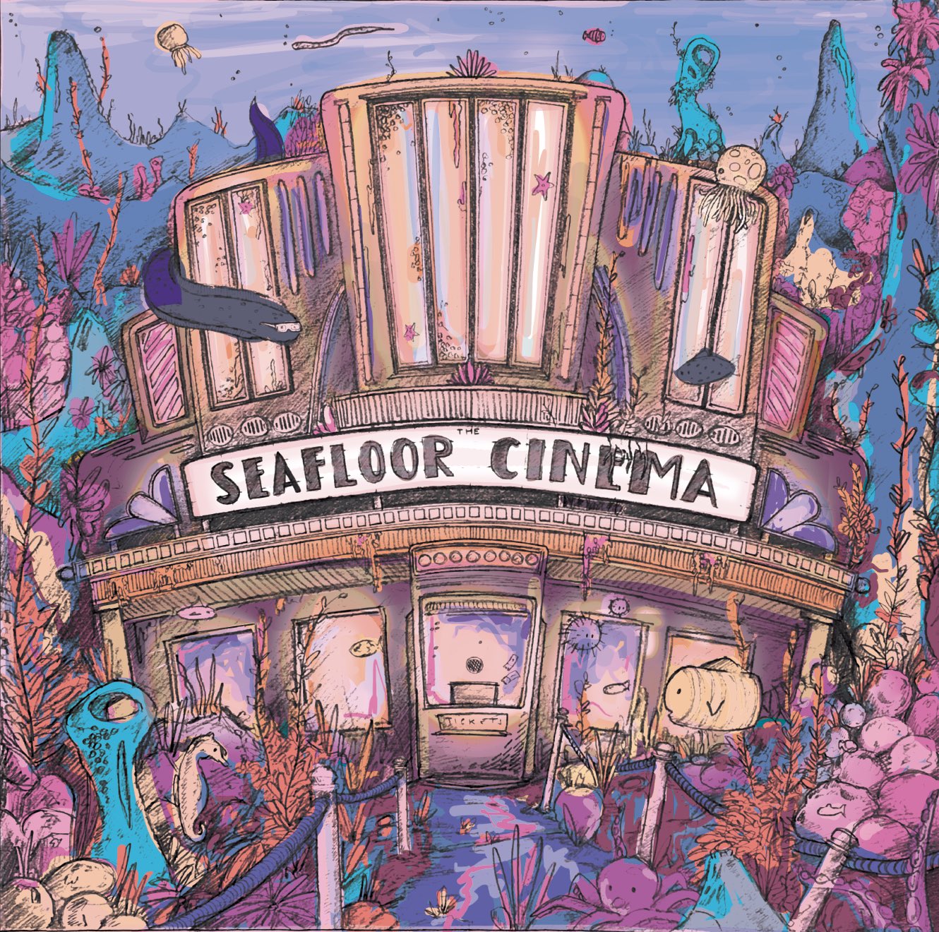
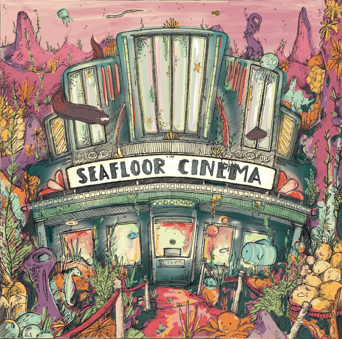
Due to the nature of the short turnaround, it was at this point that I mentioned (in writing) the concept of the Whale with 3D Glasses which could go on the back, which was met with a very positive reception. Thankfully this was something they just let me steam ahead with once the cover composition was approved. From here I jumped straight into the linework. Whilst I had already pencilled out the front cover, for the back cover I made do without and decided to do the pencil work on the fly. Once I knew where the whale was going to sit, the rest of the environment shouldn’t have been too challenging since I would have already established how it would look with the front cover linework. Below you can see the 2 separate illustrations I did for the front and back covers.

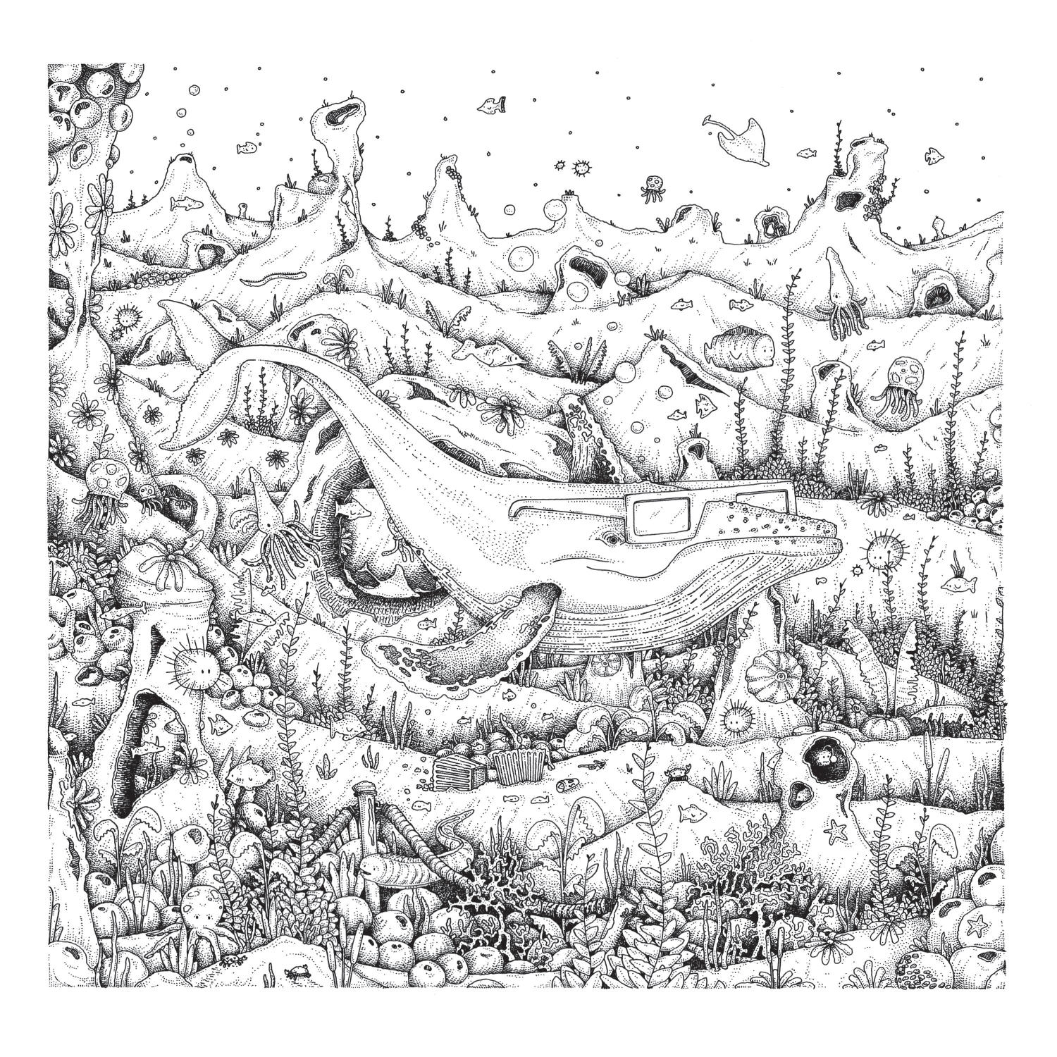
Even though I drew them on separate pieces of paper, I made sure to align my linework so that when it came to creating one fluid piece it’d be an easy job. I scanned in the work, stitched it together digitally and then coloured it!
DISC LABELS
Following on from the jacket, the next thing I tackled was the disc labels. Once I’d finished the jacket artwork, I knew what I wanted the labels to be. But since I started trying to plan them before I’d completed it, there was a bit more exploration and testing done. Initially I did 4 different designs that I sent to the band.
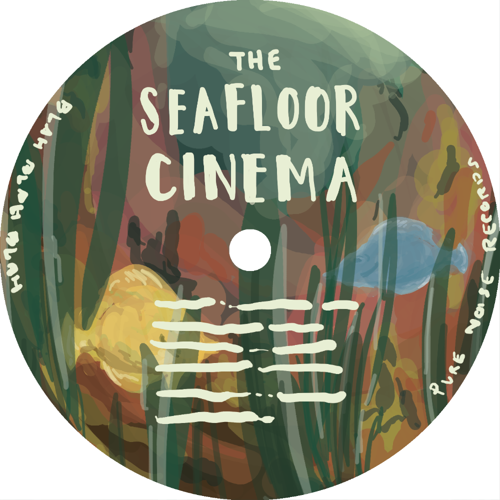
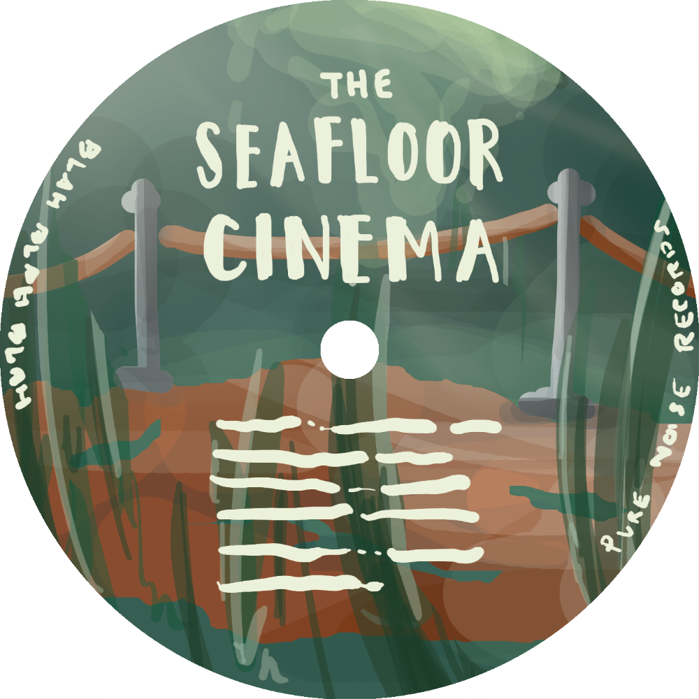
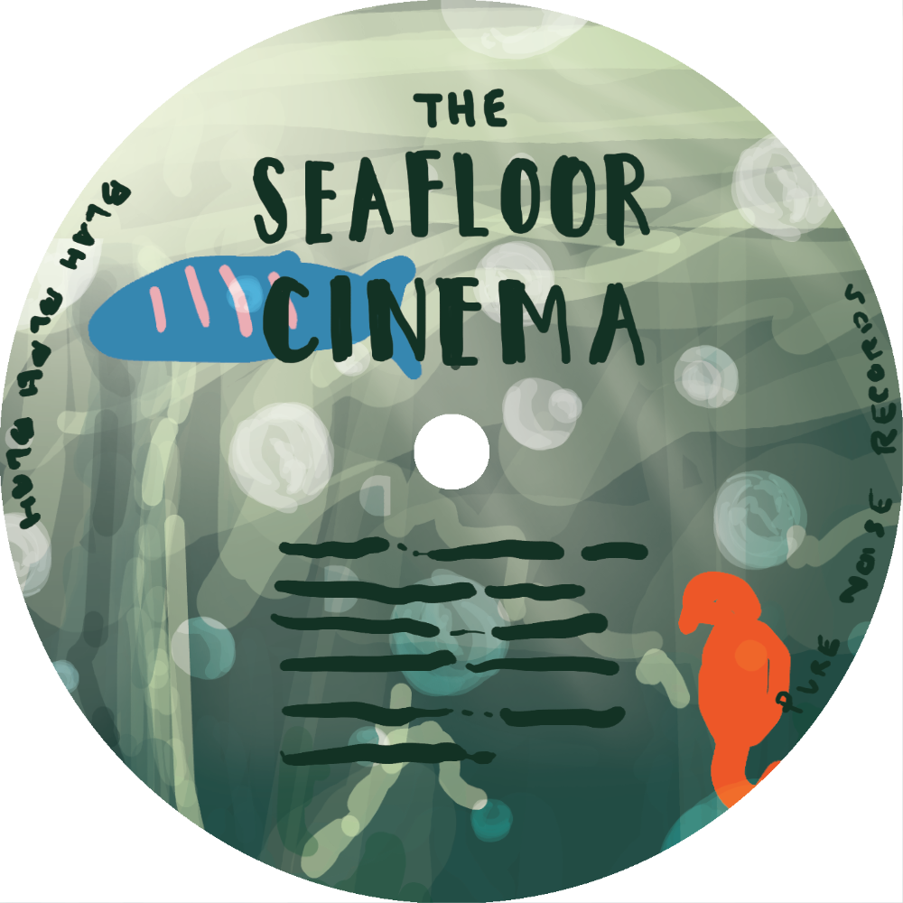
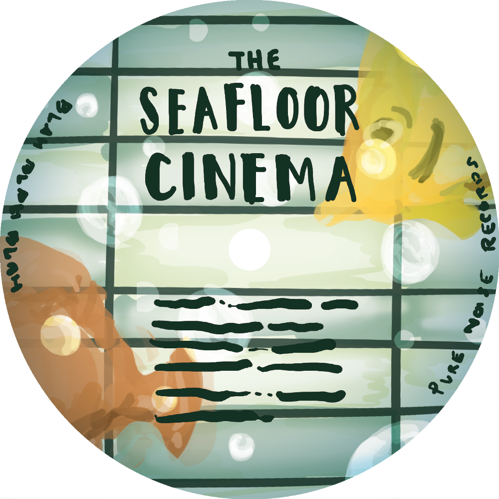
One of these designs, the first one, ended up being one of the labels that I developed further. And whilst I was quite partial to Design #2, it became clear once I had done the jacket artwork that I wanted to do a close-up of the Whale. Because a Whale with glasses is both cool and fun. As with the jacket, I did the linework for the labels, and then scanned in and coloured them digitally. Even though I knew the labels were going to be cropped in to a circle, I drew them as full squares because, often much to my detriment, I am a perfectionist.


I also filmed a timelapse of the first label, which you can see below if you want a speedy look at how I create my work, from drawing it through to colouring it.
INSERT
The final thing(s) I created for the album was the insert. This was going to hold a whole bunch of text, so I wanted to do a simple illustration that left a lot of space for that to be done. And what better than a cinema screen! Once I’d suggested this idea to them through writing, I was able to immediately get on and draw it. Whilst both sides of the insert are similar, I did want them to be different and despite being in a time crunch I didn’t want to reuse any elements and expedite the drawing process. I think it’s the small details in my drawings that people like, whether they consciously see them or not. The little differences makes the illustrations feel lived in.
All that’s to say, I did have to reuse the linework for the top edge of the screen. I know, I know. Agh! A hypocrite! If it makes you feel any better, it upsets me too. But it was getting late and the work had to be done. A (very) rare example of me cutting a corner. I wholeheartedly apologise to anybody who thought better of me. Silliness aside, I’m really happy with how these came out, and despite being very simple I think they hold a lot of charm.


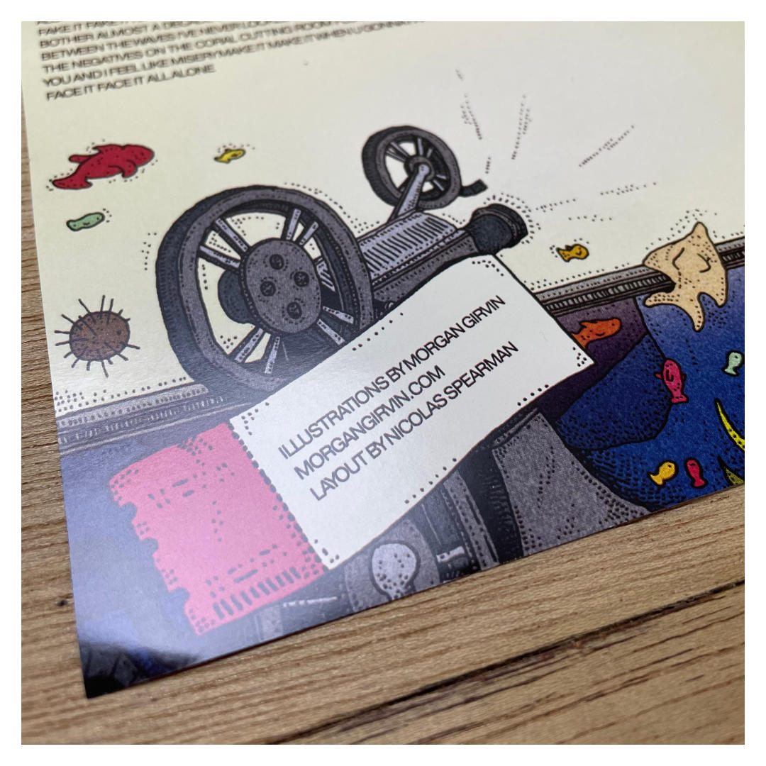
ASSETS
But that’s not all! One of the other things I had done on the outer jacket was a handwritten typeface that hangs above the lobby of the cinema. Again, I wanted something classically ‘Art Deco’, and since I’m a graphic designer by degree, I probably could find a suitable font to slot into the drawing. But, as is often the case, I like things to match. And rather than try and integrate a sleek and clean vector-based font into my rough, handdrawn linework I decided I’d just create one by hand.

It’s very basic and was just based upon my jumbled memory of all those art deco fonts that I’ve seen before. I was half expectant that Pure Noise Records would replace it with a big boy typeface once I handed the artwork over, and I gave them a version of the artwork without my lettering to make this process easier, but to my surprise they actually came back to me and asked me to do the whole alphabet for use on the insert. I love lettering, and despite the fact it never comes out as cleanly as I’m hoping, I often try and include it in my work (especially when drawing film posters). So I was delighted that they actually wanted to use what I had done.

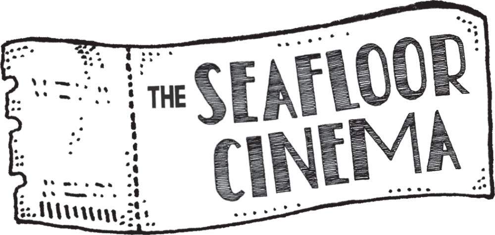
The final thing I created, which was initially for the disc labels but also ended up being used elsewhere, were these ticket stubs. A nice simple thing to house the logo (or any other pertinent information) where needed.
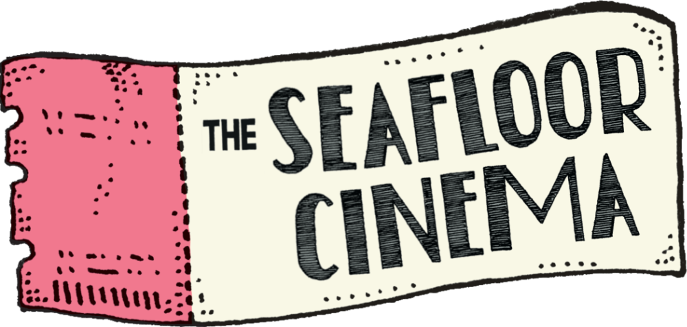
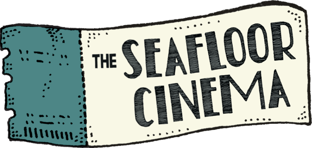
And that’s that! I had a lot (a lot) of fun creating this artwork, and I think I did a really solid job with it. It was a lot more vibrant and colourful than a lot of the previous work I had done, and I’m proud I was able to push my own boat out. There’s some photos below of the album, and if you want to purchase a copy for yourself you can find it through Pure Noise Records!