morgan girvin
illustrator, maker and hermitinfo
about
contact
shop
illustrated work
wimmelbilder
film postersalbum art
maps
general illustrations
crafted work
hand crafted projects
big things
film boxsets

morgan girvin
illustrator, maker and hermit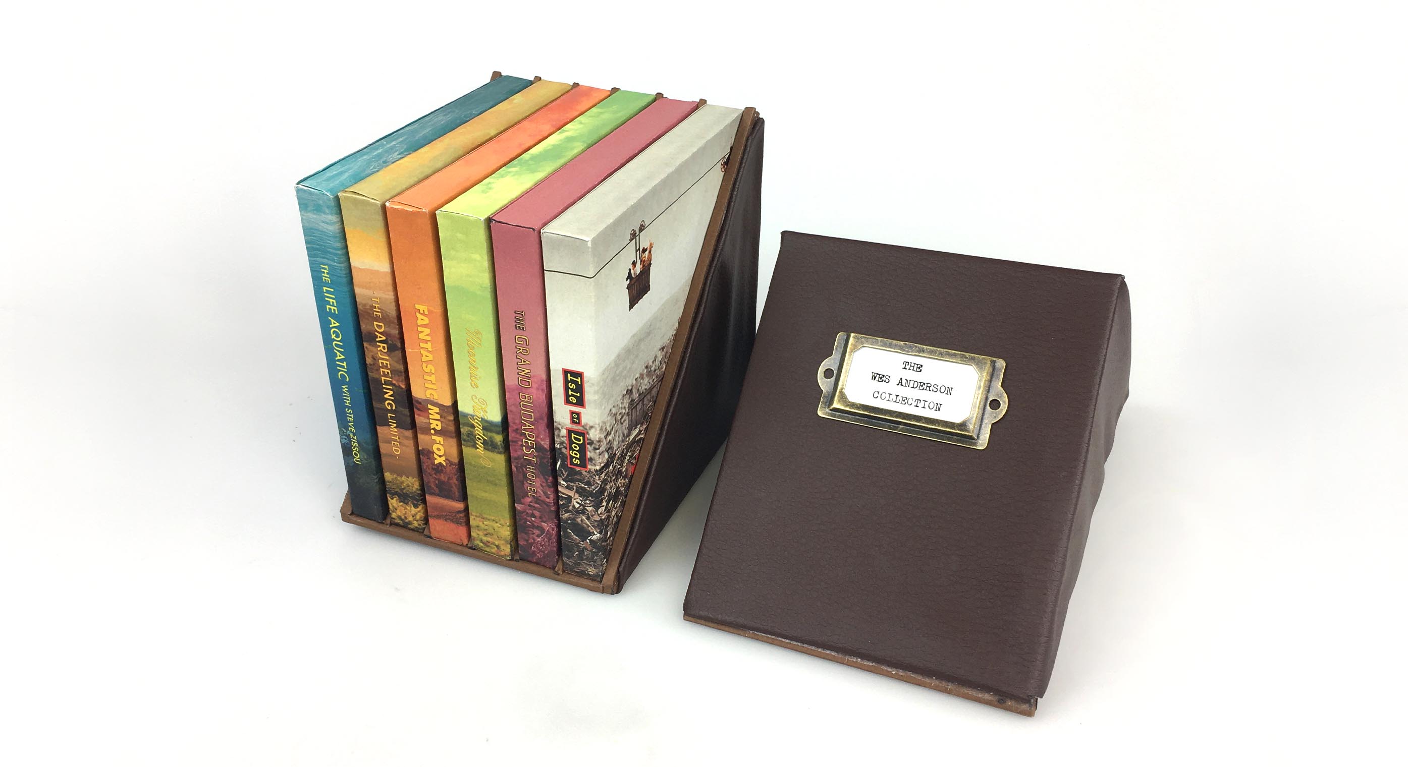
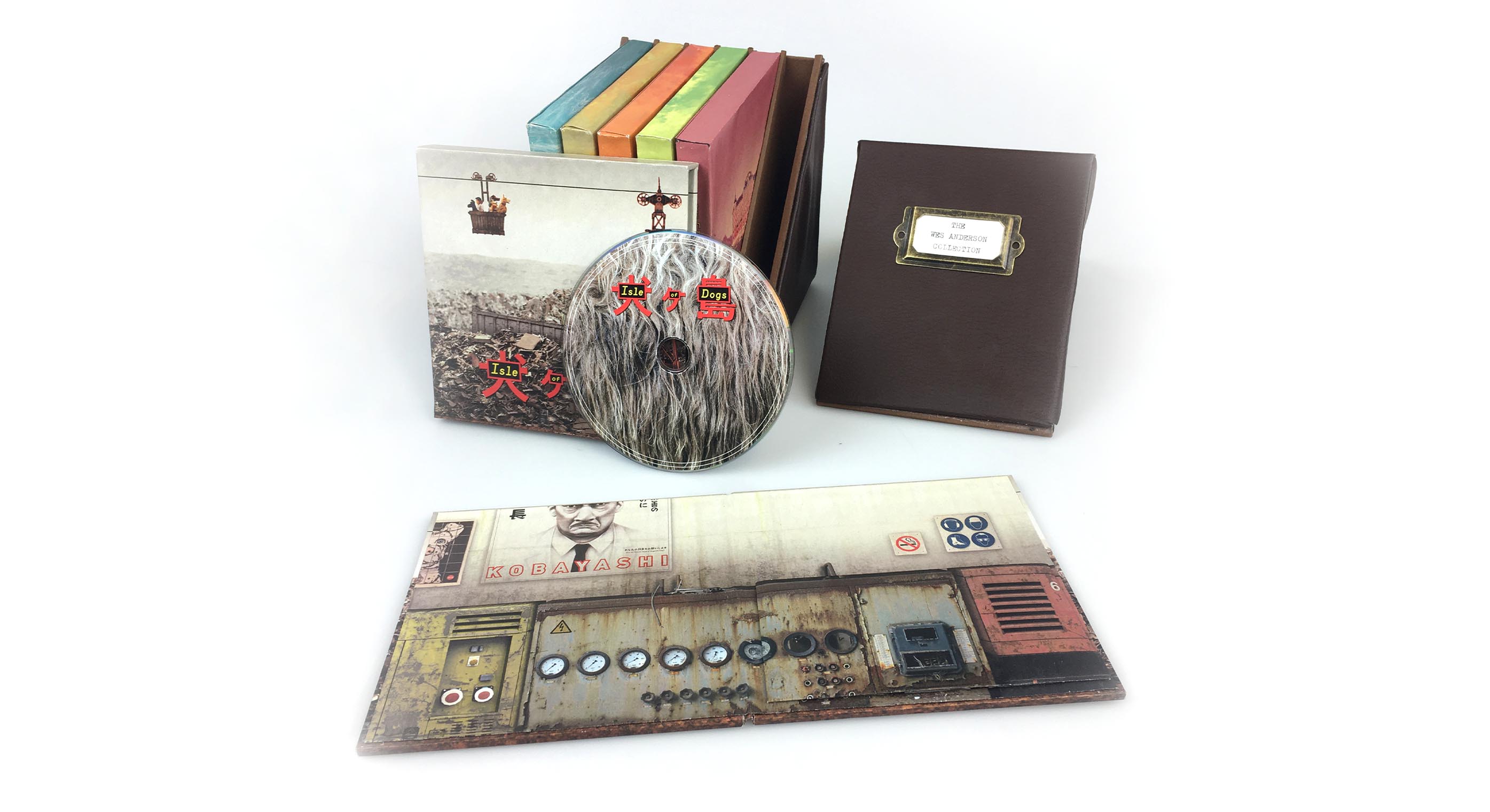
Some photos of the finished collection, plus the 6 designs that feature on the front of each slipcase.
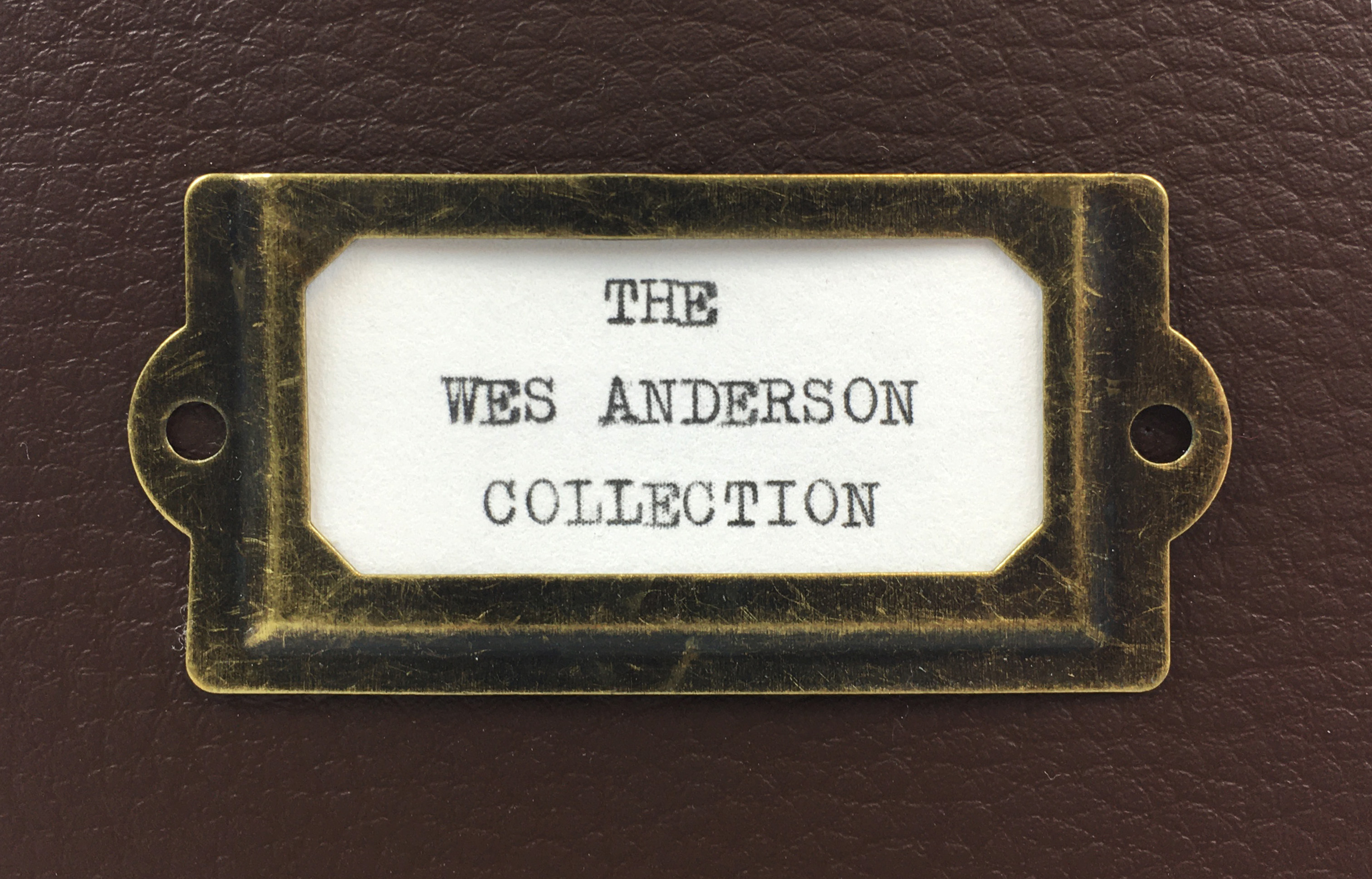
THE WES ANDERSON COLLECTION
First things first, this project was an absolute ball-ache. It took me months of tinkering and flip flopping to be able to get to a final design that I was happy with, plus a lot of different mockups. The Boxset contains 6 of Wes Anderson’s films, from The Life Aquatic through to Isle of Dogs. Each film has a custom disc design, housed inside a hardback booklet case, which then sits inside a hard box case. Each box case has it’s own place to slot inside the main boxset. The entire project is made from greyboard, with the designs printed on paper before being carefully wrapped to the cases. The exterior of the boxset is a faux leather style fabric, which quite frankly, was an absolute nightmare to work with.
THE BRIEF
The Brief for this University project was to create a boxset for anything we wanted. Whether it be a film series, a book series or perhaps a certain artists discography. I tiptoed around a few ideas before ultimately deciding on creating a Wes Anderson Collection. Ideally, I would have liked to do all of Wes Anderson’s films (including his 10th film The French Dispatch which hadn’t yet been released), but I realised that I was probably set my ambitions to be simpler, and if I had time I could always return and do the other 4 films. And boy, am I immensely grateful for my sense to stick to 6 films. It took me absolutely forever to complete this project, and I was pretty burnt out by the end of making the set. I’m not sure I would have maintained the mental capacity required to go back and complete the other 4 films, even if I had the time.
RESEARCH
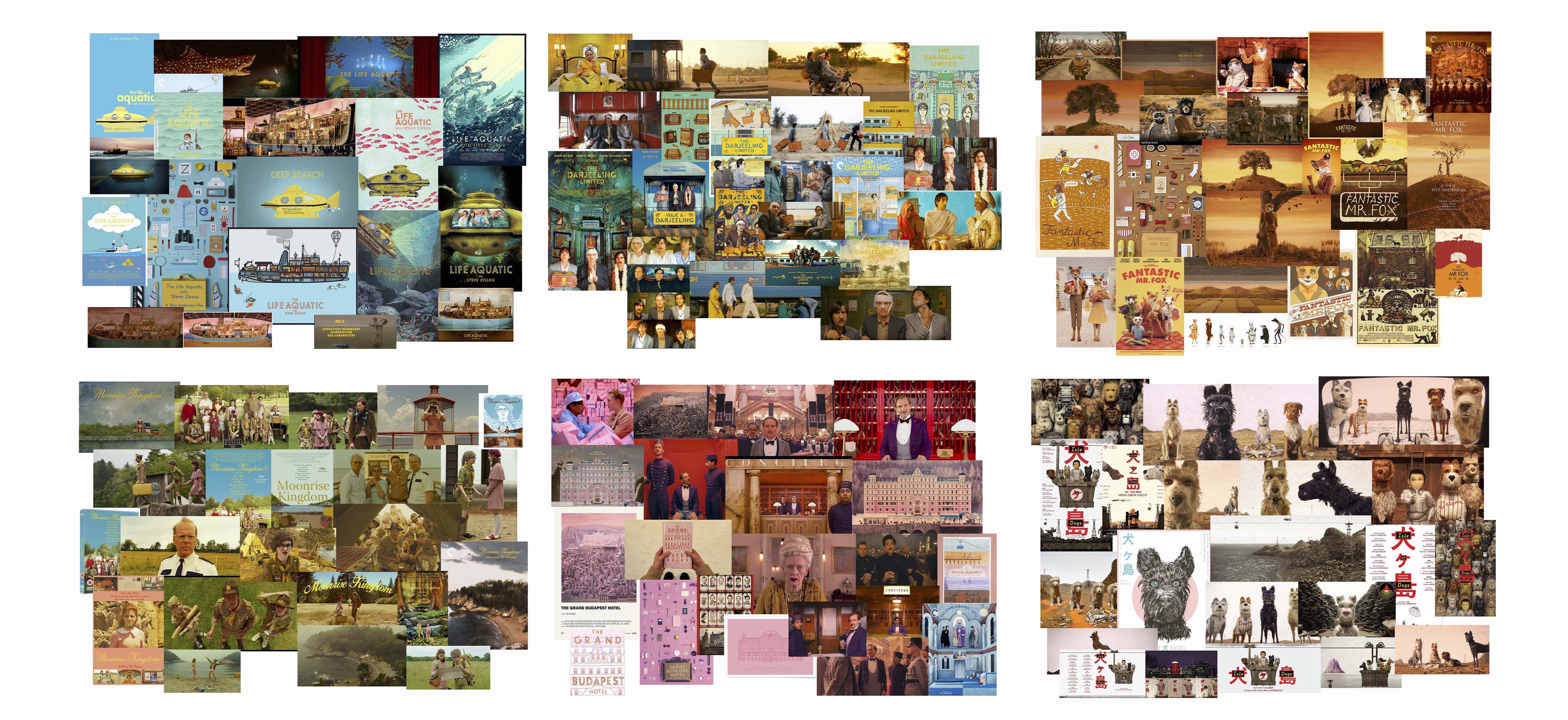
I had a delightful time doing research for this project, revisiting Anderson’s films and collating images that related to the films. Creating moodboards for the films was useful, even though it just reaffirmed what I already knew: they all have distinctive colour palettes. This meant I had quite clear guidelines for creating any imagery.
![]()
INITIAL IDEA - POP UPS
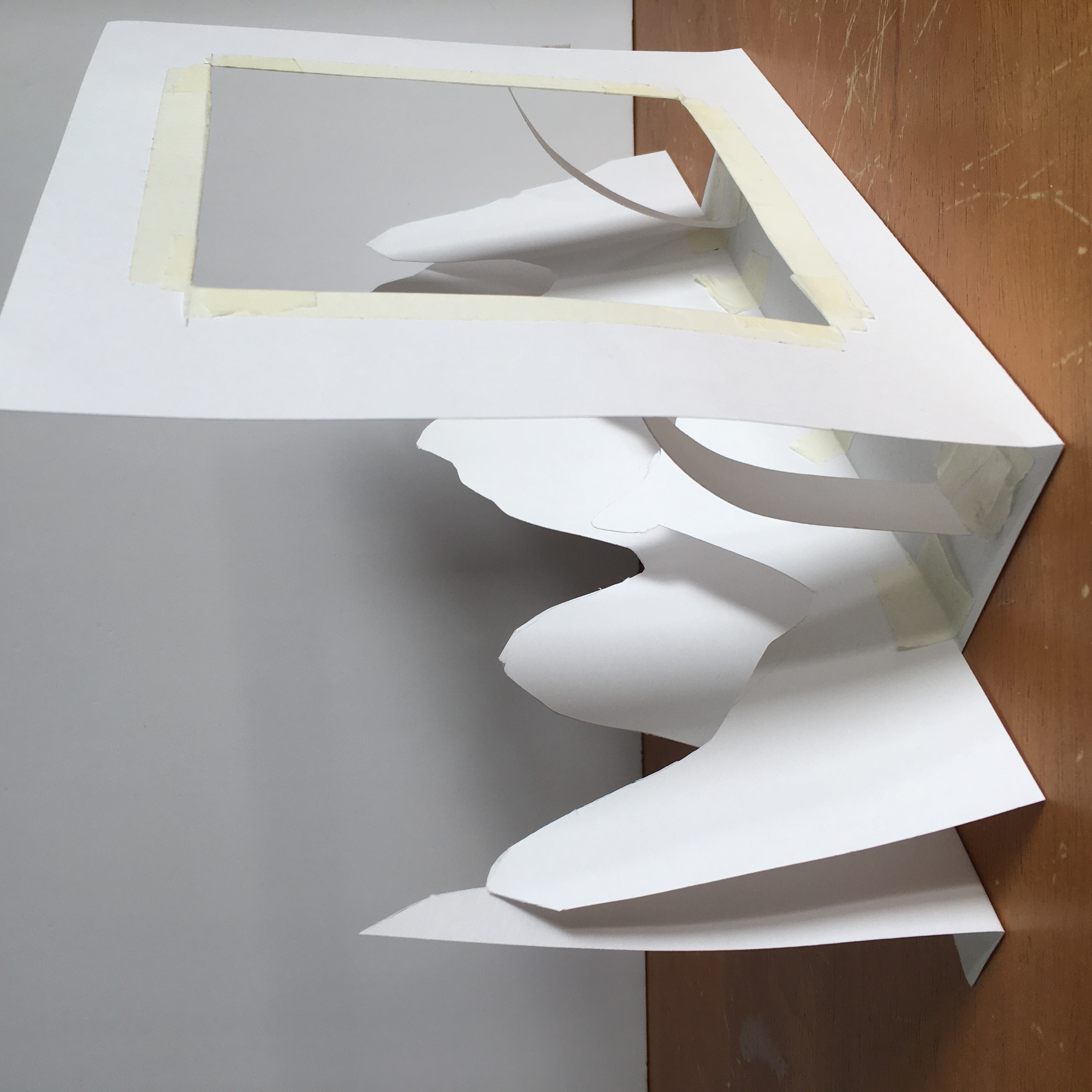
My initial plan for the project was to create a series of Wes Anderson ‘Pop Up booklets’, which housed the discs for the films. I felt like I wanted something that had a quirky uniqueness about it, in the same way that Anderson’s films do, and I was really interested in replicating this feeling through small pop up scenarios. I did a bunch of experimentations looking at ideas, and settled on the idea of having a location from each of his films be the ‘pop-up’.
![]()
![]()
CHANGING TACTS
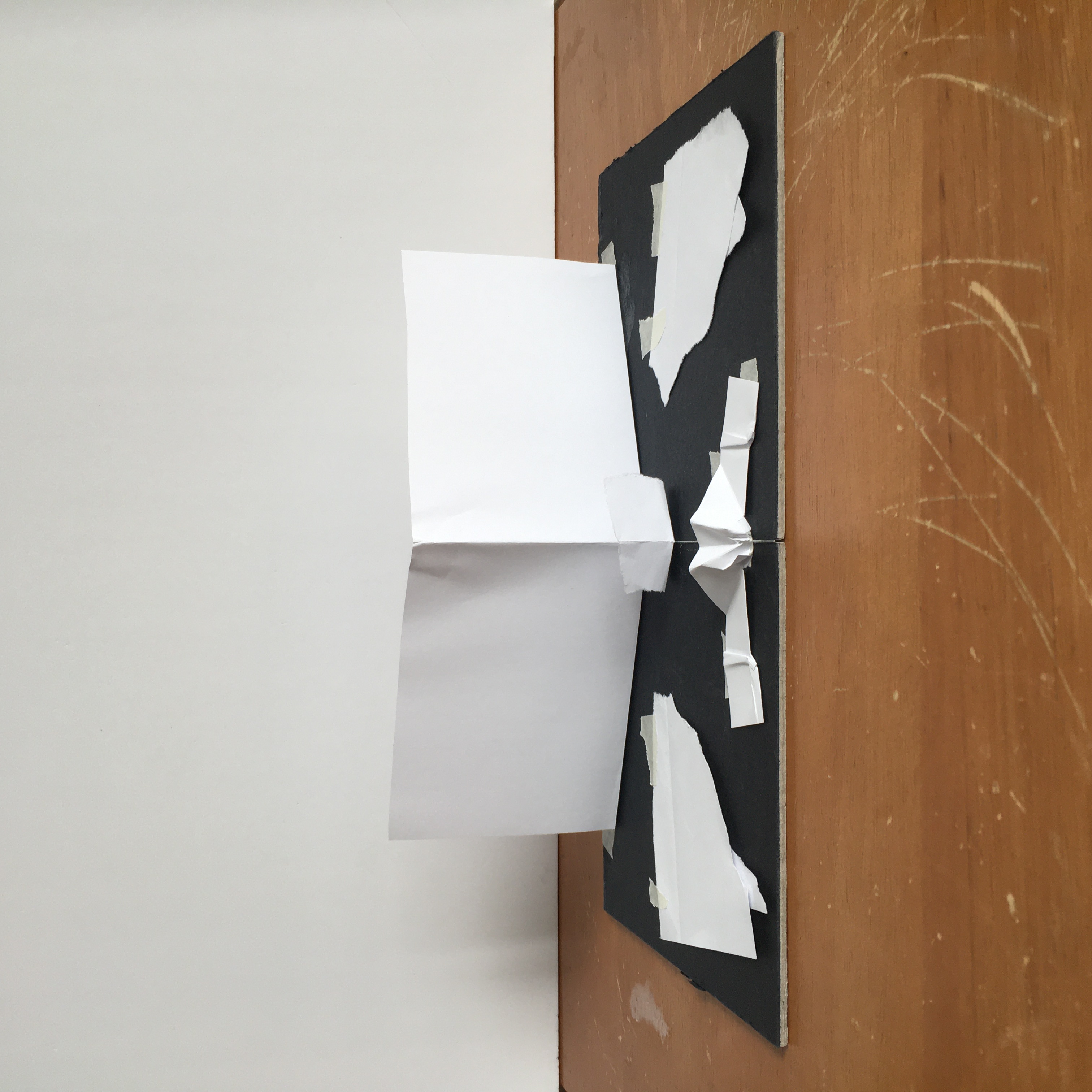
After deciding that this was overly convoluted and wasn’t the way forward I decided to change tacts. I knew I still wanted to create something physical for the project. I felt Wes Anderson’s filmography always has a careful and planned aesthetic too it, and I wanted to pay homage to it by creating something equally planned and cared for. I decided to work with layering paper to create scenery, which I would then photograph and use as the imagery for the cases. I did some quick tests with how this potentially might look ‘in-camera’, before I moved in to Photoshop to develop the imagery I would use.
![]()
![]()
CREATING THE EXTERIORS IN PHOTOSHOP
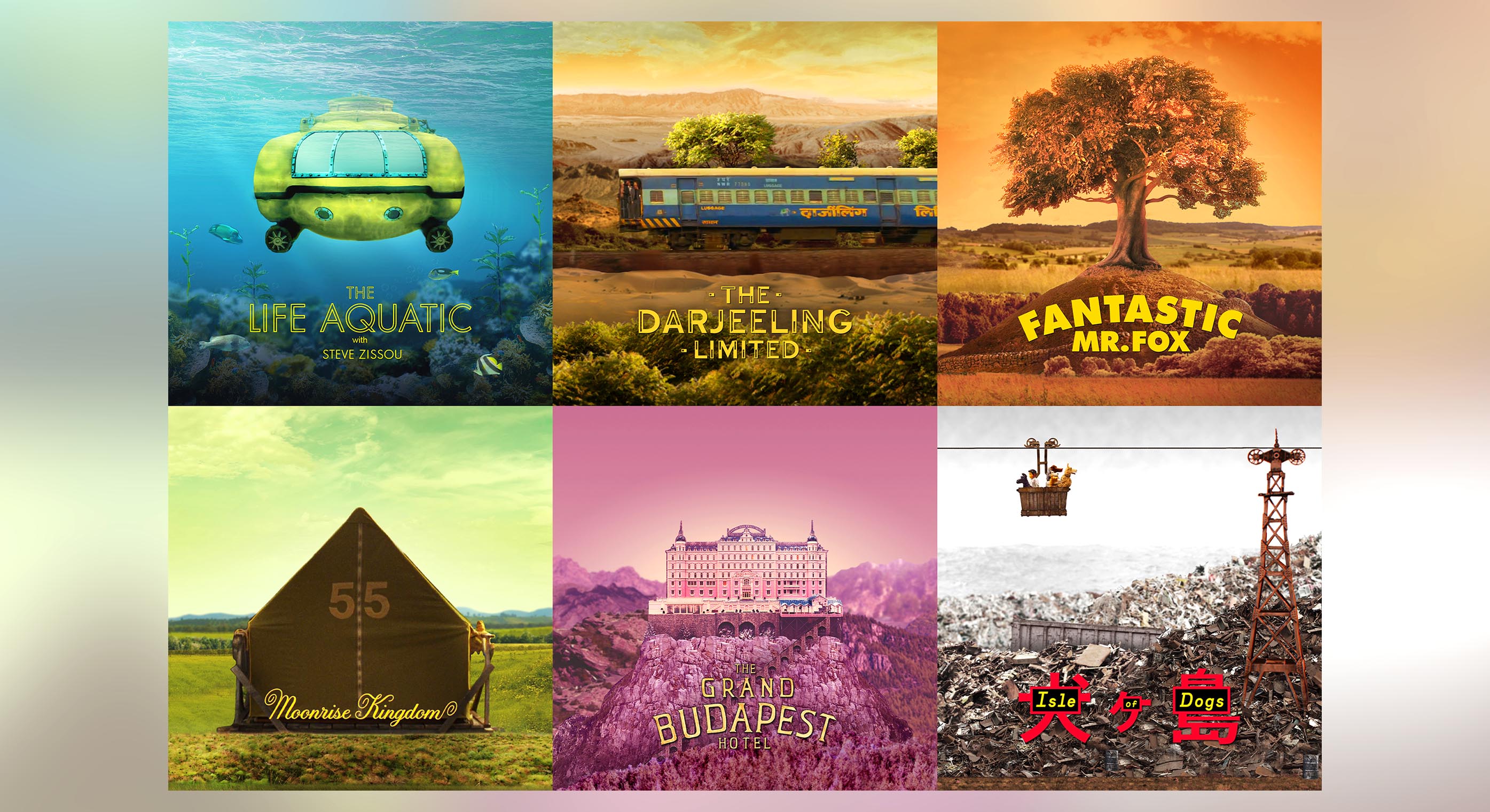
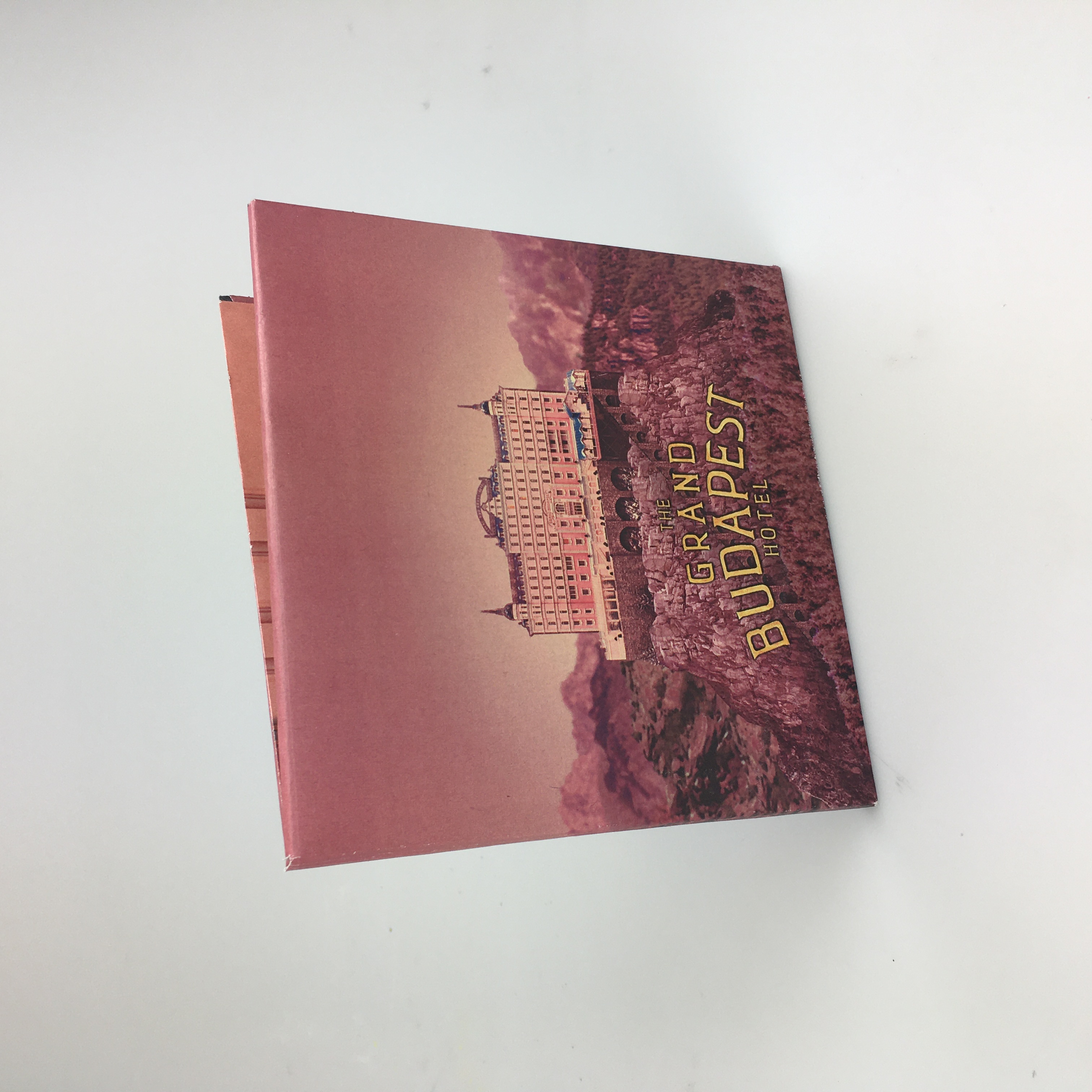
The first film I started with was ‘The Grand Budapest Hotel’, due to the fact that it probably has the most iconic landscape imagery out of the 6 films (The Hotel itself). Other than the hotel and other structures (which I cut out from various production images of the film), I worked with images found from www.textures.com to recreate the scenery and the landscape that the hotel was situated on. It took me a lot longer than expected to complete, but it was done, and I was ready to separate the different layers so that I could print them off, assemble them like in the mockup above, and then I could photograph it to use as the actual imagery. Except...it already looked pretty great?
![]()
There are a few parts of the photoshop work that don’t work exceptionally well, such as the rocks on the left side compared to the large rock that the Hotel is situated on, but I also think that adds to the charm that the image holds. By accident, through the use of scale and blur, it almost feels like the image itself is a miniature model, and I’d managed to achieve the layered feel that I was looking for.
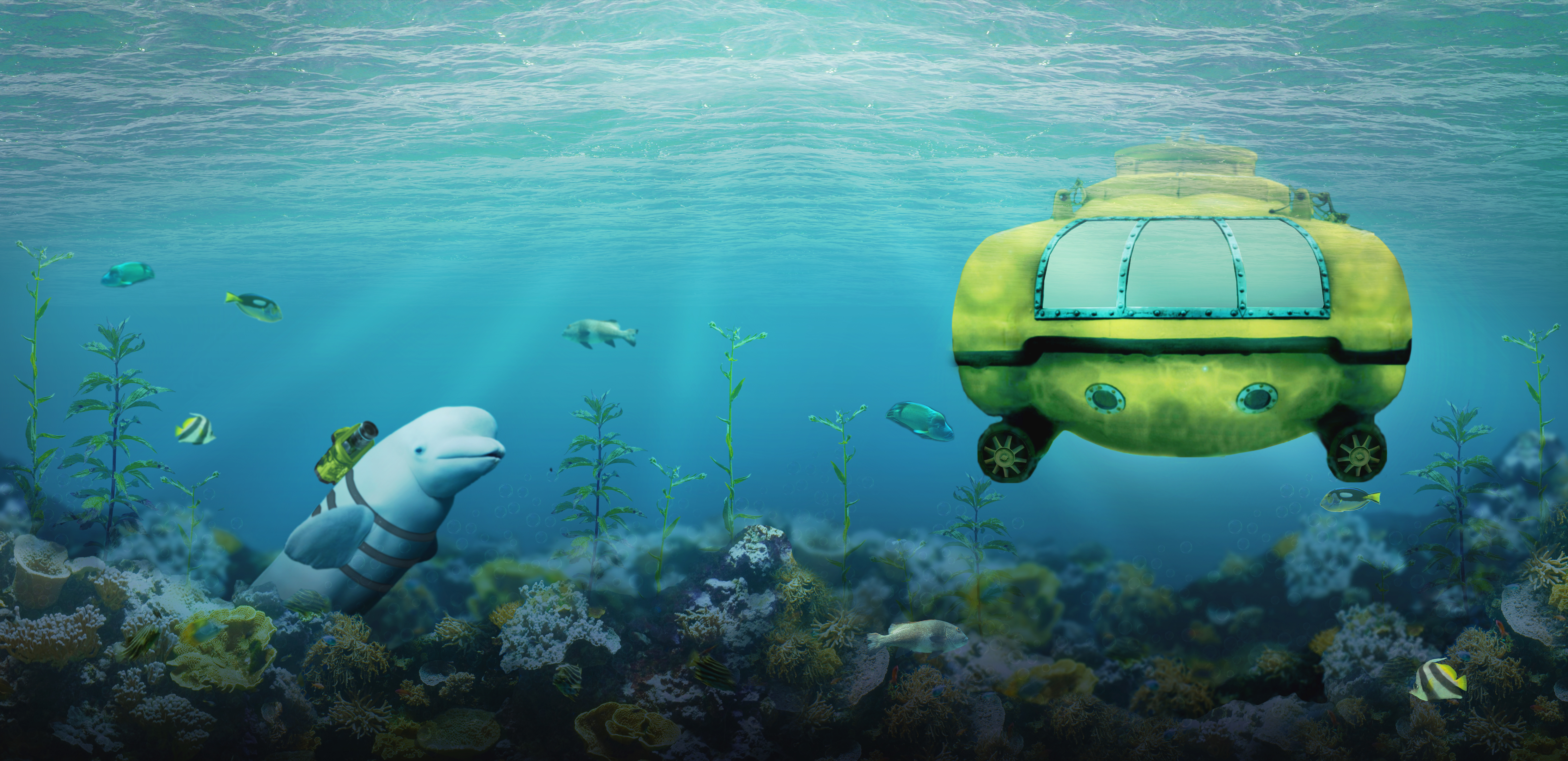
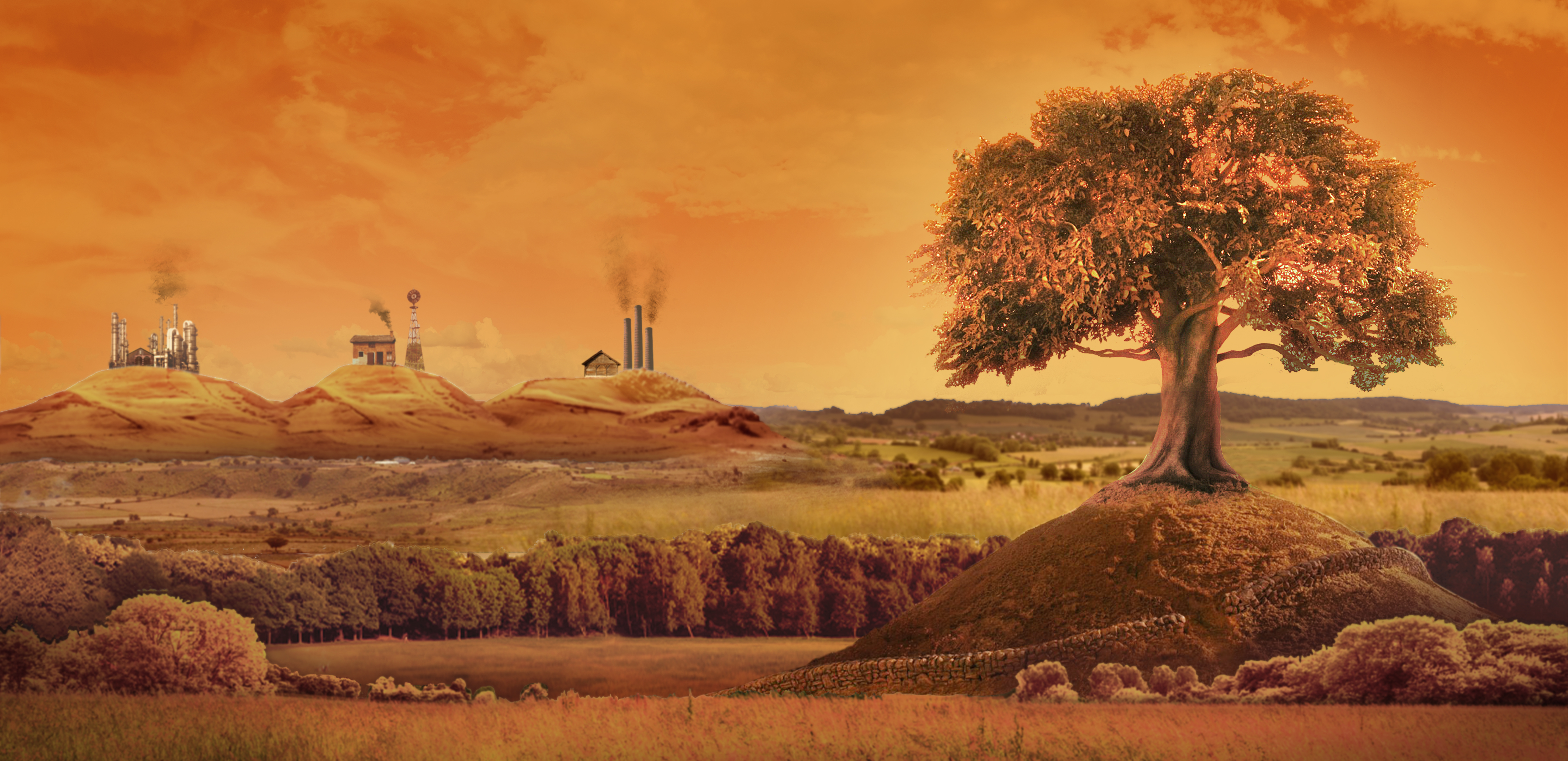
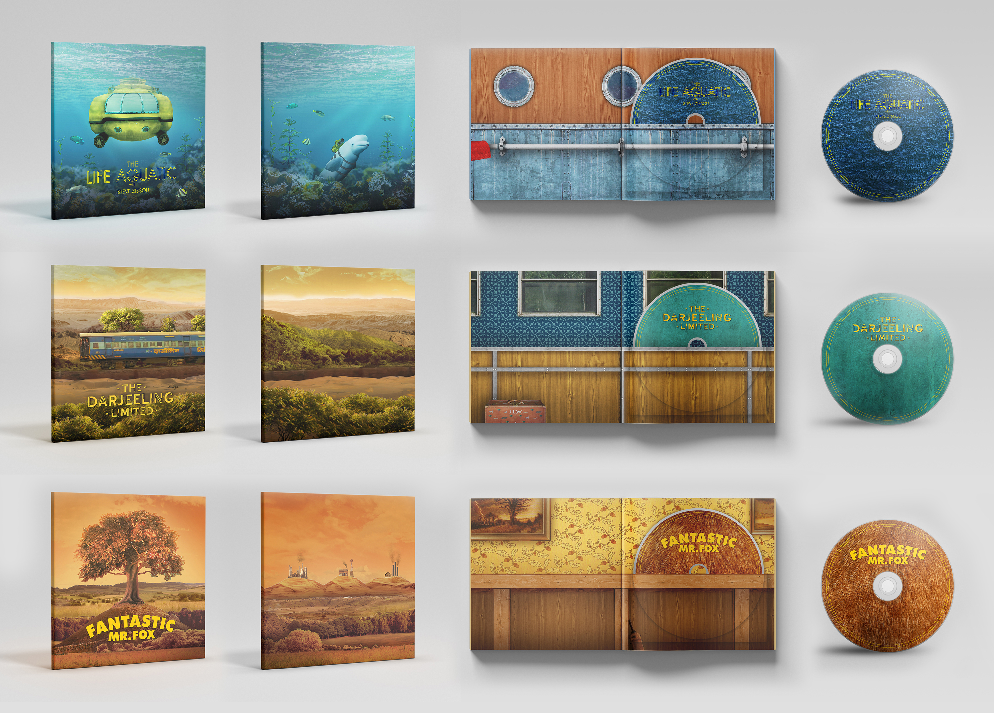
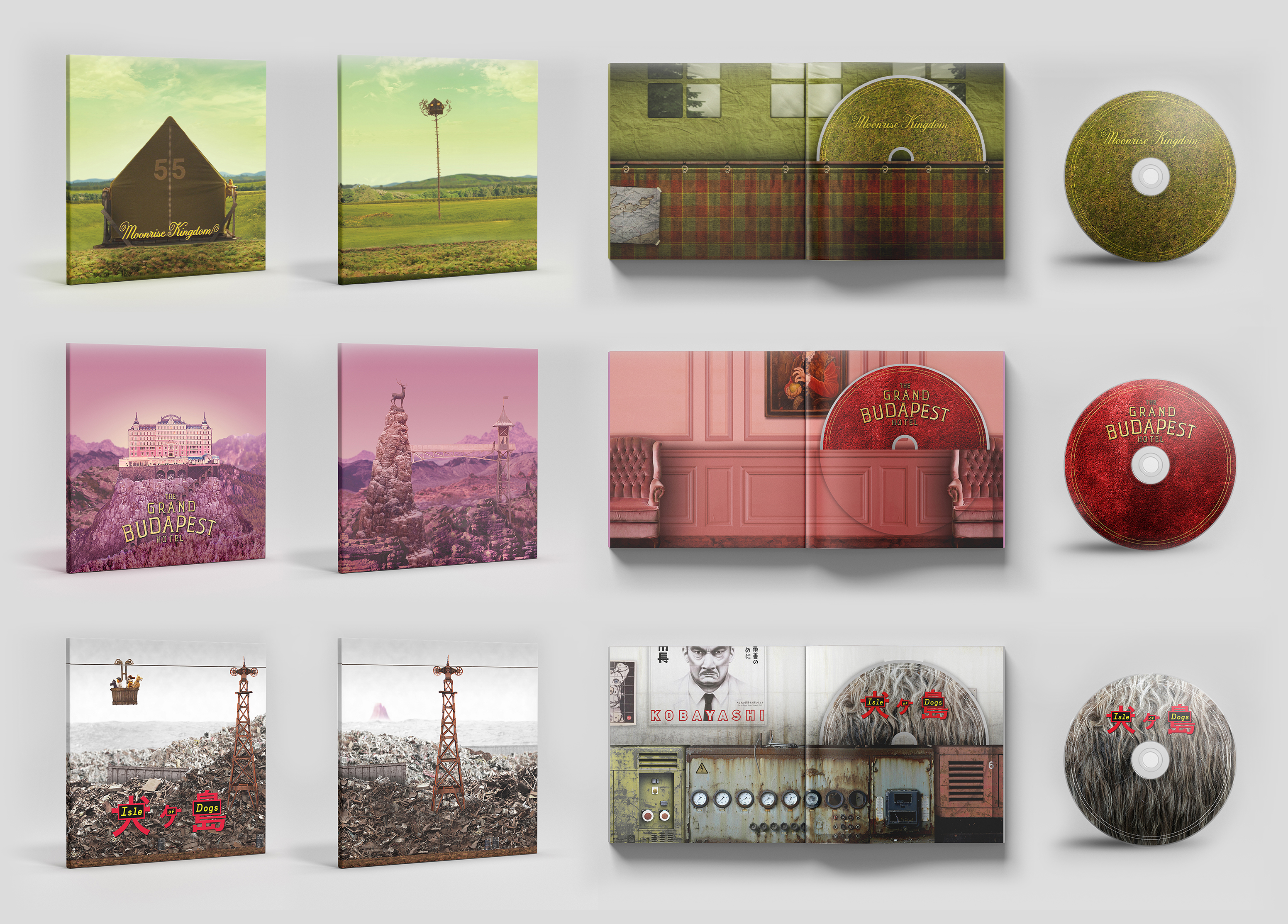
Anyway, below you can scroll through the ‘layered’ images that I ultimately created for each of the 6 films.
![The Life Aquatic with Steve Zissou]()
![The Darjeeling Limited]()
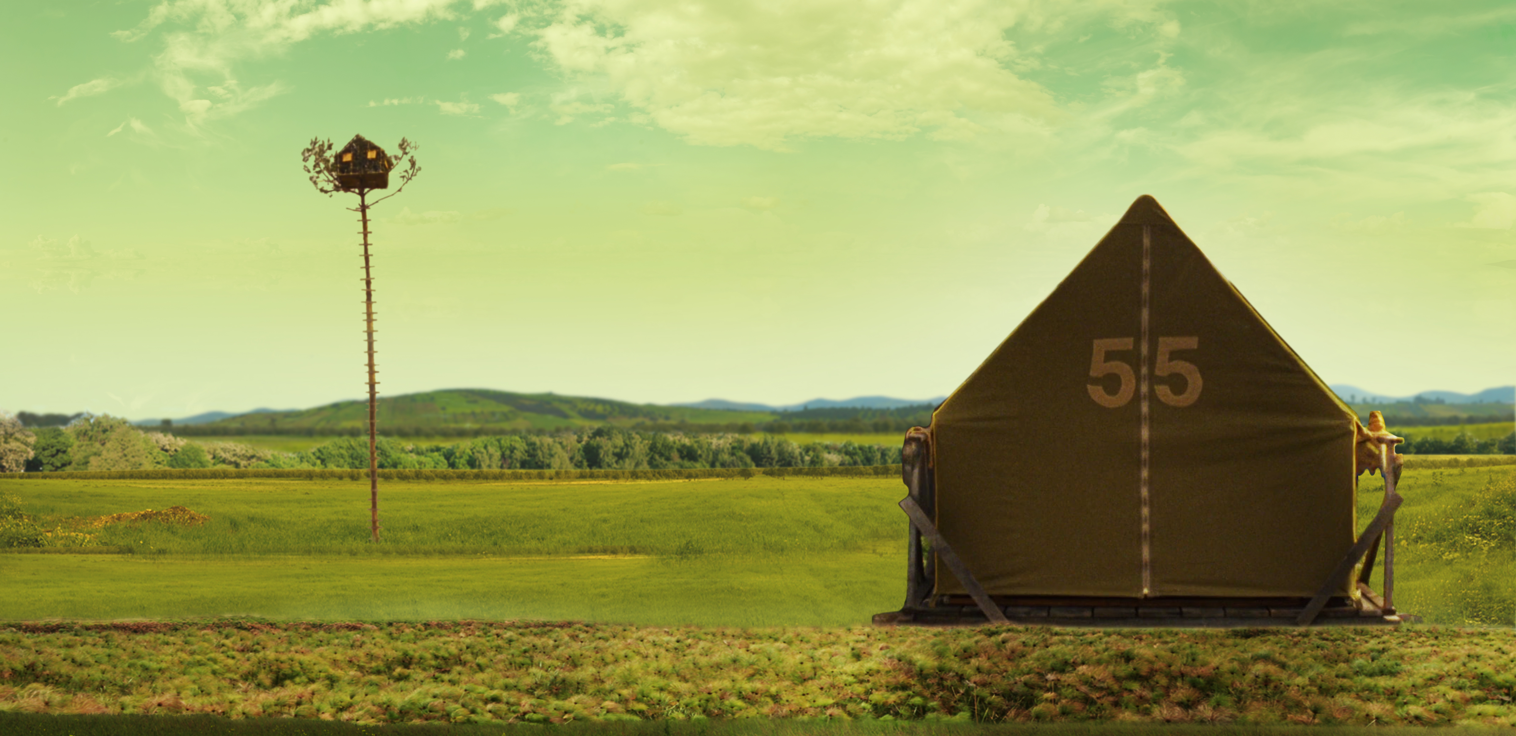
![Fantastic Mr Fox]()
![Moonrise Kingdom]()
![The Grand Budapest Hotel]()
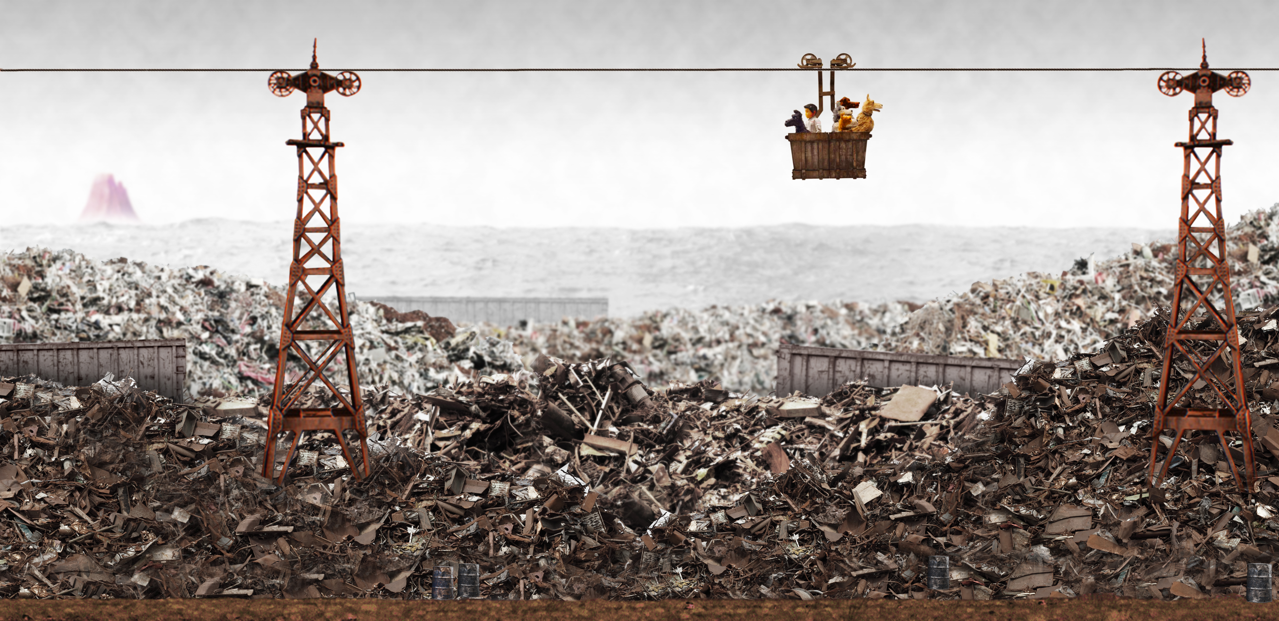
![Isle of Dogs]()
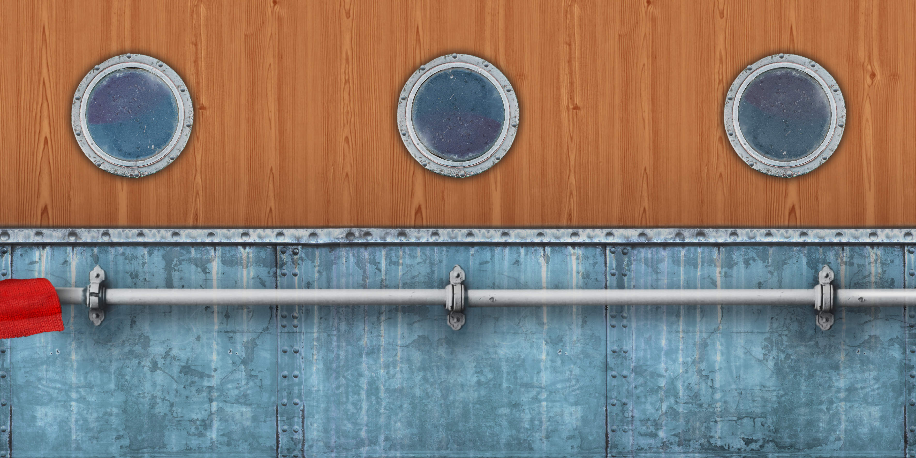
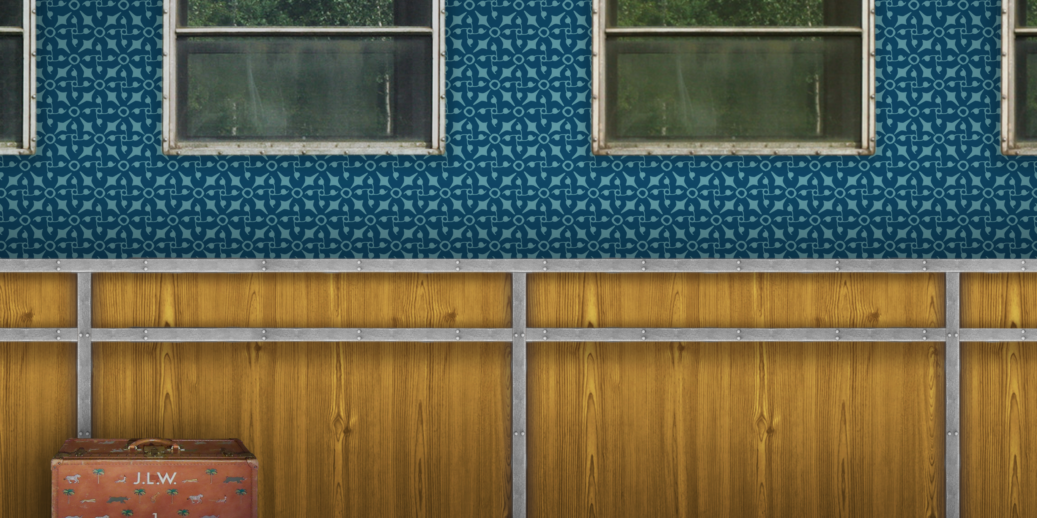
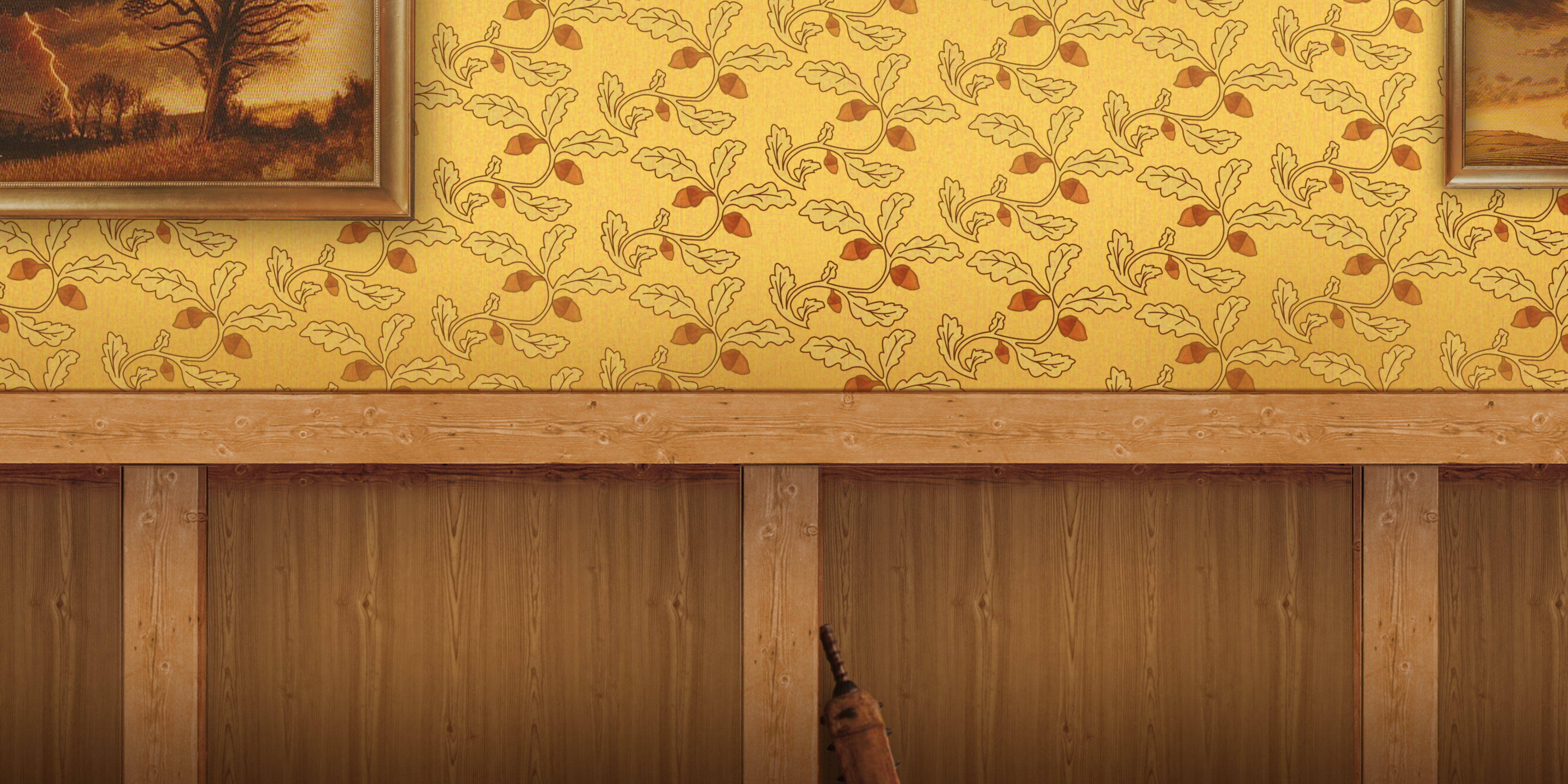
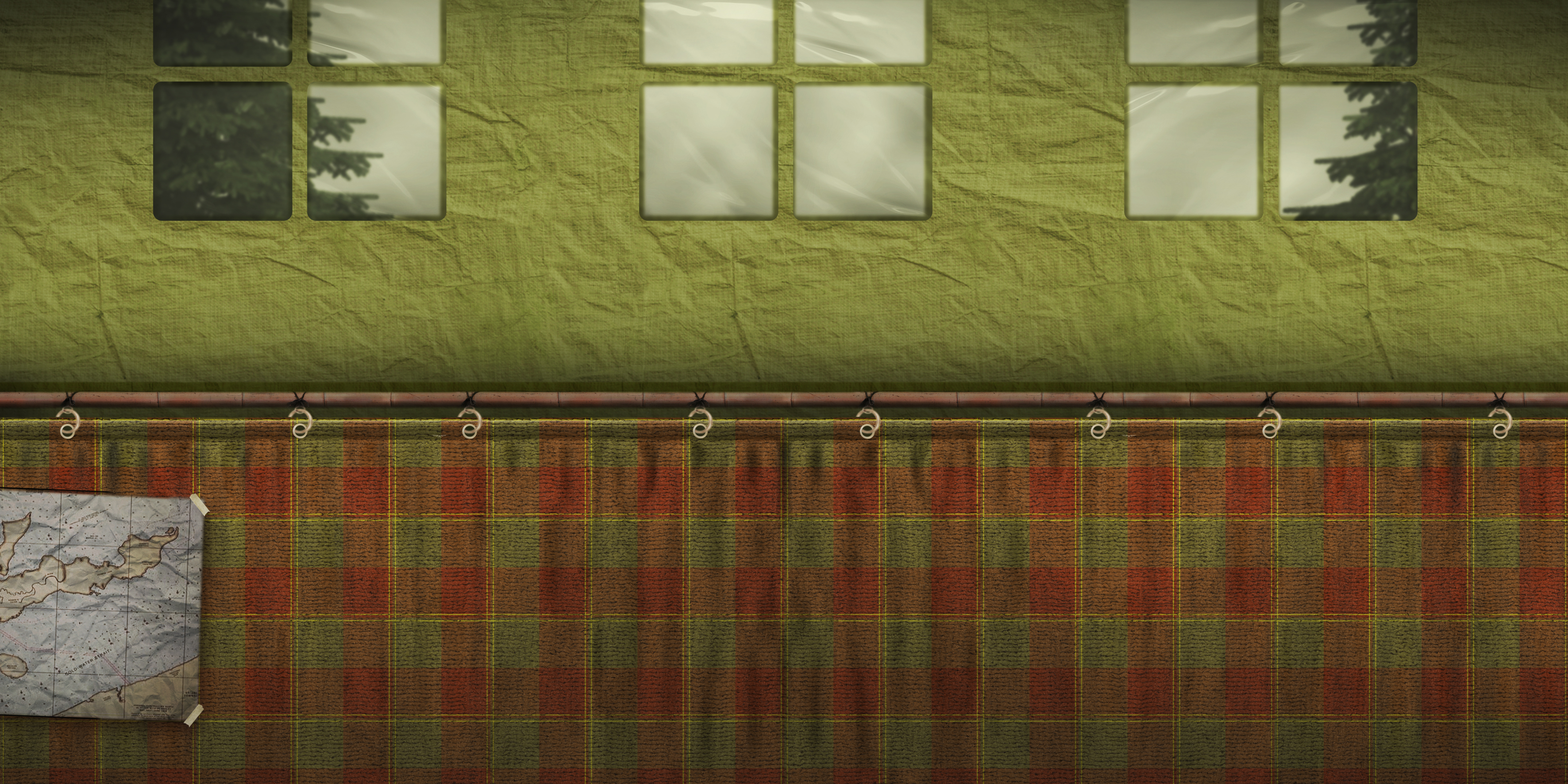
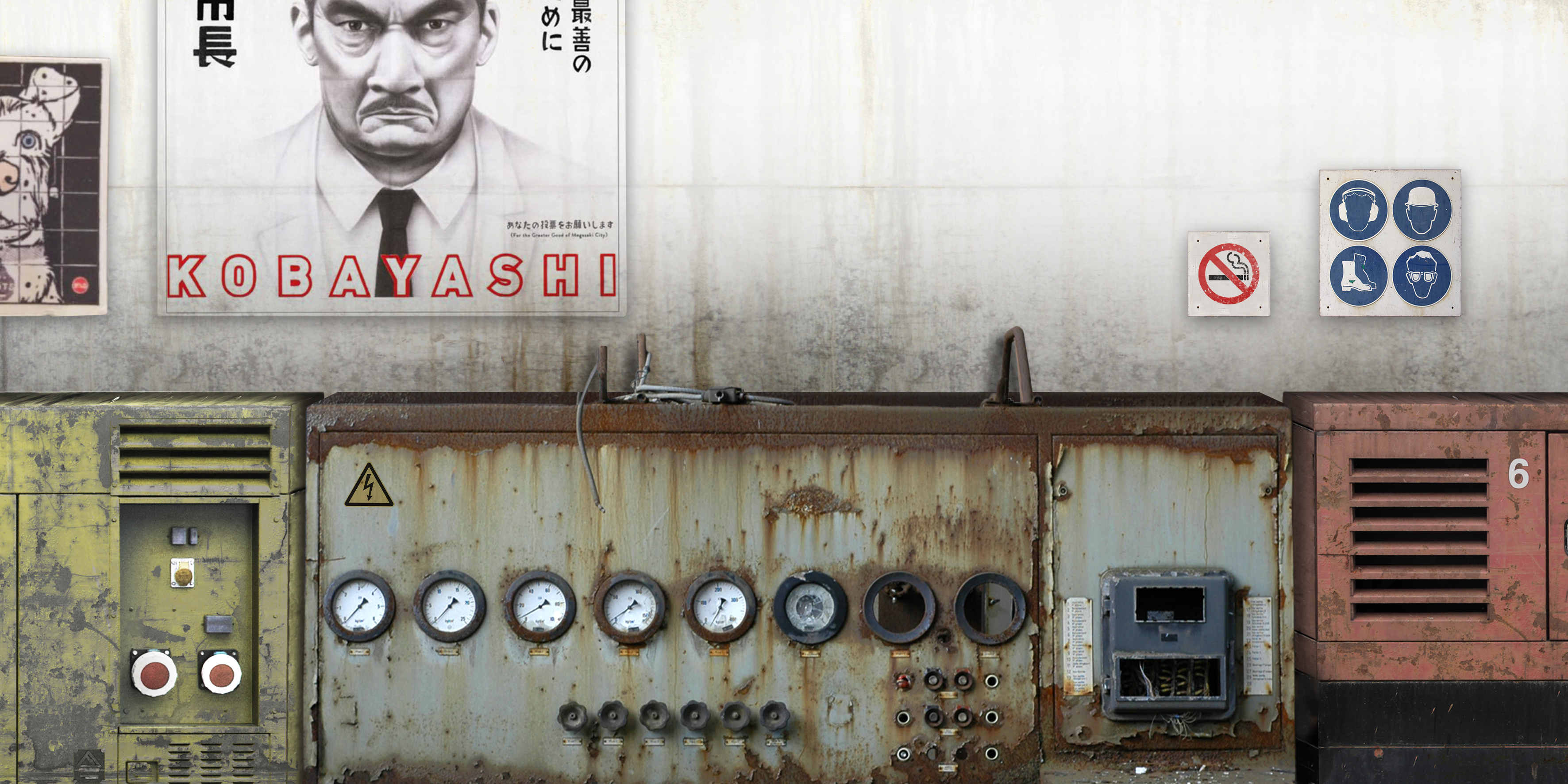
The interior of the disc cases was the next thing I focused on. Since I had created ‘outdoor’ imagery for the exterior of the case, I decided to make ‘indoor’ imagery for the interior of the case. Again, this was a lot of Photoshop work to create the image, using various sources mostly from www.textures.com. You can see the slideshow gallery for the interior designs below.
![The Life Aquatic with Steve Zissou]()
![The Darjeeling Limited]()
![Fantastic Mr Fox]()
![Moonrise Kingdom]()
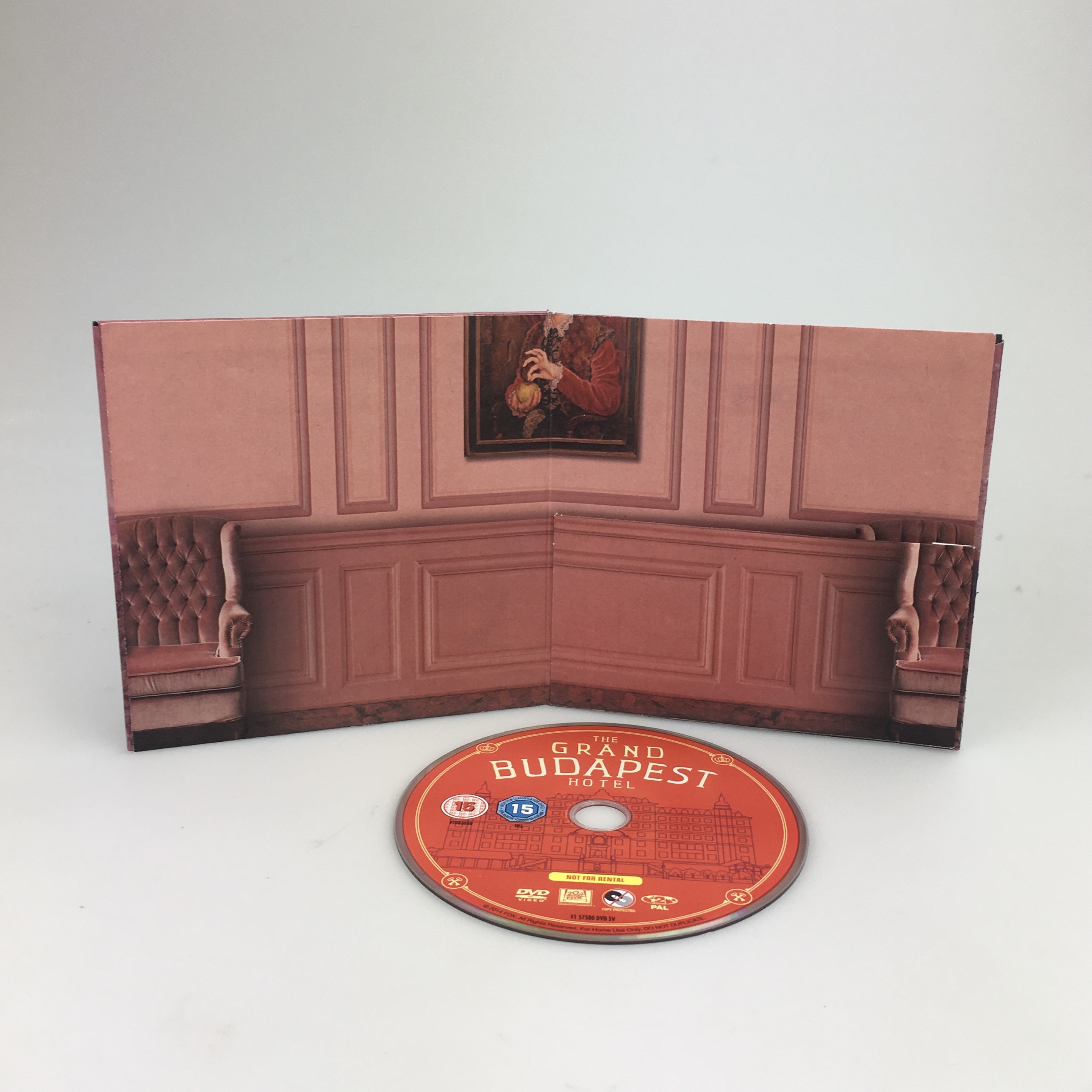
![The Grand Budapest Hotel]()
![Isle of Dogs]()
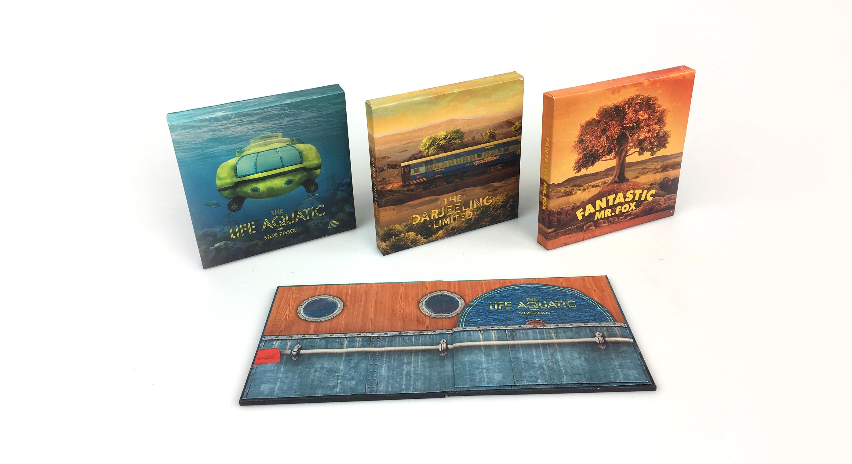
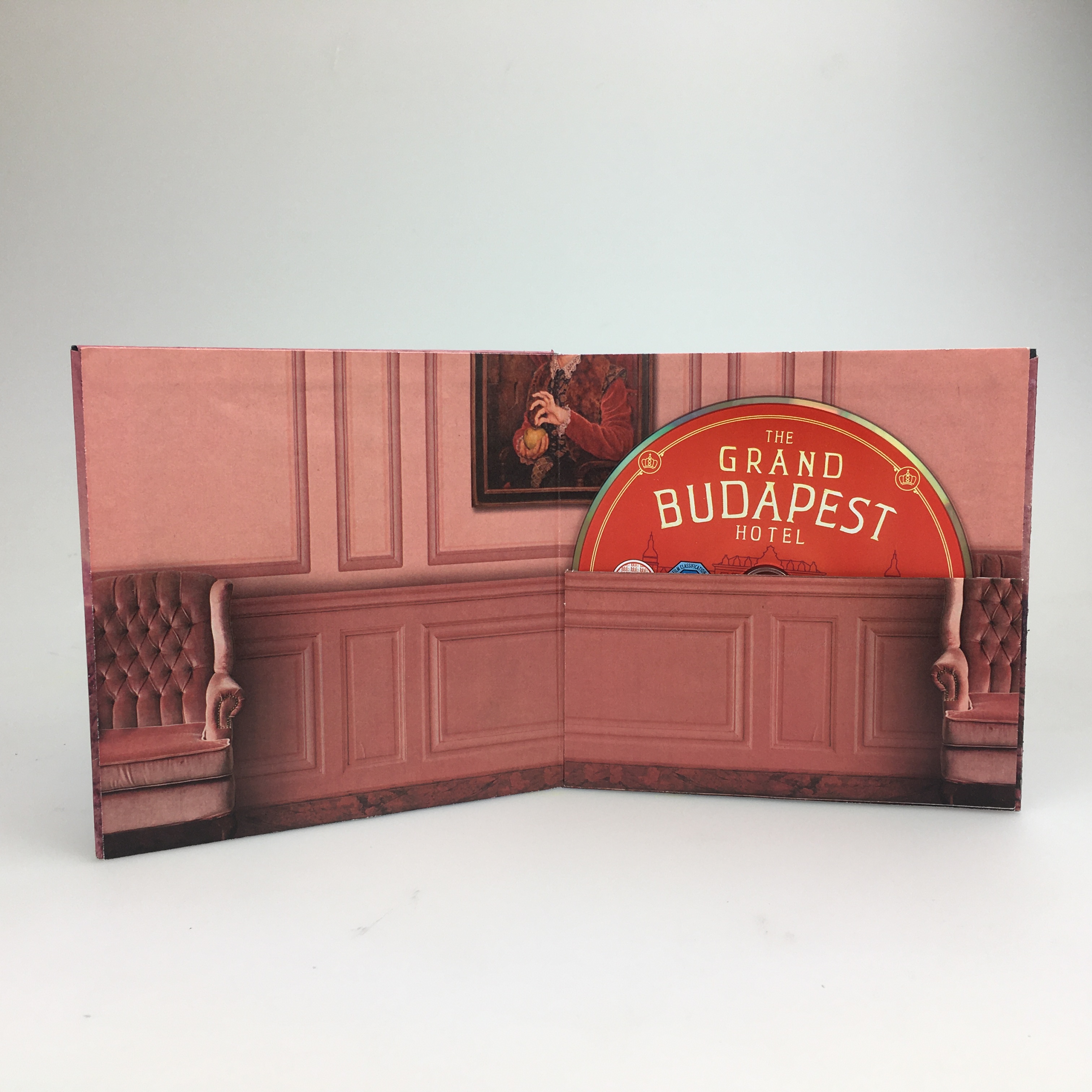
In each of the designs, I tried to hide a small detail that relates to each of the films. For Life Aquatic, there is a red beanie hat, the suitcase for Darjeeling, the paintings and a whack-bat for Fantastic Mr Fox, the Map for Moonrise Kingdom, Boy with Apple for Grand Budapest, and a Mayor Kobayashi poster (as well as Spots) for Isle of Dogs.
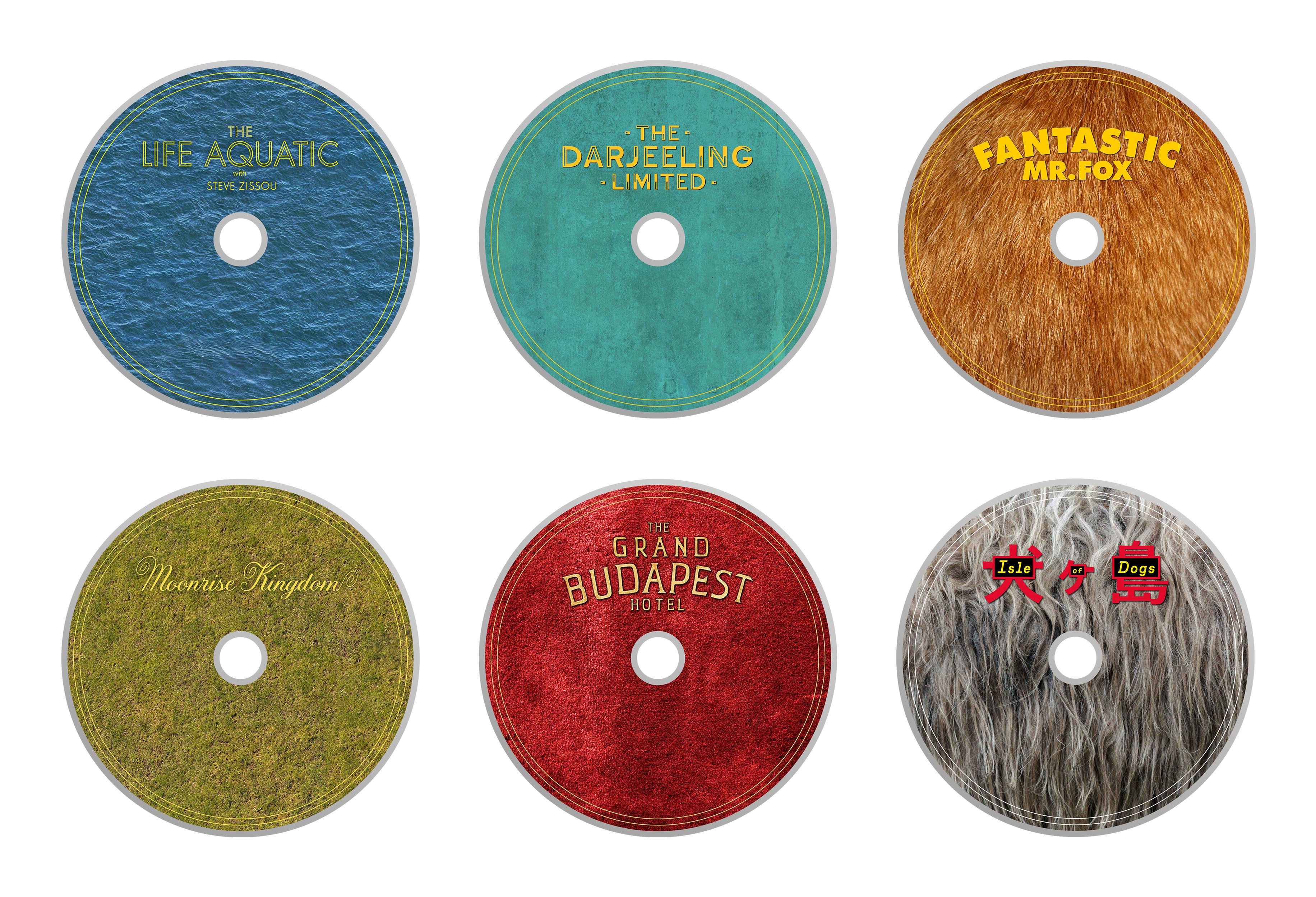
THE DISCS
The discs were a really simple design element to create, but I was really happy with how they looked, and I think the simple texture really elevated how they looked and matched with their relative case. Unfortunately I couldn’t physically print the designs onto discs, as I don’t have a printer capable of that, but for showcase purposes I’m happy using a paper cutout.
![]()
In the case, the discs would be housed in a small paper slip which they could slide in and out of. If you look at the interior case designs above, you will notice they all have a ‘split’ down the horizontal middle, whether it’s a difference in wood or a change in fabric. This was so that I could almost ‘hide’ the piece of paper that would hold the discs in place, and make them a lot less noticeable. I also think it has a nice effect only being able to see the top half of the discs. There’s something that makes you want to take it out and have a look at it. You can see this in the mockups below.
Below you can see the photoshop mockups I created to show how the designs work together. I feel the designs work really well together and are very complimentary of one another, and seeing them together really does make it feel like a complete set.
![]()
![]()
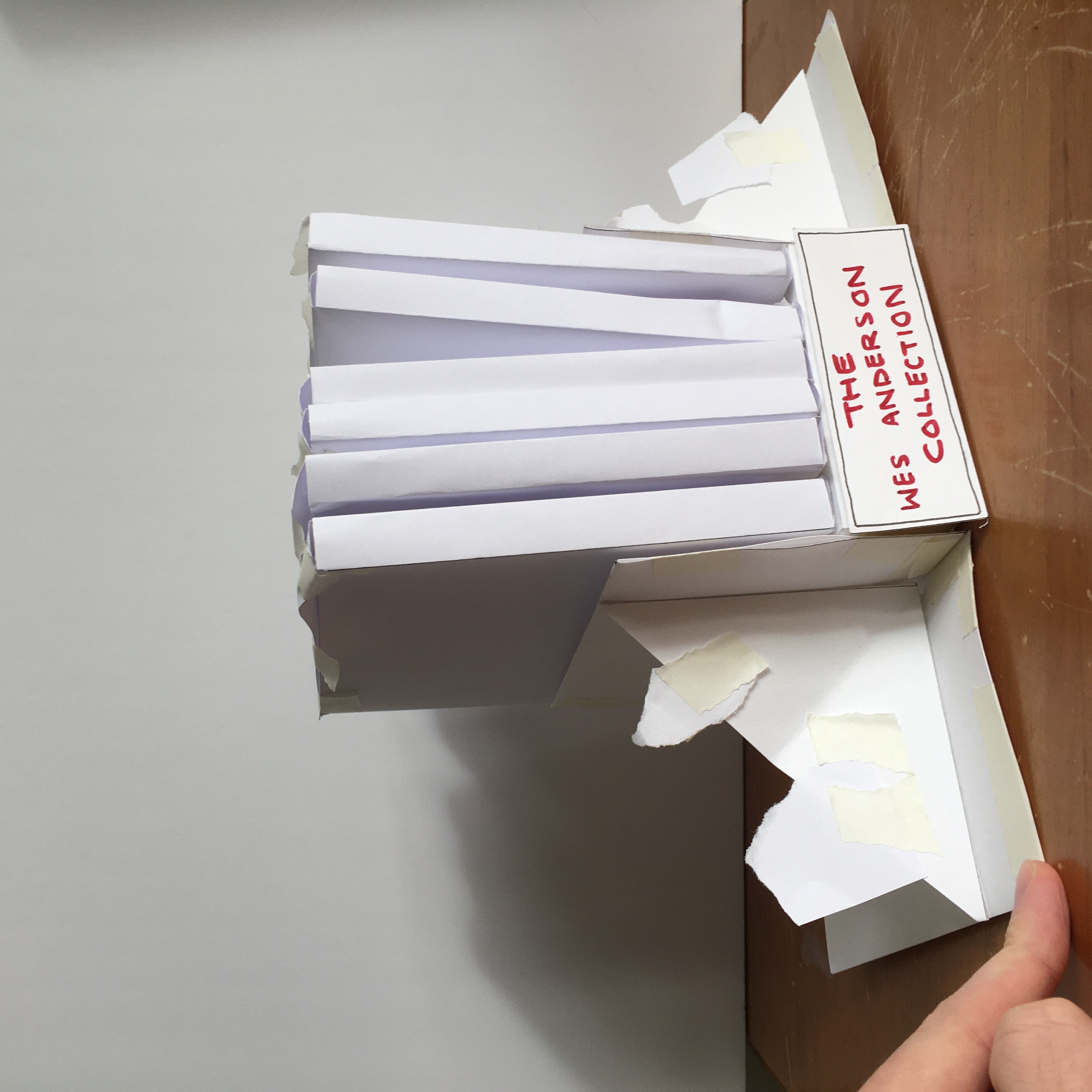
I made quite a large number of physical mockups for this project, as it required a lot of trial and error to get it right. Initially I ploughed ahead and made the first 4 films physically, only to realise that they were very flimsy and I needed to double up on the greyboard.
![]()
![]()
![]()
After the 6 were complete, I realised I wanted another outer box to hold the booklet case, so that the discs would not be able to fall out if they were held upside down. For this, I was able to reuse the designs I had created, I just had to rejig them in Photoshop first to refit the new template. The benefit of doing this was that the spine of each film would be significantly wider, and I could now have the name of each film feature on the spine (something I previously couldn’t do due to the thinness of each booklet case).
![]()
![]()
I then was finally able to move on to creating the outer box that would house the 6 films. I wanted something that, when opened, would leave the spines exposed, as I’d spent so long working on the designs they deserved to be shown off. This led me to creating a triangular design, where the lid would lift off and leave the top and front exposed. I felt this was a unique outcome and even though it was a slight amount of extra work to get the angles right I’m glad that I did it.
As for the material I would use on the outside? I initially almost went with some brown paper due to time constraits and deadlines, but I thought to myself:
“No. You know what? You’ve not spent months of your life designing this boxset just to cover it in some naff paper. Do something proper”.
And so I did. I bought some faux leather fabric material, and it was the worst thing I’ve ever had to work with in my life. Nothing I had would stick it to the greyboard. I tried wood glue, super glue, pva glue, fabric glue, double sided tape, it just wasn’t having it. In the final photos that I took that feature at the top of the page, I’d managed to get it to hold with the tape, but by the next day it had all peeled off again. It was a nightmare. It ended up sitting on my shelf unfinished for another few months after I finished uni because I was sick of it. I did eventually go back to it and manage to super glue the fabric into place. And it does look very nice. I’m glad I went out of my way to finalise the project nicely. But I’m also very glad it’s over.
![]()
THE BRIEF
RESEARCH
I had a delightful time doing research for this project, revisiting Anderson’s films and collating images that related to the films. Creating moodboards for the films was useful, even though it just reaffirmed what I already knew: they all have distinctive colour palettes. This meant I had quite clear guidelines for creating any imagery.
INITIAL IDEA - POP UPS
My initial plan for the project was to create a series of Wes Anderson ‘Pop Up booklets’, which housed the discs for the films. I felt like I wanted something that had a quirky uniqueness about it, in the same way that Anderson’s films do, and I was really interested in replicating this feeling through small pop up scenarios. I did a bunch of experimentations looking at ideas, and settled on the idea of having a location from each of his films be the ‘pop-up’.
CHANGING TACTS
CREATING THE EXTERIORS IN PHOTOSHOP
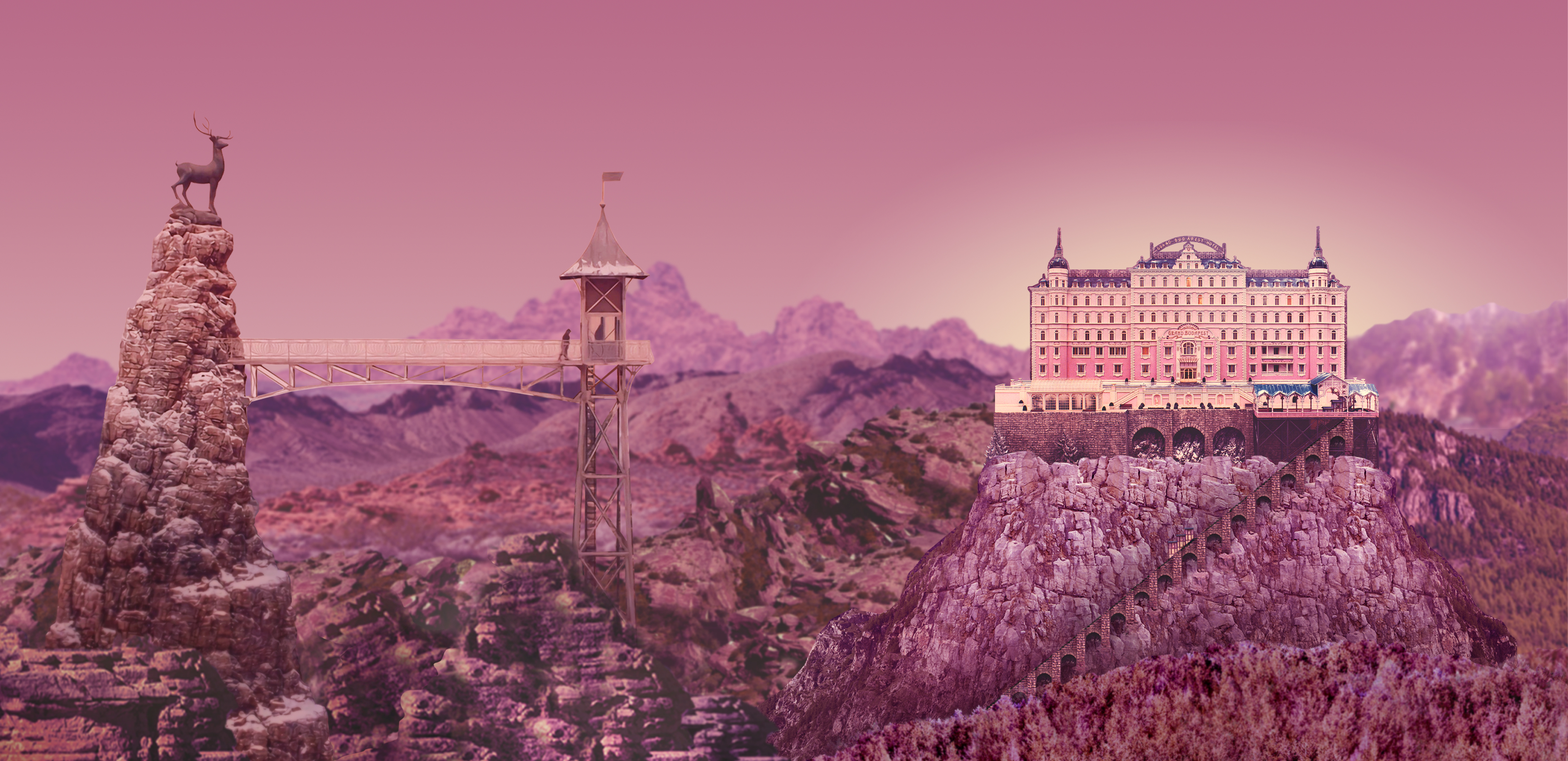
There are a few parts of the photoshop work that don’t work exceptionally well, such as the rocks on the left side compared to the large rock that the Hotel is situated on, but I also think that adds to the charm that the image holds. By accident, through the use of scale and blur, it almost feels like the image itself is a miniature model, and I’d managed to achieve the layered feel that I was looking for.
Anyway, below you can scroll through the ‘layered’ images that I ultimately created for each of the 6 films.

INTERIOR OF THE DISC BOOKLETS

In each of the designs, I tried to hide a small detail that relates to each of the films. For Life Aquatic, there is a red beanie hat, the suitcase for Darjeeling, the paintings and a whack-bat for Fantastic Mr Fox, the Map for Moonrise Kingdom, Boy with Apple for Grand Budapest, and a Mayor Kobayashi poster (as well as Spots) for Isle of Dogs.
THE DISCS
In the case, the discs would be housed in a small paper slip which they could slide in and out of. If you look at the interior case designs above, you will notice they all have a ‘split’ down the horizontal middle, whether it’s a difference in wood or a change in fabric. This was so that I could almost ‘hide’ the piece of paper that would hold the discs in place, and make them a lot less noticeable. I also think it has a nice effect only being able to see the top half of the discs. There’s something that makes you want to take it out and have a look at it. You can see this in the mockups below.
DIGITAL MOCKUPS
PHYSICAL MOCKUPS
After the 6 were complete, I realised I wanted another outer box to hold the booklet case, so that the discs would not be able to fall out if they were held upside down. For this, I was able to reuse the designs I had created, I just had to rejig them in Photoshop first to refit the new template. The benefit of doing this was that the spine of each film would be significantly wider, and I could now have the name of each film feature on the spine (something I previously couldn’t do due to the thinness of each booklet case).
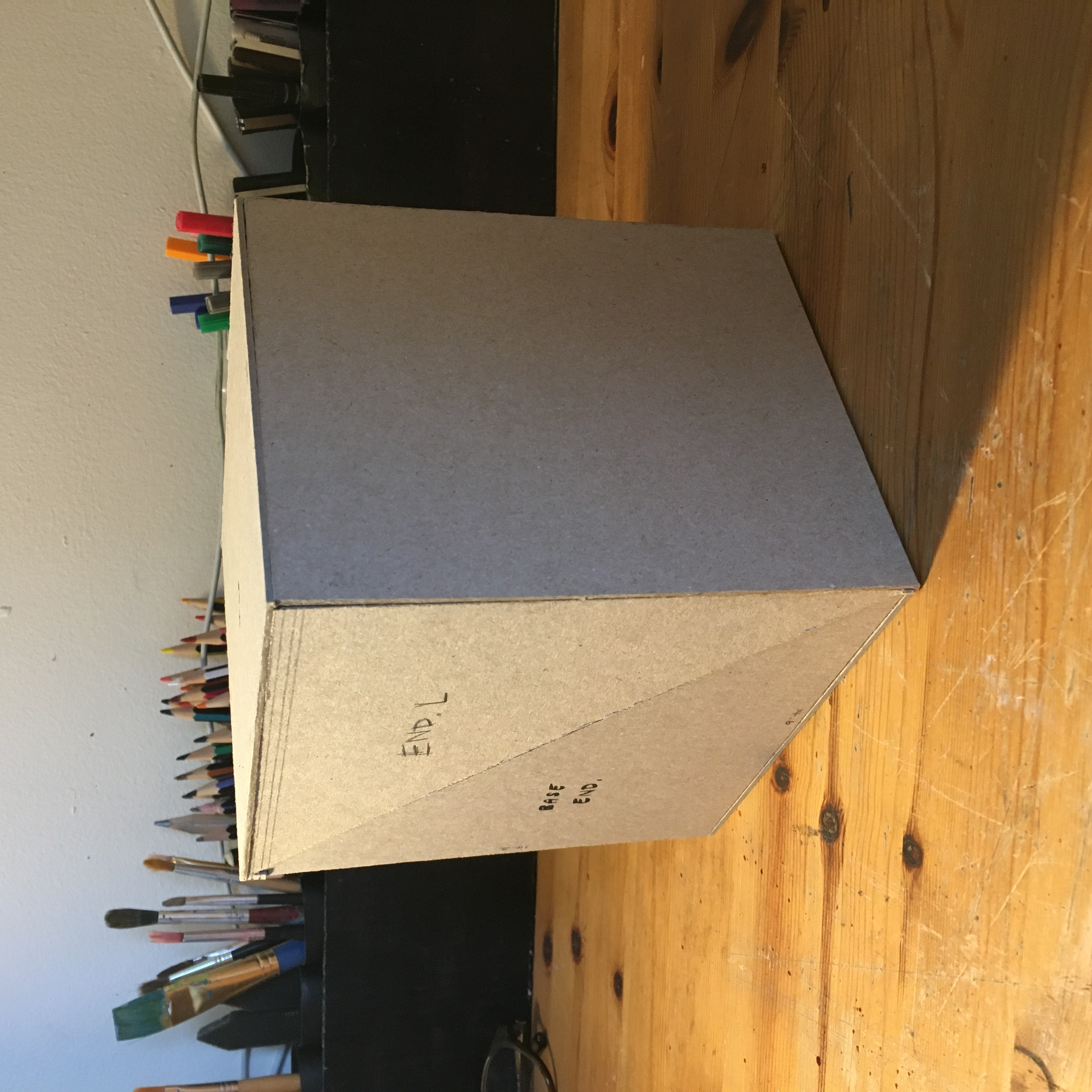
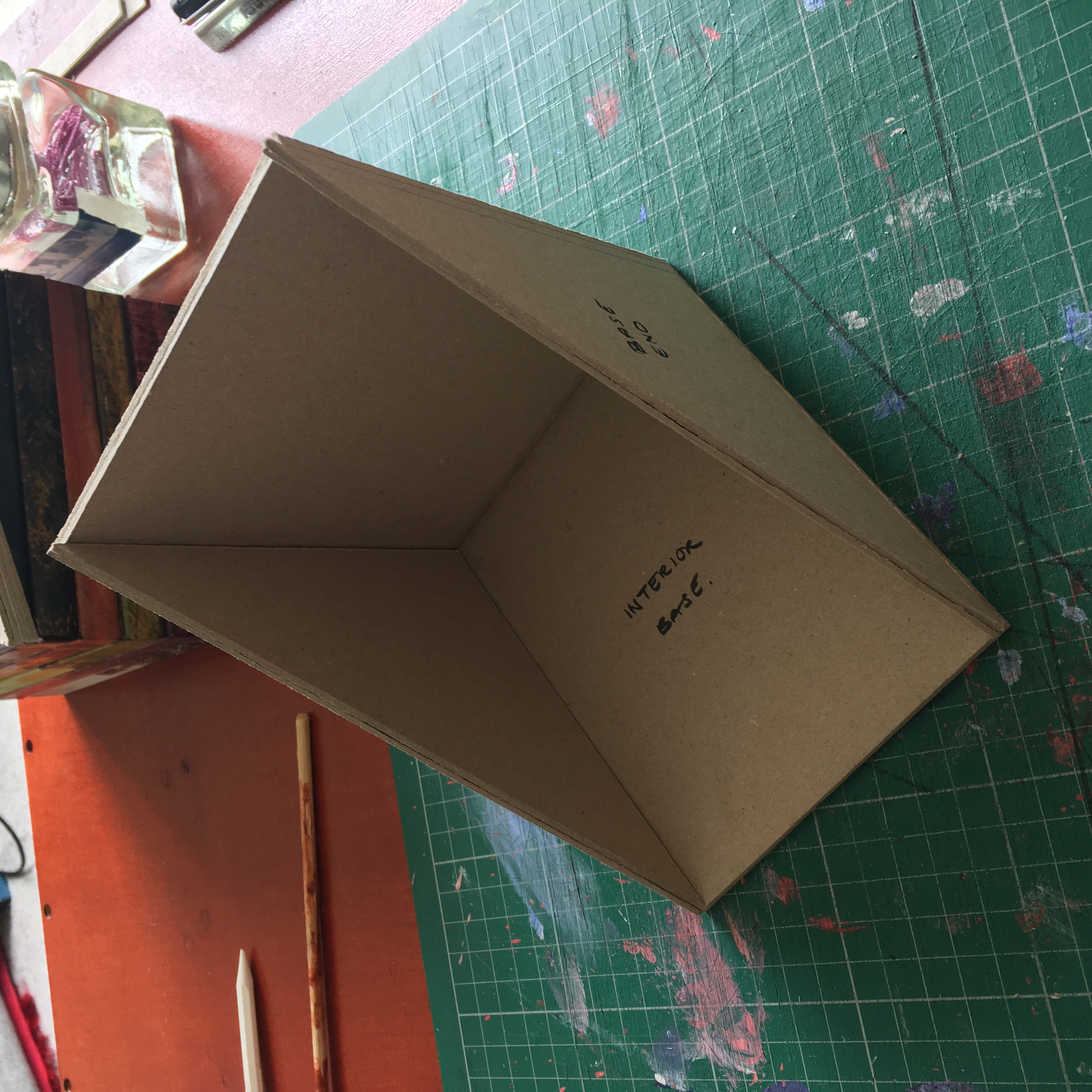
I then was finally able to move on to creating the outer box that would house the 6 films. I wanted something that, when opened, would leave the spines exposed, as I’d spent so long working on the designs they deserved to be shown off. This led me to creating a triangular design, where the lid would lift off and leave the top and front exposed. I felt this was a unique outcome and even though it was a slight amount of extra work to get the angles right I’m glad that I did it.
As for the material I would use on the outside? I initially almost went with some brown paper due to time constraits and deadlines, but I thought to myself:
“No. You know what? You’ve not spent months of your life designing this boxset just to cover it in some naff paper. Do something proper”.
And so I did. I bought some faux leather fabric material, and it was the worst thing I’ve ever had to work with in my life. Nothing I had would stick it to the greyboard. I tried wood glue, super glue, pva glue, fabric glue, double sided tape, it just wasn’t having it. In the final photos that I took that feature at the top of the page, I’d managed to get it to hold with the tape, but by the next day it had all peeled off again. It was a nightmare. It ended up sitting on my shelf unfinished for another few months after I finished uni because I was sick of it. I did eventually go back to it and manage to super glue the fabric into place. And it does look very nice. I’m glad I went out of my way to finalise the project nicely. But I’m also very glad it’s over.