morgan girvin
illustrator, maker and hermitinfo
about
contact
shop
illustrated work
wimmelbilder
film postersalbum art
maps
general illustrations
crafted work
hand crafted projects
big things
film boxsets
morgan girvin
illustrator, maker and hermithome > wimmelbilder > taskmaster wimmelbild
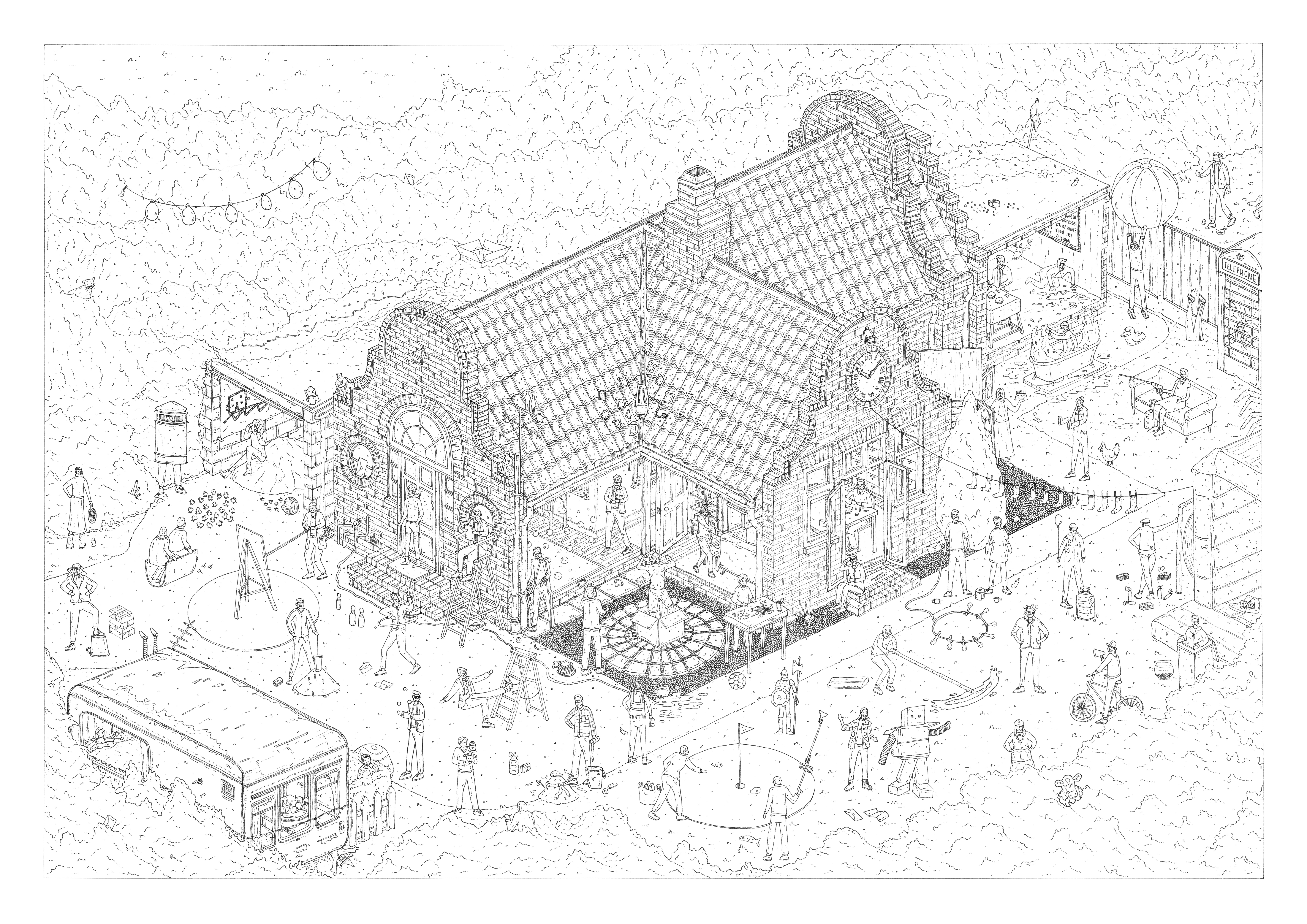

The Original Linework and the final Coloured Illustration
TASKMASTER WIMMELBILD
A2 / 0.05 & 0.03 Unipin Fineliners / April 2021
I knew going into this project that it would be a challenge, since I normally struggle with drawing people. It’s been a challenge trying to find a style that compliments the other types of things I illustrate, but I think I’m getting there. Needless to say, I was out of my comfort zone when it came to drawing the contestants, let alone 50 of them, but I think it served as a great exercise for myself and has helped me improve quite substantially.
PLANNING
The planning stage of the illustration was quite extensive. I knew going into the illustration that I wanted to draw each contestant in the midst of one of their ‘iconic moments’. Naturally, some moments in the Taskmaster community are downright infamous (i.e. Joe Wilkinson’s Potato Throw), but other contestants don’t necessarily have as much of a singular stand-out moment, and are instead beloved for a consistent vibe. Since I wanted to crack on with the illustration, and I didn’t want to rewatch the entirety of the show before starting, I enlisted the help of the Taskmaster Reddit community to help me identify different potential moments for different contestants. I set up a spreadsheet with every contestant and asked people to contribute different ideas for what I could do. I got a lot more responses than I expected, and without those people I’m not sure I could have made the drawing at all!
There was a lot of reference gathering before I could even start the drawing, such as finding photos of the contestants and trying to find a floorplan for the house (it was news to me that the lab is right at the back!).
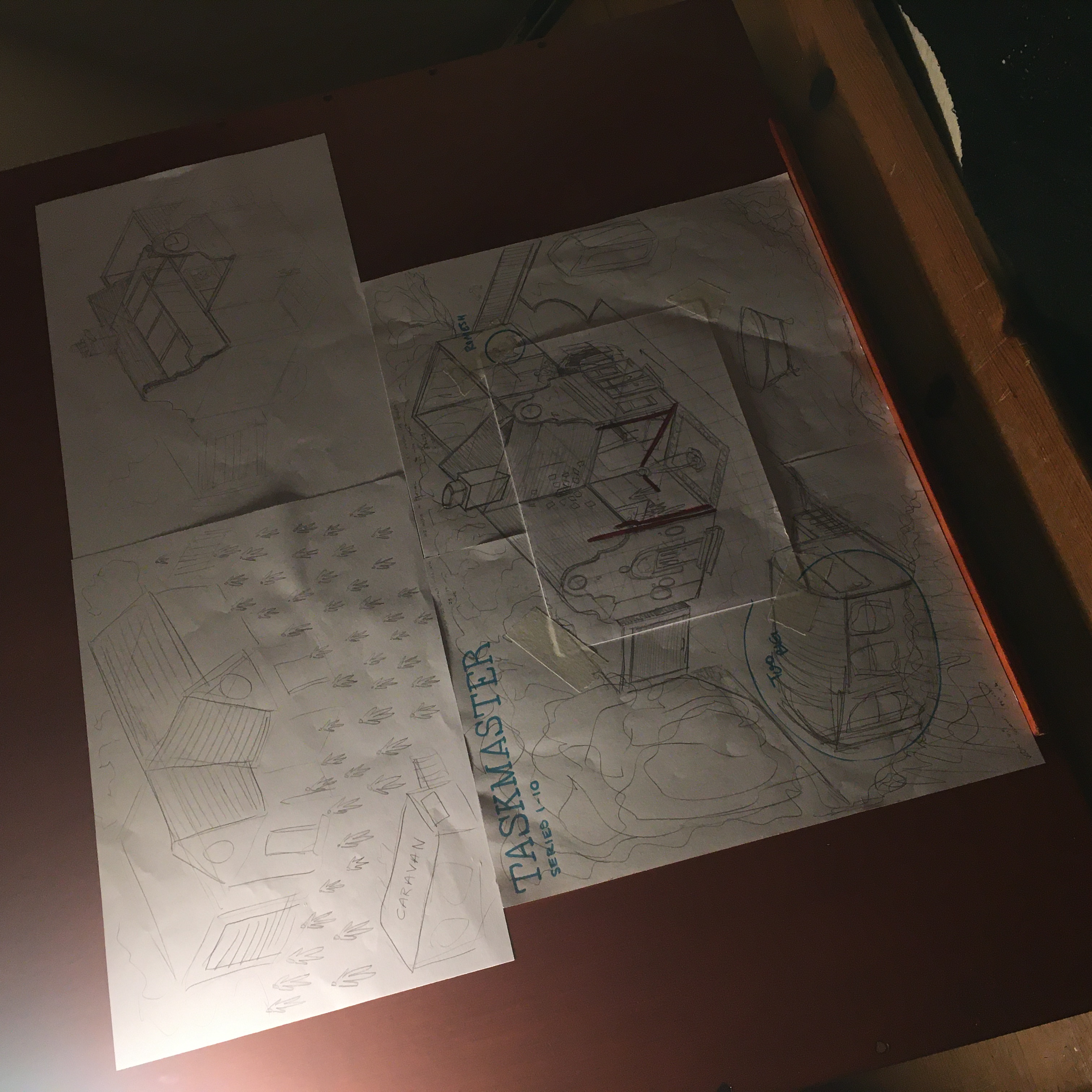
Then it was a case of roughly drawing the shape of the house, drawing out the contestants, and moving them around on the page. Some contestants were bound geographically, such as Romesh being in the lab scoffing down watermelon, but other contestants were able to slot in anywhere, so I started with the definitive ones and moved the rest around aesthetically.
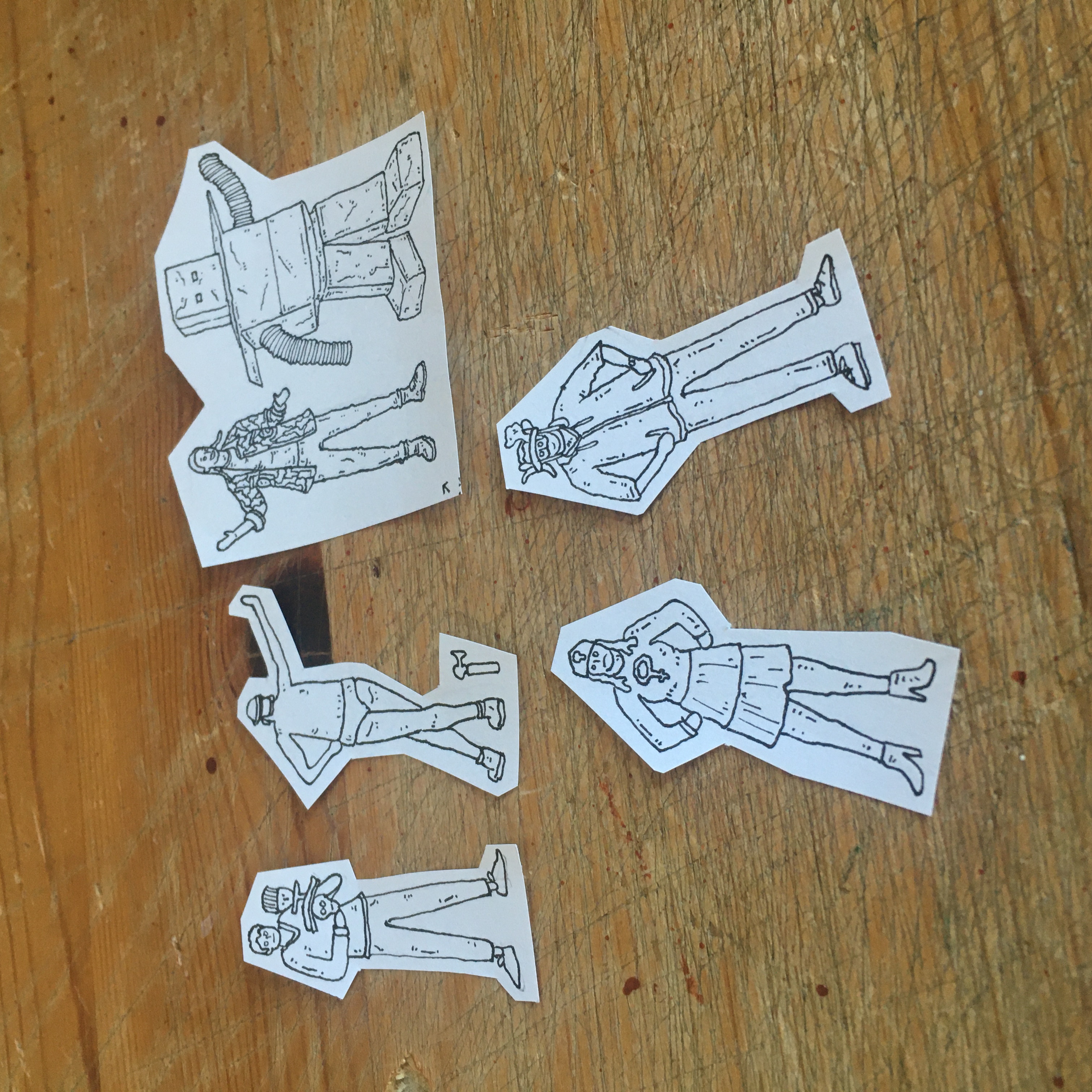
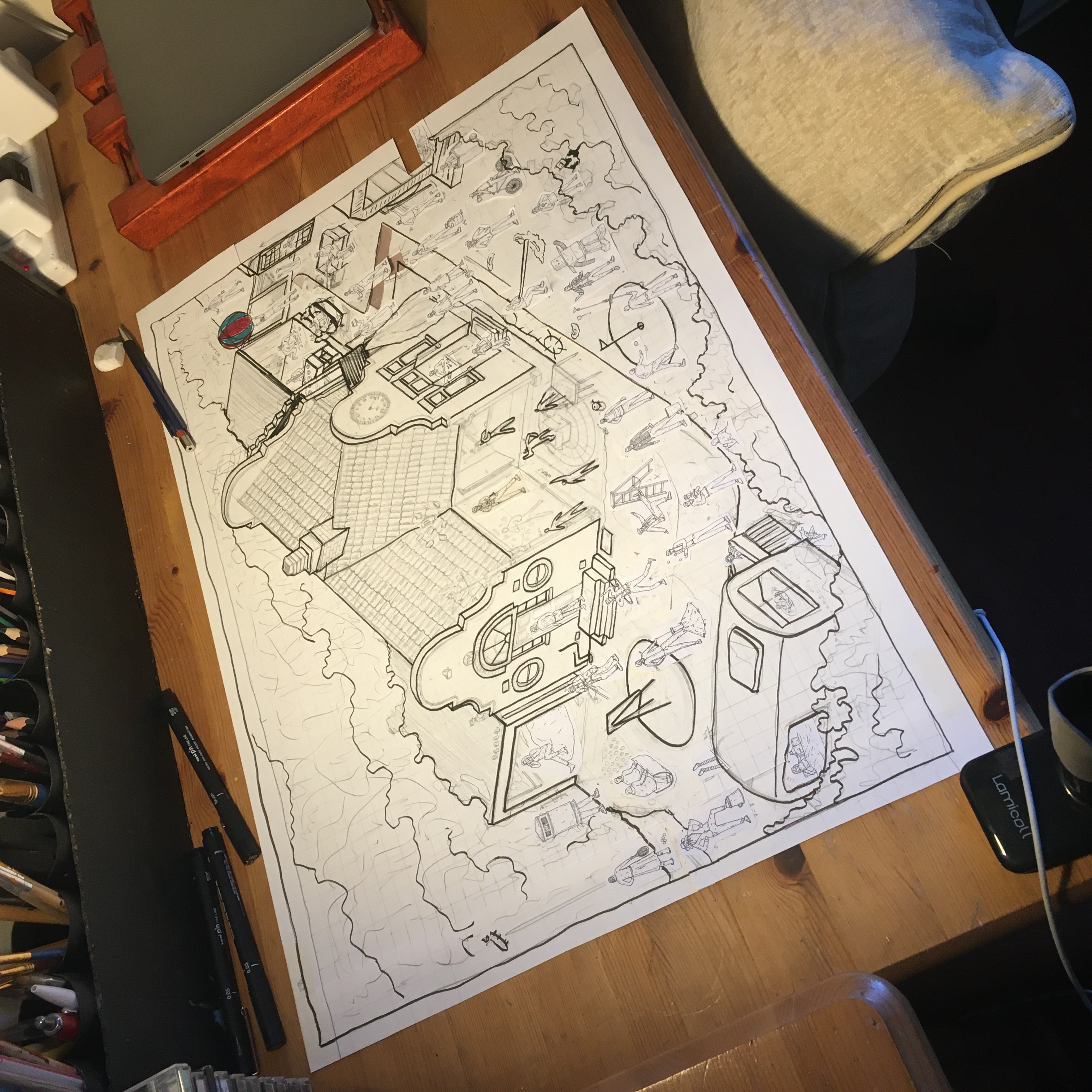
Whilst the rest of the drawing was done in rough pencil, the contestants were all drawn out properly on separate pieces of paper. I’m not confident in drawing people, and I definitely wouldn’t have been confident enough to just draw 50 contestants directly onto the drawing itself. It was also quite challenging trying to fit detail and likeness into the contestants when they were only about 1.5cm tall, but I am happy with how they all came out.
THE DRAWING
The drawing itself was a lot of fun to do! It was the first time I’d used the wooden drawing board that I had made, and it was also the first time I had filmed some of the drawing process (I haven’t yet done anything with the video footage as I don’t know how to present it, but if you want to check out the raw timelapse you can below!).
If you’ve got a vigilant eye, you’ll notice that the drawing here is different to the final one at the top of the page. When it came to colouring in the drawing digitally, I found that compositionally speaking there were aspects that weren’t the best (such as the giant block of bushes in the top left). So quite late into the process I made some tweaks that made the drawing feel more balanced.
THE COLOURING
Before I even started drawing the illustration, the first thing I did was create a colour plan in Photoshop, where I experimented with different colours by filling in the basic shapes on the sketch. This was the first time I had done this, and it was a really helpful step as it meant I could see what the final outcome might start to look like before I committed it to ink. It also allowed me to move the different elements around, for instance I realised that the house looked better if it was around 1.5cm lower than I had initially planned for.

It also sped things up a lot when it came to colouring the final scan. Even though it still took me 40 hours to colour, I felt like I had a leg up when starting since I had already explored the different colours I wanted to use. These did end up changing slightly by the time the illustration was finished, but it meant I didn’t have to faff about as I went along.
And then the final step was just adding the colour! I’m really happy with how this came out, and if you’re a fan of the show then I hope you enjoy finding all the small details.
If you’re interested in buying a print of this drawing, there are some available in my shop!