morgan girvin
illustrator, maker and hermitinfo
about
contact
shop
illustrated work
wimmelbilder
film postersalbum art
maps
general illustrations
crafted work
hand crafted projects
big things
film boxsets

morgan girvin
illustrator, maker and hermit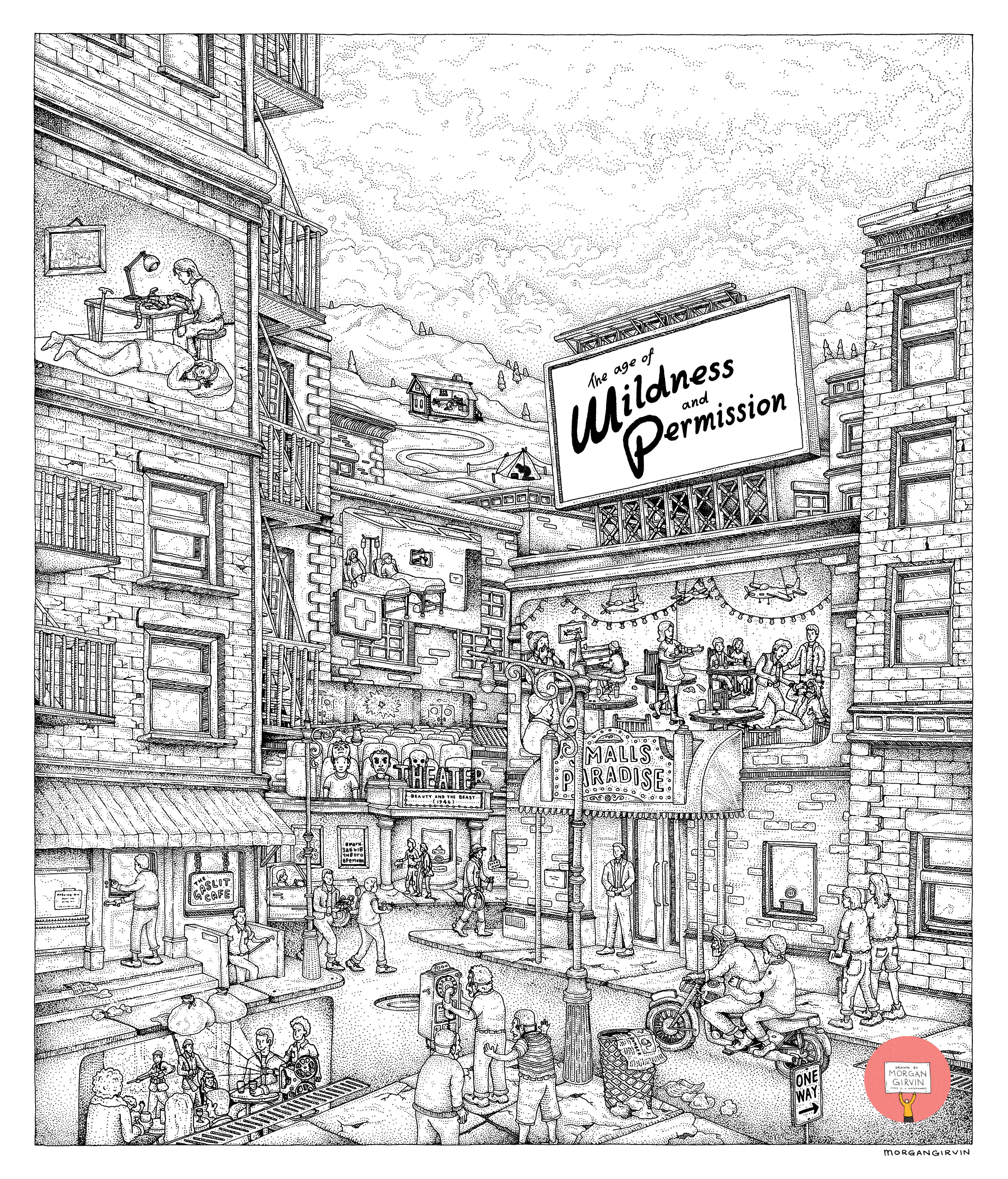
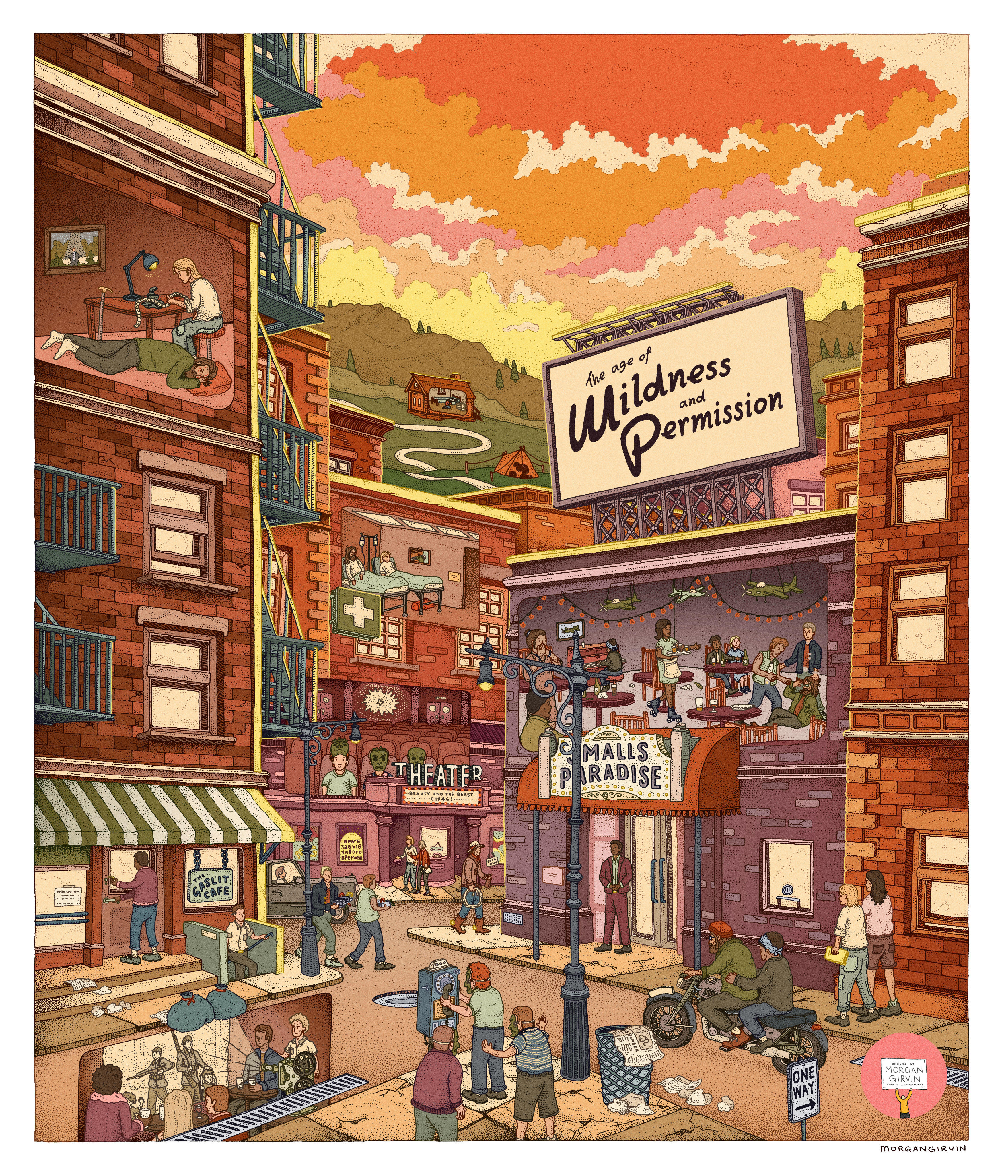
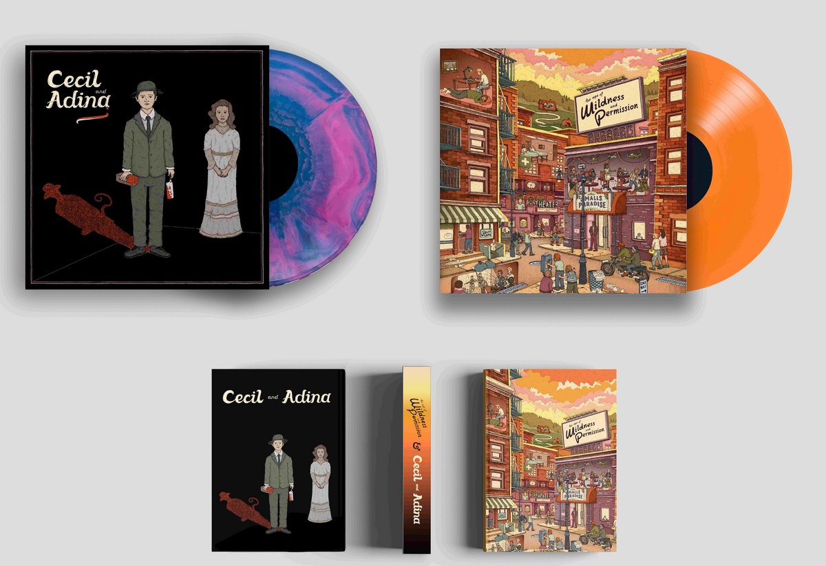
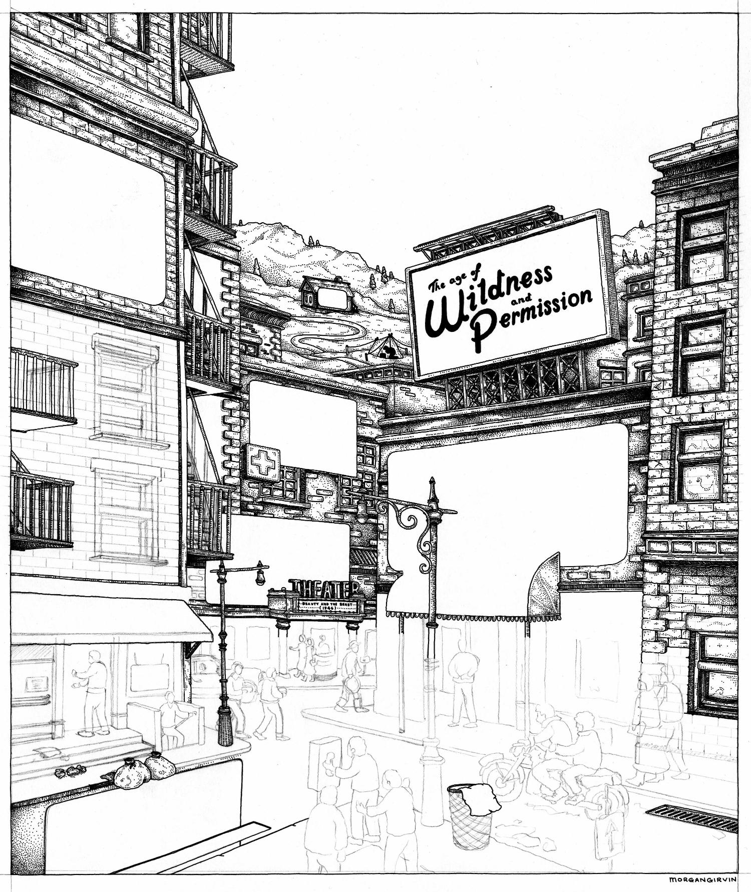
Both the original linework and the finished illustration I did for the cover of Richard Edwards’ new book/album The Age of Wildness and Permission, a joint project alongside Cecil and Adina
THE AGE OF WILDNESS AND PERMISSION
30x36cm / 0.35 rOtring Isograph / May 2024
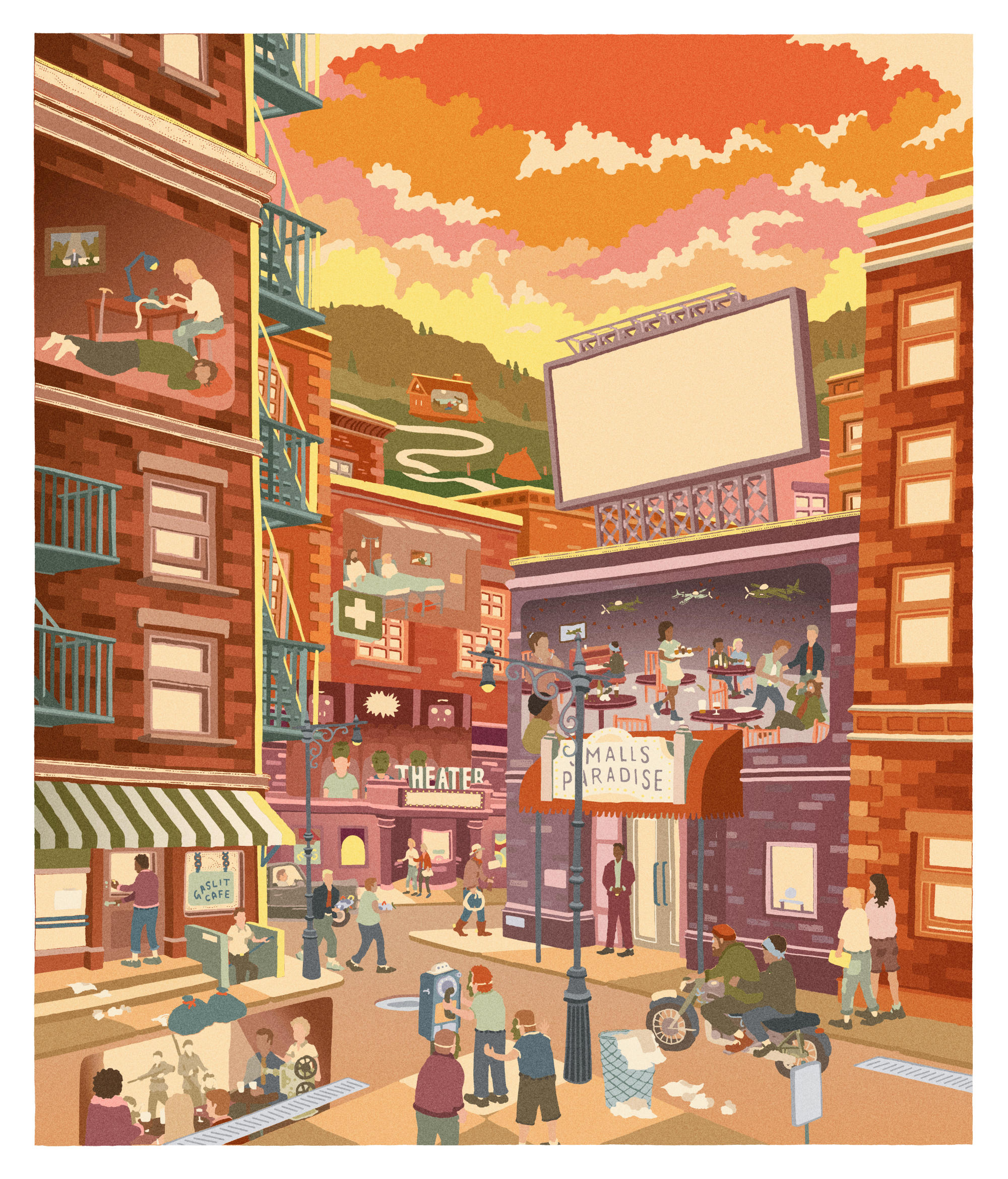
As part of Richard Edwards’ joint project The Age of Wildness and Permission & Cecil and Adina, I was fortunate enough to be asked to create 2 pieces of artwork, with this being the second that I completed. One of the great things about working with Richard is that he knew what he wanted. With some projects it’s nice to have creative freedom to do what you want - with others it’s nice to be pushed in a particular direction. With The Age of Wildness and Permission, there was a great mix of both.
The artwork had to serve a three-prong of functions. Centrally, the art was based upon a film script that Richard had written (entitled, of course, The Age of Wildness and Permission), and so it had to be reminiscent, and quasi-serve, as a film poster. But Richard also scored music to pair with the script, and so the artwork had to function as an album cover. He also compiled the script, development material etc into a book, and so the artwork had to function as a book cover.


[Above] The 3 formats of artwork: Original Drawing , Album Artwork and Book Cover
COMPOSITION
Having been provided a PDF document of the different details that we wanted to include in the artwork, I was initially unsure if I’d be able to get them all in the same frame in one continuous piece of artwork. It’s a wide-ranging story, described by Richard as:
However there are also elements of a story within a story, as Anne is writing a novel wherein a Russian woman has gone to sleep until her husband can recite a specific combination of 4 words that will wake her up. The narrative becomes intertwined, and it was elements from all these different fictions that would have to be present in the artwork.
I’d started trying to hash it out in a sketch, but was finding that due to the mish-mash of content (Russian house, tent, trauma centre, apartment building...) I was drawn to creating collage of elements, rather than one congruent landscape. Eventually, over the course of a couple of sketches, the drawing started to find it’s footing and I realised I’d be able to make it work.
"In 1956 New York, Anne Astrom falls in love with a French Radical against the backdrop of a bombing spree"
However there are also elements of a story within a story, as Anne is writing a novel wherein a Russian woman has gone to sleep until her husband can recite a specific combination of 4 words that will wake her up. The narrative becomes intertwined, and it was elements from all these different fictions that would have to be present in the artwork.
I’d started trying to hash it out in a sketch, but was finding that due to the mish-mash of content (Russian house, tent, trauma centre, apartment building...) I was drawn to creating collage of elements, rather than one congruent landscape. Eventually, over the course of a couple of sketches, the drawing started to find it’s footing and I realised I’d be able to make it work.
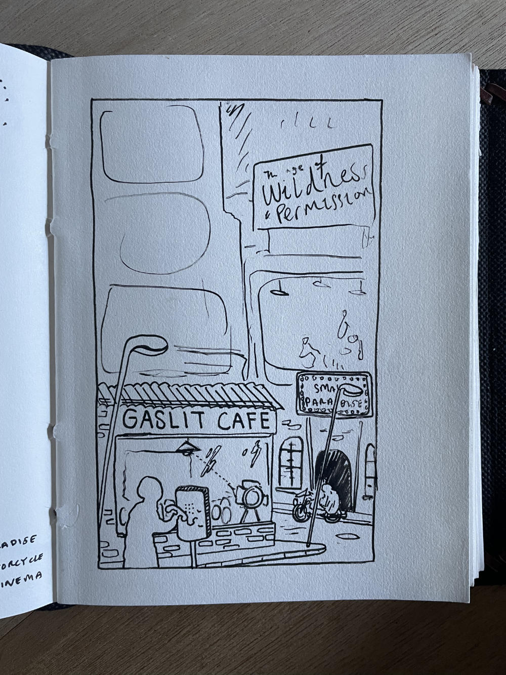

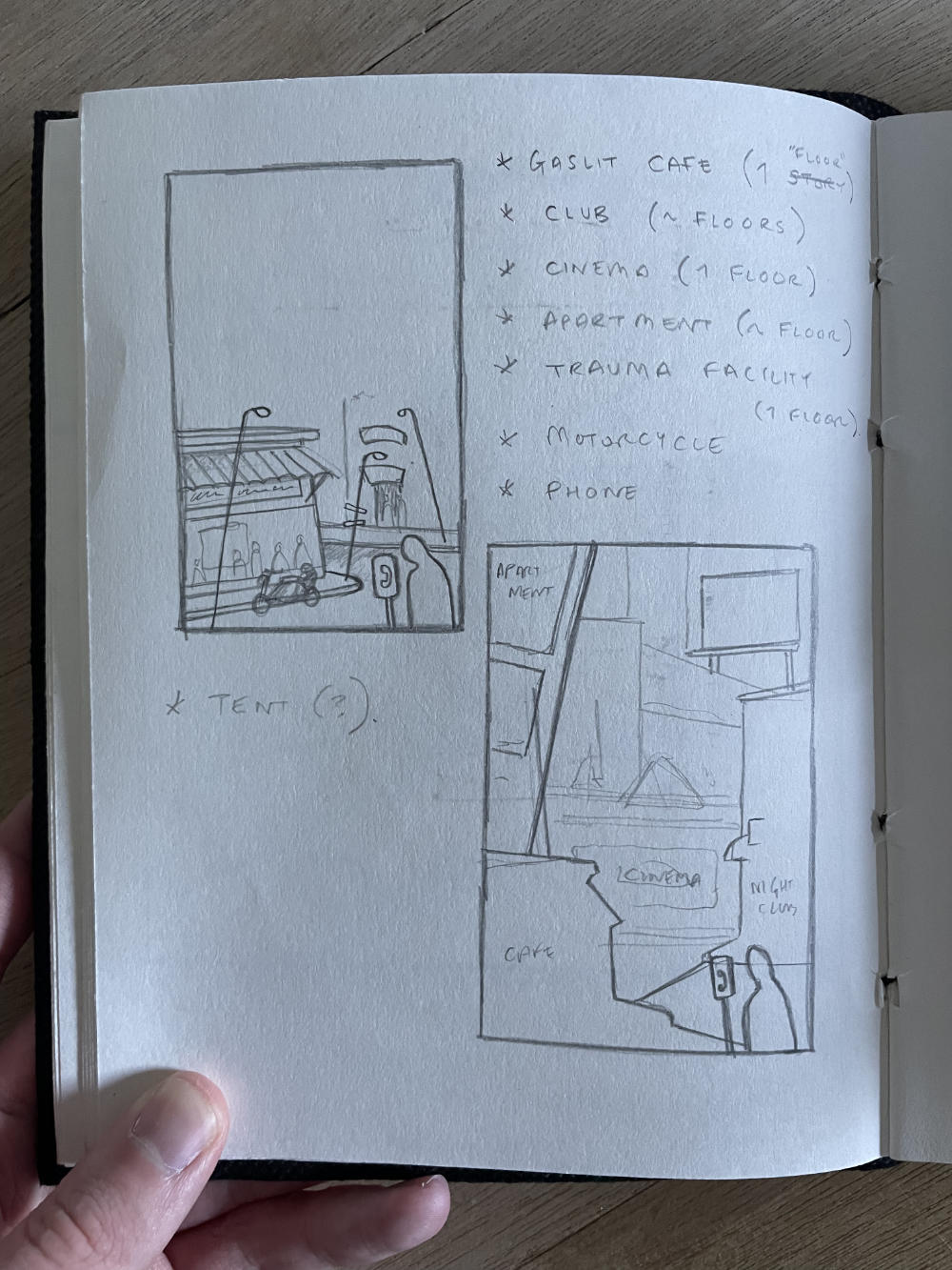
[Above] The progression of sketches for figuring out the composition
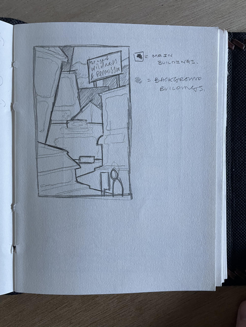
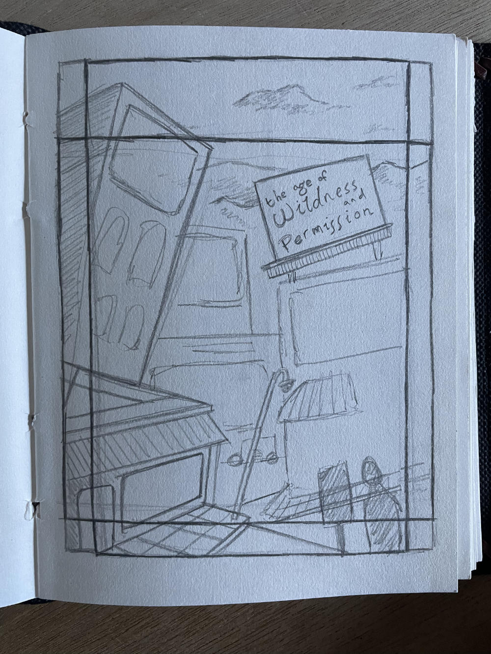
It’s an interesting conundrum I often find myself in when hashing out layouts. Working digitally offers a lot of freedom; you can draw elements separately and move them freely. And yet somehow it’s not rough enough for me. I need to be able to feel the pencil on the paper to find out where things are wanting to go.
In this case, however, the traditional sketching was only getting me so far. It was proving to be a very iterative process, and I was having to start a new sketch every time I wanted to tweak the layout. So I moved to doing something digital, and it was here where the layout finally started to come together.
In this case, however, the traditional sketching was only getting me so far. It was proving to be a very iterative process, and I was having to start a new sketch every time I wanted to tweak the layout. So I moved to doing something digital, and it was here where the layout finally started to come together.


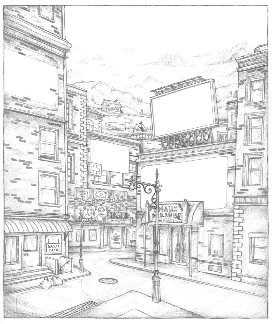
[Above] The refined layout, for both the album and book formats
It was also here where I realised I wanted to do ‘cut-away’ sections of the buildings. Part of my hesitation for capturing all the details in one landscape originally was the mixture of interiors and exteriors. An apartment over there, a nightclub over here, an underground club down there. I could try and place all these details behind windows, but I felt they were too important to be obscured by anything.
Then I remembered my Taskmaster Wimmelbild that I’d done a few years prior, and how I’d cut away some of the wall to show the inside of the building. It’s hardly a technique exclusive to me, and it’s used by a wide variety of illustrators, but it was only something I’d done once before and it was something I was keen to do again. This became the approach I’d take with Wildness and Permission, and would give me the freedom to show all those smaller moments without compromising them.
Then I remembered my Taskmaster Wimmelbild that I’d done a few years prior, and how I’d cut away some of the wall to show the inside of the building. It’s hardly a technique exclusive to me, and it’s used by a wide variety of illustrators, but it was only something I’d done once before and it was something I was keen to do again. This became the approach I’d take with Wildness and Permission, and would give me the freedom to show all those smaller moments without compromising them.

[Above] Example of the ‘cut-away’ I did in my Taskmaster illustration
SHAPING UP
With the layout semi-finalised, I was able to move onto actually developing the illustration. First port of call is back to traditional, and hashing out the more refined details. The shape of the lampposts, the bricks, the buildings et al. The main sketch was done on one sheet of paper, whilst all the details were done on smaller sheets. This was because:
a) Drawing people isn’t my forte, if something were to go wrong I could just draw it again, and not have to worry about erasing/ruining the rest of the sketch,
b) Working on smaller sheets meant that I could bring them on the train with me, and I’d spend my 15 minute commutes to work doing little bits here and there.
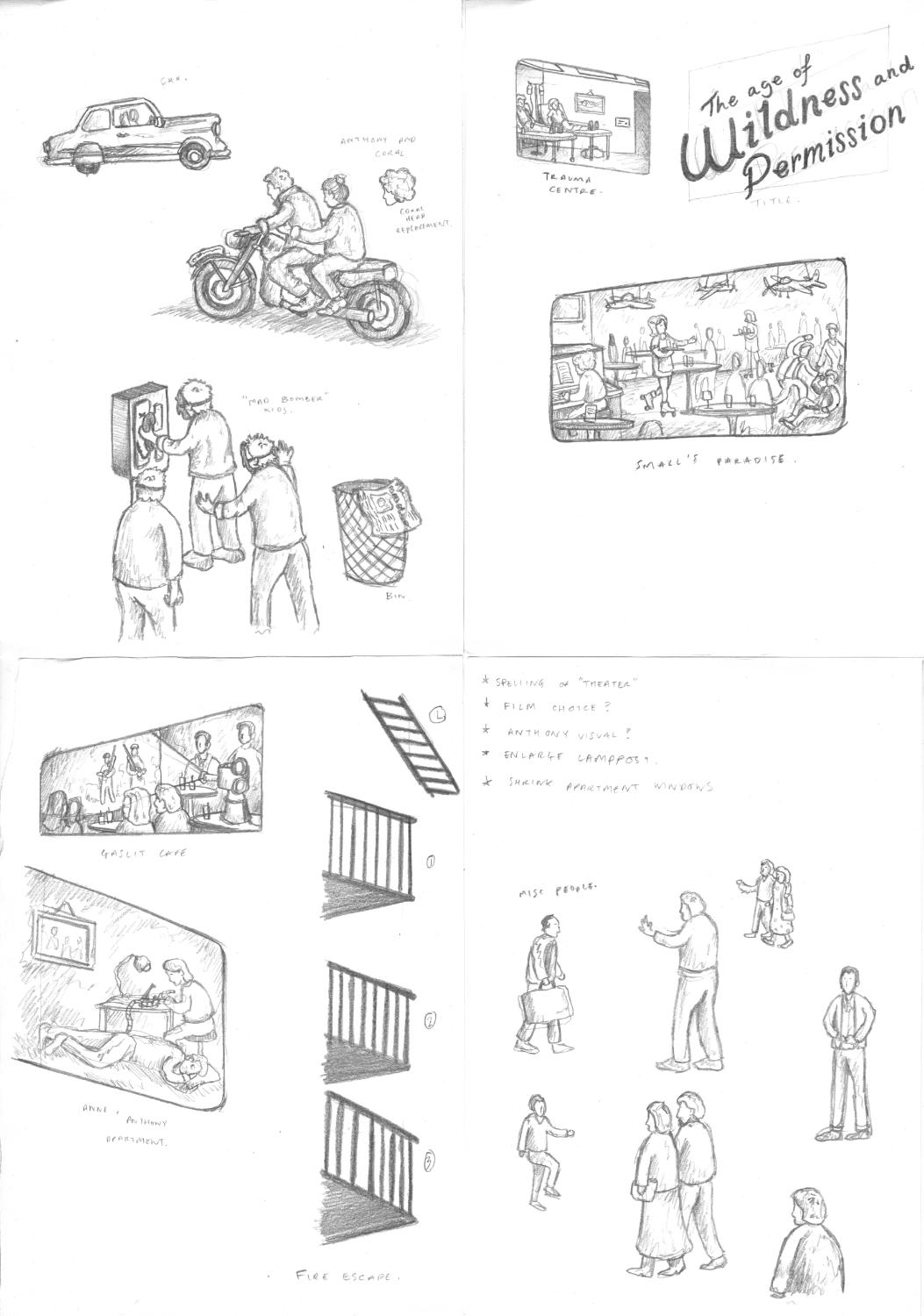

[Above] The base sketch, the detail sketch, and the digitally-combined sketch
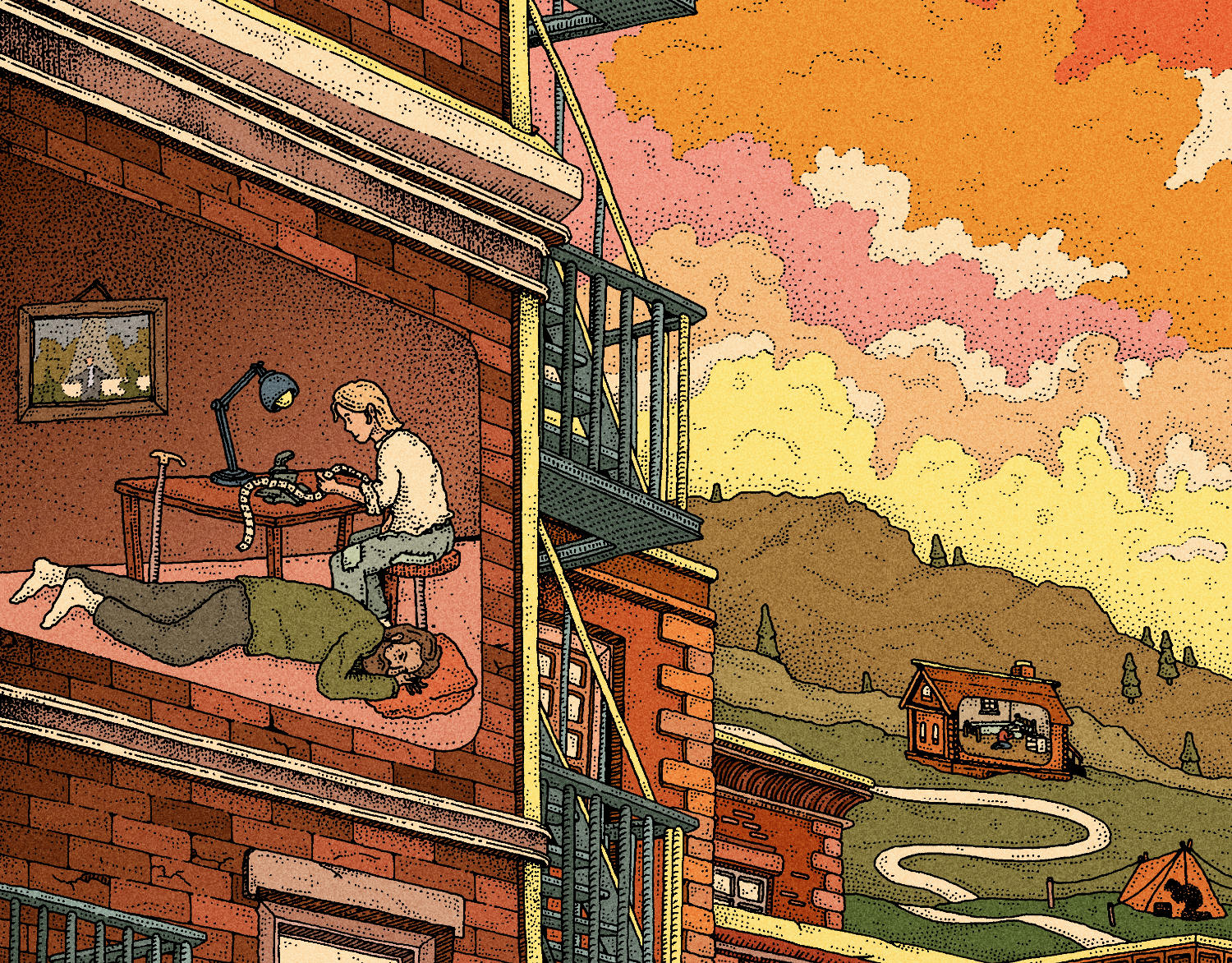
As is usual practice for me now, before I started the linework I wanted to figure out the colours. Richard said he was thinking “fall colours” and so that’s what I went with. It took a few tries to get things balanced, but at this point I was getting excited about how it was shaping up.

[Above] The rough colour plan before starting the linework
The main benefit I’ve found for doing the colour plan before hand is that, occassionally, it might influence how you go about the linework. In this case, that presented itself through the clouds in the sky.
Something I’d considered was adding colour to the linework (more on this further down). Most particularly, I felt this would give me more freedom when it came to adding detail to the sky. Often, if I’ve wanted to draw clouds, I’ve felt the sky becomes bogged down with black.
![]()
If you look at this piece I did from 2022 (entitled Hills), the line of cloud is absolutely solid. This isn’t a bad thing, it’s an aesthetic I quite like, but it’s also very limiting. And so I knew this time that if I was going to colour the linework, I wouldn’t have to hold myself back from adding ink to the sky.
Something I’d considered was adding colour to the linework (more on this further down). Most particularly, I felt this would give me more freedom when it came to adding detail to the sky. Often, if I’ve wanted to draw clouds, I’ve felt the sky becomes bogged down with black.
If you look at this piece I did from 2022 (entitled Hills), the line of cloud is absolutely solid. This isn’t a bad thing, it’s an aesthetic I quite like, but it’s also very limiting. And so I knew this time that if I was going to colour the linework, I wouldn’t have to hold myself back from adding ink to the sky.

[Above] Scans of the linework from different stages of completion
Just like with the pencil sketch, I opted to draw a lot of the ‘cut-out’ sections on separate pieces of paper. I love to capture everthing in one singular drawing, often to my own detriment, but I felt in this case it would be easier (and there would be less pressure to get it right) if I drew them on their own and composited them digitally.
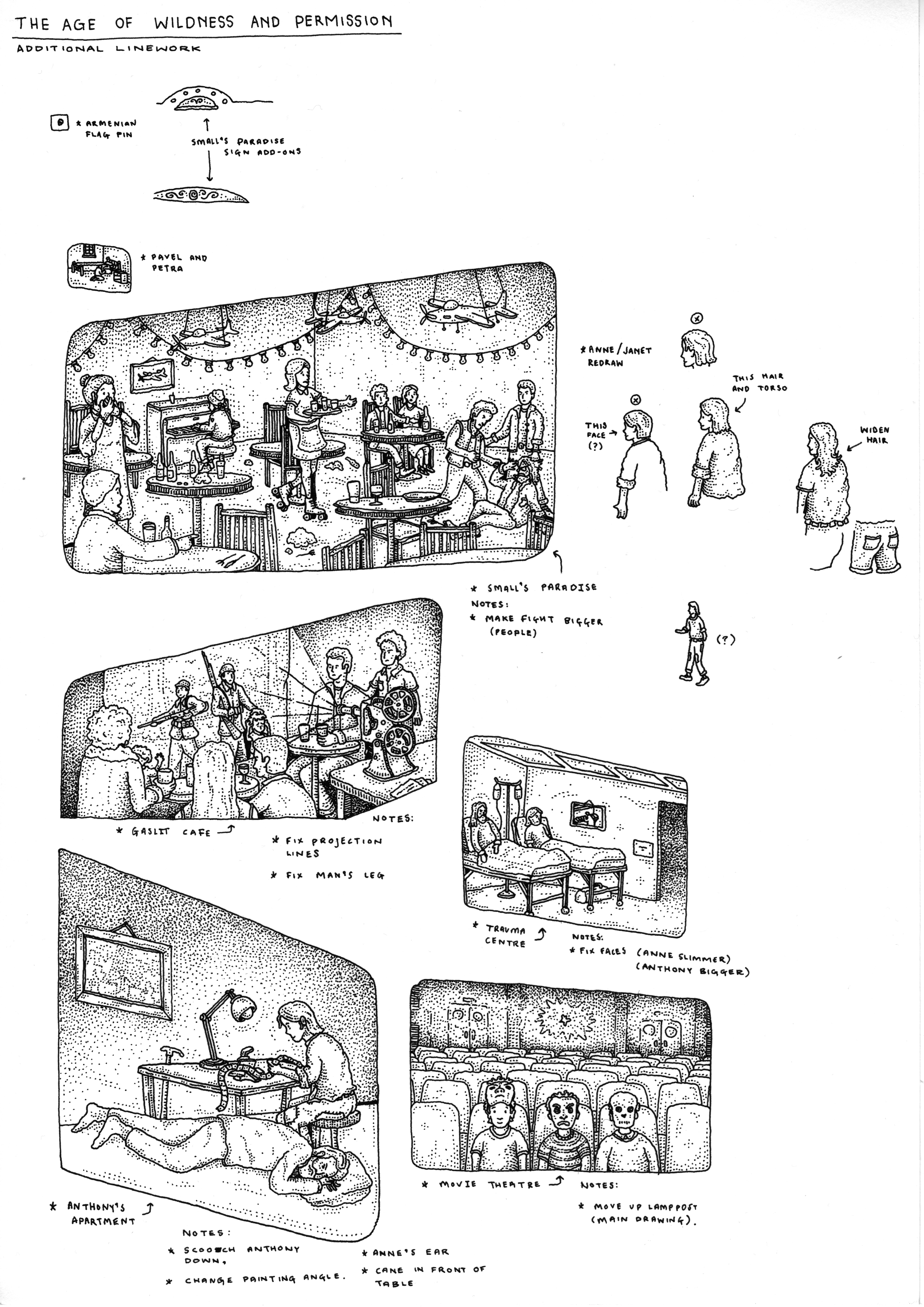
[Above] The additional linework that would be composited into the final piece, including a few bits that needed fixing/changing, and the finished linework
COLOURING
Since I’d figured out the colour plan, the colouring was quite a straight-forward process. I did, however, wind up colouring a lot more of the linework than I initially anticipated. As a process, this is probably only slightly less time-consuming than the main colouring itself, and so it’s roughly twice the workload that I dumped on myself. I am however very happy with how it came out, and I think the softness of the coloured lines works very subtly to bring the artwork to life.

[Above, Left] Black Linework [Above, Right] Coloured Linework
If you’re ever curious to see how the artwork looks without the linework, or seeing how the coloured linework looks on its own, well boy do I have a treat for you! They don’t really serve any purpose, but I think they’re interesting to look at. Especially since I often share the linework without the colour - it might be fun to share the reverse.
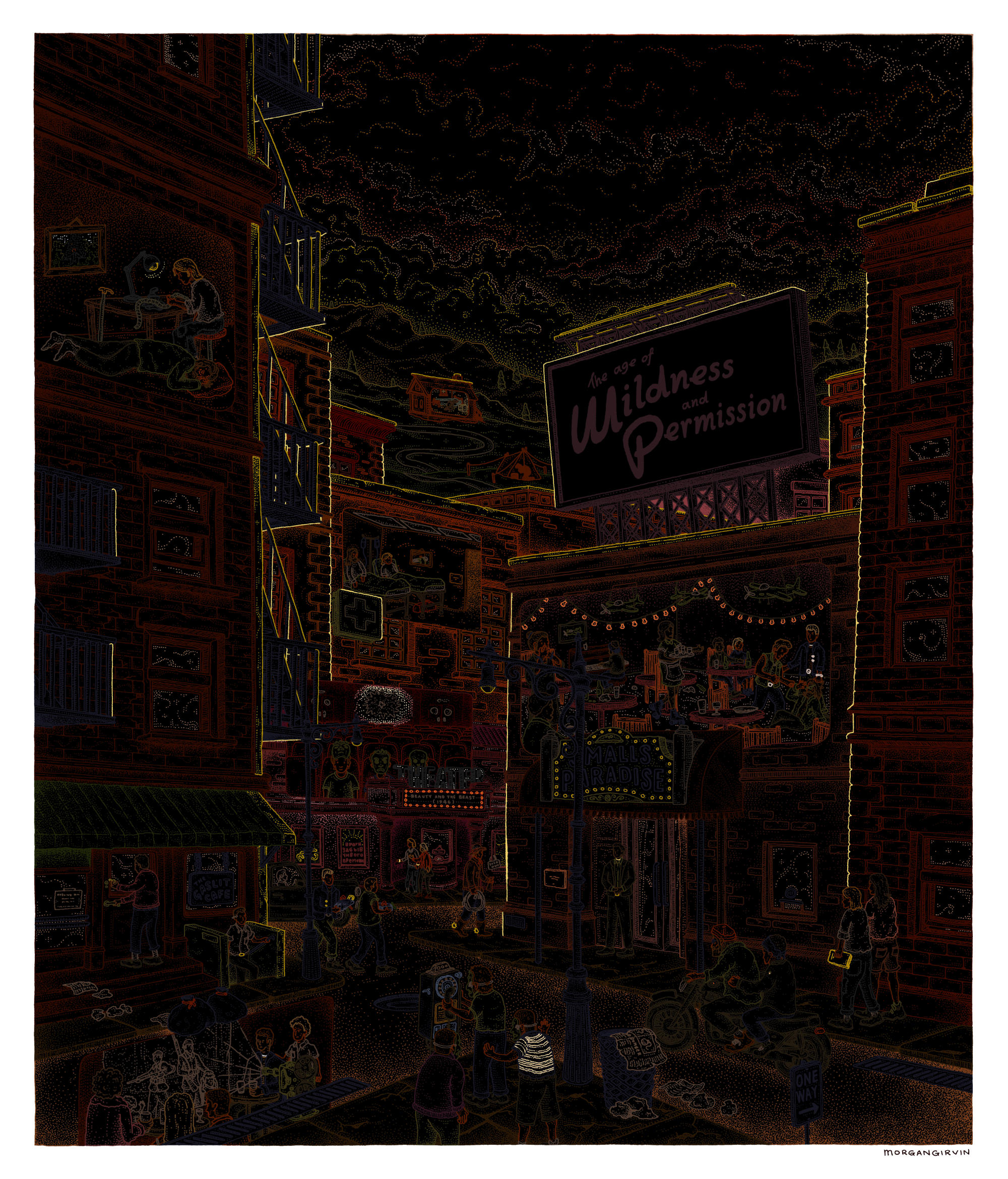
[Above, Left] Coloured Linework [Above, Right] Colour sans Linework
And that just about does it! I had a lot of fun working on this project and I’m really happy with how the artwork came out. Beyond that, I’m thrilled to have worked on such a unique and passionate project in general. There’s also a smaller write up for the sister illustration, Cecil and Adina, if that tickles your fancy, and below you can see how both pieces of art sit within their intended spaces!
Pretty good if you ask me.
Pretty good if you ask me.