morgan girvin
illustrator, maker and hermitinfo
about
contact
shop
illustrated work
wimmelbilder
film postersalbum art
maps
general illustrations
crafted work
hand crafted projects
big things
film boxsets
morgan girvin
illustrator, maker and hermithome > wimmelbilder > Welcome to Goo Lagoon
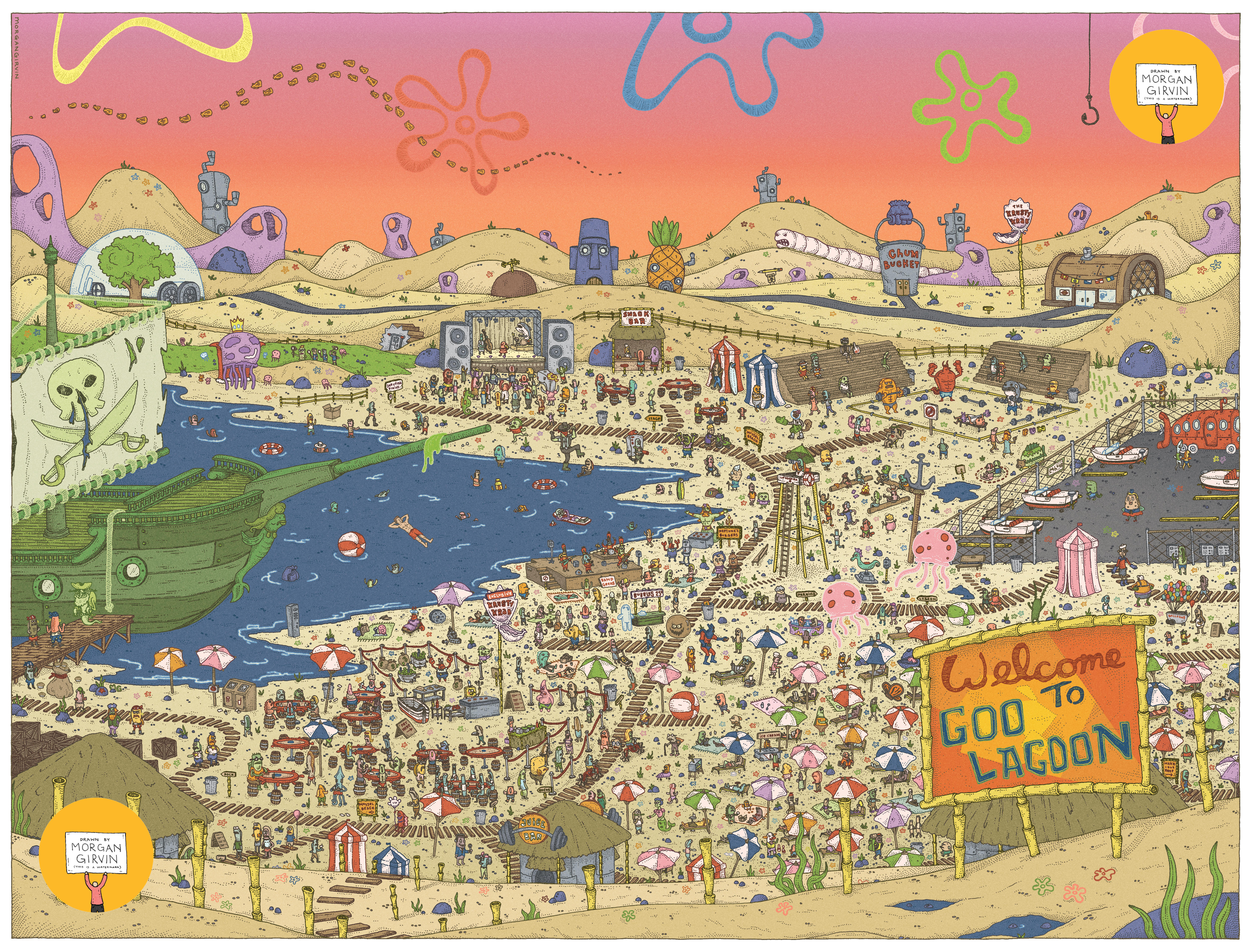


The Final 18x24” Illustration, as well as the night-time colour variant and the Original Drawing
WELCOME TO GOO LAGOON
18x24” / 0.35 rOtring Isograph / February 2024
PLANNING
There was a lot of prep work that went into this one, specifically trawling through a list of the episodes and making note of anything I could reference. For anyone unfamiliar, the first 3 seasons of the show (and the movie that follows) are generally considered the ‘Golden Era’ of Spongebob material, and this is the period that I’m most familiar with. So that’s what I decided to work with. There are probably a whole cohort of characters that have been introduced in the seasons since then, but I felt I’d have enough on my plate if I just stuck with the early episodes that I was (oh so) familiar with. When scrolling through the aforementioned list, I found I was able to recall most of the stories pretty easily and thus knew what I wanted to include as Easter Eggs. There were a few where I had to read the plot synopsis, but thankfully not so many that it became overly time-consuming.
In the illustration I did, there’s references to quite a lot of those early episodes, but not every single one. Some episodes felt like they didn’t have anything visually exciting that I could take from, and others I didn’t want to just shoe-horn in for the sake of it, so I tried not to beholden myself to the idea of referencing every single one. If you want to spoil yourself for what I chose, and what was left out, I have a Google Spreadsheet here that you’re welcome to peruse!
DEVELOPMENT
The first step I took was to just create a (very) rough composition layout for how I wanted the piece to look. I knew that, since there would be a lot of characters, I wanted the environment to be some form of ‘neutral’ area. I could have situated all of the characters outside of The Krusty Krab, but I didn’t want to give that area any precedence over the other locations (Spongebob’s house, Sandy’s Treedome, The Chum Bucket etc).

In thinking about what I wanted the piece to look like, I was inevitably reminded of ‘Where’s Wally’, and in particular I thought about the one with Wally on the beach (as I’ve shared above). And that was it! The characters would be in Goo Lagoon - with all the key locations being given equal precedence in the background. So the first step was to just create a very rough composition that got the general vibe/location of the piece across.

Being at the beach (or Goo Lagoon) also presents a solid narrative thread that I think is pretty important for a piece like this. Clearly it’s a warm day, and all the characters have come to the beach to make the most of it. If I’d gone forward with having the characters be somewhere at the Krusty Krab I might have had to create some event to give a logistical and narrative reason for why everyone had gathered there, and that would have vetoed the idea of ‘neutrality’ that I wanted. I’m sure most people don’t think that heavily about the artwork I produce, but I believe that the work is built upon the small details. And without those in place it would just crumble.
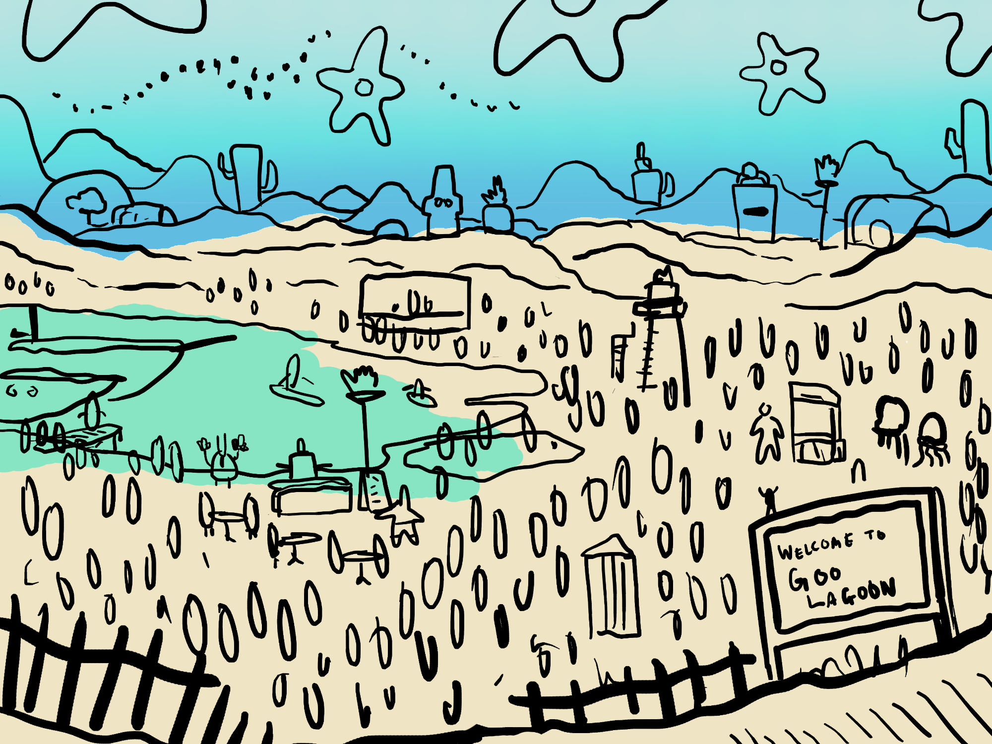
Once I had the general vibe sorted, I began to refine the linework - ever so slightly. Ha! That’s a bit of a stretch. Even though this next plan still looks incredibly messy, it was important for starting to nail down the location of some of the bigger pieces of the illustration: The Flying Dutchman’s Ship, the stage performance, the ‘Welcome’ sign, placement of Spongebob etc.
I then just jumped straight into the developed pencil sketch; from here I would use this as the basis for the linework. I often find trying to plan things out digitally quite tedious. It’s useful for the rough broad strokes, as you can create as many variations as you like very quickly. But as soon as it comes down to actually hashing out the details it feels so much easier to work with a pencil. The developed pencil sketch was drawn at A3, which I then scanned in, cleaned up, printed out on 4 x sheets of A4, and taped together to make one A2 illustration. This is what I used (alongside a lightbox) to trace the final linework directly on top of.
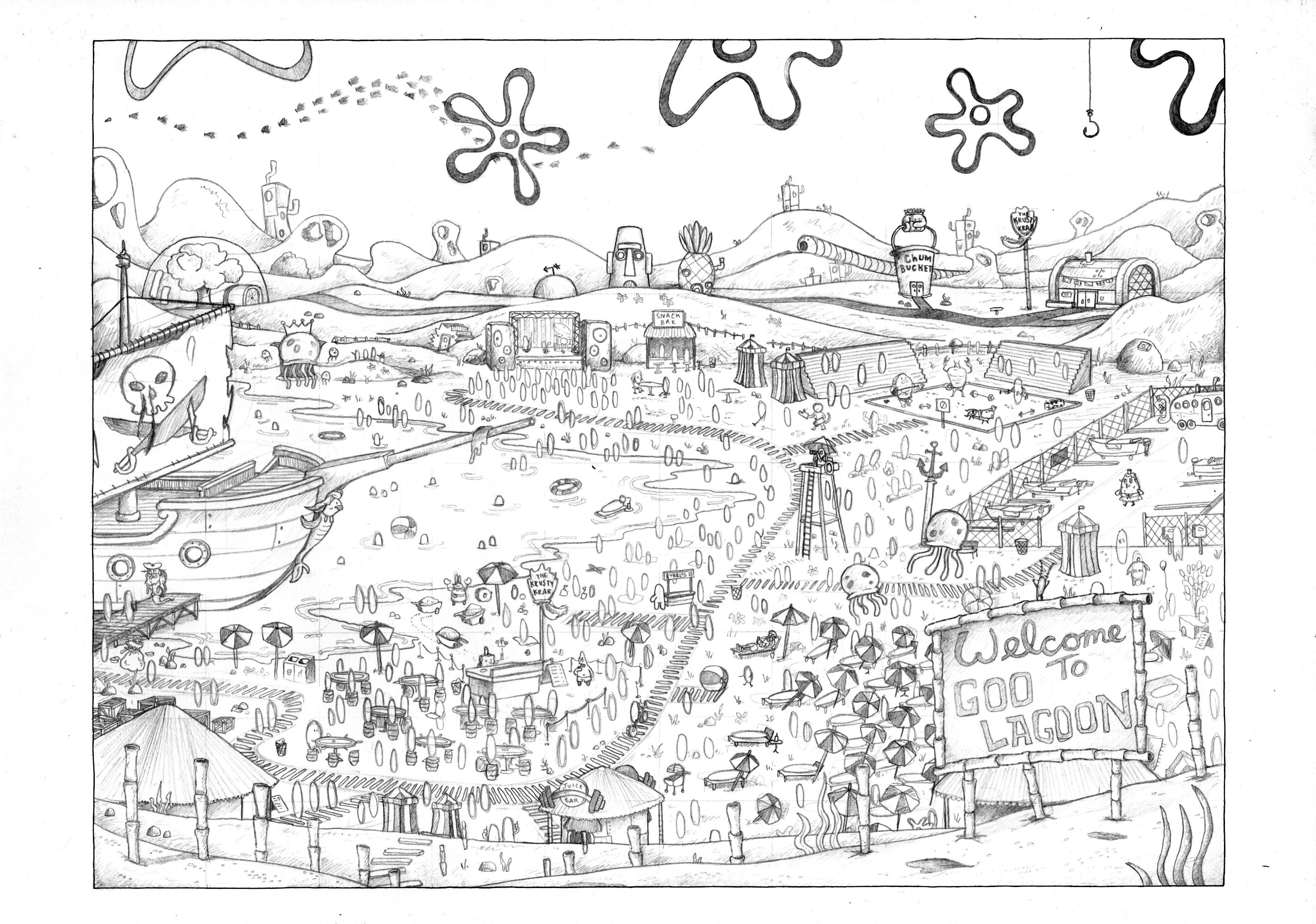

Before I started the linework I did one final colour pass on the pencil sketch to get a good idea of how it might look. This is always a more important step than I give it credit for, as the colour can (and should) influence how dense I might make certain areas of linework. It’s been a slow learning process to come to that realisation, but the colour should be built up alongside the linework, and not just added as an afterthought.
From here I ploughed ahead with the linework. I used my 0.35 rOtring Isograph on an A2 sheet of paper, which I then scanned at 600dpi so that when I slightly scale it up to 18 x 24” there weren't any problems with quality. As always, there ended up being a lot more lines in the illustration that I anticipated. But hey-ho, perhaps one day I will come to my senses and learn to scale it back.*
*I type this as I am currently well underway on a new illustration - and I can report that I have not learnt my lesson.
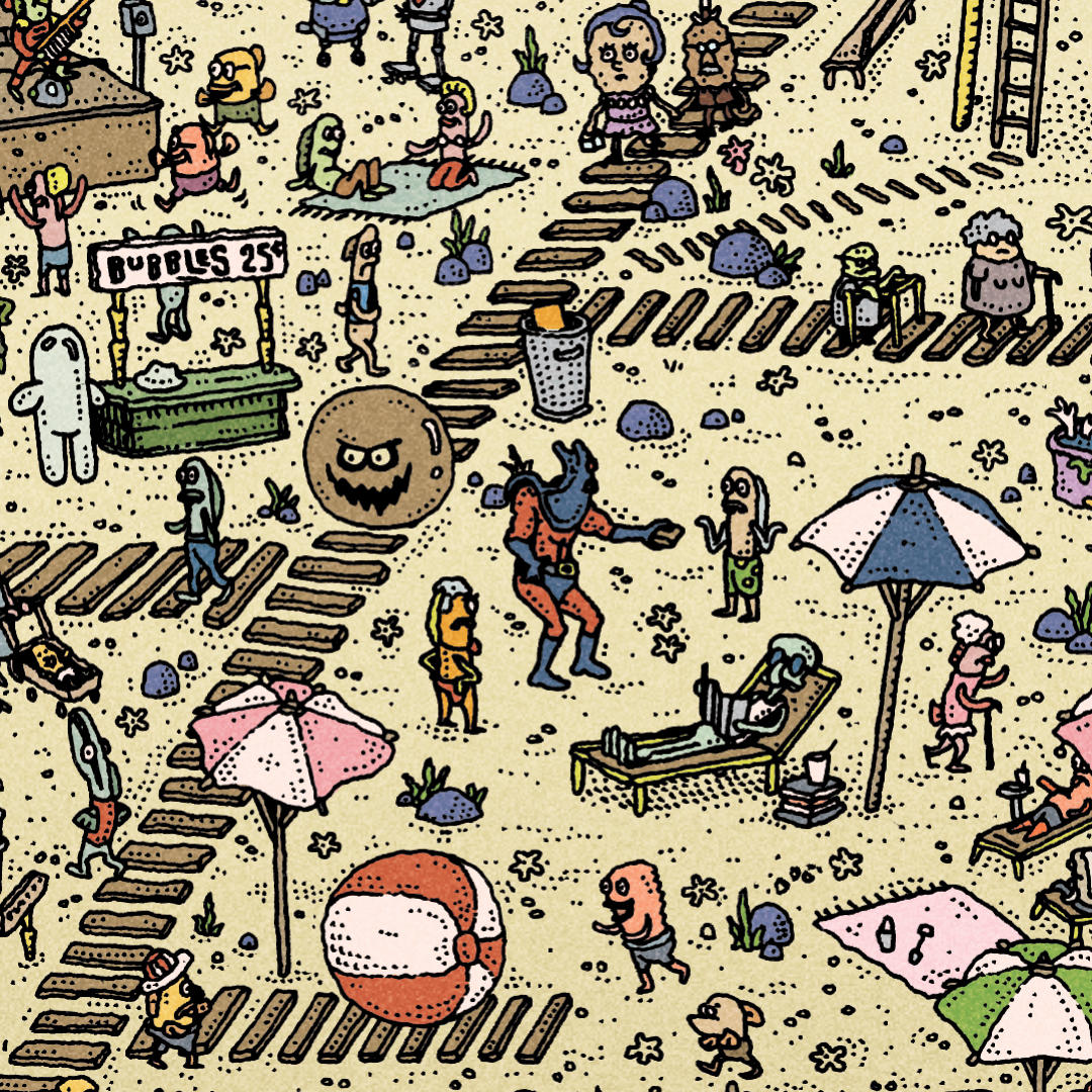
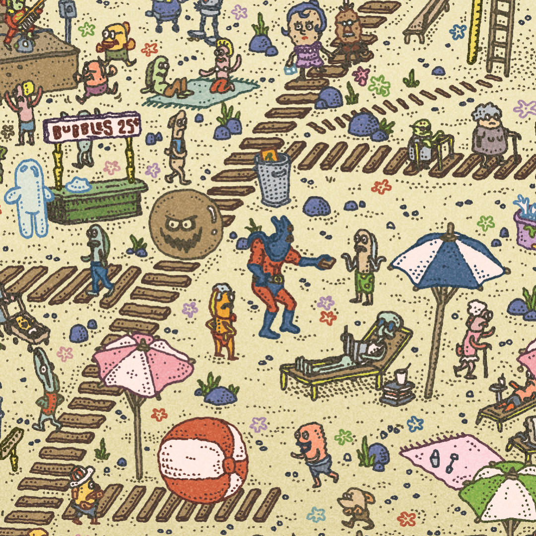
This ended up taking a lot of time, as it was essentially colouring the drawing twice. But I’m very glad that I did it as I think it does a lot of the legwork in bringing the illustration to life. Usually I would import the scanned linework into the colour file and simply set the layer mode to ‘Multiply’ - but to achieve the coloured linework I instead used the ‘Select Colour Range’ tool, selected all of the white areas and deleted them, thus leaving just the black linework on a transparent background. I then used this as a layer mask and was able to freely colour under it. You can see below how the coloured linework looks when it is not being masked to the drawing.
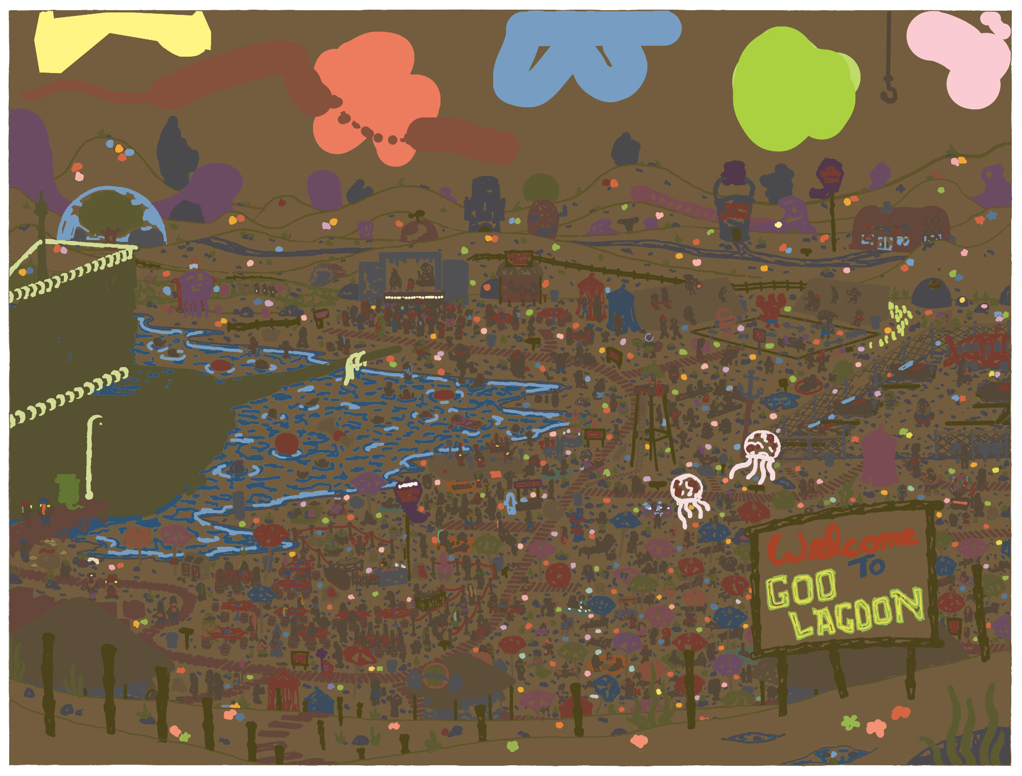
One other noticable difference between the original plan and the final illustration was the colour of the sky. This came about when I was exploring a variant option, and was just tweaking the colours in general. I liked the original blue, since it honours the aesthetic of the actual show, but ultimately I went with the purple to a) Differentiate it from the blue-heavy variant, but also b) I felt the orange/pink sky complemented the ‘Welcome to Goo Lagoon’ sign a bit nicer, and tied the whole piece together. Anyway, here are both pieces again if you’re too lazy to scroll back up to the top of the page. Both versions went up for sale at Bottleneck Gallery on 11th April 2024. Here’s a link if you’re interested in buying one, or if you just want to view the page out of posterity.