morgan girvin
illustrator, maker and hermitinfo
about
contact
shop
illustrated work
wimmelbilder
film postersalbum art
maps
general illustrations
crafted work
hand crafted projects
big things
film boxsets

morgan girvin
illustrator, maker and hermit

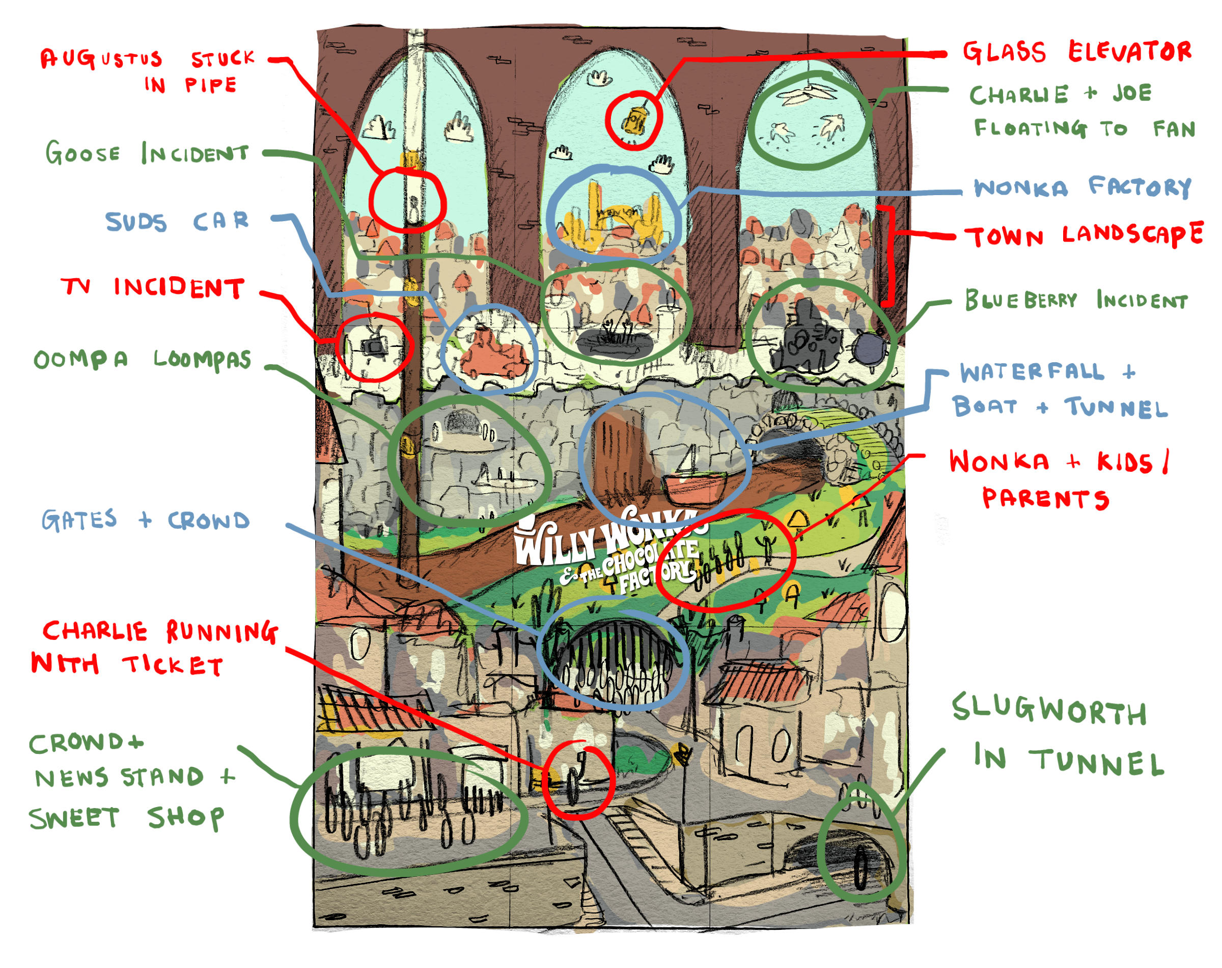
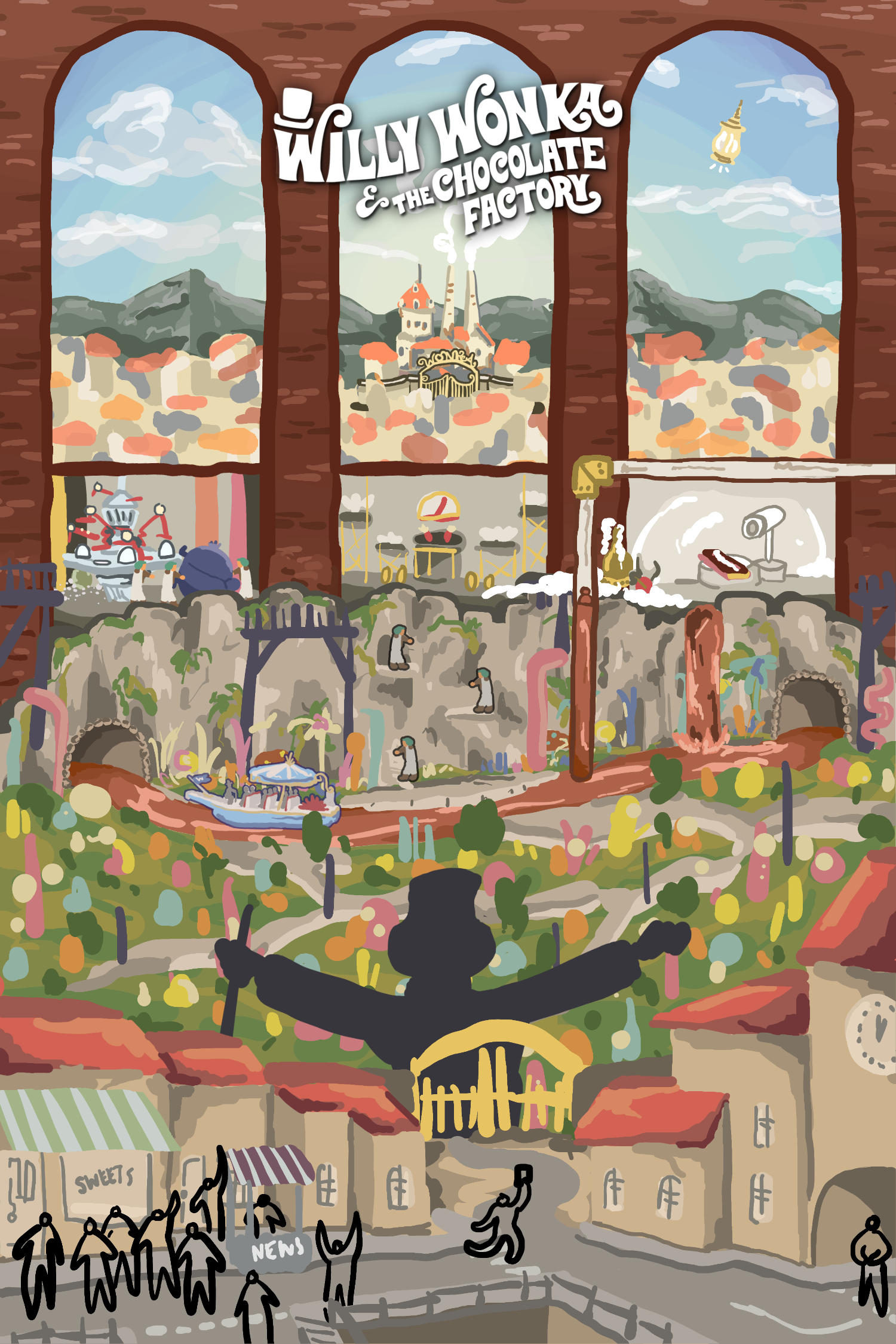
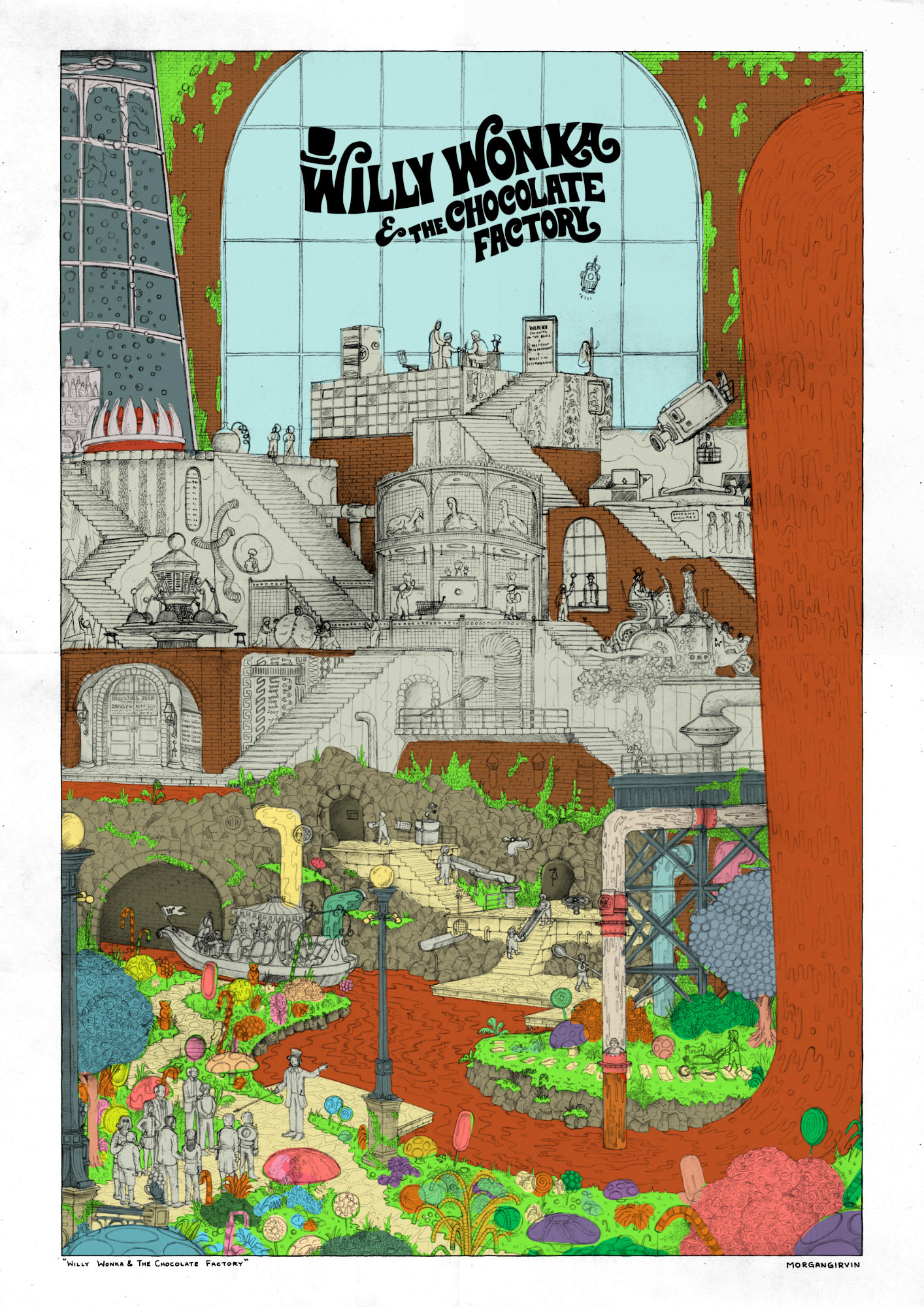
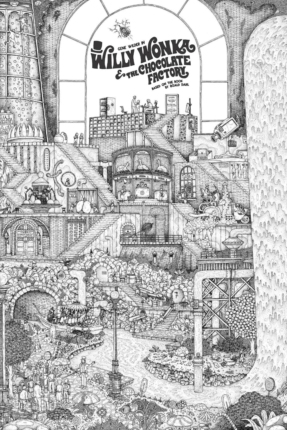
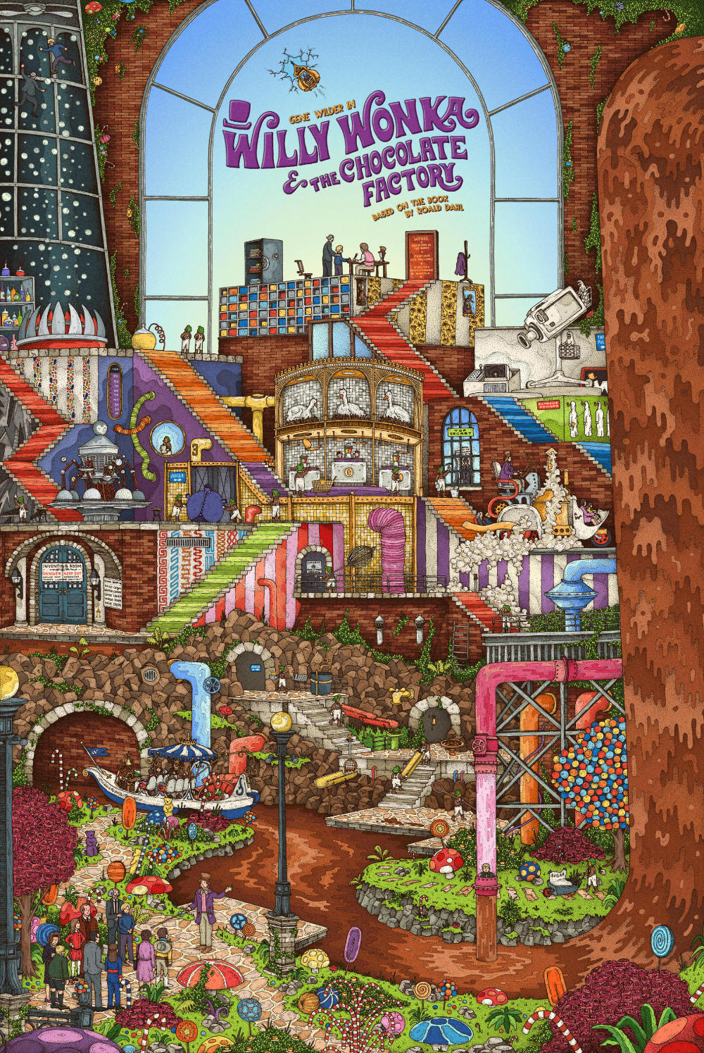
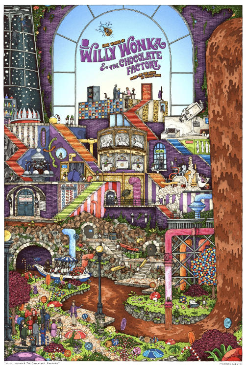
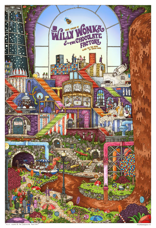
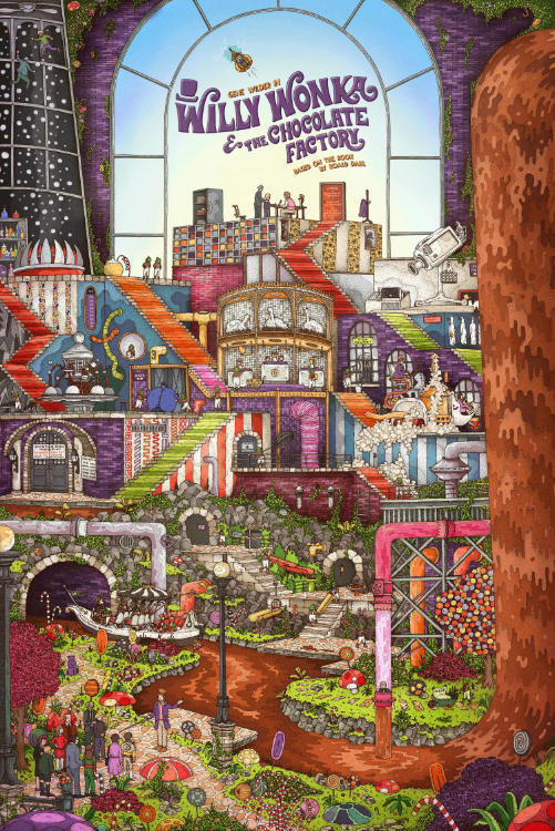
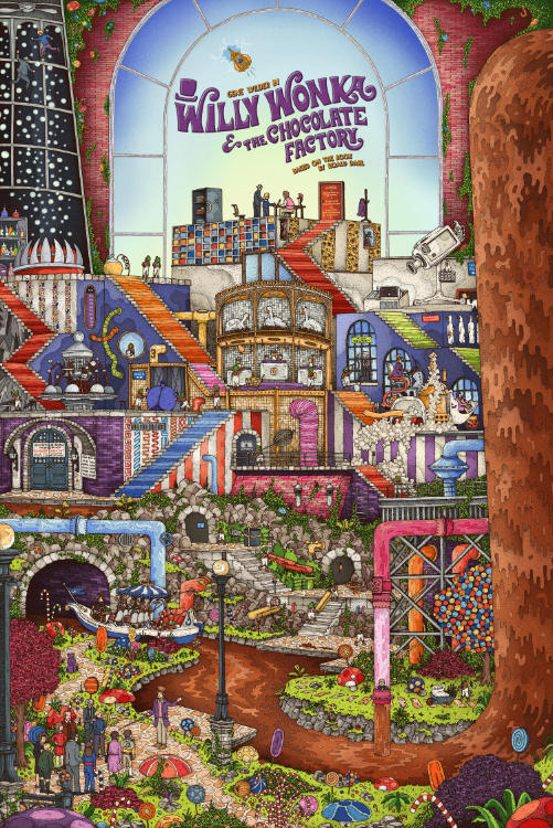
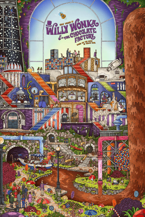
The Original Drawing and the Final 24x36” Illustration
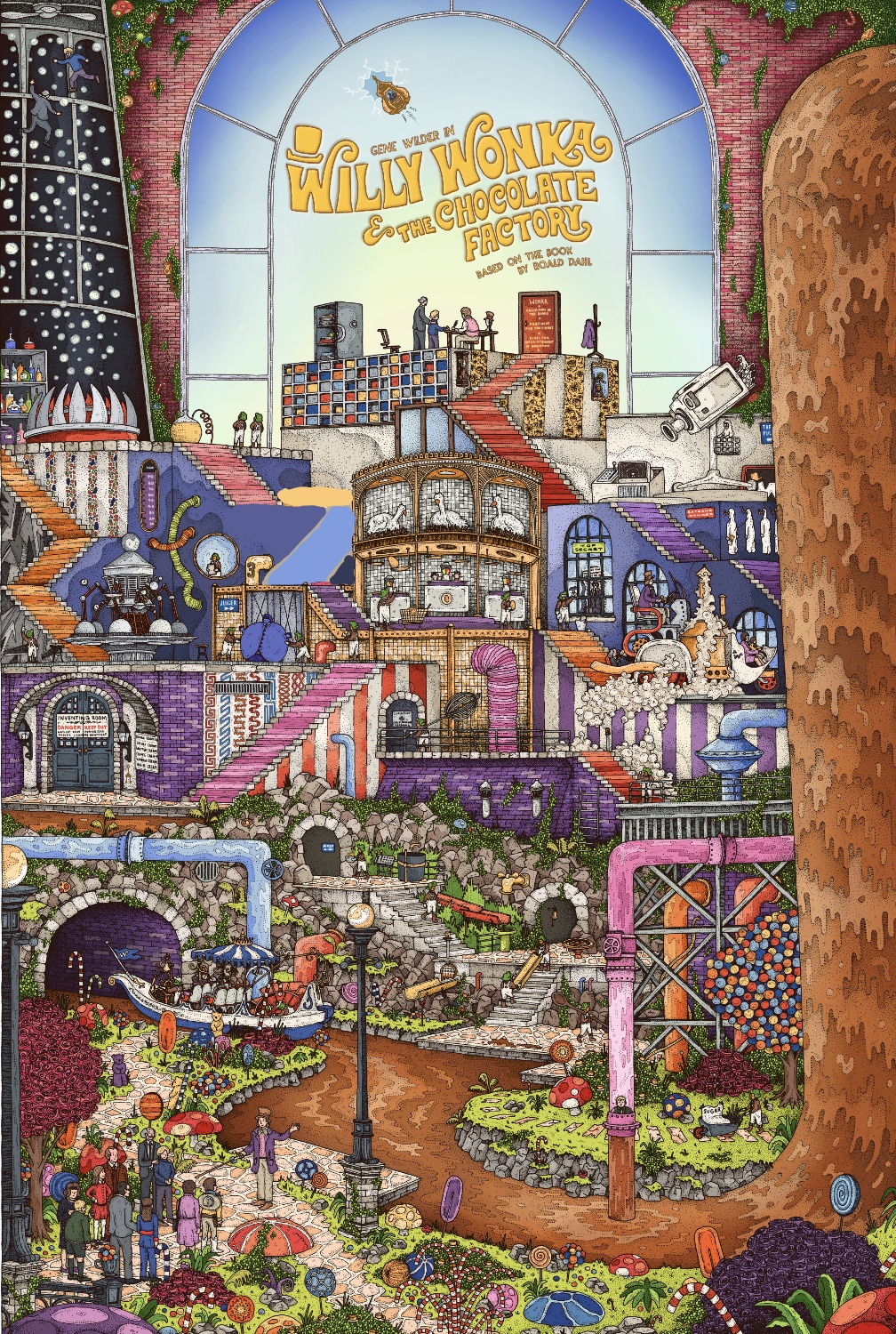
WILLY WONKA & THE CHOCOLATE FACTORY
24x36” / 0.35 rOtring Isograph / January 2025
Even by my own standards, this one is pretty crazy! This is an illustration I worked on towards the back end of 2024 (and a touch into 2025) for the 1971 film ‘Willy Wonka & The Chocolate Factory’ starring Gene Wilder. There was a lot of work that went into this one, both in early development and during the final colouring stages. It was a tough nut to crack, but I’m delighted with how it came out.
There were roughly 220 hours in this one, spread over the course of a few months. There’s also 5 golden tickets hidden in the illustration (along with 50 Oompa Loompas) if you want to go scouring for them!
DEVELOPMENT
20 Hours
Now, what a rollercoaster this one was. When it was proposed to me to do something for Willy Wonka it all seemed so straight forward. I mean, there are a million details, I certainly wasn’t going to be short of things to include! And that proved true. But what I didn’t anticipate was just how difficult it would be to knit those details together.
The initial idea was to replicate what I’d done with my Grand Budapest Hotel illustration, with the town (and Charlie Bucket running through it) at the bottom and the Factory at the top. In the middle would be the interior of the factory with all its different bells and whistles.

As with a lot of my work, there was a lot of jumping about between sketching on paper vs on my laptop. On the one hand, working digitally is always useful when you’re trying to crack the composition of a piece. You have the freedom to move elements around the page and you can change colours willy nilly; something you’re not afforded with pencil. And yet, I just find it’s a deeply unsatisfying process - there’s something about feeling the pencil interact with the grooves of the paper that just can’t be replicated. With digital stuff, if I know what I’m aiming for, it’s fine. But if I don’t, then it’s awfully tedious. As such, I’ll regrettably ping-pong back and forth whilst trying to figure things out.

During a call about the project, I had the commissioner say to me:
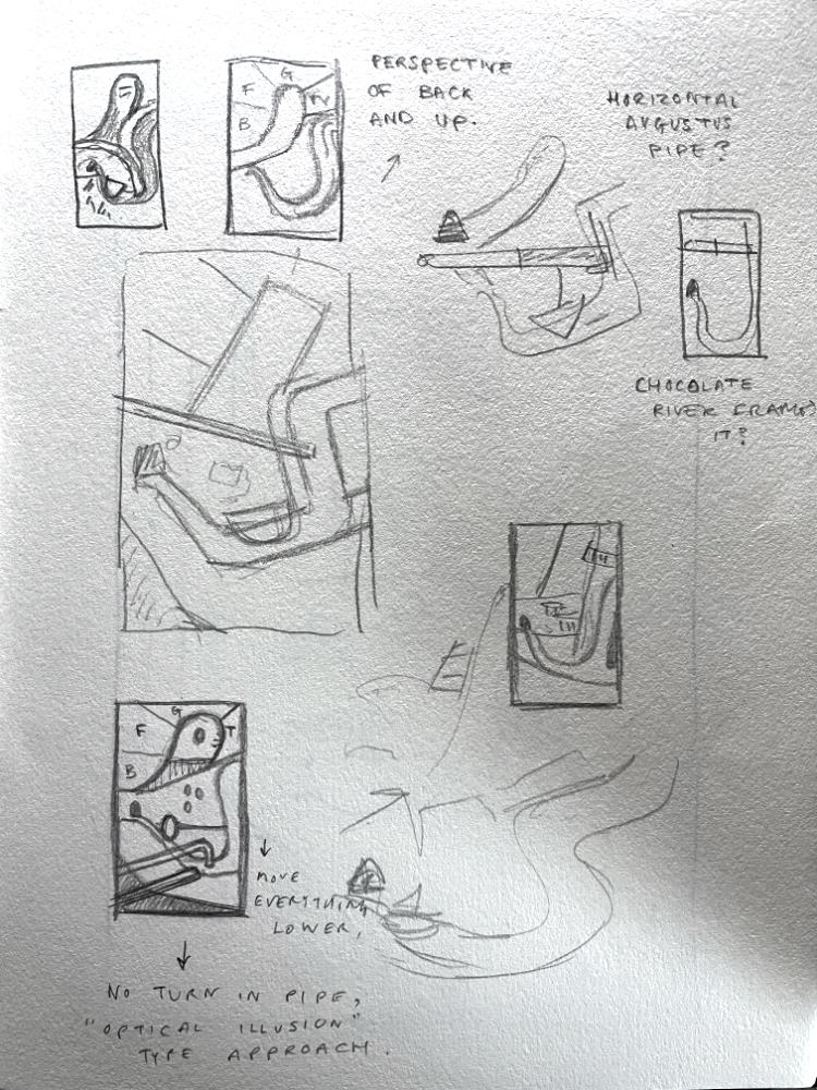
“Its too structured. I feel like you really excel at doing interesting perspectives and we need to lean into that”
Which, from my end, was a funny thing to say, as I’m constantly fighting the urge to make everything symmetrical and neat. Perspective does not come naturally to me. Every time I put pen to page I am a hair’s breadth away from drawing something flat and square. Any work of mine that has depth usually only has so because I’ve brute-forced my way into figuring it out. And that’s, thankfully, exactly what happened here. Cue some of the sketches!

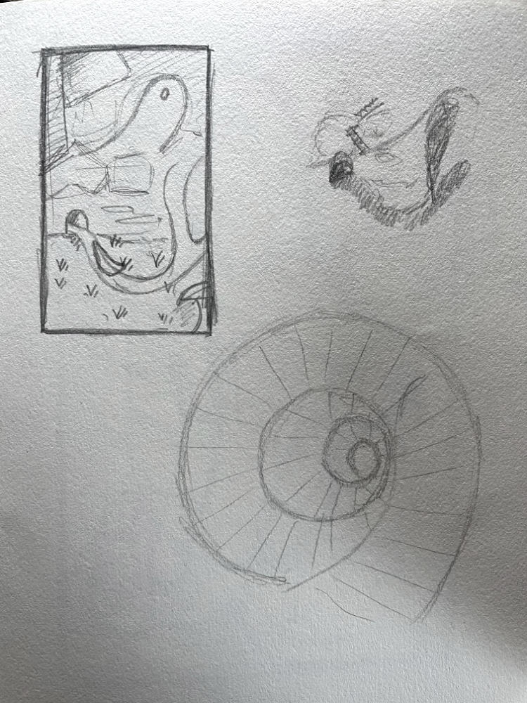

And then, finally: the watershed moment! I’m not sure how it came about, but it was truly one of those eureka moments. The film is supposed to be bursting with nonsense and creativity, right? So, what if I take inspiration from M.C. Escher? For those unfamiliar by name alone, I’ll attach some of his artworks below.
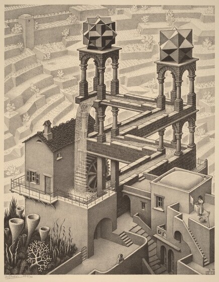


A small selection of M.C. Escher’s works - most notably ones featuring staircases, platforms and layers
Famed for his dizzying perspectives, I felt like this was the exact sort of energy I needed to inject into my own piece. Up until this point I’d been trying to accommodate accuracy for the film, but with this new direction I decided to take more of a creative liberty; adding a visible, and open, route through the factory rather than the enclosed corridors we see in the film, and a comically large, and impossible, waterfall, rather than one that is limited to a small gaggle of rocks.
It’s not often that there is such a clear-cut moment of inspiration for me, so this was a real treat (and relief) when I finally figured out what the artwork wanted to be.
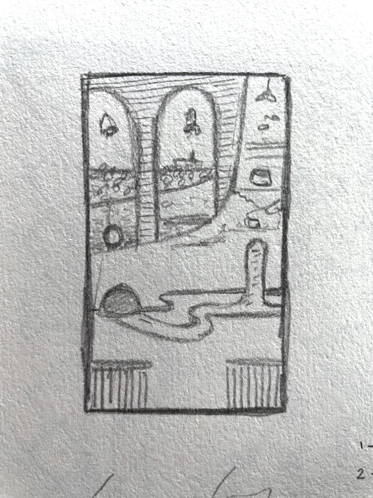
PENCIL
30 Hours
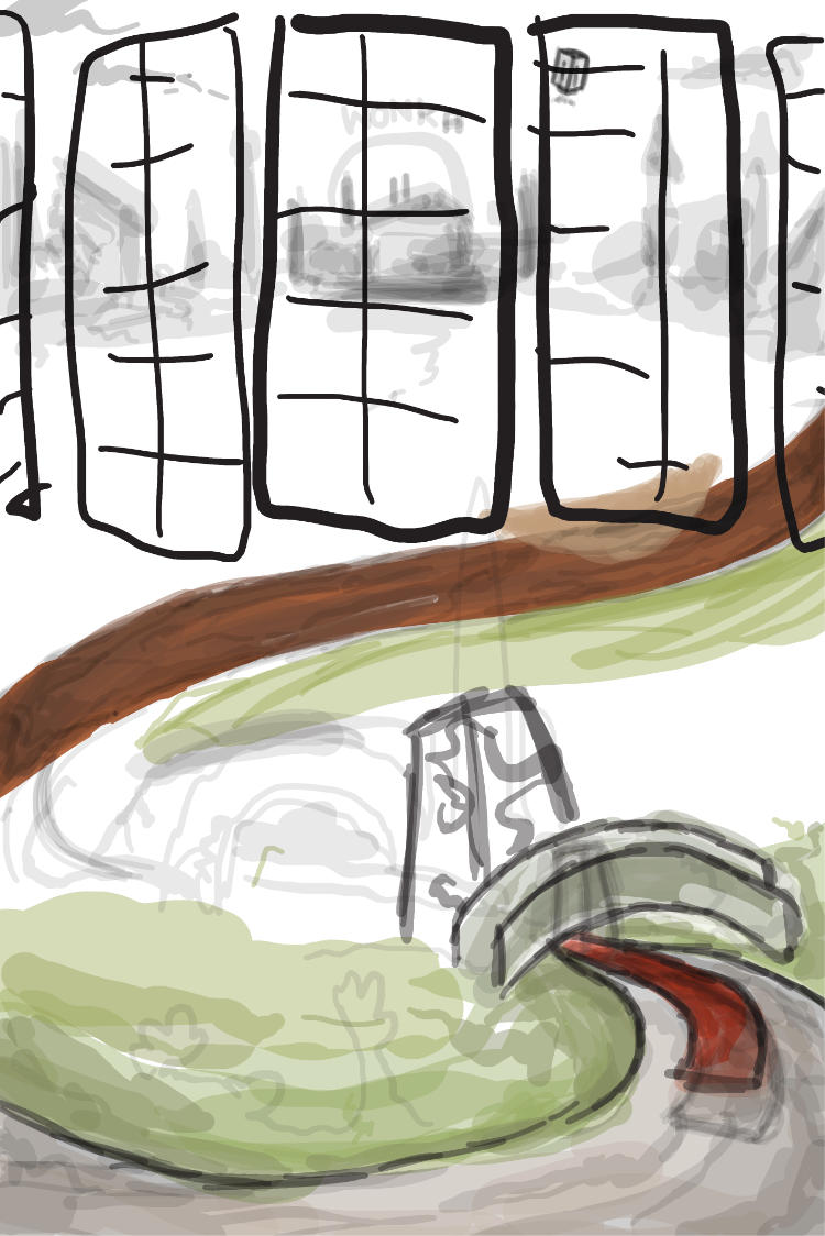
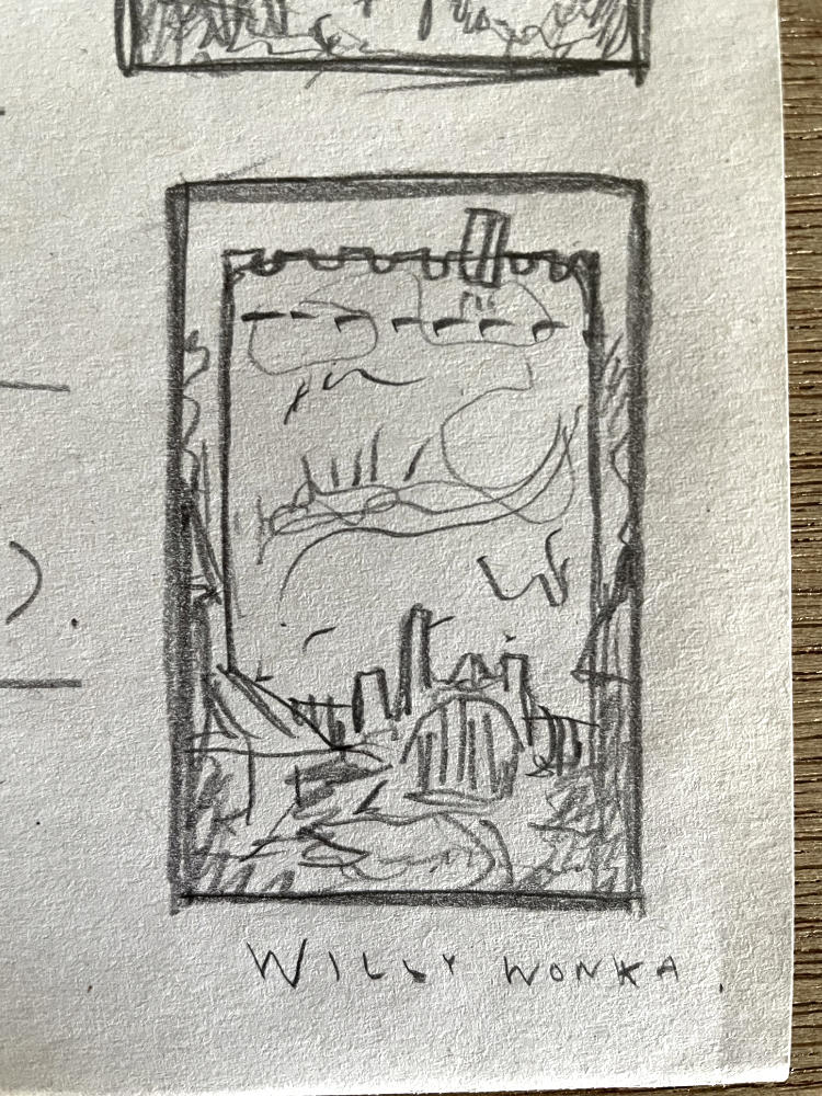
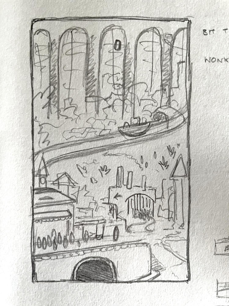
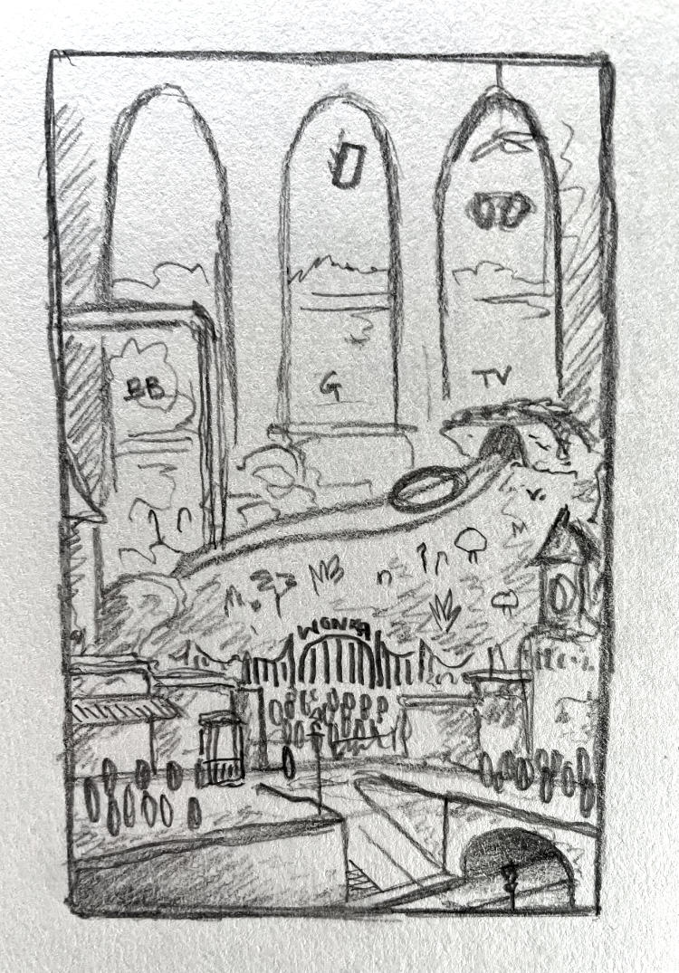
With the gears in my head finally in full-turn, progress was swift(er). I started by plotting out the broad-strokes on a smaller scale initially. Figuring out what the general shapes of the piece would be before I tried to fill it out with detail.
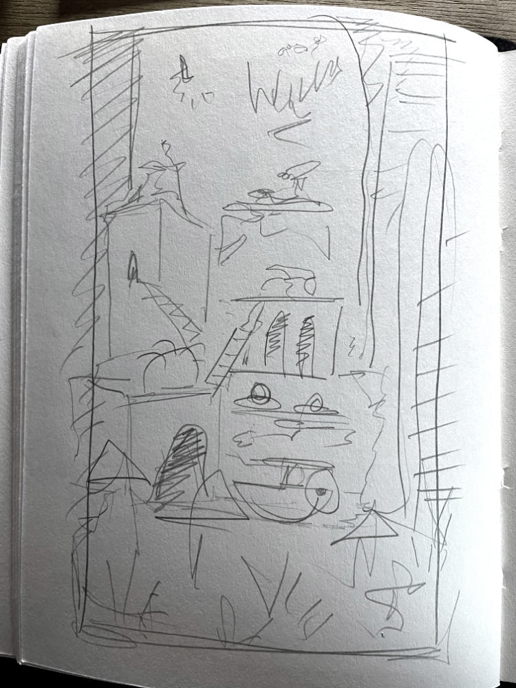

We had decided to get rid of the town and instead just focus on the interior of the factory. Now, with the garden at the bottom, the idea of the illustration was that each room (wherein the children get
In drawings like these, resources like https://fancaps.net/ are beyond helpful. Being able to look through high resolution screenshots of the film, near frame-by-frame, is perfect for when it comes to looking for all those references and small details.
One thing that I found interesting when revisiting the film is that, in reality, it actually looks...quite rubbish? I say this with the utmost fondness; my memories of watching the film as a child are of the intricate vibrancy of all the various sets. So much creativity and imagination packed into Wonka’s factory! And yet, looking at it through the eyes of someone trying to emulate it, I was surprised to see just how bare-bones a lot of it is. The walls are often plain concrete, the brick and steel windows are reminiscent of a standard factory, and the garden area is not in fact a sprawling, never-ending wonderland, but rather just… a garden. It was quite curious to realise that whilst the film has music and acting that compounds the whimsy, if I wanted to recapture the magic in a stationary illustration I was going to have to fill in gaps and liven up the details where possible.
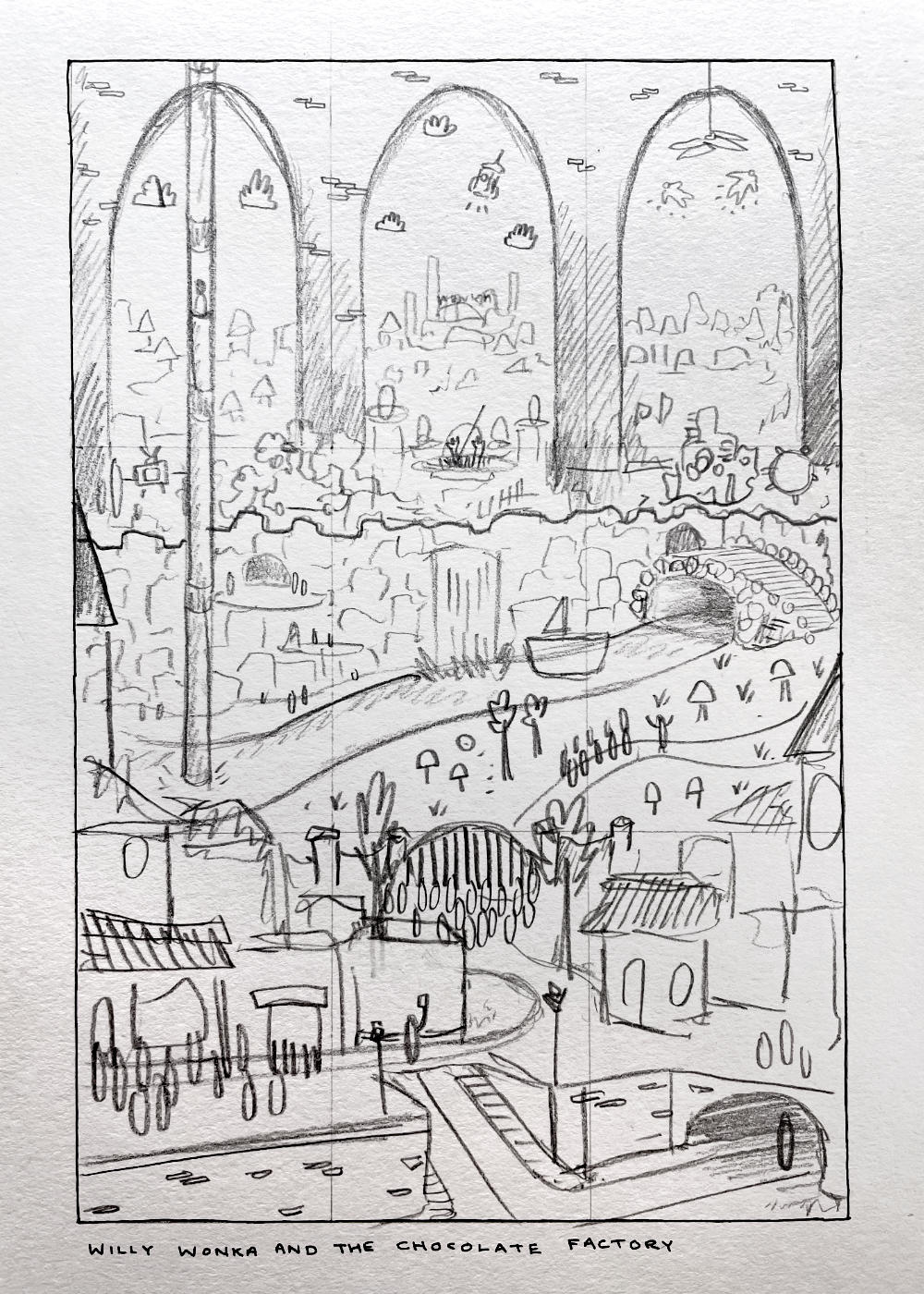
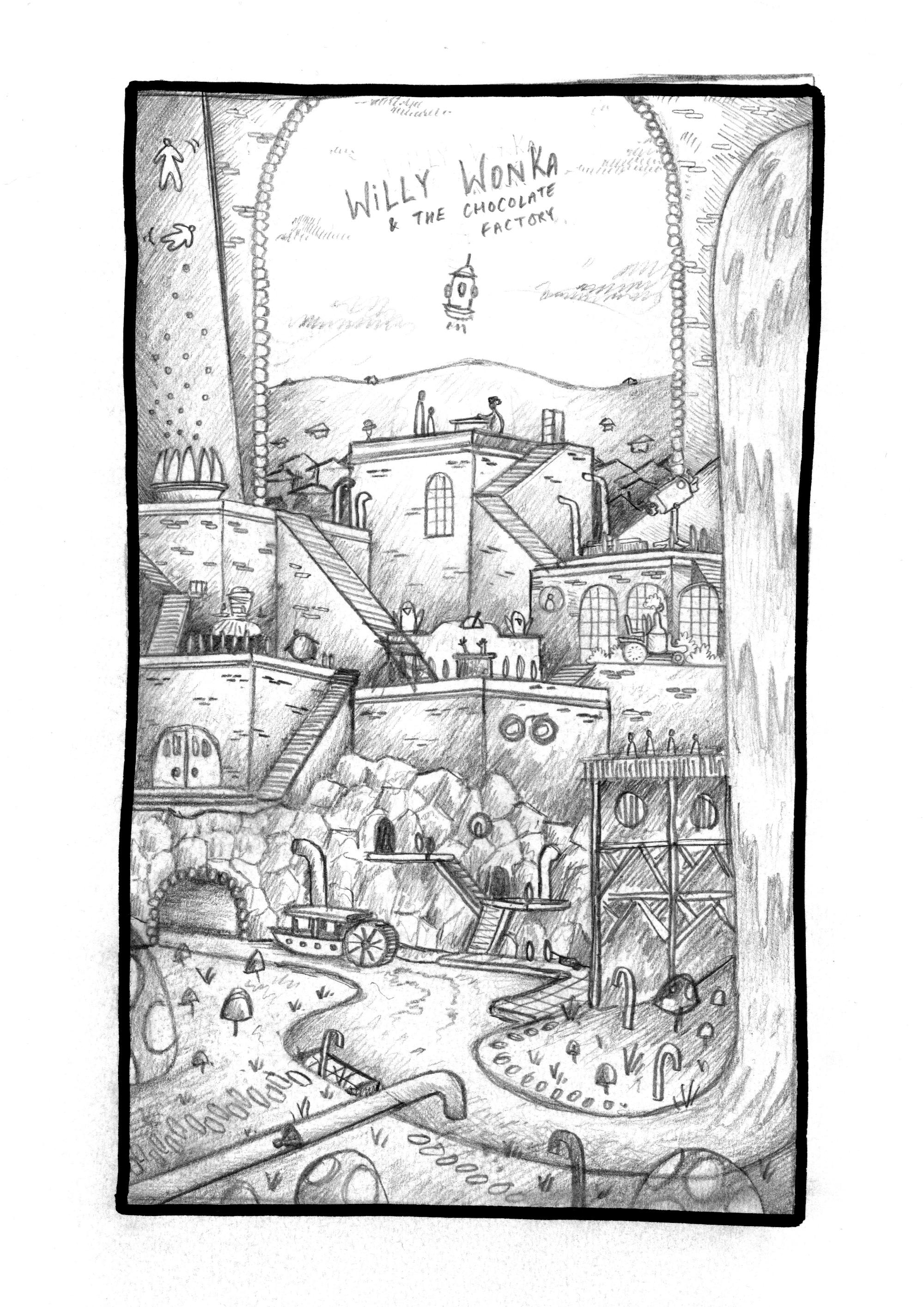
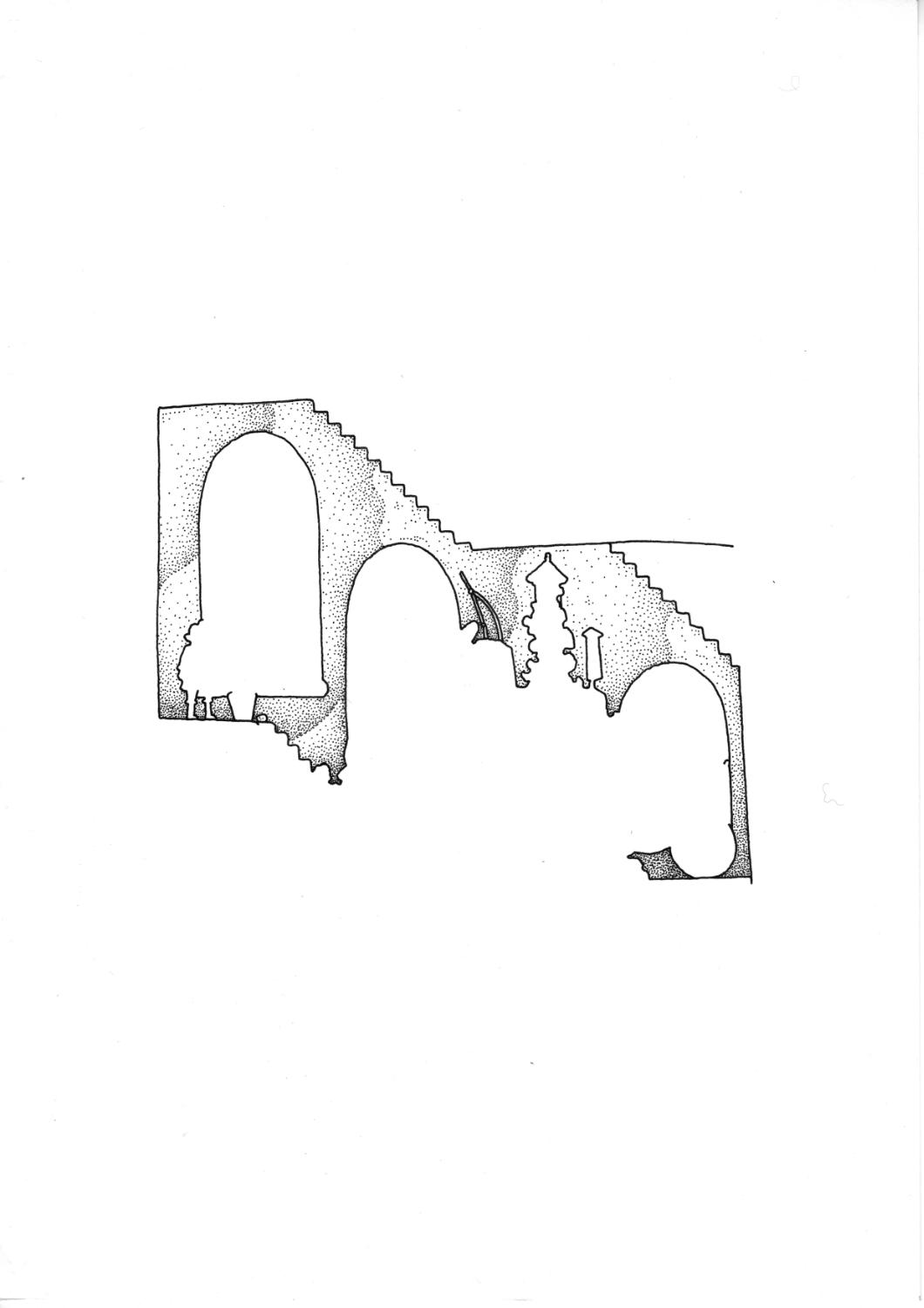
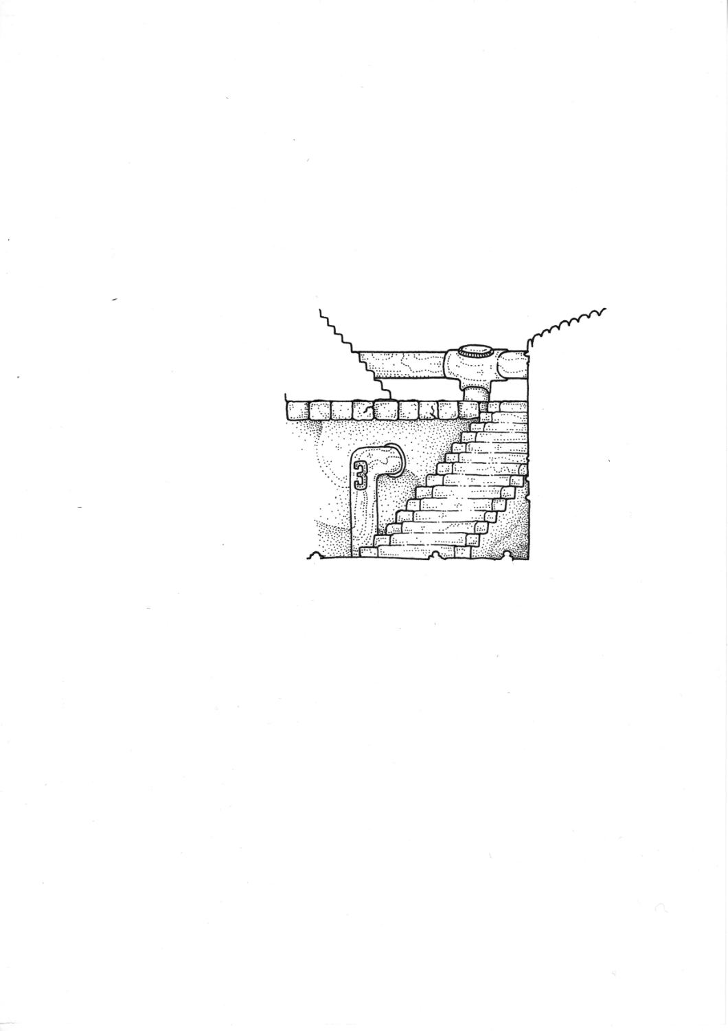
The third, and most developed, sketch above was done on a sheet of A4 paper. With the general shapes figured out, I translated this to A3, where I created the full-scale sketch that I would do the inking from. Sometimes I lay another piece of paper on top of the sketch, and create the ink on a fresh sheet by tracing the pencil on a light box. In this instance, I drew the ink directly on top of the pencil, and just erased it afterwards. I like being able to keep the pencil sketch as its own piece of work at the end of the project, but I also work slower when I have to trace it. Since this was quite a large artwork I decided to bite the bullet and just ink directly on top of the pencil to save time. I scanned in the final pencil sketch to memorialise it, which you can see below:

DRAWING / INKING
70 Hours
Due to how long these illustrations can take me, I’ll often try and solve issues as I go along - rather than come up with a perfect plan up front. This is a politician’s way of saying that I bury my head in the sand until I can’t avoid the elements of the art that aren’t working any longer. One of these things was the logo.
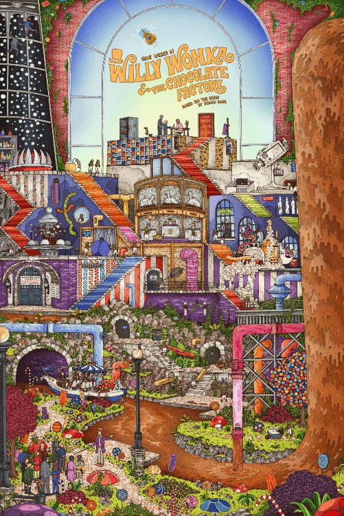
The drawing itself was absolutely plain sailing, and I had a complete blast doing it. It is, and continues to be, my favourite part of the process of creating these illustrations. But as I was nearing completion, I came to the sad reality that I still didn’t know how the logo was going to look, and it was becoming high time to figure it out. Below are some of the different options that we considered, before ultimately settling on the last image.
I did the drawing across 2 sheets of A2 paper, which I had taped together with masking tape. The flatbed scanner I use only does up to A3 sheets, so I have to scan the work in sections and then stitch it together digitally. It can be a bit of a pain, but the more I do it the more I understand the limitations and what I have to try and do to expedite the process. You can see in the logo options above how there are 4 different quadrants that are only roughly aligned. These were all scans from when the drawing was nearly, but not quite, completed.
Each time I do a new piece of work, I often try to improve on one specific thing. Previously this has been anything from drawing people through to colouring the linework more effectively. This time I wanted to create the drawing using 2 different size pens.
When I do these illustrations, I’ve found that often the details are so dense that they all blend together, and it becomes hard to tell where some details stop and others start. So, this time around I decided I would use a 0.5 rOtring Isograph alongside my usual 0.35 one. I was hoping this would be helpful from two angles:
a) The main ‘objects’ would be done in the larger 0.5 pen, whilst the shading/stippling would be done in the smaller 0.35, giving the “important” bits of the drawing a subtly fatter outline and thus making them easier to identify amidst the chaos.
b) By using a larger pen, I was hoping this would speed up my process slightly and I would get the drawing done quicker.
I’m happy to report that, I think, I was successful on both fronts! I’d also like to say that I don’t do any research/inspiration gathering on what would make my drawings look better. It’s just trial and error, and subsequently common sense, from one drawing to the next. I would undoubtedly benefit from reading some sort of guide, or seeking advice, but it’s undeniably satisfying when I take those steps forward of my own accord.

COLOURING AND CHANGES
100 Hours
One frustrating thing I’m finding is that, increasingly, my drawings are taking longer and longer to colour. I love the colouring process, it allows me to sit on a comfy sofa and watch films whilst I work. But I wish it were quicker. Perhaps I’m just overly precious about being neat, tidy and getting everything within the lines. I’m hopeful that it is something I’ll speed up at; maybe that will be one of the aforementioned focuses of my next illustrations.
Since I do all of my colouring digitally, I often focus on getting the individual layers down first - and from there I can start to tweak and get everything into place. This is what the first pass of colour looked like, once I got all the details done:
BROWN! Too brown (much too brown) was the feedback I got. In hindsight, yes, I see it, but at the time it looked fine to my eyes. I think that’s the problem when you spend so long doing anything; it looks weird once you change it. However, I trust the feedback, and so I started working through alternatives. And man, what a nightmare.
If you’ve read any other of my write-ups, you’ll know how much I hate figuring out colours. It’s so difficult! One thing I found on this particular go around was that there are just not enough colours in the world, and I cannot fathom where other artists pull them from.
A Willy Wonka piece needs to be colourful, it’s at the core of the film, and yet every time I coloured a new section and tried to introduce a new colour I found that I had already used it elsewhere. How on earth do these people make things feel as though they are bursting with colour?! There aren’t enough colours in the world! “Okay, this pipe, I’ll use orange now - Agh! Nope, I’ve already used orange down here. Blue? Agh! No! Red? Agh…” and so on and so forth.
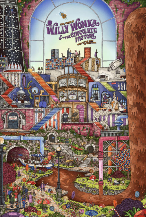
From the initial colour palette I created, we started trying to nudge it towards being less brown. See some iterative screenshots below:
One thing that became apparent to me was that some sections of the illustration just didn’t work in colour. In black and white I think everything looks great, but once the colour started being applied there were areas that started to be less forgiving. The main offender was the big pile of bloody rocks around the bottom third. I knew this was going to cause a problem from the very beginning. It’s in the film, so I didn’t want to get rid of it, but it’s just such an eyesore. It creates a harsh divide between the garden and the rest of the factory and I’d been struggling to iron that out.
The solution we came to was to jazz it up with more bushes. And honestly, I think it works well enough. It doesn’t feel like such a dense blob anymore, and more foliage is always a nice thing to look at.
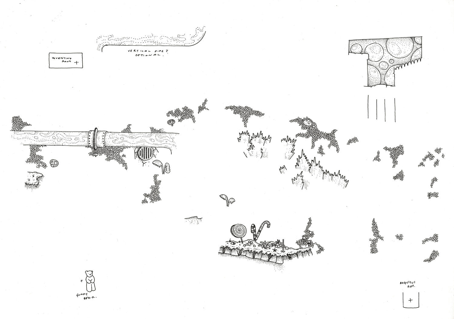
The other thing we planned on changing was removing some of the brickwork. There’s a lot of sections that defaulted to being brick (again - a feature of the film), and it contributes to the piece feeling quite heavy. The initial suggestion was to add some more stripes to that top left wall, under Wonka’s office - but when I tried it I felt it was too similar to the stripes on the room below. Instead, I experimented with doing a circular/bubble pattern. You can see the additional linework I did for it, and other things, below.
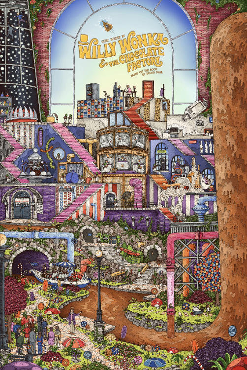
Once I’d drawn this linework, there was a lot of flip-flopping between colours. Honestly, it felt like we were going round in circles until the cows were coming home.
Brown Bricks. Purple Bricks. Pink Bricks. No Bricks. Stripes. Circles. Dots.
As mentioned earlier when talking about the composition, it felt like I was just brute-force trying things until we found something that worked. There is, undoubtedly, a ‘good’ way of doing things, and of making it work, I can just never foresee what it is. And while it takes a long time to get there, it is always, without a doubt, worth it. Here’s some more colour iterations below from what we tried.


Finally, as we were getting tired and wrapping up the artwork, there was another small eureka moment. It was a two-fold notion:
1) I was going to upend and change the long orange staircase on the left. Comparatively speaking, that was quite a dead section of the artwork, and I wanted to liven it up a bit. It would also break up the long streak of orange and allow for another colour to be introduced (if I could find one).
2) There needed to be more Oompa Loompas. It was a conscious choice at the start to not include too many. The idea was that they’re in the background, on their own little walkways away from the main route through the factory. The idea that they’re neither seen nor heard until a child has beenmurderedhurt and needs help. But upon looking at the final drawing, I realised that it fundamentally needed more populace. There were 23 Oompa Loompas in the original drawing, so I decided to do another 27 and bring the total to 50. Nice round number.
Once again, the additional linework is below. Each time I add something I do it on a separate sheet of paper, which I then composite into the digital file.
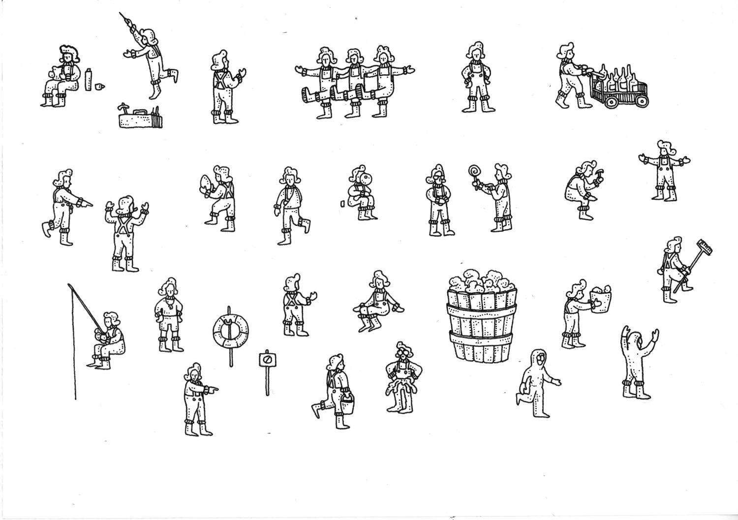
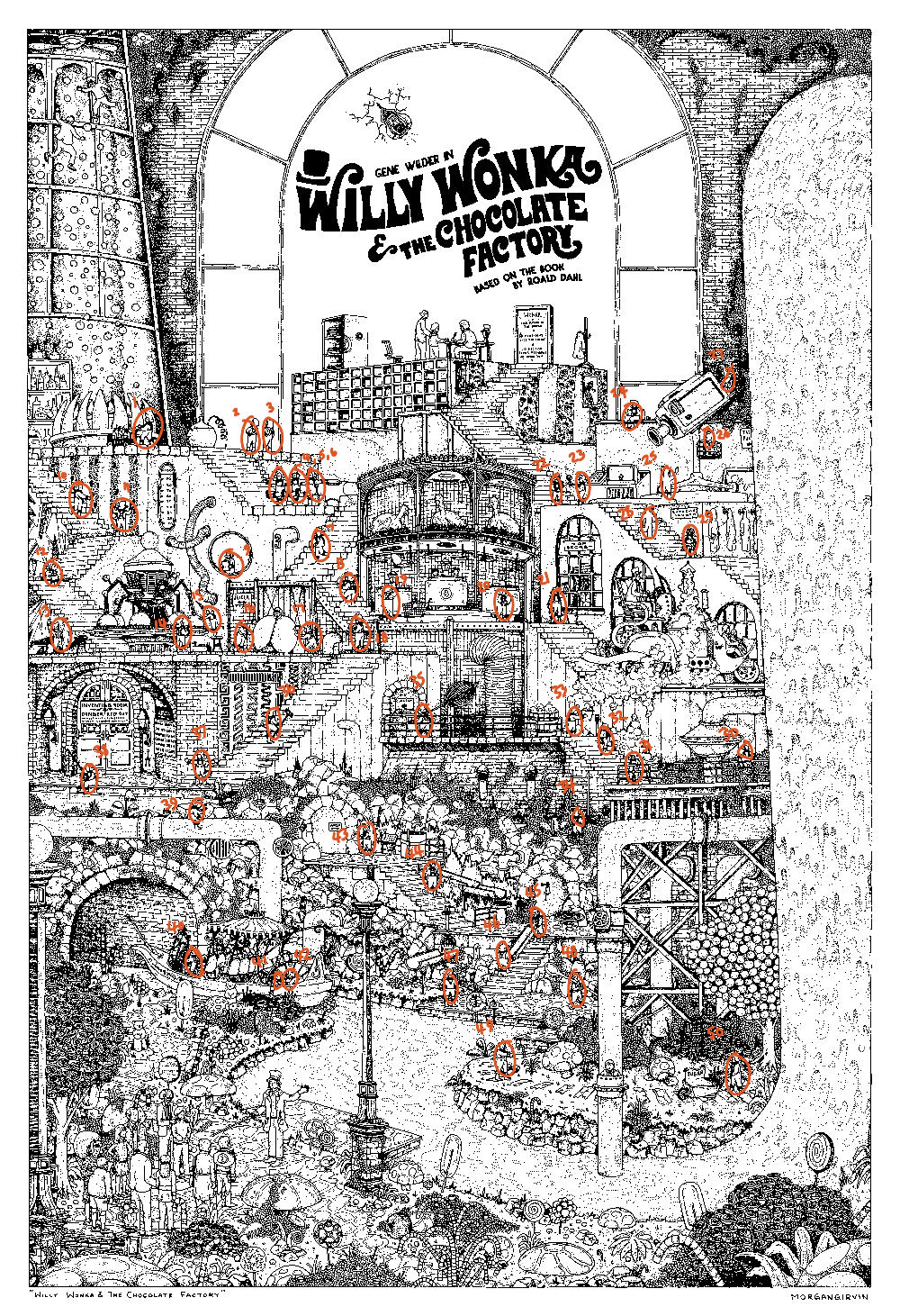
I tried to blitz through the additional Oompa Loompas, and so I was working on it quite late at night after a day of other work. I wanted to be sure I had a solid 50 of them, but trying to count them at 1am wasn’t doing me any favours. I did 4 separate counts, and each time I got varying numbers between 46-49. After that fourth attempt, I finally relented and did the proper thing of labelling and numbering them. The numbered file is below if, like me, you’re going mad looking for them all.
And that was pretty much that! Once I got the final linework additions composited in, it was just a case of colouring them and exporting the final file. At the time of writing, I am still yet to clean up the Affinity file so that it can be sent for printing. There is an ungodly amount of layers, masks and filters in this one, so please pray for me. I do not envy future Morgan when he is dealing with the task.
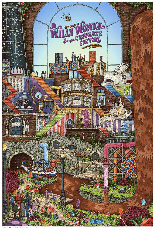
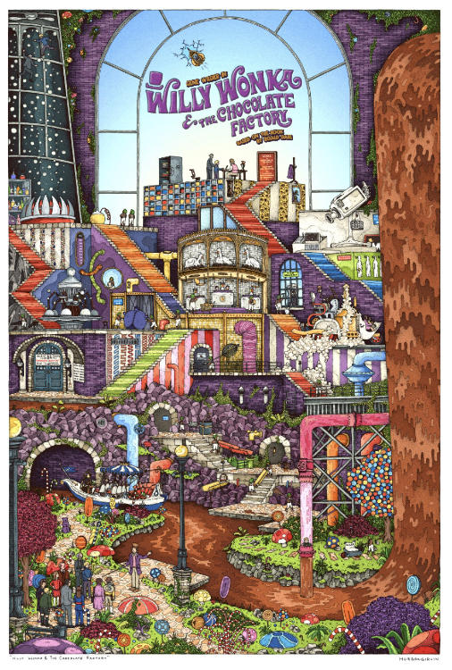
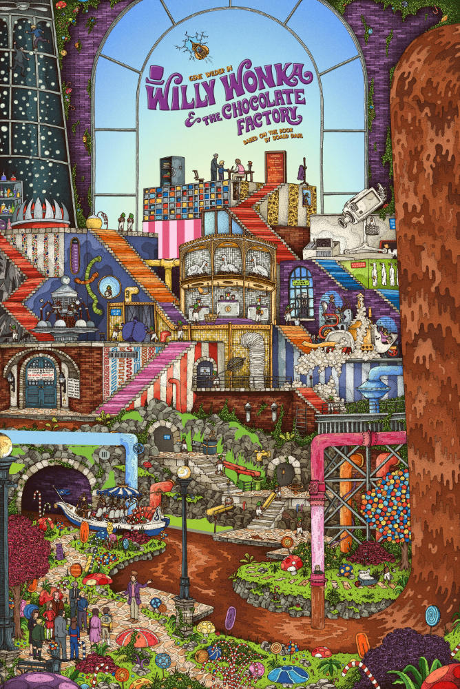
And once again for good measure (and to save you scrolling back to the top) here is the final linework and the final coloured illustration!