morgan girvin
illustrator, maker and hermitinfo
about
contact
shop
illustrated work
wimmelbilder
film postersalbum art
maps
general illustrations
crafted work
hand crafted projects
big things
film boxsets

morgan girvin
illustrator, maker and hermithome > film posters > reservoir dogs
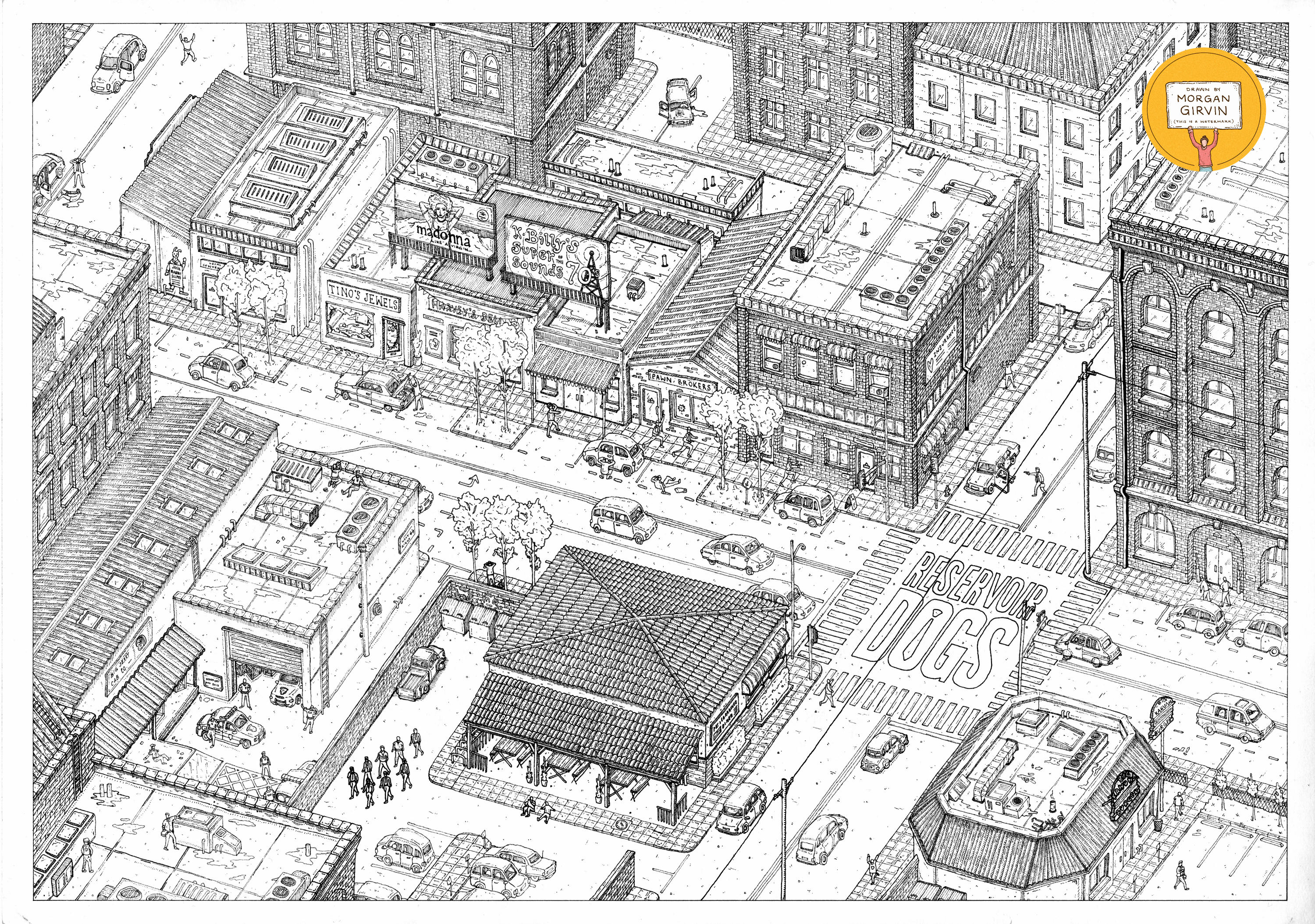
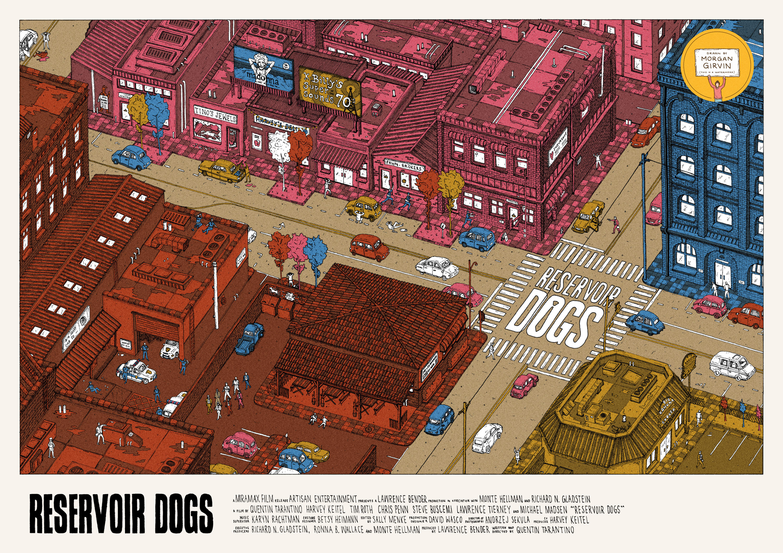
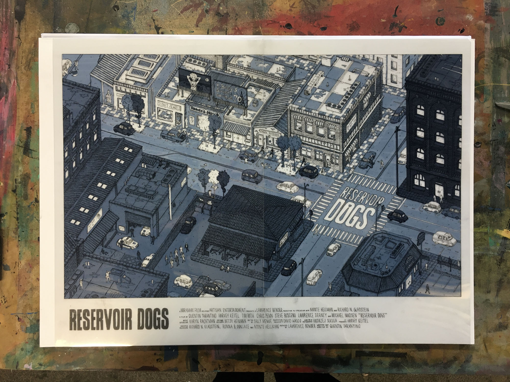
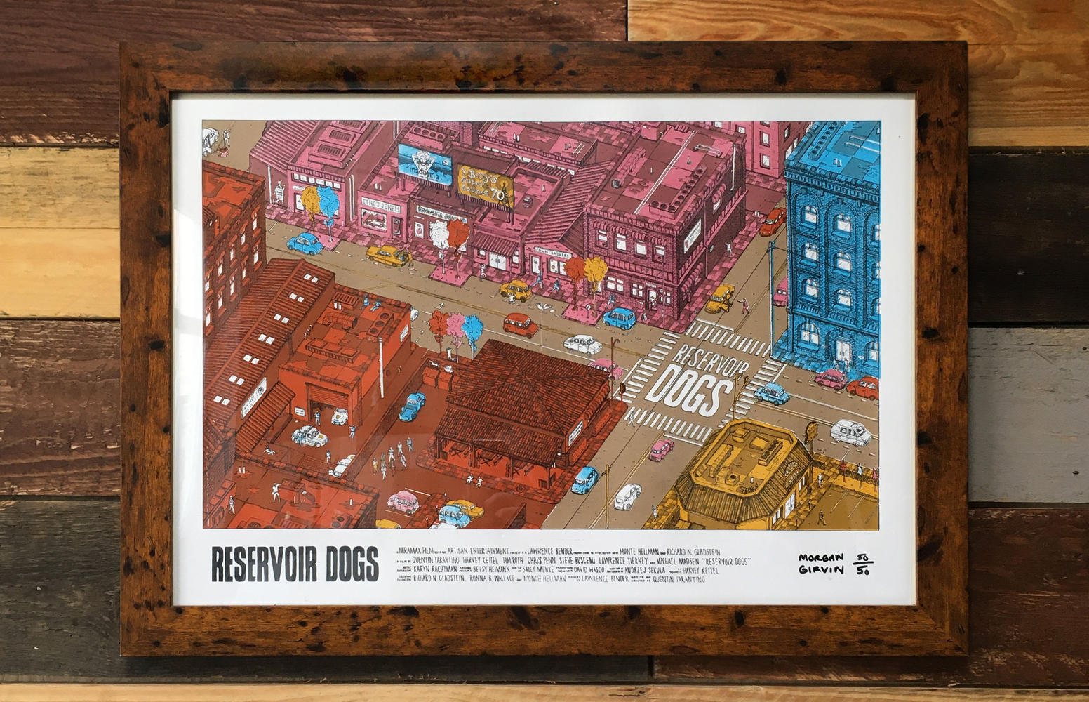
The Original A3 Drawing and the Final Illustration
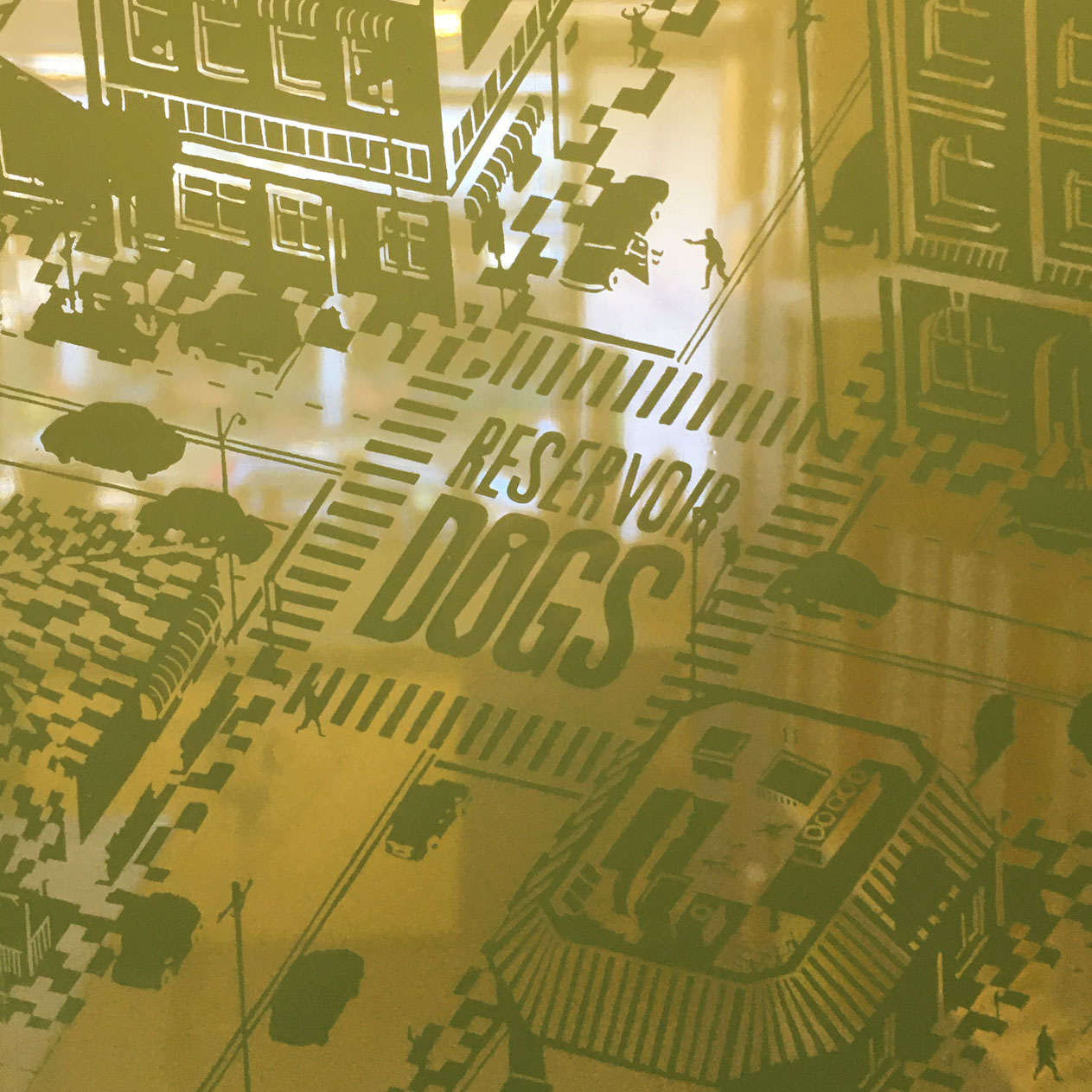
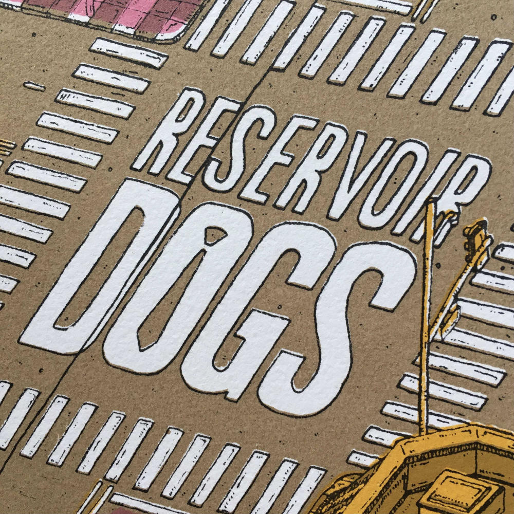
RESERVOIR DOGS
A2 / 0.05 & 0.03 Fineliners / January 2022
This is a poster I illustrated (and consequently screen-printed) for Quentin Tarantino’s debut film ‘Reservoir Dogs’. The original drawing was done at A3 with 0.05/0.03 Fineliners, before being scanned in, coloured digitally and finally screen-printed as a limited run of 50 A2 posters. If you wish to purchase one, you can find them in my shop here!
DEVELOPMENT
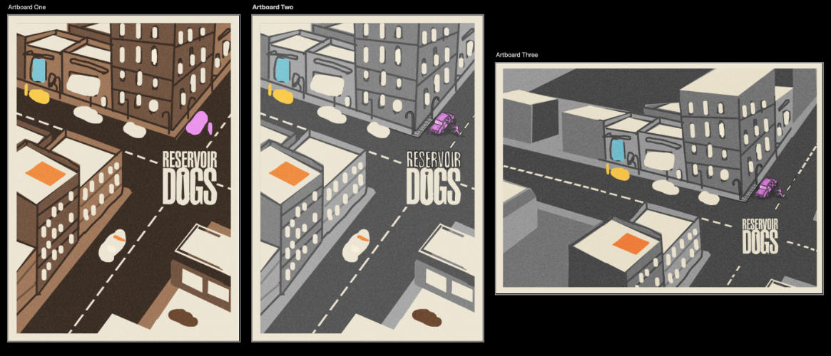
I decided to move forward with the landscape version, as I felt it was reminiscent of traditional, quad style movie posters - which I felt was especially fitting giving Tarantino’s penchant for homages to Hollywood films gone by. This was something I feel I accentuated further once I added the film logo and billing block later on in the process.
During the development stages, I was having a really hard time figuring out how to apply colour to the illustration. I think in the end I got to a really simple and elegant solution, but bloody hell was it a nightmare to get there. This project really is a perfect example of how simple design can be really hard to get right.
If you’ve seen the film then you’ll know the plot is centred around a heist gone wrong, and the crew members involved are all code named after colours: Mr White, Mr Blonde, Mr Pink, Mr Orange, Mr Blue and Mr Brown. So immediately I thought about producing a poster using only those 6 colours (as well as Black for my linework). It would be bold, bright and colourful, with the limited colours standing out against each other, sounds obvious...right?
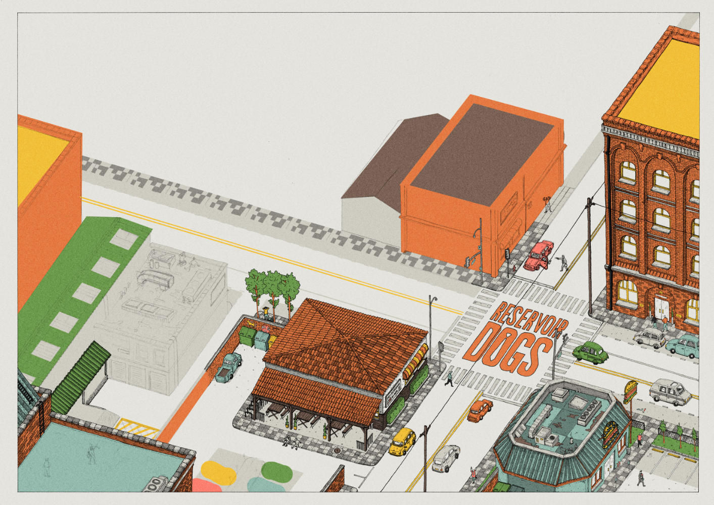
Well, what a bloody journey it was to get to the final piece. For some reason, my brain just kept over complicating the process and I struggled to find a way to use the 6 colours without getting lost. In the initial planning above you can see that I first thought about doing a monochromatic poster, and using the colours to highlight details about each character (Mr Orange on the rooftop learning his lines, Mr Pink hijacking the car etc...). I didn’t like this, I didn’t think the colours would be spread around the poster evenly enough, especially since some characters feature significantly less than others (looking at you Mr Blue).
Something I then decided to do, which I don’t think I’ll be doing again, is plowing ahead with the drawing without a sufficient colour plan. Sure, I knew what the linework was going to look like, but I had no idea how to colour it. “Eh, I’ll figure it out later”. BIG MISTAKE. It ended up causing me a lot of stress when I was halfway through the linework and I realised that if I couldn’t get the colour to work then the whole idea would fall apart. Here is what I was trying when I was knee-deep in the drawing:
Absolute drivel! I think the idea was that I was going to colour it as I would a normal piece, but only using 6 colours. Since I was screen printing it I knew I’d be able to overlap blue and yellow to make green for the trees and thus give myself an extra colour. I could also probably make purple if I mixed pink and blue...
Eventually I snapped out of this daft direction and realised I was moving further and further away from the idea of limiting myself to the 6 colours. Eventually, I don’t know how it happened, I came up with the idea of doing each quadrant a different colour. That was 4 colours down. then I could use Brown for the road and use White across the entirety of the piece for things like windows and details. HALLELUJAH. Possibly the biggest breakthrough I’ve ever had to come to in a piece, and probably the most relief when I finally came up with this idea:
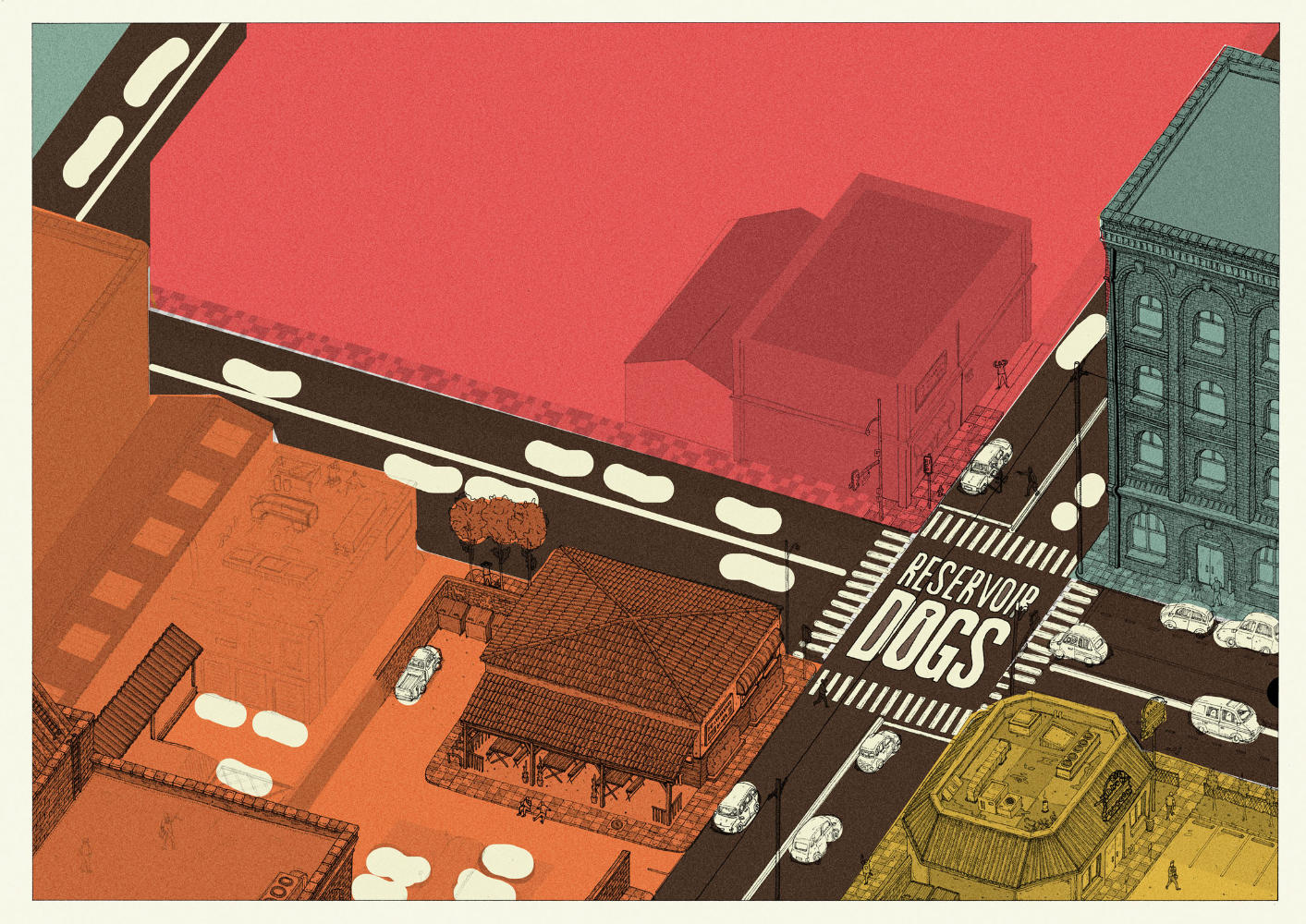
In hindsight, it seems like an incredibly obvious solution. It’s exactly the type of thing I was aiming for when I first set out to create the piece, and yet it took a lot of pain and experimenting to get there. I couldn’t even tell you why! I think it really is proof that executing something simple is often harder than doing something that's complicated.
THE PRINTING PROCESS
Just as I thought I was through the problematic part of the process, another can presented itself to me, and this can was filled with even more worms than the last. Now the previous project I’d screen printed (my Daft Punk/TRON piece) was the first time I’d properly screen printed something, and all things considered it went pretty smoothly. I was in quite a flurry to get it done, but it went smoothly. So this time would go even calmer right? Since it was my second time and I knew what I was doing? Hahaha..haha...ha....ha...ha. Not really.
There were a whole bunch of mistakes I made this time around, and given that screen printing can be quite an expensive process there were most definitely some hard lessons learned. With my TRON Screen Print I’d done last time, I bought A3 acetate to run through my own home printer in order to create the film positives for the exposure. This went 100% fine last time so I presumed there’d be no reason it wouldn’t go fine again. Whoops.
Since the Reservoir Dogs print was going to be A2 in size rather than A3, I’d have to use 2 sheets of acetate and stick them together. No worries, I’m pedantically precise when I cut and measure things so this shouldn’t be a problem. I did this for all 6 layers of the film positives, precisely cutting and sticking 12 sheets of acetate together so that they’d all line up once printed. I first exposed the linework layer and the base brown layer onto screens so I could get going. The brown would be going down first, as this had to go under the blue/orange/yellow/pink to create shadows under those colours. The linework wouldn’t be going down until last, but I felt it important to test that this layer would actually work and the detail would come through clearly, otherwise I would have 70 odd 5 layer screen prints that couldn’t be finished.
And this is where the next issue arose. The acetate didn’t want to expose properly. It left a squiggly/wavy pattern all over the print, where the ink hadn’t quite come through the screen. After consulting Kirstie (who along with Ellie was (as always) tremendously helpful in helping to get my screen prints sorted) we came to the conclusion that it was probably caused by my acetate having a slight blue tinge/frost to it (which you can see in the photo above from when I layered the 6 sheets on top of one another) as well as the fact that my printer ink might not have printed the blacks dark enough. Either way, the 2 screens I’d prepped were now going to have to be stripped and all the positives I’d cut/stuck together were useless.
Kirstie was very kind in reprinting my positives for me, using acetate that they had stocked in the Arthouse which was more suitable for the job. I was starting to get a bit frustrated at this point, and I mucked up cutting/sticking these together. Nothing I couldn’t fix, but was just another thing to add onto the growing pile of annoyances. Anyways, acetate sorted, I can get to exposing my screens. And from here things seemingly went quite smoothly.
There was one tiny issue, of course, in that where I had cut/stuck the acetate together there was now a white line running through the centre of the print. I didn’t think it was too bad at the time, and I was also reaching the point where I was beyond caring and I needed to get them finished before the deadline.
Anyways, I got around 75 or so prints done, which I then had to narrow down into which ‘good’ prints and ‘bad’ prints. This was quite a disheartening moment when I flicked through them all and I realised that there wasn’t a single perfectly aligned print among them. I wasn’t too surprised, given that the error for margin when my work is as detailed as it is very low, as well as the fact I was having to work quite quickly to prevent the screen from drying out. But still, I had been hoping that at least a couple would stand out as being really well aligned. Oh well, lesson learned for next time.


SELLING/DISTRIBUTING THEM
I signed them, numbered them and shipped them off to the US where they would be featured and sold in a gallery show. I wasn’t entirely happy with them, especially given the white line down the centre and the general misalignments, but it had been such a colossal and continuous nightmare that I was just happy to have it finished and over with.
Except it wasn’t. I got an email from the Gallery a few weeks later, just before the show, that they (rightfully so) didn’t feel comfortable displaying the prints. I would have liked to scream when I read the email, but at the end of the day I don’t blame them in the slightest, especially when I was already aware of the issue and I probably should have forewarned them before I sent the prints. It’s just one of those things that is a lesson to be learned.
The final cherry on top was getting them sent back to me, only for UPS to slap an additional £120 import tax onto my bill. As if I needed any more financial burden from this project. Good times.
Anyways, never fear! I decided to post the prints on my own shop, and sell them at a discounted price to account for the misalignments. I honestly still think the prints look great framed and displayed, it’s just when you get close to them you can see where the ink overlaps and isn’t playing nice. If you’ve read all this babble and waffle and you still wish to still purchase one (like an absolute hero), then you can find them here on my shop!
RETROSPECT
I find it a bit odd writing things like this. I wouldn’t go so far as to call the project a failure, but I certainly feel I’m being more transparent than a lot of other creators would be about things like this. And I think that’s important. I think it’s foolish to expect there to not be any hurdles when you’re starting out and there isn’t any point in hiding those obstacles that you do have to overcome. Might as well own them and learn from them. And I can tell you for a fact, I won’t bloody well be making these mistakes again!
On a lighter note, I did get a refund (mostly) for that UPS charge. Silving linings and all that.